



- Posts: 1165
- Thank you received: 122


October Challenge: Horror rework
September entries: Legend
Important, change your password!
Go here for further information: https://cgartnexus.com/index.php/forum/announcements/840-hacked
March 2019 - Classic Cover - WIPs
07 Mar 2019 00:04 #24053
by Atto
No smudge tool was harmed in the making of this image.
Replied by Atto on topic March 2019 - Classic Cover - WIPs
Thanks Val. I’m looking forward to them but with a great sense of trepidation too.
There still hasn’t been a great adaptation of the book imho. The source material is so rich and complex I wonder if there ever will be. I’ve read the entire series many times (even those god awful Kevin J Anderson ones) and it’s now a part of my psyche.
I’ve purposefully sharpened Alecs nose in my Wip to enhance that classic Atreides hawk like profile and I’m going to edit it further to bring him closer to my personal interpretation too. I used a slightly older photo as reference like Hansnomad did too to give him a more mature look. More along the lines of Dune Messiah than the spoilt kid from Caladan.
Hansnomad, that looks great so far. Love the way you’ve handled the hands and the gun and leaving the silhouette as a container for another image shows much more forethought than me.
There still hasn’t been a great adaptation of the book imho. The source material is so rich and complex I wonder if there ever will be. I’ve read the entire series many times (even those god awful Kevin J Anderson ones) and it’s now a part of my psyche.
I’ve purposefully sharpened Alecs nose in my Wip to enhance that classic Atreides hawk like profile and I’m going to edit it further to bring him closer to my personal interpretation too. I used a slightly older photo as reference like Hansnomad did too to give him a more mature look. More along the lines of Dune Messiah than the spoilt kid from Caladan.
Hansnomad, that looks great so far. Love the way you’ve handled the hands and the gun and leaving the silhouette as a container for another image shows much more forethought than me.
No smudge tool was harmed in the making of this image.
Please Log in or Create an account to join the conversation.
07 Mar 2019 01:52 #24055
by Valence
Replied by Valence on topic March 2019 - Classic Cover - WIPs
Kevin J Anderson is an awful hack writer that'll churn out dross for any franchise you like. 
Please Log in or Create an account to join the conversation.
07 Mar 2019 02:32 #24056
by Atto
No smudge tool was harmed in the making of this image.
Replied by Atto on topic March 2019 - Classic Cover - WIPs
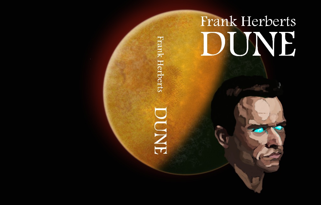
Sooooooo.....I’m starting a new driving job on Monday to generate some beer money before the shows start in May/June. The upshot is I’m not going to be able to spend much time on this once I start. I’ve pushed it as far as my eyes can handle today and I’m pretty happy so far.
I thought that it looked pretty cliched at first but I’m hoping that’s because I have a copy of Bladerunner 2 by K W Jeter with a similar cover (that planet motif).
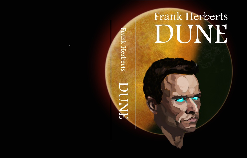
2 versions so far. I need to resolve the portrait and figure out what I’m doing on the rear of the cover but I’d appreciate your opinions. Ignore the white vertical lines on the second image, they’re just to mark where the spine would go.
I’m thinking on the second one I will use that dark green of the planets shadow and the dark brown rim to form the Atreides hawk motif. It’ll be a stylised profile and I intend the beak to echo Muad’Dibs nose.
Would love to hear which you all prefer.
I thought that it looked pretty cliched at first but I’m hoping that’s because I have a copy of Bladerunner 2 by K W Jeter with a similar cover (that planet motif).
2 versions so far. I need to resolve the portrait and figure out what I’m doing on the rear of the cover but I’d appreciate your opinions. Ignore the white vertical lines on the second image, they’re just to mark where the spine would go.
I’m thinking on the second one I will use that dark green of the planets shadow and the dark brown rim to form the Atreides hawk motif. It’ll be a stylised profile and I intend the beak to echo Muad’Dibs nose.
Would love to hear which you all prefer.
No smudge tool was harmed in the making of this image.
Please Log in or Create an account to join the conversation.


07 Mar 2019 11:28 #24058
by Banj
Replied by Banj on topic March 2019 - Classic Cover - WIPs
*cough* Apostrophe *cough*
The following user(s) said Thank You: Atto
Please Log in or Create an account to join the conversation.
07 Mar 2019 12:42 #24059
by Atto
No smudge tool was harmed in the making of this image.
Replied by Atto on topic March 2019 - Classic Cover - WIPs
Me’h I’ll sort it out when I settle on a final text.
No smudge tool was harmed in the making of this image.
Please Log in or Create an account to join the conversation.
07 Mar 2019 13:13 - 07 Mar 2019 13:13 #24062
by Charlotte
Any an all misspellings are henceforth blamed on the cats.
Replied by Charlotte on topic March 2019 - Classic Cover - WIPs
Not sure which version I prefer. I kind of like it where the planet is offset rather than centered around the head like a halo, but I also like the other version where the face has a bit more room to breathe... 
Edit: just looking at the thumbs I think I prefer the first one.
Edit: just looking at the thumbs I think I prefer the first one.
Any an all misspellings are henceforth blamed on the cats.
Last edit: 07 Mar 2019 13:13 by Charlotte.
The following user(s) said Thank You: Atto
Please Log in or Create an account to join the conversation.
07 Mar 2019 15:47 #24063
by Atto
No smudge tool was harmed in the making of this image.
Replied by Atto on topic March 2019 - Classic Cover - WIPs
I agree Charlotte. A mix of the two will probably be where I take it.
I need some room on the right hand side of the face to add the motif but I don’t think that halo, which was my original intention, works when it’s centred around the portrait exactly. I’m glad the idea came across though.
I need some room on the right hand side of the face to add the motif but I don’t think that halo, which was my original intention, works when it’s centred around the portrait exactly. I’m glad the idea came across though.
No smudge tool was harmed in the making of this image.
Please Log in or Create an account to join the conversation.


09 Mar 2019 13:50 - 09 Mar 2019 14:01 #24079
by hansnomad
Replied by hansnomad on topic March 2019 - Classic Cover - WIPs
Thanks for your comments, guys.
Atto: Looking very good. Love the starkness of the design (the darkness of space against the rich warm color of Arrakis and the figure). Just watch that the dark area of the planet doesn't coincide with the darker back of his head. You want the portrait to pop, so keep an eye on the shapes and position of light against other shapes (which is why I think version 2 of the ones you posted works better). Frankly, when I look at what you are doing, I could totally see it on a bookshelf at Barnes & Noble.
I'm moving fast on mine because I have some business travel in the latter half of the month, so I'm compressing my finish timeline (if I don't, I'll probably not finish). I'm hoping to be done some time mid month (before I have to go away).
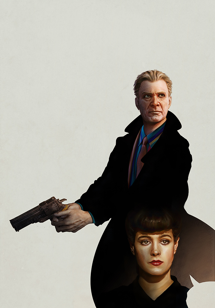
Here an update (WIP02): Used Deckard's coat as a container to add Rachael's portrait. Used one of the still shots from the movie as a reference for her (there's tons of them). I may or may not do additional detailing on the figures depending on the time I have. I may do away with the split in Deckard's coat in the back. I added it to break up the space, but with Rachael there it looks like a comic speech bubble. I'll see how it reads when I add the background.
I think the toughest part of this will be the city background and the lettering design of the title. I've been looking at a lot of the paperbacks published in the 1960's for ideas.
Atto: Looking very good. Love the starkness of the design (the darkness of space against the rich warm color of Arrakis and the figure). Just watch that the dark area of the planet doesn't coincide with the darker back of his head. You want the portrait to pop, so keep an eye on the shapes and position of light against other shapes (which is why I think version 2 of the ones you posted works better). Frankly, when I look at what you are doing, I could totally see it on a bookshelf at Barnes & Noble.
I'm moving fast on mine because I have some business travel in the latter half of the month, so I'm compressing my finish timeline (if I don't, I'll probably not finish). I'm hoping to be done some time mid month (before I have to go away).
Here an update (WIP02): Used Deckard's coat as a container to add Rachael's portrait. Used one of the still shots from the movie as a reference for her (there's tons of them). I may or may not do additional detailing on the figures depending on the time I have. I may do away with the split in Deckard's coat in the back. I added it to break up the space, but with Rachael there it looks like a comic speech bubble. I'll see how it reads when I add the background.
I think the toughest part of this will be the city background and the lettering design of the title. I've been looking at a lot of the paperbacks published in the 1960's for ideas.
Last edit: 09 Mar 2019 14:01 by hansnomad.
Please Log in or Create an account to join the conversation.
09 Mar 2019 14:36 #24080
by Valence
Replied by Valence on topic March 2019 - Classic Cover - WIPs
You're right about that "speech bubble", once you notice it, it's very hard to "un-see" again and it distracts a little from the wonderful work elsewhere.
And it's a fine portrait of Rachael. I love the way you've captured that weird cat-like reflection in her eyes. That's one of the things that always sticks with me from the movie so it's nice to see it here too.
And it's a fine portrait of Rachael. I love the way you've captured that weird cat-like reflection in her eyes. That's one of the things that always sticks with me from the movie so it's nice to see it here too.
Please Log in or Create an account to join the conversation.
10 Mar 2019 20:34 - 10 Mar 2019 20:35 #24090
by hansnomad
Replied by hansnomad on topic March 2019 - Classic Cover - WIPs
Valence: Yeah, I think I'll fix that unintended speech balloon effect at the end when I tidy things up. It's a quick fix.
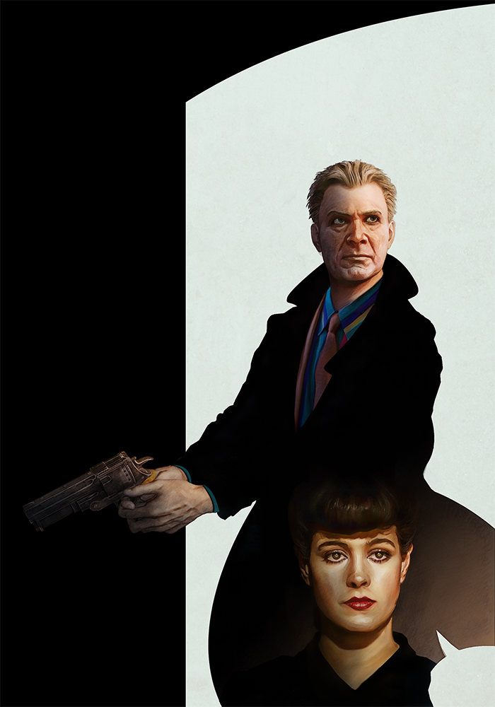
I finally decided on how to display the title. I want to use another black container as a sort of doorway through which you can see the city and I'll put the title text inside that. I made the top of it arched to look more dynamic and add a bit of interest.
WIP03: Made some minor detailing changes to Deckard's face and added the container for the title.
I finally decided on how to display the title. I want to use another black container as a sort of doorway through which you can see the city and I'll put the title text inside that. I made the top of it arched to look more dynamic and add a bit of interest.
WIP03: Made some minor detailing changes to Deckard's face and added the container for the title.
Last edit: 10 Mar 2019 20:35 by hansnomad.
Please Log in or Create an account to join the conversation.
Facebook Feed
Member Statistics
- Total Users: 228
- Latest User: DanielWilson
- Online Users: 0
- Users Today: 0
- Users this Week: 0
- Users this Month: 0
- Users this Year: 2
NOTE! This site uses cookies and similar technologies.
By using this website you agree to the use of cookies and related data storage as detailed in our privacy policy. Learn more
I understand
Site design Mad Hamster Studios. All content is protected under © and the property of the various contributers and not to be reproduced without permission of the creator.