


 I know what day it is, maybe not the month or year

Important, change your password!
Go here for further information: https://cgartnexus.com/index.php/forum/announcements/840-hacked
CGAN March 2018 - Roman Gods - WIPs
- cgmythology
-
- Offline
- Premium Member
-

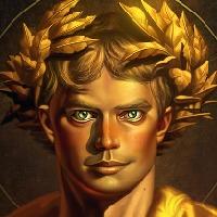
Thomgirl: Really enjoying your concept, very much looking forward to how it progresses!
............
I worked on the image some more in between work. I think I'll work on it exclusively during the weekend and spend a lot of time on it then. Feedback welcome as always

Please Log in or Create an account to join the conversation.

Everybody else's, that is.

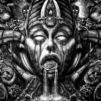
Everything I've been doing over the past few days (for this pic and others) has been absolutely terrible but I finally managed a bit of improvement to my two-faced fellow tonight.
I'm hoping I can start to tighten it up a bit more now but ... we'll see.

Keep up the good work, everyone.

Please Log in or Create an account to join the conversation.
I hope you're going to keep the painterly styles different on the two faces like your WIP suggests and the 'join' between the two is going to give you some interesting challenges but also some great opportunities to melt flesh (maniacal laughter ensues!)
All your forms are looking good already CG. Especially on her dress and Plutos throne - some really exciting chances to play around with those ghostly figures at the back here.
Thomgirl - flesh tones are looking really convincing already and I get a real feeling that the leather armour encases her form with those early drop shadows.
So heres my first sketch:
Bacchus on a Vespa, excuse the rather stereotypical thought process behind this. I'm just deciding whether to leave him quite slim and muscular (as I see him in statues) or whether to flesh him out with red rosey cheeks and a big belly as he appears in many of the paintings I have found
No smudge tool was harmed in the making of this image.
Please Log in or Create an account to join the conversation.

Atto- I am TOTALLY stoked to see you take a modern approach to the idea. I seriously considered trying to like a sci fi Minerva, but decided to stick with classic instead. Not regretting it, but I'm really liking your out of the ordinary concept on the subject. Should be a lot fun.
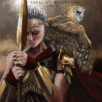
As for me, trying to keep to my own advice and keep it loose. A very fun mess, gotta say. I may do a little further tightening on the lips, nose and certainly the hands. Metal's giving me a fit... SHOULD have stuck to leather, but eh... f-it. She's a goddess, she should be clad in the best. It's far from done, just laying out stuff to work out issues. The owl will be my reward, looking forward to tackling him, but he shall be last.
Please Log in or Create an account to join the conversation.

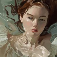
I've decided instead to go with Vulcans underwater forge cause thats gonna be SO much easier.
I dropped a blue layer over my ref set to lighten to try and get a better idea of how this might look and then I've worked up his face some with darker hues (purples and blacks) to push the contrast - still miles to go and I haven't even begun to put in the actual forge - which is going to be a mini volcano type thingy with lava spewing out, an anvil and some suggested forms in the background - but I'd love to know if you think I'm on the right track colour wise - Cheers.
Edit - before anyone mentions the glaringly awful mistake, I've changed his hair up so it looks like its in a current! OOOoopsy
[/attachment]
No smudge tool was harmed in the making of this image.
Please Log in or Create an account to join the conversation.


Been looking a lot at the work of Alphonse Mucha lately, and how he used to incorporate decorative borders and elements as part of his work. So I wanted to try working other graphic elements into the piece (never tried this before in this style).
WIP01: Drew up shapes in Photoshop to make a decorative design to use as elements to frame my character.
WIP02: Filled the shapes and the border with Art Noveau elements (used stencils and stamps I found online) and adjusted the colors to match the color scheme I have in mind. Since Luna and Diana are part of the same Roman lunar god pantheon (and Diana is a huntress), I used nature graphics to fill the design.
WIP03: Painted a moon and inserted it into the round framing element to act as a halo around the character's head.
WIP04: Used the framing composition as a guide to draw a character (on it's own layer)
Please Log in or Create an account to join the conversation.
Please Log in or Create an account to join the conversation.
You obviously DO have those skills because this already looks amazing!
Both colour schemes looked fine to me so don't worry too much. Just keep drawing those lovely flowing lines.
Please Log in or Create an account to join the conversation.
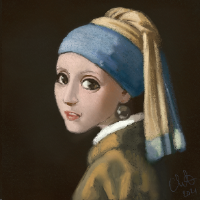

I think somthing like the current outfit would work fine, but I think the linework needs a few changes for more Mucha style - especially his typical flowing hair. If you want to make it typical, that is
Any an all misspellings are henceforth blamed on the cats.
Please Log in or Create an account to join the conversation.
Atto wrote: ...the 'join' between the two is going to give you some interesting challenges...
Ain't that the truth! (he says after struggling)
I rather liked the humour of your Vespa pic, Atto. You could've put an Audrey Hepburn reference in and made it a Roman (Gods) Holiday.
But your second sketch does fit the theme and tone better and it does have that recognisable muted stillness of being underwater.
I'm liking the progress of your pic too, Thomgirl.
The colours are well chosen and give it a consistent, harmonious feel and those feathers already look convincing with those expressive brush strokes.
Please Log in or Create an account to join the conversation.
Facebook Feed
Member Statistics
- Total Users: 226
- Latest User: norajohnson
- Online Users: 1
- Users Today: 0
- Users this Week: 0
- Users this Month: 0
- Users this Year: 0
Members Online
NOTE! This site uses cookies and similar technologies.
By using this website you agree to the use of cookies and related data storage as detailed in our privacy policy. Learn more
Site design Mad Hamster Studios. All content is protected under © and the property of the various contributers and not to be reproduced without permission of the creator.