


- Posts: 1256
- Thank you received: 96
My first project here
12 Jul 2014 16:16 #2295
by Domtopia
Everything's on the right!!!
It's like driving abroad!
Replied by Domtopia on topic My first project here
This is a good example of the sort of distance I'm talking about.
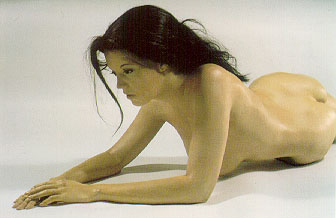
Everything's on the right!!!
It's like driving abroad!
Please Log in or Create an account to join the conversation.

12 Jul 2014 17:01 #2319
by Stuart
Replied by Stuart on topic My first project here
Thanks for taking the time to look out a pic, but if you look at the direction of the pose her head is arched away from the breast. Imagine if she dipped her head to look between her arms, her chin would then be maybe half a head-length. Does that make sense?
Please Log in or Create an account to join the conversation.
12 Jul 2014 17:06 #2324
by Domtopia
Everything's on the right!!!
It's like driving abroad!
Replied by Domtopia on topic My first project here
Yep. But I don't think it would make as much difference to the proportions as it has.
Maybe it's because when we (guys) draw girls, we can't help but make them with perky or massive breasts. I think that they are too perky in the painting and thus too high.
The nipple should be a full head's distance from her chin I reckon.
But I might be wrong. Let's see what other folk think.
Maybe it's because when we (guys) draw girls, we can't help but make them with perky or massive breasts. I think that they are too perky in the painting and thus too high.
The nipple should be a full head's distance from her chin I reckon.
But I might be wrong. Let's see what other folk think.
Everything's on the right!!!
It's like driving abroad!
Please Log in or Create an account to join the conversation.
12 Jul 2014 17:13 #2331
by Stuart
Replied by Stuart on topic My first project here
Lol, I never draw massive breasts. 
Please Log in or Create an account to join the conversation.
12 Jul 2014 17:38 #2336
by Stuart
Replied by Stuart on topic My first project here
So I don't think I'll do much more tonight, getting tired and my night-shift starts at 23:00. :angry:
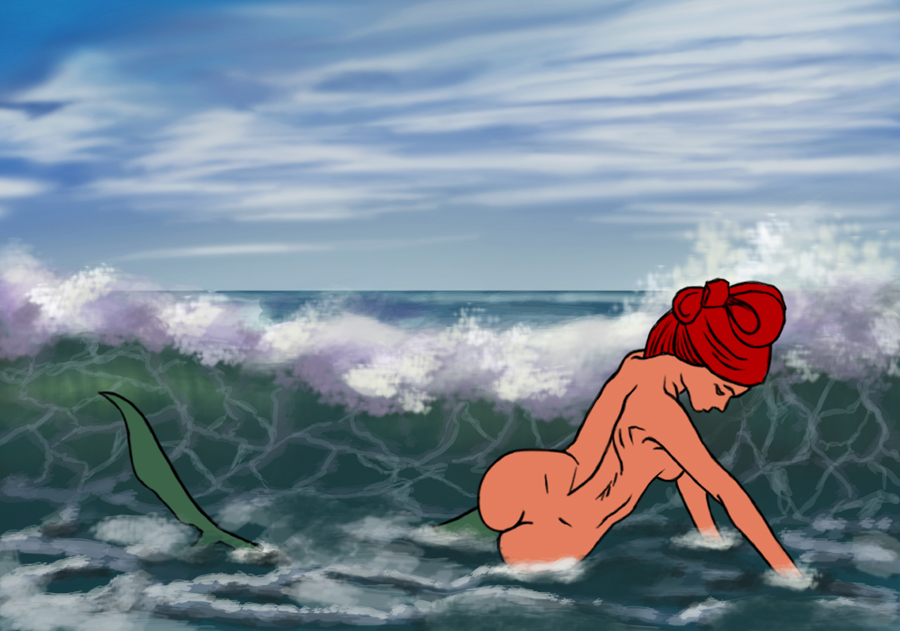
Here's what I have so far:
Anyone know any good tutorials on painting surf? :p
Here's what I have so far:
Attachment MermaidWIP.jpg not found
Anyone know any good tutorials on painting surf? :p
Attachments:
Please Log in or Create an account to join the conversation.
12 Jul 2014 19:44 - 12 Jul 2014 19:45 #2359
by Stuart
Replied by Stuart on topic My first project here
I can't stop!
Last edit: 12 Jul 2014 19:45 by Stuart.
Please Log in or Create an account to join the conversation.
12 Jul 2014 19:47 #2360
by Stuart
Replied by Stuart on topic My first project here
Found a bug banj, if you try to attach a file with the same name it reverts to the previous filename's image. So I posted Mermaid WIP, then tried to post an updated version with the same filename, however it showed the original image twice instead. Does that make sense?
Please Log in or Create an account to join the conversation.
12 Jul 2014 23:08 #2405
by Kynamh
Replied by Kynamh on topic My first project here
It's a really abrupt transition from curvy buttocks to fish tail in this view. I would try and tweak that a bit, maybe have some of tail visible between her lower body and arms, or more of it sweeping behind her?
Please Log in or Create an account to join the conversation.
13 Jul 2014 04:42 #2424
by Smolin
Replied by Smolin on topic My first project here
Hi Stuart:
Looking really good so far, but I think there are a few issues you might want to resolve before getting into the next stage.
I see what Dom means about the breasts appearing a bit too high, but her chin is down, so maybe not a full head in this case? But I keep thinking that the placement of the spine is knocking things out of whack. I think if you correct the placement of the spine, it'll give the body much more form. I'd push that line closer to the far shoulder (her left).
I'd also have a think about the composition. The horizon line cuts the image in two equal halves, which isn't optimal. The shape of the wave doesn't do much either -- it's almost straight. A more exaggerated curve on the wave would add some flow to the composition.
Finally, she is sort of low in the frame, so unless you're really going to make the image about the seascape with a mermaid accent, you might want to raise her a bit more.
Simpler option for the composition in general is to just crop out half of the sky!
I hope some of this is useful! I'm looking forward to seeing more. It's a really good start despite these little nitpicks.
Please Log in or Create an account to join the conversation.
13 Jul 2014 09:52 - 13 Jul 2014 10:10 #2430
by mute827
Replied by mute827 on topic My first project here
I agree with everybody else about the breast placement and other suggestions. Right now her breast, look stiff and weightless, like there not being affected by gravity. The placement will be different depending on the pose and perspective, as well as the size of the breast. It doesn't have to be 100% accurate, as my sketch isn't, but you want to give them a sense of weight. As for the rest of the anatomy, the line that you have connecting the upper rear and hips are overlapped the wrong way. The way that I interpreted your pose, the back and hips should be in front of the rear. Also, because of the pose, you wouldn't see her butt crack that much , but since you're making her a mermaid it doesn't really matter anyway. For the face, depending on how much you are going to turn it, the eye would be closer to the edge and you probably wouldn't see much of her nose, if at all, because of the way the body is angled. Also you wouldn't see her lips, but all of this depends on how much you are going to turn her head.
As far as the composition, I would crop it to focus more on the mermaid. Unless you had planned on painting something else in that space, but I believe that would take away from her presence. For the wave, it would probably look better if you made it smaller so it doesn't look like it would almost push her over. I think it would complement her pose more.
Hope this helps. Good luck
, but since you're making her a mermaid it doesn't really matter anyway. For the face, depending on how much you are going to turn it, the eye would be closer to the edge and you probably wouldn't see much of her nose, if at all, because of the way the body is angled. Also you wouldn't see her lips, but all of this depends on how much you are going to turn her head.As far as the composition, I would crop it to focus more on the mermaid. Unless you had planned on painting something else in that space, but I believe that would take away from her presence. For the wave, it would probably look better if you made it smaller so it doesn't look like it would almost push her over. I think it would complement her pose more.
Hope this helps. Good luck
Last edit: 13 Jul 2014 10:10 by mute827.
Please Log in or Create an account to join the conversation.
Facebook Feed
Member Statistics
- Total Users: 226
- Latest User: norajohnson
- Online Users: 0
- Users Today: 0
- Users this Week: 0
- Users this Month: 0
- Users this Year: 0
NOTE! This site uses cookies and similar technologies.
By using this website you agree to the use of cookies and related data storage as detailed in our privacy policy. Learn more
I understand
Site design Mad Hamster Studios. All content is protected under © and the property of the various contributers and not to be reproduced without permission of the creator.