


- Posts: 1140
- Thank you received: 118
Attos' Sketchbook and Studies NSFW Nudity
01 Mar 2016 03:25 #13440
by Atto
No smudge tool was harmed in the making of this image.
Replied by Atto on topic Attos' Sketchbook and Studies NSFW Nudity
Think I'm done with this one.
No smudge tool was harmed in the making of this image.
Please Log in or Create an account to join the conversation.
09 Mar 2016 17:38 #13497
by Atto
No smudge tool was harmed in the making of this image.
Replied by Atto on topic Attos' Sketchbook and Studies NSFW Nudity
Following on from Micro's comments about using photo manipulations as a tool to generate ideas I thought I would give it a go and came up with the following.
I've wanted to do something on an epic scale for some time and have been considering adapting real life locations since I saw the remake of Total Recall.
The first is of a new manhattan bridge. I've had to play a little with the skyline unfortunately but I think its still just about recognisable.
The second is of the fairy bridge in China. Not entirely sure which city it is, I believe somewhere in the states.
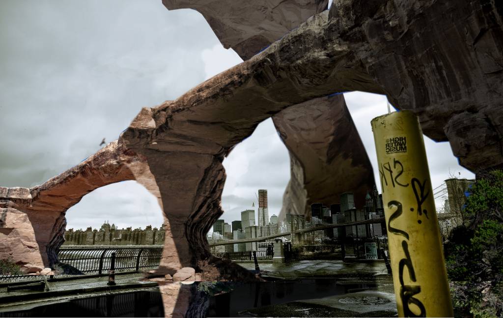

Would appreciate it if you guys would let me know what you think as this is my first foray into the world of the HUUUUGE! Cheers.
I've wanted to do something on an epic scale for some time and have been considering adapting real life locations since I saw the remake of Total Recall.
The first is of a new manhattan bridge. I've had to play a little with the skyline unfortunately but I think its still just about recognisable.
The second is of the fairy bridge in China. Not entirely sure which city it is, I believe somewhere in the states.
Would appreciate it if you guys would let me know what you think as this is my first foray into the world of the HUUUUGE! Cheers.
No smudge tool was harmed in the making of this image.
Please Log in or Create an account to join the conversation.

11 Mar 2016 14:33 - 11 Mar 2016 16:19 #13504
by Valence
Replied by Valence on topic Attos' Sketchbook and Studies NSFW Nudity
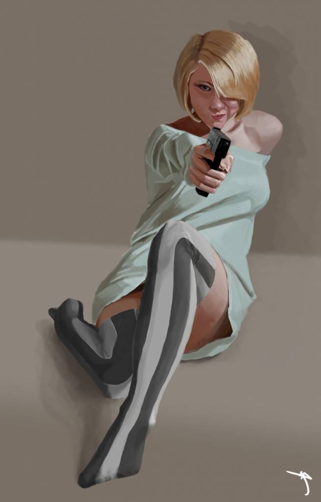
You finished that vampire shooting girl quickly! It was posted up without me noticing.  The gun pops out very well, and it makes a good avatar too.
 ")
I think the structures and compositions of your photo-manips look impressively epic. The depth looks a little confusing though. I think it comes with using photos with different depth of field and focusing distance. It's most noticable when you have a sharp distant building next to a slightly blurry bit of rock. (EDIT: Resampling different resolution photos also creates that blurry/sharp discrepancy.)
But the colour and lighting match up very well.
The gun pops out very well, and it makes a good avatar too. I think the structures and compositions of your photo-manips look impressively epic. The depth looks a little confusing though. I think it comes with using photos with different depth of field and focusing distance. It's most noticable when you have a sharp distant building next to a slightly blurry bit of rock. (EDIT: Resampling different resolution photos also creates that blurry/sharp discrepancy.)
But the colour and lighting match up very well.
Last edit: 11 Mar 2016 16:19 by Valence.
The following user(s) said Thank You: Atto
Please Log in or Create an account to join the conversation.
- microscopi
-

- Offline
- Premium Member
-

Less
More
- Posts: 743
- Thank you received: 79
11 Mar 2016 18:17 - 11 Mar 2016 18:37 #13505
by microscopi
Replied by microscopi on topic Attos' Sketchbook and Studies NSFW Nudity
She looks great Atto,her face and hair are my favorite part, really nailed the smooth shiny look, and her expression is perfect, adds a lot of flirtation and character ") . It's really hard to do fabric also but you did a good job there too.
. It's really hard to do fabric also but you did a good job there too.
Nice pinup!
The photos you chose are good starting points for sure to show an epic scale. I think having a huge structure next to a small one does a great job to show scale. That's why artists usually put a little human in their pic to show how big in relation the objects are. The best part of photo manipulating is painting over them in your own style, eventually the photo gets painted away and you're left with a great pic!
. It's really hard to do fabric also but you did a good job there too.Nice pinup!
The photos you chose are good starting points for sure to show an epic scale. I think having a huge structure next to a small one does a great job to show scale. That's why artists usually put a little human in their pic to show how big in relation the objects are. The best part of photo manipulating is painting over them in your own style, eventually the photo gets painted away and you're left with a great pic!
Last edit: 11 Mar 2016 18:37 by microscopi.
The following user(s) said Thank You: Atto
Please Log in or Create an account to join the conversation.
15 Mar 2016 16:37 #13532
by Atto
No smudge tool was harmed in the making of this image.
Replied by Atto on topic Attos' Sketchbook and Studies NSFW Nudity
Thanks both.
The fabric on the pin-up was something I really struggled with - even spent a very frustrating but ultimately rewarding few hours doing pencil studies of drapery from old masters work. It's something I certainly need improvement on (hell I cant paint naked people for the rest of my life......or can I?). This kind of scale is where I'm at my most confident, a single figure, with very little in the way of background or props.
Thats part of the reason I'm pushing toward more complex compositions and subjects like in the last stand entry and the photo manips above.
I have some work to do on similar subjects as the pin-up for friends before I can start on those but thanks for the crit.
No smudge tool was harmed in the making of this image.
Please Log in or Create an account to join the conversation.
16 Mar 2016 13:43 #13538
by Atto
No smudge tool was harmed in the making of this image.
Replied by Atto on topic Attos' Sketchbook and Studies NSFW Nudity
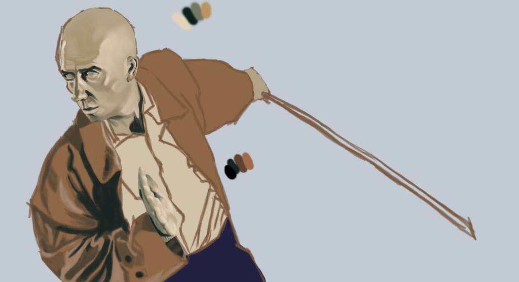
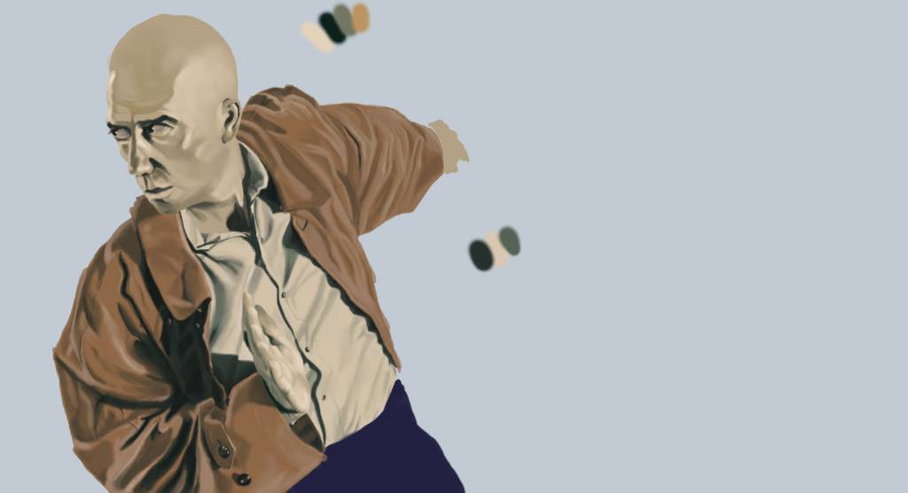
My new work - concentrating on portraiture and that pesky fabric stuff.
I may have mentioned once or twice the work of Phil Hale so I thought I'd try using a colour palet of his that I really liked, yeah, his is the first image.
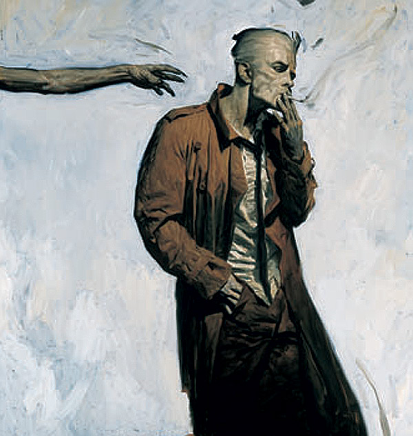
I may have mentioned once or twice the work of Phil Hale
so I thought I'd try using a colour palet of his that I really liked, yeah, his is the first image.No smudge tool was harmed in the making of this image.
Please Log in or Create an account to join the conversation.
17 Mar 2016 00:41 #13546
by Atto
No smudge tool was harmed in the making of this image.
Replied by Atto on topic Attos' Sketchbook and Studies NSFW Nudity
A little more on this one....
No smudge tool was harmed in the making of this image.
Please Log in or Create an account to join the conversation.
17 Mar 2016 14:11 #13549
by Atto
No smudge tool was harmed in the making of this image.
Replied by Atto on topic Attos' Sketchbook and Studies NSFW Nudity
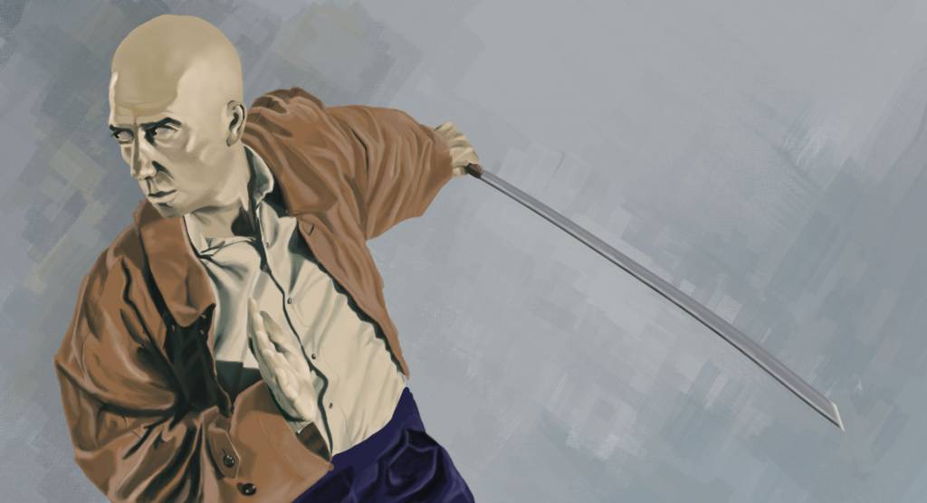
Trying to put a little dynamism into the background - not sure this is working at all though.
No smudge tool was harmed in the making of this image.
Please Log in or Create an account to join the conversation.
17 Mar 2016 15:42 #13550
by Valence
Replied by Valence on topic Attos' Sketchbook and Studies NSFW Nudity
It seems to be working so far.
The only two issues I currently see are 1: The arm that has the sword doesn't quite recede into the distance just yet. I think that pushing the values of the creases will help explain that better. And 2: The other free hand could do with being a bit warmer in colour. At the moment it blends in too easily with the shirt and is virtually invisible unless you really study the detail.
The pose and composition are excellent and you're controlling the browns very well indeed. I always struggle with the saturation of brown shades but there are none of those problems here.
Also you might want to add a bit more texture to the background to really match the style of the reference. I find that Ditlev's impasto style Photoshop brushes are good for this kind of stuff.
The following user(s) said Thank You: Atto
Please Log in or Create an account to join the conversation.
17 Mar 2016 18:40 #13553
by Atto
No smudge tool was harmed in the making of this image.
Replied by Atto on topic Attos' Sketchbook and Studies NSFW Nudity
Thanks for the feedback Val. I noticed that disappearing hand and it's actually given me an idea for a new piece - I'll fix it before I post the final in my gallery.
Regarding the back arm I agree it doesn't recede correctly but since I altered the colours from the ref I'm struggling to figure out how to change it. Do you think it should be lighter in tone? Less saturated? Or I was thinking of adding some blue to the highlights to help it tone into the background more.
Unfortunately I don't use photoshop and there are very few brushes available for the programme I do use.
As far as the browns go I noticed Phil Hale uses a deep blue/green colour in the ref above for shadows (yeah I colour picked something I try to avoid but worked here as I was trying to copy his palette) I'm glad you think it worked.
Regarding the back arm I agree it doesn't recede correctly but since I altered the colours from the ref I'm struggling to figure out how to change it. Do you think it should be lighter in tone? Less saturated? Or I was thinking of adding some blue to the highlights to help it tone into the background more.
Unfortunately I don't use photoshop and there are very few brushes available for the programme I do use.
As far as the browns go I noticed Phil Hale uses a deep blue/green colour in the ref above for shadows (yeah I colour picked
something I try to avoid but worked here as I was trying to copy his palette) I'm glad you think it worked. No smudge tool was harmed in the making of this image.
Please Log in or Create an account to join the conversation.
Facebook Feed
Member Statistics
- Total Users: 226
- Latest User: norajohnson
- Online Users: 2
- Users Today: 0
- Users this Week: 0
- Users this Month: 0
- Users this Year: 0
NOTE! This site uses cookies and similar technologies.
By using this website you agree to the use of cookies and related data storage as detailed in our privacy policy. Learn more
I understand
Site design Mad Hamster Studios. All content is protected under © and the property of the various contributers and not to be reproduced without permission of the creator.