


- Posts: 1140
- Thank you received: 118
April challenge here: Elder God
March entries - Egg Bunnies
The shoutbox is unavailable to non-members
Shoutbox History
CGMythology's Sketchbook (nudity)
10 Nov 2020 09:54 #32134
by Atto
No smudge tool was harmed in the making of this image.
Replied by Atto on topic CGMythology's Sketchbook (nudity)
Great work again, it has all your lovely hallmark touches in the lighting and the believable environment that I’ve come to expect from your work. I kinda agree with Val on the wings but I think it’s a personal/character decision that you’ve made and the execution of that decision is well handled. Personally I’d like to see a little human shoulder structure there in the transition but it’s certainly no deal breaker.
It’s a similar issue with her dress. I feel the blue/white separation divides her body in a slightly awkward way but again this might be a character design decision.
I’d be absolutely chuffed if this was my work and the fact we can have these kind of discussions about design as opposed to say, anatomy critiques, shows how successful an image it is. Nicely done!
No smudge tool was harmed in the making of this image.
The following user(s) said Thank You: cgmythology
Please Log in or Create an account to join the conversation.
- cgmythology
-
 Topic Author
- Offline
- Premium Member
-

26 Nov 2020 03:42 #32444
by cgmythology
Replied by cgmythology on topic CGMythology's Sketchbook (nudity)
Valence: Thanks for your honesty. I wasn't trying to go for a smooth, 'blended' transition with the wings, as I quite like the shape and basic silhouette. Glad you enjoy the other elements, however! ")
Atto: Thank you, really glad to hear you appreciate those details! Great critiques as well, this one was definitely one of my most challenging pieces as I don't have as much experience handling wings as I'd like... but I'm glad that the image is generally successful!
............
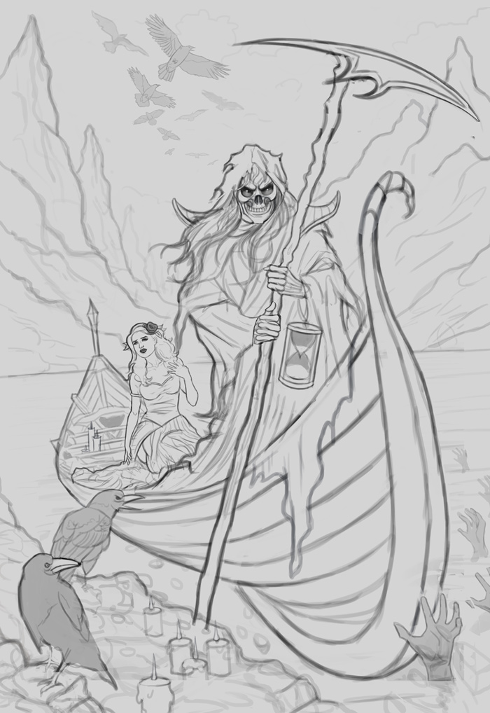
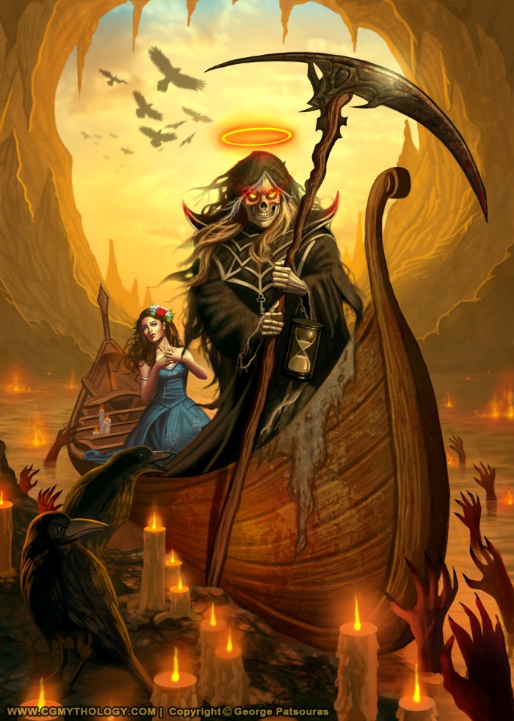
Started on a new sketch, spent quite some time bringing this one to life. It depicts a scene in the underworld, so I'm likely gonna go with a reddish/hellish color palette for this one. Here is the final sketch, any feedback before I begin painting it in would be greatly appreciated!
Atto: Thank you, really glad to hear you appreciate those details! Great critiques as well, this one was definitely one of my most challenging pieces as I don't have as much experience handling wings as I'd like... but I'm glad that the image is generally successful!
............
Started on a new sketch, spent quite some time bringing this one to life. It depicts a scene in the underworld, so I'm likely gonna go with a reddish/hellish color palette for this one. Here is the final sketch, any feedback before I begin painting it in would be greatly appreciated!
Please Log in or Create an account to join the conversation.

26 Nov 2020 09:36 #32449
by Charlotte
Any an all misspellings are henceforth blamed on the cats.
Replied by Charlotte on topic CGMythology's Sketchbook (nudity)
I like it, it's a well composed scene and I like how the woman is looking to see what lays ahead. A few small things:
If that's Charon, I don't think he's actually "evil" and while I love the face, he does look evil at this point... I might have gone for sad, or weary, myself...
The main issue for me is also fairly small: the parts of the scythe don't seem to go together - the blade seems to be just an overlaid shape, rather than something attached to the shaft.
And then there's the little "twirl" at the front end of the boat, that I am assuming is meant to be a spiral but it seems to spiral sideways rather then in the same direction as the rest of the boat?
And maybe we should see some more creepy hands on the left side of the boat too? Like one or two to the left of the uppermost raven. (And now I realise the boat doesn't seem to be in the water? Which could be cool, but if that's the intention perhaps there needs to be a bit more distance between boat bottom and water surface to make it evident it's intentional?)
Overall, it's looking really good, though As always, I'm looking forward to seeing it progress.
If that's Charon, I don't think he's actually "evil" and while I love the face, he does look evil at this point... I might have gone for sad, or weary, myself...
The main issue for me is also fairly small: the parts of the scythe don't seem to go together - the blade seems to be just an overlaid shape, rather than something attached to the shaft.
And then there's the little "twirl" at the front end of the boat, that I am assuming is meant to be a spiral but it seems to spiral sideways rather then in the same direction as the rest of the boat?
And maybe we should see some more creepy hands on the left side of the boat too? Like one or two to the left of the uppermost raven. (And now I realise the boat doesn't seem to be in the water? Which could be cool, but if that's the intention perhaps there needs to be a bit more distance between boat bottom and water surface to make it evident it's intentional?)
Overall, it's looking really good, though
As always, I'm looking forward to seeing it progress. Any an all misspellings are henceforth blamed on the cats.
The following user(s) said Thank You: cgmythology
Please Log in or Create an account to join the conversation.

26 Nov 2020 12:43 #32452
by Valence
Replied by Valence on topic CGMythology's Sketchbook (nudity)
I love the look of this one, the composition is fantastic. And I don't mind the scarier skellington man.
I like the way he dominates the scene and the way that his grip and the diagonal of the scythe breaks the symmetry of his pose.
I think the geometry of the boat looks a little squished at the bottom, unfortunately I don't know enough boaty terminology to describe it with words so I did a over-scribble to explain...
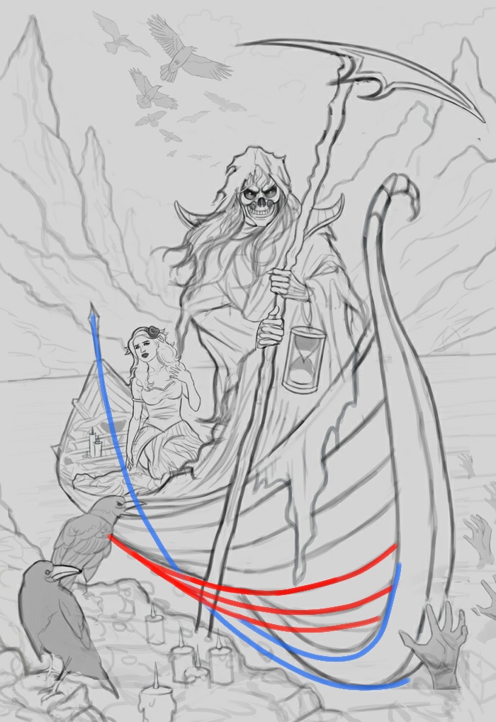
Putting in the centre line along the entire length of the boat makes it a little easier to visualise the other shapes.
Looking forward to seeing the next steps!
I like the way he dominates the scene and the way that his grip and the diagonal of the scythe breaks the symmetry of his pose.
I think the geometry of the boat looks a little squished at the bottom, unfortunately I don't know enough boaty terminology to describe it with words so I did a over-scribble to explain...
Putting in the centre line along the entire length of the boat makes it a little easier to visualise the other shapes.
Looking forward to seeing the next steps!
The following user(s) said Thank You: cgmythology
Please Log in or Create an account to join the conversation.
- cgmythology
-
Topic Author
- Offline
- Premium Member
-
30 Nov 2020 13:27 #32518
by cgmythology
Replied by cgmythology on topic CGMythology's Sketchbook (nudity)
Charlotte: Thank you! Great point regarding the face, although I think I'll stick to what I initially implemented as I'm not too concerned with accuracy of mythology. What I mean is that I enjoy the contrast of having the figure look vile compared to the innocence of the female figure, I just think it works better visually that way.
Great point regarding the blade, I reworked it a bit although the design isn't final, I'll refine it as I go along. Excellent point regarding the tip of the boat, I just refined it based on your input and I feel it works much better now! Added some more hands as suggested, too! Excellent feedback as always, very much appreciate your help!!
Valence: Thank you, glad you enjoy Skeletor! The fix you did on the boat was excellent, just incorporated it to the current progress, thank you for that!
.............
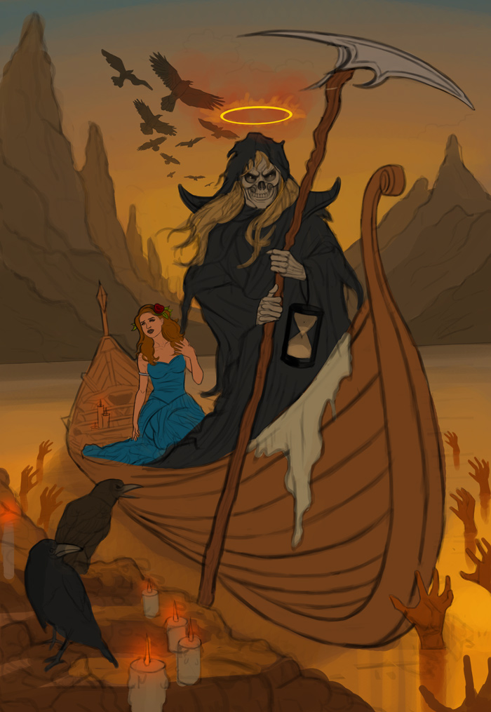
I updated the sketch based on the input I received and began the painting process. Still very early but it should give you an idea of where it's heading. Pretty satisfied with the color palette so far. For the woman's dress I wasn't sure whether to go with white or a colored version, but ultimately I felt white was too cliché so I chose a contrasting color of blue instead. I hope this was the right choice! Any input appreciated as always!
Great point regarding the blade, I reworked it a bit although the design isn't final, I'll refine it as I go along. Excellent point regarding the tip of the boat, I just refined it based on your input and I feel it works much better now! Added some more hands as suggested, too! Excellent feedback as always, very much appreciate your help!!
Valence: Thank you, glad you enjoy Skeletor!
The fix you did on the boat was excellent, just incorporated it to the current progress, thank you for that!.............
I updated the sketch based on the input I received and began the painting process. Still very early but it should give you an idea of where it's heading. Pretty satisfied with the color palette so far. For the woman's dress I wasn't sure whether to go with white or a colored version, but ultimately I felt white was too cliché so I chose a contrasting color of blue instead. I hope this was the right choice! Any input appreciated as always!
Please Log in or Create an account to join the conversation.
- cgmythology
-
Topic Author
- Offline
- Premium Member
-
07 Dec 2020 14:29 #32576
by cgmythology
Replied by cgmythology on topic CGMythology's Sketchbook (nudity)
I continued the painting process, it's come quite a long way I think! Did some changes to the composition and 'flipped' the mountains in the back as I feel it worked better this way. Pretty happy with how it's coming along so far. Any input appreciated as always!
Please Log in or Create an account to join the conversation.
07 Dec 2020 15:27 #32577
by Valence
Replied by Valence on topic CGMythology's Sketchbook (nudity)
Nice lighting in the sky, and the little suggestion of distant clouds is subtle and convincing. And I see you're showing off with lots of hands again. 
The flipped mountains is an interesting choice, I think the first version was a little more balanced but the newer version seems to have more of a "direction" to it as all the weight pulls you to the right side along with the boat. Both work in their own way so I guess it's just down to your own preference of what you want the picture to say.
The flipped mountains is an interesting choice, I think the first version was a little more balanced but the newer version seems to have more of a "direction" to it as all the weight pulls you to the right side along with the boat. Both work in their own way so I guess it's just down to your own preference of what you want the picture to say.
Please Log in or Create an account to join the conversation.
- cgmythology
-
Topic Author
- Offline
- Premium Member
-
31 Dec 2020 14:20 #32961
by cgmythology
Replied by cgmythology on topic CGMythology's Sketchbook (nudity)
Valence: Thank you! Glad you dig the hands... so many of them to illustrate, haha. I reworked the mountains significantly as well, hopefully they work even better now!
.............
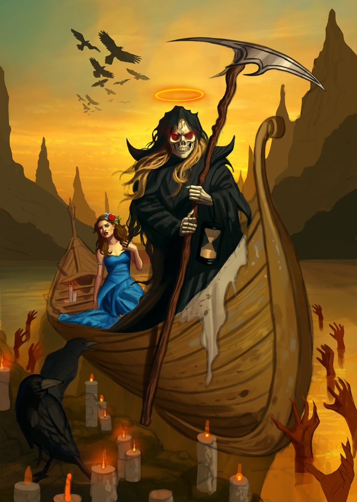
Took some time off work and had the chance to finalize the image! Thanks to everyone for taking the time to offer critique and suggestions, was very helpful and I'm quite pleased with the final image. Here it is:
.............
Took some time off work and had the chance to finalize the image! Thanks to everyone for taking the time to offer critique and suggestions, was very helpful and I'm quite pleased with the final image. Here it is:
Please Log in or Create an account to join the conversation.
- cgmythology
-
Topic Author
- Offline
- Premium Member
-
03 Jan 2021 06:28 #33017
by cgmythology
Replied by cgmythology on topic CGMythology's Sketchbook (nudity)
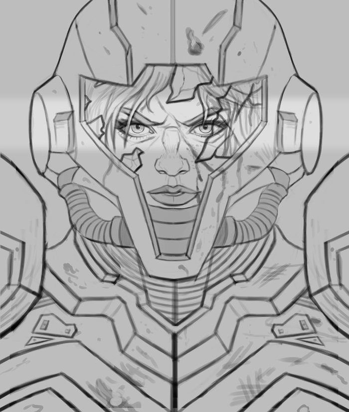
Been doing a lot of pieces that were a bit complex, so I wanted to slow things down and tackle something simpler. I finished up a sketch based on Metroid from the popular Nintendo games, pretty pleased with it. It's looking a bit symmetrical but I think I can fix that when I tackle detail and texture work later on in the process. Any input before I begin would be especially helpful!
Please Log in or Create an account to join the conversation.
03 Jan 2021 19:57 #33020
by Valence
Replied by Valence on topic CGMythology's Sketchbook (nudity)
Missed the post of that final pic, you did a great job on it. The colours and lighting all came together very well at the end, especially with the glow of the candles.
And I like the changes made to the background. The overhang of the cave adds a nice framing element to the image and the glare pushes everything back to create space and perspective.
Great Work.
And I like the changes made to the background. The overhang of the cave adds a nice framing element to the image and the glare pushes everything back to create space and perspective.
Great Work.
The following user(s) said Thank You: cgmythology
Please Log in or Create an account to join the conversation.
Facebook Feed
Member Statistics
- Total Users: 226
- Latest User: norajohnson
- Online Users: 1
- Users Today: 0
- Users this Week: 0
- Users this Month: 0
- Users this Year: 0
Members Online
NOTE! This site uses cookies and similar technologies.
By using this website you agree to the use of cookies and related data storage as detailed in our privacy policy. Learn more
I understand
Site design Mad Hamster Studios. All content is protected under © and the property of the various contributers and not to be reproduced without permission of the creator.