


- Posts: 1256
- Thank you received: 96
June challenge here: The Leprechaun
May entries - Submarine
CGMythology's Sketchbook (nudity)
13 Jul 2014 21:28 #2625
by Domtopia
Oh... maybe it's just me then..!
Everything's on the right!!!
It's like driving abroad!
Replied by Domtopia on topic CGAddict's Sketchbook - Updated Daily (nudity)
kazky wrote: i also really like the colouring,
Oh... maybe it's just me then..!
Everything's on the right!!!
It's like driving abroad!
Please Log in or Create an account to join the conversation.

13 Jul 2014 21:30 #2628
by kazky
Replied by kazky on topic CGAddict's Sketchbook - Updated Daily (nudity)
no i know what you mean Dom, and yours is more natural, but George's colouring gives it an old pin up feel to me.
The following user(s) said Thank You: cgmythology
Please Log in or Create an account to join the conversation.

13 Jul 2014 21:30 #2629
by Charlotte
Any an all misspellings are henceforth blamed on the cats.
Replied by Charlotte on topic CGAddict's Sketchbook - Updated Daily (nudity)
Well Dom she does have a rather reddish skin tone, but I don't think it's over the top if colourful is the intention. Also it gives the impression of early morning or late evening light, whereas your suggestion (slightly too pale and yellow on my screen  ) would suggest more of a midday. Since the background isn't finalised it's hard to tell what skin colour would be the most correct, I think.
) would suggest more of a midday. Since the background isn't finalised it's hard to tell what skin colour would be the most correct, I think. Any an all misspellings are henceforth blamed on the cats.
Please Log in or Create an account to join the conversation.
13 Jul 2014 21:51 #2643
by Stuart
Replied by Stuart on topic CGAddict's Sketchbook - Updated Daily (nudity)
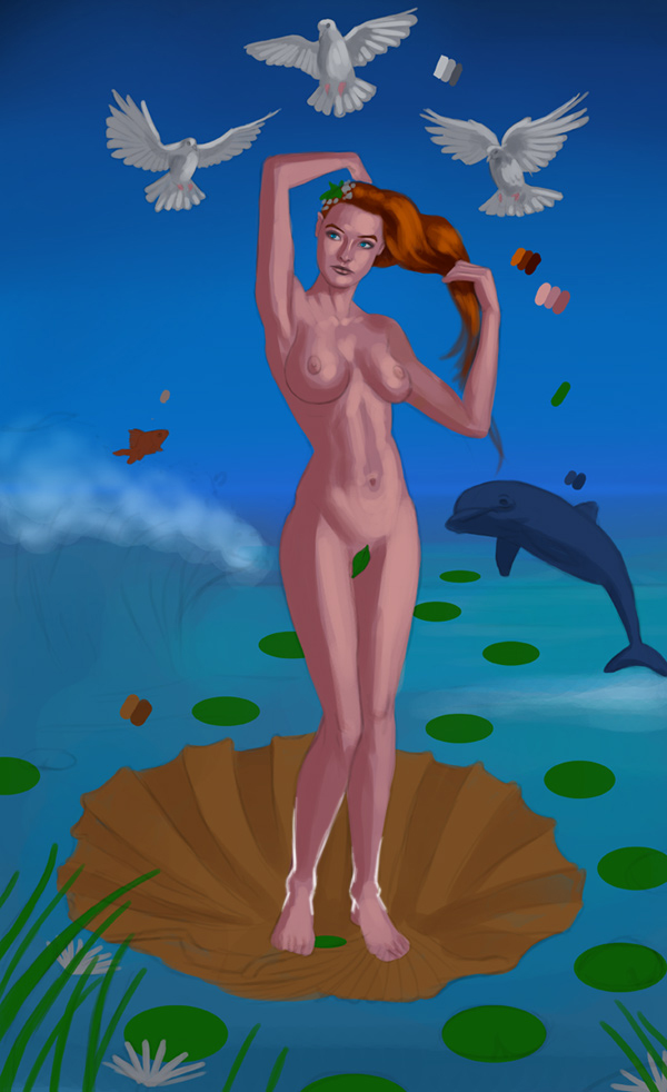
Did a quick rough paintover of her ankles. You just need to exaggerate the bones a little more I think. Hope this helps.
The following user(s) said Thank You: cgmythology
Please Log in or Create an account to join the conversation.
- Digital Dave
-

- Offline
- Platinum Member
-

Less
More
- Posts: 2242
- Thank you received: 163
13 Jul 2014 21:55 #2649
by Digital Dave
Agree completely. Besides the old pin up feel Kaz mentions, it also (to me anyway) also gives it that fantasy feel that fits the rest of the elements.
I get sketchy around pencils! ...
Replied by Digital Dave on topic CGAddict's Sketchbook - Updated Daily (nudity)
kazky wrote: no i know what you mean Dom, and yours is more natural, but George's colouring gives it an old pin up feel to me.
Agree completely. Besides the old pin up feel Kaz mentions, it also (to me anyway) also gives it that fantasy feel that fits the rest of the elements.
I get sketchy around pencils! ...
Please Log in or Create an account to join the conversation.
- ClaudeCrow
-

- Offline
- New Member
-

Less
More
- Posts: 82
- Thank you received: 8
13 Jul 2014 22:27 #2680
by ClaudeCrow
Replied by ClaudeCrow on topic CGAddict's Sketchbook - Updated Daily (nudity)
I think your changes to the lilly pads are in the right direction but personally I think it should be a lot more extreme again. This is a very rough paint over but hopefully this gives you some idea of how much I was thinking. Perhaps some of the others can give some insight on to how they think the ground plane should look..
The rendering is coming on beautifully by the way and the birds and face are looking particularly good.
I'd also say that the skin colour is fine as is though perhaps there should be a little more colour conformity throughout the image, then again I'm no good with colour so who's to say..

The rendering is coming on beautifully by the way and the birds and face are looking particularly good.
I'd also say that the skin colour is fine as is though perhaps there should be a little more colour conformity throughout the image, then again I'm no good with colour so who's to say..
The following user(s) said Thank You: cgmythology
Please Log in or Create an account to join the conversation.
- Forrestimel
-
- Offline
- New Member
-
Less
More
- Posts: 37
- Thank you received: 4
13 Jul 2014 22:33 #2689
by Forrestimel
Replied by Forrestimel on topic CGAddict's Sketchbook - Updated Daily (nudity)
Great start to the sketchbook CG, I'm liking it so far. Since everyone is chiming in with crits I hope it's alright if I add something in as well.
So the major thing that's bothering me is the lighting. You have what seems to be sunlight coming from behind the right of the viewer and a blue light on the left. That's fine, the only problem is that she's the only one being affected by any of this. None of the other things in the image have that lighting on them. And the girl has no shadow either. Adding universal lighting to everything sort of gives the illusion of reality, like this is a place that these objects are all in, otherwise it can look very cut and paste. If you apply these crits people are supplying this image could jump to a whole new level so don't get discouraged")
Keep posting
So the major thing that's bothering me is the lighting. You have what seems to be sunlight coming from behind the right of the viewer and a blue light on the left. That's fine, the only problem is that she's the only one being affected by any of this. None of the other things in the image have that lighting on them. And the girl has no shadow either. Adding universal lighting to everything sort of gives the illusion of reality, like this is a place that these objects are all in, otherwise it can look very cut and paste. If you apply these crits people are supplying this image could jump to a whole new level so don't get discouraged
Keep posting
The following user(s) said Thank You: cgmythology
Please Log in or Create an account to join the conversation.
14 Jul 2014 07:16 #2728
by Stuart
Replied by Stuart on topic CGAddict's Sketchbook - Updated Daily (nudity)
It's the hard part eh, you get the concept on paper and start posting WIPs, then there's a long road of tweaking ahead eh!? 
Please Log in or Create an account to join the conversation.
- cgmythology
-
 Topic Author
- Offline
- Premium Member
-

14 Jul 2014 15:25 - 14 Jul 2014 15:27 #2795
by cgmythology
Replied by cgmythology on topic CGAddict's Sketchbook - Updated Daily (nudity)
I have to say I'm really glad I posted on this forum, got an overwhelming amount of feedback which I greatly appreciate. I'll definitely be active here on a regular basis, I feel I already learned so much just by the comments I received, thank you!
Charlotte Ahlgren: Thank you, I altered the ankles a bit, hope it's better now.
Digital Dave: Skin tones can be tricky, there's a lot of subtle variations here and there that could really make a difference. Thanks for your input!
Domtopia: Thanks for that, you're right the figure looks better with warmer tones. I altered the skin based on your feedback, thank you
kazky: Thank you Glad to hear you get a pin up feel for t his image, I was going for a bit of that 
Stuart: Thanks for that, I incorporated your input, hopefully the bones are a bit more evident now...
ClaudeCrow: Thank you, that was a great help, altered the lily pads a bit more.
Forrestimel: Thank you. You have a point about the lighting, generally I like adding rim lighting to my figures to make them pop out a bit from the background, but you're right, I do need to apply the same lighting to the other elements as well to give it a more uniform feel. Thanks for your input.
Stuart: Indeed! I'm very glad that I'm posting my WIPs here, the feedback I received is very constructive!
................
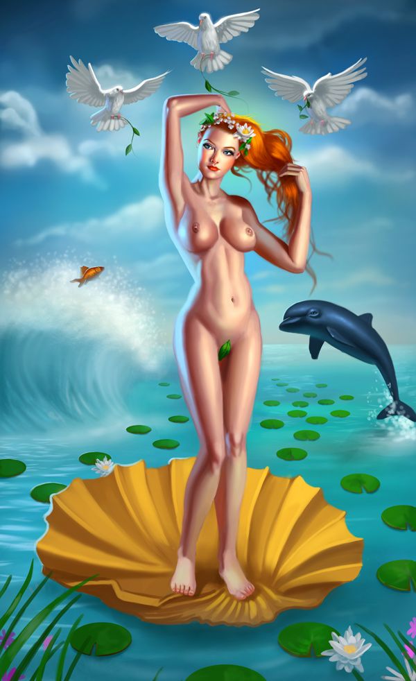
Here's the latest update on Aphrodite:
...........
And here's a caricature of a sexy Nurse I completed:

...............
Thanks again to everyone for taking the time to help me with the Aphrodite piece!
Charlotte Ahlgren: Thank you, I altered the ankles a bit, hope it's better now.
Digital Dave: Skin tones can be tricky, there's a lot of subtle variations here and there that could really make a difference. Thanks for your input!
Domtopia: Thanks for that, you're right the figure looks better with warmer tones. I altered the skin based on your feedback, thank you
kazky: Thank you
Glad to hear you get a pin up feel for t his image, I was going for a bit of that Stuart: Thanks for that, I incorporated your input, hopefully the bones are a bit more evident now...
ClaudeCrow: Thank you, that was a great help, altered the lily pads a bit more.
Forrestimel: Thank you. You have a point about the lighting, generally I like adding rim lighting to my figures to make them pop out a bit from the background, but you're right, I do need to apply the same lighting to the other elements as well to give it a more uniform feel. Thanks for your input.
Stuart: Indeed! I'm very glad that I'm posting my WIPs here, the feedback I received is very constructive!
................
Here's the latest update on Aphrodite:

...........
And here's a caricature of a sexy Nurse I completed:

...............
Thanks again to everyone for taking the time to help me with the Aphrodite piece!
Last edit: 14 Jul 2014 15:27 by cgmythology.
Please Log in or Create an account to join the conversation.

14 Jul 2014 16:59 #2831
by Kodabble
Replied by Kodabble on topic CGAddict's Sketchbook - Updated Daily (nudity)
CG really like the way this image is progressing the latest update is great.
Some personal observations:. Aphrodite is really looking great form the thighs up, but that could be since the work on that portion appears to be more complete. One consideration is the lighting. Where I really love the birds and their lighting, their main light is white from above while Aphrodite’s main is warm from the right and the secondary is blue from the left. As for the issues about the feet; consider where she standing. The scallop shell is a bowl (see image) some sallower then others. Is she supposed to be balancing on the tip/edge or in the bowl shape? If on the tip the right foot would angle down with the toes possibly wrapping around the shell. If, however she is in the bowl, the tip of the shell would partially block the foot and thus disguise part of the foot.
Keep going. I’m looking forward to the finished piece.
The following user(s) said Thank You: cgmythology
Please Log in or Create an account to join the conversation.
Facebook Feed
Member Statistics
- Total Users: 226
- Latest User: norajohnson
- Online Users: 0
- Users Today: 0
- Users this Week: 0
- Users this Month: 0
- Users this Year: 0
NOTE! This site uses cookies and similar technologies.
By using this website you agree to the use of cookies and related data storage as detailed in our privacy policy. Learn more
I understand
Site design Mad Hamster Studios. All content is protected under © and the property of the various contributers and not to be reproduced without permission of the creator.