


- Posts: 2242
- Thank you received: 163
 Like I said. Now
*presses B again*
![:]](https://cgartnexus.com/images/mod_shoutbox/unsure.png)
He does like meowing a lot.
I meant *here* but I guess Val might be a cat...
Does one belong to a cat?
I suspect there are two brains here. 
The shoutbox is unavailable to non-members
Shoutbox History
Like I said. Now
*presses B again*
He does like meowing a lot.
I meant *here* but I guess Val might be a cat...
Does one belong to a cat?
I suspect there are two brains here.
The Nexus Coloring Book
- Digital Dave
-
 Topic Author
- Offline
- Platinum Member
-

Less
More
21 Jul 2014 18:20 #3729
by Digital Dave
I get sketchy around pencils! ...
Replied by Digital Dave on topic The Nexus Coloring Book
That looks awesome, Dom. Never used a pattern like that before myself, but might give it a shot just to see how it all works. Came out great. ... You doing anything with the bull?
I get sketchy around pencils! ...
Please Log in or Create an account to join the conversation.

21 Jul 2014 18:24 - 21 Jul 2014 23:15 #3732
by Valence
Replied by Valence on topic The Nexus Coloring Book
Wow! Wish I'd thought of the pattern thing. I now want to go back and change my rather bland looking effort. But I won't.
I actually found this one a bit more difficult than the last, perhaps because of all the different, complex features in the composition. Also the only thing worse than my knowledge of bull anatomy is my knowledge of armpit anatomy! If I'd been drawing that arm I would've cheated and covered it up with ...erm... something. But thankfully Thomgirl has already drawn it so all I had to do was ruin it.")
I did it the same as the last one: Brighten the levels, Add a colour layer, Then a soft light layer for shadows/highlights, but this time I did a tiny bit of "Normal" painting to try and make the skin transitions a little smoother (although I don't think I managed that in the way I'd hoped.) And then at the end instead of doing the Auto Colour Balance I tweaked the Red channel using the Levels tool: Dragging both the mid-tone arrow and the bottom-right arrow to the left a bit. It just adds a bit more variety of colour across the value range.
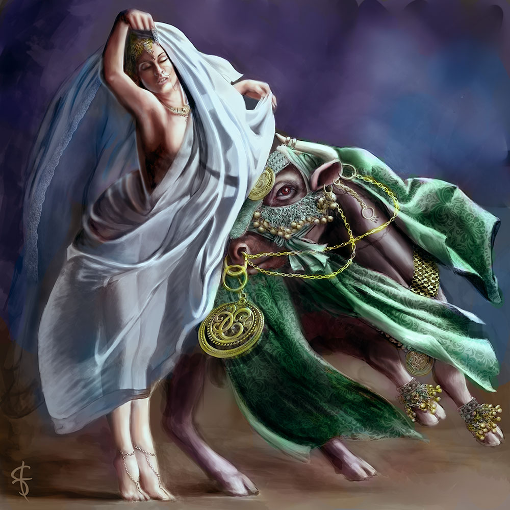

Edit:I felt a bit guilty after ruining that arm so after a bit of research in PoseTool I had another little go at that armpit. Apologies for altering the pose but it was the only way I could get my feeble brain around the complex muscles there.
I actually found this one a bit more difficult than the last, perhaps because of all the different, complex features in the composition. Also the only thing worse than my knowledge of bull anatomy is my knowledge of armpit anatomy! If I'd been drawing that arm I would've cheated and covered it up with ...erm... something. But thankfully Thomgirl has already drawn it so all I had to do was ruin it.
I did it the same as the last one: Brighten the levels, Add a colour layer, Then a soft light layer for shadows/highlights, but this time I did a tiny bit of "Normal" painting to try and make the skin transitions a little smoother (although I don't think I managed that in the way I'd hoped.) And then at the end instead of doing the Auto Colour Balance I tweaked the Red channel using the Levels tool: Dragging both the mid-tone arrow and the bottom-right arrow to the left a bit. It just adds a bit more variety of colour across the value range.
Edit:I felt a bit guilty after ruining that arm so after a bit of research in PoseTool I had another little go at that armpit. Apologies for altering the pose but it was the only way I could get my feeble brain around the complex muscles there.
Last edit: 21 Jul 2014 23:15 by Valence.
Please Log in or Create an account to join the conversation.
- Digital Dave
-
Topic Author
- Offline
- Platinum Member
-
Less
More
- Posts: 2242
- Thank you received: 163
21 Jul 2014 19:08 #3751
by Digital Dave
I get sketchy around pencils! ...
Replied by Digital Dave on topic The Nexus Coloring Book
Wow, you guys are really making these look great. Very nice work, Valence. Will definitely have to give some of the steps here a shot. Haven't had much experience with any of the layers to be honest, but after seeing these may have to take a dive into them sometime soon.
I get sketchy around pencils! ...
Please Log in or Create an account to join the conversation.
- ArtbyAlReid
-

- Offline
- New Member
-

Less
More
- Posts: 43
- Thank you received: 4
21 Jul 2014 19:19 #3754
by ArtbyAlReid
Replied by ArtbyAlReid on topic The Nexus Coloring Book
Pretty amazing colouring of this piece (it was excellent to begin with as well). Love the patterned version and the more see through one too. Nice techniques!
Please Log in or Create an account to join the conversation.
23 Jul 2014 14:42 #3927
by Thomgirl
Replied by Thomgirl on topic The Nexus Coloring Book
The cool colors of the green and blue I wouldn't have thought of Valence! They really make the gold stand out. Nice work!
Please Log in or Create an account to join the conversation.
23 Jul 2014 17:20 #3957
by Kodabble
Replied by Kodabble on topic The Nexus Coloring Book
Valence really great coloring, especially the gold and silver mix.
One note is the tip of the horn behind the veil appears to be either piercing her in the heart or the right half of the girls chest seems to be missing.
One note is the tip of the horn behind the veil appears to be either piercing her in the heart or the right half of the girls chest seems to be missing.
Please Log in or Create an account to join the conversation.

15 Aug 2014 20:46 #5249
by Domtopia
Everything's on the right!!!
It's like driving abroad!
Replied by Domtopia on topic The Nexus Coloring Book
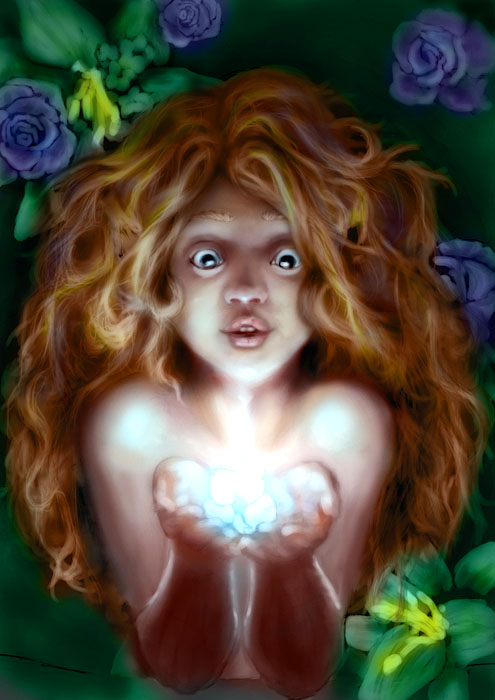
In the interest of keeping this thread bubbling, I could do with a bit of help with this image.
My plan was to grey scale the whole thing and then add colour later. But, the blend modes on PS don't seem to be cooperating! Either they distort the colour, or show too much grey through the colour.
So, can anyone else try adding colour to this and see what they can come up with? Give it a shot!
It's not finished, but the drawing should be a reasonable place to start!
Everything's on the right!!!
It's like driving abroad!
Please Log in or Create an account to join the conversation.
29 Aug 2014 18:32 #5686
by Valence
Replied by Valence on topic The Nexus Coloring Book
First of all let me say that this is a great picture so far and I hope you continue with it.
Secondly, I hope I haven't ruined it but here goes:
As with previous pics I tweaked the levels as described previously then created another layer set to Colour and used that to draw in all the necessary hues (rather generic ones it has to be said but that's a recurring fault of my lack of imagination)
I then created a new layer between the other two. I set it to Overlay and painted on it using a low opacity airbrush using ONLY black and white. This allows you to alter values selectively without changing the colour or destroying the detail you've already painted. Using this I darkened some shadows with the black and used the white where the colours were muddy and grey. Remember the drab muddiness indicates a problem with value NOT a problem with the colour.
I then made a new layer on top of everything and set it to Soft Light and here I added some more yellowy tones to the skin and boosted the blue highlights.
Finally I flattened the image, added a basic "Omni" Lighting Effect to enhance the "glowing in the dark" mood and did a cool Cyan Photo Filter to neutralise some of the excessive saturation.
Please Log in or Create an account to join the conversation.
29 Aug 2014 22:15 #5692
by Domtopia
Everything's on the right!!!
It's like driving abroad!
Replied by Domtopia on topic The Nexus Coloring Book
Wow! That's really good Val! Thanks for the effort and the walk through. really helpful stuff.
I am especially impressed by the way you have such a smooth graduation across her skin. I just could not create that smooth skin effect with the grey scale under painting. Plus, I like the colour in her hair. It looks great.
The only issue is the colour choices. In the story, she has raven black hair and the flower glows with violet light which is reflected in her violet eyes. It is a story telling element that does not affect the colour method exercise though, which was exactly what I was hoping for!!
Thanks again!
Everything's on the right!!!
It's like driving abroad!
Please Log in or Create an account to join the conversation.
30 Aug 2014 18:29 - 30 Aug 2014 18:30 #5744
by Valence
Replied by Valence on topic The Nexus Coloring Book
One thing I noticed from your greyscale image is that although the form and shading is excellent the value of the skin is virtually the same as that of the hair. This is very rarely the case, especially if you choose to do raven hair, and this was why I used the extra B&W Overlay layer to brighten the skin and discriminate between different surfaces and colours.
Over in the resources section there's a recommendation for Sycra's YouTube channel, I know I've learnt loads from there, and he has several videos on colour theory. There is one particular one called "Understanding Colour and Value" which addresses the issue of colouring greyscale images, understanding the value ranges of different colours and demonstrates the muddy grey problem and how to solve it.
(I've tried to link to it but the site won't let me paste from my tablet but the video is easy enough to find.)
Last edit: 30 Aug 2014 18:30 by Valence. Reason: Damn typos.
The following user(s) said Thank You: Domtopia
Please Log in or Create an account to join the conversation.
Latest Activity

Banj updated their profile picture


Charlotte Still wearing a mask? Is it so we won't see you hoarding food in those cheeks of yours?
See More
Banj Mfmuh Guhmfpf
See More
Charlotte I'll take that as a yes...
See More
Charlotte Why is there a tiny flashing thing in front of the reply link/button? It's so small I can't see if it's an exclamation mark or a question mark... or...both?)
See More
Banj Because? Both!
See More
Charlotte *gasp*
See More

CaptainDeth updated their profile picture

CaptainDeth Ahoy folks, just a newbie here, just getting started. Thanks for allowing me in.
CaptainDeth Thank You
CaptainDeth and Mr.Bungle joined the site


honbasic joined the site


Gawk joined the site