


- Posts: 2242
- Thank you received: 163


 Like I said. Now
*presses B again*
![:]](https://cgartnexus.com/images/mod_shoutbox/unsure.png)
The shoutbox is unavailable to non-members
Someone's gotta start this ball a-rolling!!
- Digital Dave
-

- Offline
- Platinum Member
-

Less
More
04 Jul 2014 20:47 #317
by Digital Dave
I get sketchy around pencils! ...
Replied by Digital Dave on topic Someone's gotta start this ball a-rolling!!
Thanks, Banj. I actually tried to post back a few times saying I hadn't read the posting info yet, just being excited about the new site. But when I used the quote link from your post, it kept saying my post was considered spam and wouldn't allow it? Might have been something I did? Will definitely read up on everything. ")
I get sketchy around pencils! ...
Please Log in or Create an account to join the conversation.
04 Jul 2014 20:49 - 04 Jul 2014 20:50 #319
by Banj
Replied by Banj on topic Someone's gotta start this ball a-rolling!!
Yeah, sorry Dave I noticed some spam logs that said as much. It's not you it's the resident anti-spam bot we like to call HAL. It gets a little over zealous with post deletion, but he's getting better.
edit - and sorry Dom, we should probably get back to your pics")
edit - and sorry Dom, we should probably get back to your pics
Last edit: 04 Jul 2014 20:50 by Banj.
Please Log in or Create an account to join the conversation.

08 Jul 2014 09:01 #1045
by Stuart
Replied by Stuart on topic Someone's gotta start this ball a-rolling!!
I genuinely chuckled out loud at that one. I'm gonna start using it a work!
Please Log in or Create an account to join the conversation.

17 Jul 2014 21:37 - 17 Jul 2014 21:39 #3315
by Domtopia
Everything's on the right!!!
It's like driving abroad!
Replied by Domtopia on topic Someone's gotta start this ball a-rolling!!
D'oh... once again I have neglected my own WIP thread in favour of commenting on others' work.
Here's a piece I have had in storage for a while that I thought I would get back to. I really like the concept, but need some crit' so that I don't start ruining it as I go.
So, over to you fine and freckled people!
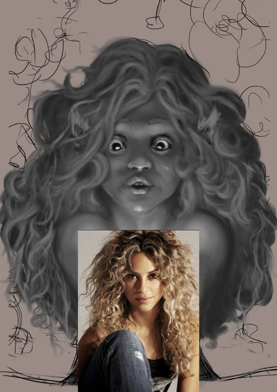
PS. Is there a way to change the title of this thread, as I think it is dating it a bit!...?
Here's a piece I have had in storage for a while that I thought I would get back to. I really like the concept, but need some crit' so that I don't start ruining it as I go.
So, over to you fine and freckled people!
PS. Is there a way to change the title of this thread, as I think it is dating it a bit!...?
Everything's on the right!!!
It's like driving abroad!
Last edit: 17 Jul 2014 21:39 by Domtopia.
Please Log in or Create an account to join the conversation.

17 Jul 2014 21:46 #3316
by Charlotte
Any an all misspellings are henceforth blamed on the cats.
Replied by Charlotte on topic Someone's gotta start this ball a-rolling!!
You can edit the subject line when you edit a post. Not sure if you need to edit all posts or just the first, though... Or maybe, first and last... 
I'll try to remember feedback tomorrow when I've had some sleep!
I'll try to remember feedback tomorrow when I've had some sleep!
Any an all misspellings are henceforth blamed on the cats.
The following user(s) said Thank You: Domtopia
Please Log in or Create an account to join the conversation.
- Digital Dave
-
- Offline
- Platinum Member
-
Less
More
- Posts: 2242
- Thank you received: 163
17 Jul 2014 21:47 - 18 Jul 2014 11:51 #3317
by Digital Dave
I get sketchy around pencils! ...
Replied by Digital Dave on topic Someone's gotta start this ball a-rolling!!
Yep, I remember you starting this one and glad you pulled it back out too. But for some reason, I'm thinking it looks different from the latest image you posted on IFX? Or maybe it's just been that long since I've seen it? Hope to see it finished though. - Sorry, but not much to crit on really, except maybe the hands might be just a tad too high, as far as the wrist placement according to the forearms angle. (hope that makes sense)
Edit: haven't tried it here yet, Dom. But on the old site you could change the title in any post, but when viewed on the main page, the original title would still showed, until you changed the title in the first post itself. Again, haven't tried it here, so you might want to give it a try and see.
But for some reason, I'm thinking it looks different from the latest image you posted on IFX? Or maybe it's just been that long since I've seen it? Hope to see it finished though. - Sorry, but not much to crit on really, except maybe the hands might be just a tad too high, as far as the wrist placement according to the forearms angle. (hope that makes sense) Edit: haven't tried it here yet, Dom. But on the old site you could change the title in any post, but when viewed on the main page, the original title would still showed, until you changed the title in the first post itself. Again, haven't tried it here, so you might want to give it a try and see.
I get sketchy around pencils! ...
Last edit: 18 Jul 2014 11:51 by Digital Dave.
Please Log in or Create an account to join the conversation.
17 Jul 2014 21:47 - 17 Jul 2014 21:49 #3318
by Domtopia
Everything's on the right!!!
It's like driving abroad!
Replied by Domtopia on topic Someone's gotta start this ball a-rolling!!
Thanks you Charlotte!
... apparently I am speaking in the past tense!
... apparently I am speaking in the past tense!
Everything's on the right!!!
It's like driving abroad!
Last edit: 17 Jul 2014 21:49 by Domtopia.
Please Log in or Create an account to join the conversation.
18 Jul 2014 11:37 #3352
by Charlotte
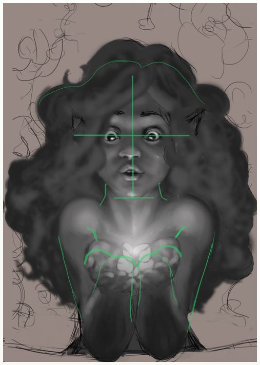
Now then. I think this is a very sweet image but there are some things I feel could be improved upon and I've tried to highlight them in my "line over".
1) You tend to put quite a mop of hair on your girls... Remember that the eyes are approximately in the middle of the tip of the chin and the top of the head. Then of course there may be plenty of thick hair on top of the scalp, but usually the hair isn't all that fluffy on top since gravity pulls it down. So I suggest a bit of a downsize.
2) Her neck is very wide at the top and then slims down, I suggest making it more delicate at the top as well.
3) With your current shading - which I understand isn't final - you've really emphasized the roundness of her shoulders. You've also emphasized it with the shape of her arms. I think maybe you'll want to make the arms a little straighter (unless you want a symbolic "heart shape" to be created by the shoulders for extra sweetness!) and I also think you should add a hint of armpits (well, the edge between arms and torso).
and 4) which I honestly wouldn't have noticed if Dave didn't point it out, but yes the wrists of her hands and her arms don't seem to be in the same place... I'm not sure how to explain it well, but if you draw the lower arms as their own oval shapes (or stumps) without hands, and then add the hands, the edge of the palm of the hand would be in about the same place as the edge of the stump (assuming you didn't make the stump too short ), so basically her hands should be placed a bit lower. Their inner structure looks fine to me, though
Any an all misspellings are henceforth blamed on the cats.
Replied by Charlotte on topic Someone's gotta start this ball a-rolling!!
Now then. I think this is a very sweet image but there are some things I feel could be improved upon and I've tried to highlight them in my "line over".
1) You tend to put quite a mop of hair on your girls... Remember that the eyes are approximately in the middle of the tip of the chin and the top of the head. Then of course there may be plenty of thick hair on top of the scalp, but usually the hair isn't all that fluffy on top since gravity pulls it down. So I suggest a bit of a downsize.
2) Her neck is very wide at the top and then slims down, I suggest making it more delicate at the top as well.
3) With your current shading - which I understand isn't final - you've really emphasized the roundness of her shoulders. You've also emphasized it with the shape of her arms. I think maybe you'll want to make the arms a little straighter (unless you want a symbolic "heart shape" to be created by the shoulders for extra sweetness!) and I also think you should add a hint of armpits (well, the edge between arms and torso).
and 4) which I honestly wouldn't have noticed if Dave didn't point it out, but yes the wrists of her hands and her arms don't seem to be in the same place... I'm not sure how to explain it well, but if you draw the lower arms as their own oval shapes (or stumps) without hands, and then add the hands, the edge of the palm of the hand would be in about the same place as the edge of the stump (assuming you didn't make the stump too short
), so basically her hands should be placed a bit lower. Their inner structure looks fine to me, though Any an all misspellings are henceforth blamed on the cats.
Please Log in or Create an account to join the conversation.
18 Jul 2014 15:12 #3367
by Smolin
Replied by Smolin on topic Someone's gotta start this ball a-rolling!!
I disagree about the hair. Curly hair can certainly create huge volumes that defy gravity. The issue is that he hasn't modeled or shaded it as much as the rest of the figure, so the volume isn't clear yet.
I'm not quite sure I agree about the wrists, either. It really depends on how the foreshortening of the upper arms and forearms plays out.
In any case, it's a great picture so far. Her face is excellent and the lighting is really great.
I'm not quite sure I agree about the wrists, either. It really depends on how the foreshortening of the upper arms and forearms plays out.
In any case, it's a great picture so far. Her face is excellent and the lighting is really great.
Please Log in or Create an account to join the conversation.
18 Jul 2014 15:13 - 18 Jul 2014 15:14 #3368
by Domtopia
Everything's on the right!!!
It's like driving abroad!
Replied by Domtopia on topic Someone's gotta start this ball a-rolling!!
Thanks Charlotte! What a well constructed reply!
All your suggestions are good ones, so I will get to them all eventually. The problem with the shape of her arms is that her hair is on a layer above her skin, so I have temporarily painted the hair over her arms, giving it a much more tapered look (the heart shape you mentioned). I will paint her arms back into shape once the hair is done.
I dunno what it is about great big hair, but I always seem to make my female characters well endowed in that area. I guess I just like girls with big hair!
Do you think it looks bad though? Or just inaccurate?
Edit: Wow! Thanks Nick! Bit of a confidence boost there!
Everything's on the right!!!
It's like driving abroad!
Last edit: 18 Jul 2014 15:14 by Domtopia.
Please Log in or Create an account to join the conversation.
Latest Activity

Banj updated their profile picture


Charlotte Still wearing a mask? Is it so we won't see you hoarding food in those cheeks of yours?
See More
Banj Mfmuh Guhmfpf
See More
Charlotte I'll take that as a yes...
See More
Charlotte Why is there a tiny flashing thing in front of the reply link/button? It's so small I can't see if it's an exclamation mark or a question mark... or...both?)
See More
Banj Because? Both!
See More
Charlotte *gasp*
See More

CaptainDeth updated their profile picture

CaptainDeth Ahoy folks, just a newbie here, just getting started. Thanks for allowing me in.
CaptainDeth Thank You
CaptainDeth and Mr.Bungle joined the site


honbasic joined the site


Gawk joined the site