


The shoutbox is unavailable to non-members
Natural Skin Tone Tutorial
- cgmythology
-
 Topic Author
- Offline
- Senior Member
-

Less
More
19 Dec 2014 20:16 - 19 Dec 2014 21:44 #7803
by cgmythology
Natural Skin Tone Tutorial was created by cgmythology
SKIN TONE TUTORIAL
George Patsouras
www.cgmythology.com
INTRODUCTION
In this tutorial, I will go about how to paint realistic skin tones using a fairly natural color scheme using Photoshop. This tutorial can be used to help illustrate a caucasian-tan figure in a realistic fashion. Let us begin!
.........................
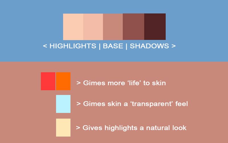
GENERAL SKIN TONES
I included a quick chart that summarizes the basic skin tones for the image, followed by a much more detailed walkthrough on how and why I chose this set of colors:
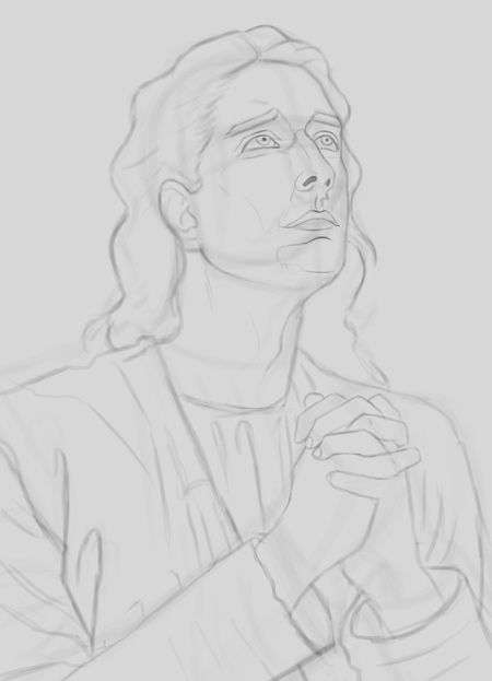
1. Sketching The Figure
Before we even begin to think about colors and skin tones, we need to start off with a sketch. Some artists prefer to begin the painting process immediately, focusing on shapes first. The method you choose is entirely up to you! When sketching, I always use two layers. The first is where I do the preliminary sketch using basic shapes. In this case I sketch in the figure using Andrew Loomis' ball and plane method to help illustrate the head in 3D. I use a hard edged brush for this step, with opacity set to only 10% with a pure black color. Once I'm satisfied with the drawing, I lower the opacity to about 30%-50% and create a new layer on top of it. Here I take my time to flesh out the figure more, giving it as much of a crisp and detailed look as possible. When I'm satisfied with the results, I delete the preliminary layer, and to keep things organized name the new layer 'sketch', which will be kept on top of the layers menu.
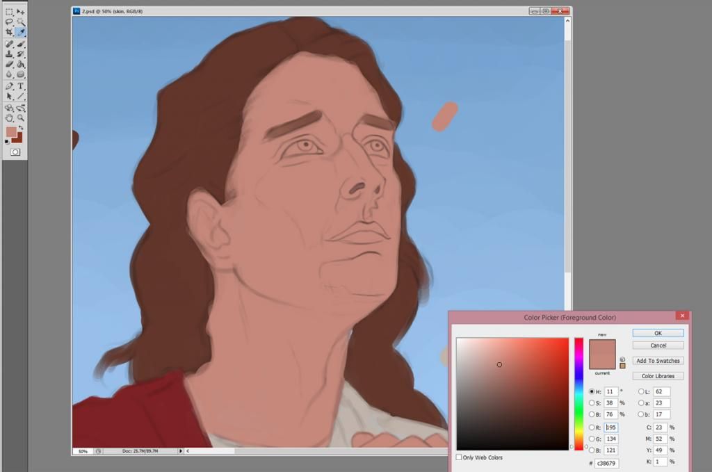
2. Setting Up A Color Theme
The second step is to decide on the color theme of the image. This step is very important, as the color theme will have a major impact on the choice of colors for the skin tones. In this case I want to use very natural colors, so I chose a bluish hue using Photoshop's color box to fill the canvas in. I'm working exclusively with a hard edged brush here. Once I'm satisfied with the background color, I need to decide each base color for each element of the piece. Getting the mid-tone to look good at an early stage is crucial, as it'll make for a smoother transition during the painting process. I select a mid tone that's not too saturated here using Photoshop's color box. I keep everything here on separate layers (skin, hair, clothes, etc.) to keep thing as organized as possible.
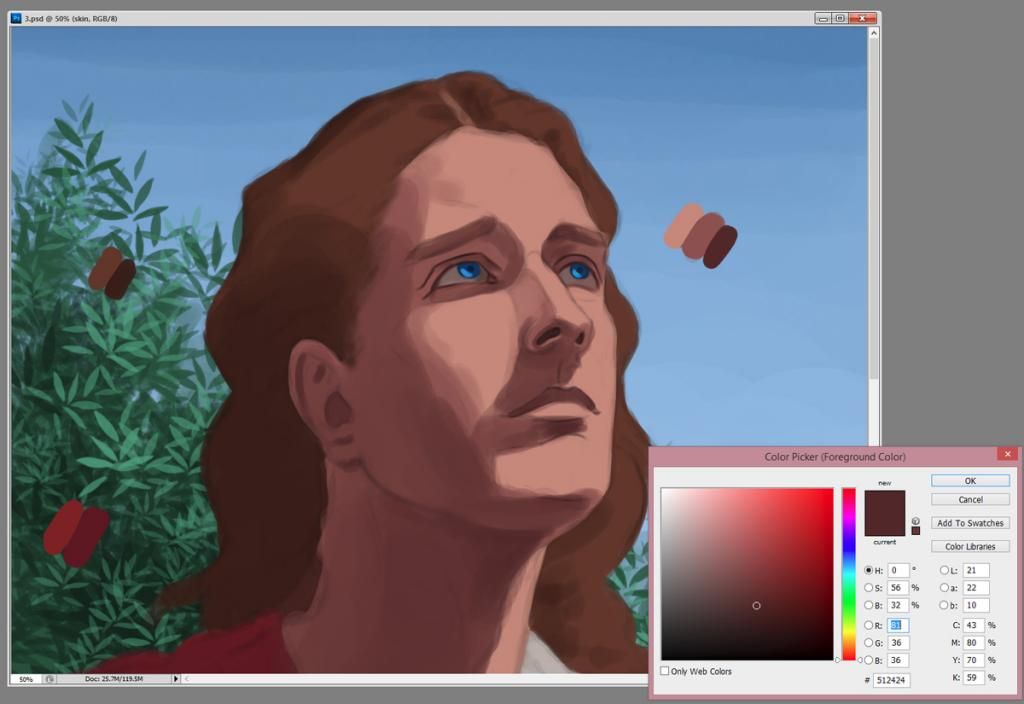
3. Adding Shadows
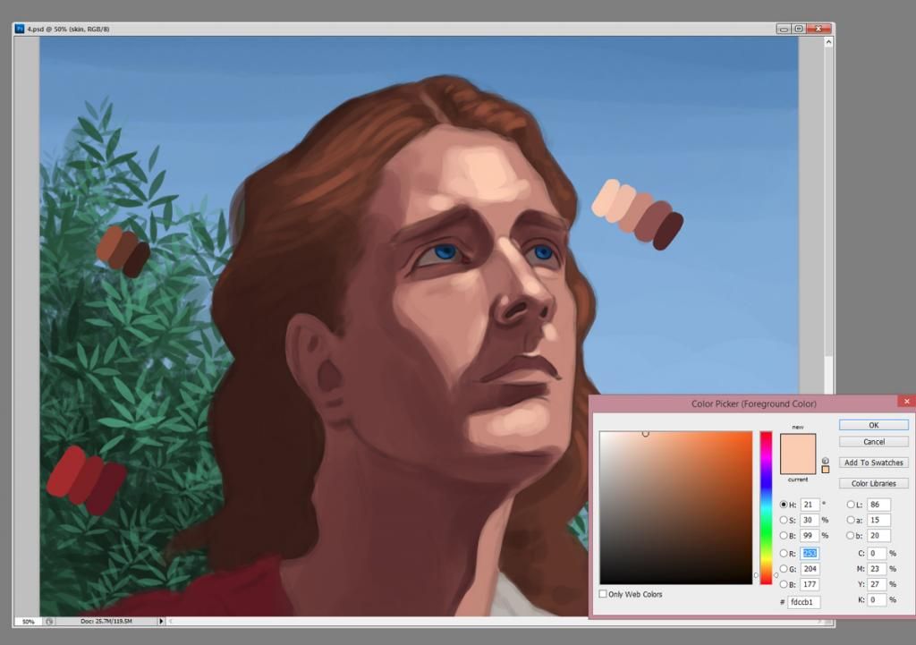
I like to pick out shadows first as opposed to highlights, primarily because it's easier to focus on form when doing so. The trick here when handling skin is color variation; We need to pick a color that's not only darker than the base tone, but also a bit different when it comes to hue. For a natural look, I pick a darker mid tone that's a bit more saturated than the initial color, and I also move the hue to a bit more reddish/magenta. Using a hard edged brush, I shade the side of the face that will be in shadow. Once that's done, I pick an even darker and more saturated skin tone, this time even with a larger hint of red/magenta for the deeper shadows on the face (the nostrils, top of the lips, etc.), as below. Also notice how I keep the color palette separate from the skin; This makes it easier to instantly pick out the tone I want to incorporate.
4. Adding highlights
Once I'm satisfied with where the shadows are placed, I decide to add the highlights to the face for a more realistic feel. The trick here is choosing a tone which will help the shadows pop out even further. In most situations, we will pick a color that's more brighter and desaturated than the base color we initially chose. I also alter the hue a bit to a more yellowish color, which will help the shadows pop out. I add the highlights on the brow ridge, the nose ridge, and at the top of the chin. As always, I'm working exclusively with a hard edged brush, as I'm focusing more on giving the face a 3D look; We can smoothen out everything later when the values are in place.
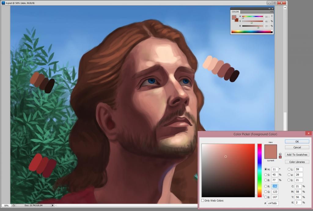
5. Skin Tone Variations
Before proceeding to the next step, it's essential that the values should be working. That is, the image should look as 3Dimensional as possible. Usually at this point I'm satisfied with the values, which lets me play around a bit with some subtle color variations.. In most cases where we're dealing with natural light, we will always have 3 'zones' of color for the face; The top 1/3 is usually yellowish (where the peak highlight is located) due to the sun reflection, the nose and cheeks are usually warmer and more reddish/orange (most especially for females), and the bottom third is usually less saturated and more greenish/bluish looking (especially for males). To do this at a fairly quick place, I use Photoshop's HSB slider (Windows > Color). This allows me to quickly play around with the saturation and colors of the skin tones. It's worth mentioning that I do all my variations on a new layer, just so I can quickly turn it on and off and note the difference and if I'm actually improving the tones or not. Sometimes I set the layer mode to 'color' as well, as to not mess up the values I've already incorporated.
6. Smoothing Everything Out
At this point, most of my painting has been done using a hard edged brush. Since I prefer a more realistic feel to my paintings, it's essential to blend in the tones using a soft edged brush. I pick a soft air brush set to 0% hardness and roughly 33% opacity and blend in the tones. As usual, I do this on top of the skin layer and merge it when I'm satisfied with the results. I also add a ton of 'pores' here and there to give it an even more natural look using a very small airbrush. Below are the results:
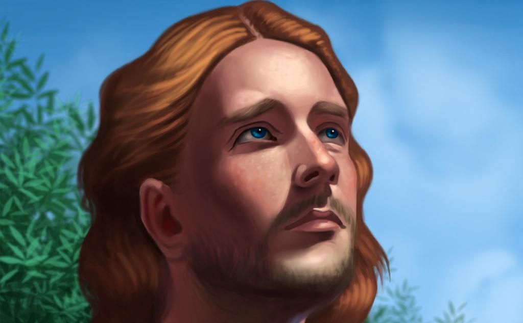
7. Finishing Up
This technique should give you a fairly natural and realistic appearance for your painting, but one common problem we may have after blending for so long is a loss in color saturation. To correct this, create a new layer and set it to 'color'. Here we can do some final adjustments towards the skin tones, and I opt to use a soft airbrush here as well. I add more saturation on the nose, ear, etc. using a soft airbrush with a very low 'flow' (as little as 5%) using a fairly saturated red/orange color.
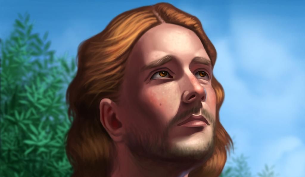
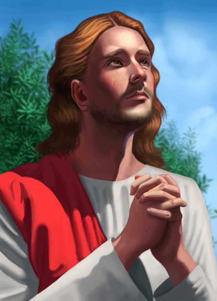
And that's it! I hope you found this tutorial useful. I had a great time painting this image and writing this tutorial, and I hope you have fun incorporating some of the techniques mentioned here. Below is the final image:
George Patsouras
www.cgmythology.com
INTRODUCTION
In this tutorial, I will go about how to paint realistic skin tones using a fairly natural color scheme using Photoshop. This tutorial can be used to help illustrate a caucasian-tan figure in a realistic fashion. Let us begin!
.........................
GENERAL SKIN TONES
I included a quick chart that summarizes the basic skin tones for the image, followed by a much more detailed walkthrough on how and why I chose this set of colors:

1. Sketching The Figure
Before we even begin to think about colors and skin tones, we need to start off with a sketch. Some artists prefer to begin the painting process immediately, focusing on shapes first. The method you choose is entirely up to you! When sketching, I always use two layers. The first is where I do the preliminary sketch using basic shapes. In this case I sketch in the figure using Andrew Loomis' ball and plane method to help illustrate the head in 3D. I use a hard edged brush for this step, with opacity set to only 10% with a pure black color. Once I'm satisfied with the drawing, I lower the opacity to about 30%-50% and create a new layer on top of it. Here I take my time to flesh out the figure more, giving it as much of a crisp and detailed look as possible. When I'm satisfied with the results, I delete the preliminary layer, and to keep things organized name the new layer 'sketch', which will be kept on top of the layers menu.

2. Setting Up A Color Theme
The second step is to decide on the color theme of the image. This step is very important, as the color theme will have a major impact on the choice of colors for the skin tones. In this case I want to use very natural colors, so I chose a bluish hue using Photoshop's color box to fill the canvas in. I'm working exclusively with a hard edged brush here. Once I'm satisfied with the background color, I need to decide each base color for each element of the piece. Getting the mid-tone to look good at an early stage is crucial, as it'll make for a smoother transition during the painting process. I select a mid tone that's not too saturated here using Photoshop's color box. I keep everything here on separate layers (skin, hair, clothes, etc.) to keep thing as organized as possible.

3. Adding Shadows
I like to pick out shadows first as opposed to highlights, primarily because it's easier to focus on form when doing so. The trick here when handling skin is color variation; We need to pick a color that's not only darker than the base tone, but also a bit different when it comes to hue. For a natural look, I pick a darker mid tone that's a bit more saturated than the initial color, and I also move the hue to a bit more reddish/magenta. Using a hard edged brush, I shade the side of the face that will be in shadow. Once that's done, I pick an even darker and more saturated skin tone, this time even with a larger hint of red/magenta for the deeper shadows on the face (the nostrils, top of the lips, etc.), as below. Also notice how I keep the color palette separate from the skin; This makes it easier to instantly pick out the tone I want to incorporate.

4. Adding highlights
Once I'm satisfied with where the shadows are placed, I decide to add the highlights to the face for a more realistic feel. The trick here is choosing a tone which will help the shadows pop out even further. In most situations, we will pick a color that's more brighter and desaturated than the base color we initially chose. I also alter the hue a bit to a more yellowish color, which will help the shadows pop out. I add the highlights on the brow ridge, the nose ridge, and at the top of the chin. As always, I'm working exclusively with a hard edged brush, as I'm focusing more on giving the face a 3D look; We can smoothen out everything later when the values are in place.

5. Skin Tone Variations
Before proceeding to the next step, it's essential that the values should be working. That is, the image should look as 3Dimensional as possible. Usually at this point I'm satisfied with the values, which lets me play around a bit with some subtle color variations.. In most cases where we're dealing with natural light, we will always have 3 'zones' of color for the face; The top 1/3 is usually yellowish (where the peak highlight is located) due to the sun reflection, the nose and cheeks are usually warmer and more reddish/orange (most especially for females), and the bottom third is usually less saturated and more greenish/bluish looking (especially for males). To do this at a fairly quick place, I use Photoshop's HSB slider (Windows > Color). This allows me to quickly play around with the saturation and colors of the skin tones. It's worth mentioning that I do all my variations on a new layer, just so I can quickly turn it on and off and note the difference and if I'm actually improving the tones or not. Sometimes I set the layer mode to 'color' as well, as to not mess up the values I've already incorporated.

6. Smoothing Everything Out
At this point, most of my painting has been done using a hard edged brush. Since I prefer a more realistic feel to my paintings, it's essential to blend in the tones using a soft edged brush. I pick a soft air brush set to 0% hardness and roughly 33% opacity and blend in the tones. As usual, I do this on top of the skin layer and merge it when I'm satisfied with the results. I also add a ton of 'pores' here and there to give it an even more natural look using a very small airbrush. Below are the results:

7. Finishing Up
This technique should give you a fairly natural and realistic appearance for your painting, but one common problem we may have after blending for so long is a loss in color saturation. To correct this, create a new layer and set it to 'color'. Here we can do some final adjustments towards the skin tones, and I opt to use a soft airbrush here as well. I add more saturation on the nose, ear, etc. using a soft airbrush with a very low 'flow' (as little as 5%) using a fairly saturated red/orange color.

And that's it! I hope you found this tutorial useful. I had a great time painting this image and writing this tutorial, and I hope you have fun incorporating some of the techniques mentioned here. Below is the final image:

Last edit: 19 Dec 2014 21:44 by cgmythology.
Please Log in or Create an account to join the conversation.
- Digital Dave
-

- Offline
- Platinum Member
-

Less
More
- Posts: 2242
- Thank you received: 163
28 Jan 2015 14:42 #8499
by Digital Dave
I get sketchy around pencils! ...
Replied by Digital Dave on topic Natural Skin Tone Tutorial
Nice Tutorial, George. Thanks for sharing your process. ")
I get sketchy around pencils! ...
Please Log in or Create an account to join the conversation.
Latest Activity

Banj updated their profile picture


Charlotte Still wearing a mask? Is it so we won't see you hoarding food in those cheeks of yours?
See More
Banj Mfmuh Guhmfpf
See More
Charlotte I'll take that as a yes...
See More
Charlotte Why is there a tiny flashing thing in front of the reply link/button? It's so small I can't see if it's an exclamation mark or a question mark... or...both?)
See More
Banj Because? Both!
See More
Charlotte *gasp*
See More

CaptainDeth updated their profile picture

CaptainDeth Ahoy folks, just a newbie here, just getting started. Thanks for allowing me in.
CaptainDeth Thank You
CaptainDeth and Mr.Bungle joined the site


honbasic joined the site


Gawk joined the site