


- Posts: 2242
- Thank you received: 163


![:]](https://cgartnexus.com/images/mod_shoutbox/unsure.png)
what? 


Why did I not notice my mojistake until now? *pout*
I guess they're all here then. :dry: I'd better not go outside (again)
The shoutbox is unavailable to non-members
Shoutbox History
what?
Why did I not notice my mojistake until now? *pout*
I guess they're all here then. :dry: I'd better not go outside (again)
(SOLVED) Suggestion I wanted to get other's thoughts on
- Digital Dave
-
 Topic Author
- Offline
- Platinum Member
-

Less
More
06 Jul 2014 22:43 - 06 Jul 2014 22:45 #770
by Digital Dave
I get sketchy around pencils! ...
Suggestion I wanted to get other's thoughts on was created by Digital Dave
This is something I thought of a while back, but don't believe I ever brought it up on the old forum? I guess I wasn't sure if others would think something like this could be useful? But what would you folks think about having a thread where the main purpose would be to share how everyone goes about adding color to a greyscale image? This could include tips and tricks that they use to get certain effects, suggestions on how to best go about handling it or in what steps to take to get specific looks? Or maybe just to see how others would handle the color of a certain image? ... One could simply provide a greyscale image they created, whether they ever added color to it or not, and then see how others tackle it. I think this could be quite educational and helpful to those that struggle with color. Or maybe just seeing different version of their work would open their minds to thinking things in a different light? ... Like myself, I think most of my images tend to be toned down too much and I don't always care for my color choices. But have had others make statements like that I always seem to pick the right colors to match the image?  It can be confusing.
But if you all think something like this would be helpful too, I just wanted to at least throw it out there. It could be done for a set time, like weekly, bi-weekly or monthly or just whenever? You could give it a simple thread name, something like COLORING BOOK, or similar. I just think if a person submits an image, and then get 2,3, or even 10 versions of it back, it could open their eyes to a lot things.") And who doesn't like to color!
And who doesn't like to color! ")
But it was just an idea I had.
It can be confusing.But if you all think something like this would be helpful too, I just wanted to at least throw it out there. It could be done for a set time, like weekly, bi-weekly or monthly or just whenever? You could give it a simple thread name, something like COLORING BOOK, or similar. I just think if a person submits an image, and then get 2,3, or even 10 versions of it back, it could open their eyes to a lot things.
And who doesn't like to color! But it was just an idea I had.
I get sketchy around pencils! ...
Last edit: 06 Jul 2014 22:45 by Digital Dave.
Please Log in or Create an account to join the conversation.

06 Jul 2014 22:55 #775
by kazky
Replied by kazky on topic Suggestion I wanted to get other's thoughts on
I really struggle with this so I'd be really interested in this thread
Please Log in or Create an account to join the conversation.
- Digital Dave
-
Topic Author
- Offline
- Platinum Member
-
Less
More
- Posts: 2242
- Thank you received: 163
06 Jul 2014 23:00 #776
by Digital Dave
I get sketchy around pencils! ...
Replied by Digital Dave on topic Suggestion I wanted to get other's thoughts on
Thanks, Kaz. Me too. ... I sometimes look at others' works and think how do they get the colors to look so good? Or wish I made bolder choices like them.
I get sketchy around pencils! ...
Please Log in or Create an account to join the conversation.
06 Jul 2014 23:09 #778
by kazky
Replied by kazky on topic Suggestion I wanted to get other's thoughts on
Same here
Please Log in or Create an account to join the conversation.

06 Jul 2014 23:12 #781
by Atto
No smudge tool was harmed in the making of this image.
Replied by Atto on topic Suggestion I wanted to get other's thoughts on
This is an area I also really struggle with too - not so much colour choices but rather the actual process of taking a grayscale into a coloured image. I so often spend a lot of time transforming basic colours with the contrast/brightness tool etc in order to produce something that looks even slightly coherent.
This thread would be a massive help in my understanding of values and tones - I just hope we could get some of the more competent artists in the forum to give up what could be a sizeable amount of time.
This thread would be a massive help in my understanding of values and tones - I just hope we could get some of the more competent artists in the forum to give up what could be a sizeable amount of time.
No smudge tool was harmed in the making of this image.
Please Log in or Create an account to join the conversation.
- Digital Dave
-
Topic Author
- Offline
- Platinum Member
-
Less
More
- Posts: 2242
- Thank you received: 163
07 Jul 2014 00:13 - 07 Jul 2014 00:21 #801
by Digital Dave
I get sketchy around pencils! ...
Replied by Digital Dave on topic Suggestion I wanted to get other's thoughts on
Thanks, Atto. But it really wouldn't have to be an article written out from each person. It could be just a simple, this is what I did here and you can see the effect it has when this is done. Then I did this, this and this. And maybe give some do's and don'ts based on how they handle it. But they could indeed go into details, which would be even more helpful.
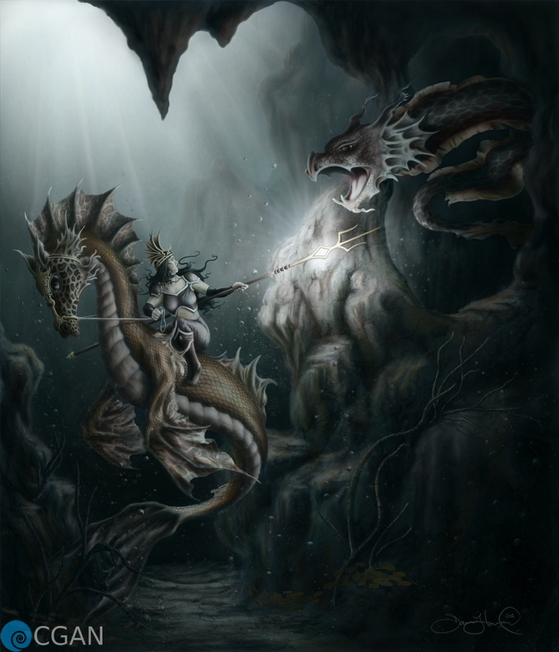
Color choices itself may or may not be issues for some, but I know personally I've done images in greyscale and once I added the color, I got responses back that made me wonder. For instance, on my Deep Sea Encounter pic, when I posted the image, I had a few that said 'that's totally not what I expected, but it looks good' ... I personally would like to see what they indeed expected, and think this thread would allow me to do just that. But this is only one example.
Thanks again
I get sketchy around pencils! ...
Last edit: 07 Jul 2014 00:21 by Digital Dave.
Please Log in or Create an account to join the conversation.
- RebeccaWeaver
-

- Offline
- New Member
-

Less
More
- Posts: 19
- Thank you received: 0
07 Jul 2014 00:18 #803
by RebeccaWeaver
Replied by RebeccaWeaver on topic Suggestion I wanted to get other's thoughts on
This is a really cool idea. I'd like to see something like this! I never really work with greyscale and add tones- it always seems very obvious that's what I did when I attempt it, so I think it would be cool to see how others go about it.
Please Log in or Create an account to join the conversation.
- microscopi
-

- Offline
- Premium Member
-

Less
More
- Posts: 743
- Thank you received: 79
07 Jul 2014 04:23 - 07 Jul 2014 04:24 #815
by microscopi
Replied by microscopi on topic Suggestion I wanted to get other's thoughts on
Sounds interesting Dave, I sometimes start pics in greyscale when I want to add color I make a separate color layer and just start putting down colors I think will look good. Then I play with the hue/sat filter to get a better color base then I just use the color dropper to select from the colors I already put down to stay consistant with the color pallete, adding more brighter and darker hues of those colors to start to build something up. It's the best way I found to get going after your greyscale pic is finished.
Last edit: 07 Jul 2014 04:24 by microscopi.
Please Log in or Create an account to join the conversation.

07 Jul 2014 06:19 #818
by Charlotte
Any an all misspellings are henceforth blamed on the cats.
Replied by Charlotte on topic Suggestion I wanted to get other's thoughts on
Certainly a nice idea. I think starting in greyscale makes it much easier to get the values right (and in ArtRage, which I use, it seems a bit trickier to check your values than it was in Photoshop - or slower at least). But like Rebecca said, it feels like it shows too well that you coloured a greyscale image once you're done.
For me it seems to be the problem that you want to use the greyscale to get the whole value range but once you start colouring the pale values get too desaturated and the dark values get way too saturated compared to what you perhaps wanted. I've been thinking it might be an idea to limit the value range, and add the lightest and darkest values after colouring, but that sort of takes away from the whole idea of starting in greyscale for the sake of getting your values right from the start...
For me it seems to be the problem that you want to use the greyscale to get the whole value range but once you start colouring the pale values get too desaturated and the dark values get way too saturated compared to what you perhaps wanted. I've been thinking it might be an idea to limit the value range, and add the lightest and darkest values after colouring, but that sort of takes away from the whole idea of starting in greyscale for the sake of getting your values right from the start...
Any an all misspellings are henceforth blamed on the cats.
Please Log in or Create an account to join the conversation.
- CherryGraphics
-

- Offline
- Junior Member
-

Less
More
- Posts: 366
- Thank you received: 33
07 Jul 2014 06:21 #819
by CherryGraphics
Replied by CherryGraphics on topic Suggestion I wanted to get other's thoughts on
I read this thread last night and it's still in my mind so it must be a good idea!
Please Log in or Create an account to join the conversation.
Latest Activity

Banj updated their profile picture


Charlotte Still wearing a mask? Is it so we won't see you hoarding food in those cheeks of yours?
See More
Banj Mfmuh Guhmfpf
See More
Charlotte I'll take that as a yes...
See More
Charlotte Why is there a tiny flashing thing in front of the reply link/button? It's so small I can't see if it's an exclamation mark or a question mark... or...both?)
See More
Banj Because? Both!
See More
Charlotte *gasp*
See More

CaptainDeth updated their profile picture

CaptainDeth Ahoy folks, just a newbie here, just getting started. Thanks for allowing me in.
CaptainDeth Thank You
CaptainDeth and Mr.Bungle joined the site


honbasic joined the site


Gawk joined the site