


The shoutbox is unavailable to non-members
Da funk!

07 Mar 2015 19:04 #9430
by Charlotte

Any an all misspellings are henceforth blamed on the cats.
That sounds just slightly ominous....I think he is innocent... Of that at least.
Any an all misspellings are henceforth blamed on the cats.
Please Log in or Create an account to join the conversation.

07 Mar 2015 20:00 - 07 Mar 2015 20:01 #9431
by Gus
Haha, thanks for the feedback guys ^^ I´ve got to do a couple more jungle pieces, I´ll post them when i´m done =) perhaps one with a central figure, I hope. And I´ll take in consideration all the suggestions you´ve made.
So here´s the sketch thingy for the contest, someday I´ll finish it.
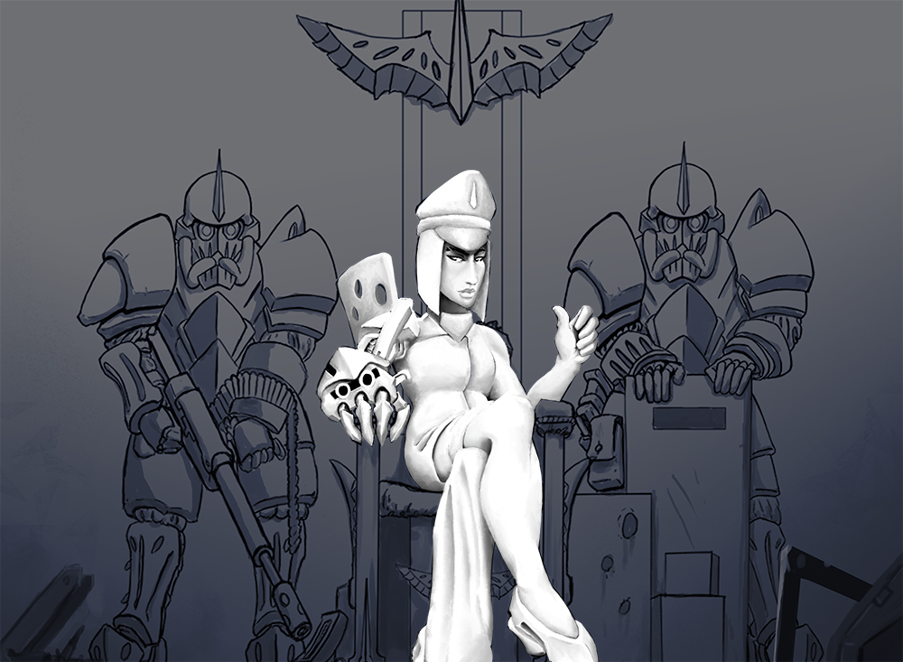
Thanks for stopping by! =)
So here´s the sketch thingy for the contest, someday I´ll finish it.
Thanks for stopping by! =)
Last edit: 07 Mar 2015 20:01 by Gus.
Please Log in or Create an account to join the conversation.
- crankshaft
-

- Offline
- Platinum Member
-

Less
More
- Posts: 1448
- Thank you received: 55
08 Mar 2015 15:34 #9440
by crankshaft
Replied by crankshaft on topic Da funk!
Hey Gus! I did a po focusing om composition. Hope this helps:
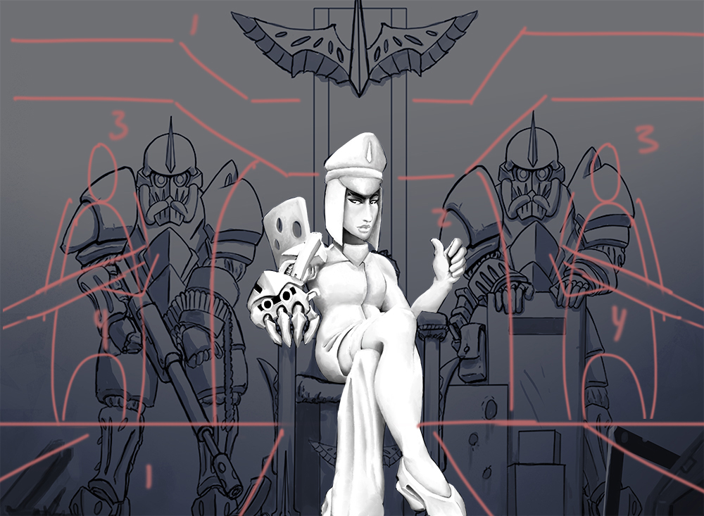
1 These can act as framing elements to prevent the eye from wandering off. The bottom 1 also directs the eye towards the head. They can also add depth, as in put lots of details/overlapping there to pop them out.
2 You can use this corridor or whatever to increase contrast around his body.
3 You can make these walls and soldiers blurry to introduce another plane/add more depth.
4 I think the guys are too crowed and could be spaced farther apart. Having the guards smaller puts priority and power on the focal. Also I'd make them have guns pointing towards the head.
Please Log in or Create an account to join the conversation.

08 Mar 2015 16:00 #9441
by Domtopia
Everything's on the right!!!
It's like driving abroad!
It's still got that big limb/small body thing going on.
The perspective could be tweaked too. If our eye level is her hips (as it seems to be) then we are looking up at her head and way up at the large guards behind her. It would help to make them bigger and bulkier. Crank's suggestion of blurring them out is a good one for you to try eventually.
One point that I would contend with is making the piece too symmetrical. I think that sort of composition is boring, so I would recommend following the rule of thirds to more effect, perhaps even going vertical instead of lateral. Imagine the impact of having a huge edifice above her! Something really imposing and Gothic to fit with the theme.
Couple of ideas there!
Everything's on the right!!!
It's like driving abroad!
Please Log in or Create an account to join the conversation.
08 Mar 2015 17:38 - 08 Mar 2015 17:42 #9444
by Gus
Both suggestions are extremely helpful to me =) thanks guys! One of my worries is the perspective which I need to practice more, specially on hard surfaces as in this case.
These are great ideas, I will make an update soon since I´m highly interested on improving composition and perspective. The best way to improve that I actually works for me is to try these things out in an actual piece, so yeah I´ll update perhaps at the end of the week, I hope!
Thanks Crank for the po and quick suggestion! ^^
What can I say Dom? haha I´m not gonna lie, I can try harder, but it seems that thing is coming from my influences (Xa-xa-xa, Greg Capullo, Stjepan Sejic..) and the tendency to exaggerate them by default. Funny thing is I´ve been thinking about it and helped me to re visit some artists portfolios I used to admire during my childhood.
Truth is I need to do more anatomy sketches which as matter of fact i´m doing at the moment. Until I´m done I hope it´s not that painful to look at my pieces "^-^ sorry Dom!
So for the suggestions I agree, I´ll combine both tips from you and see what happens. I don´t know right now if i´m going to stick or not with the symmetrical way, I just want to try and see what happens. But the Idea of a Gothic architecture behind is something I really dig. Thanks for pointing that out and for all the suggestions =)
I wish I could give tips as useful as you do! haha cheers!
Hey Gus! I did a po focusing om composition. Hope this helps:
1 These can act as framing elements to prevent the eye from wandering off. The bottom 1 also directs the eye towards the head. They can also add depth, as in put lots of details/overlapping there to pop them out.
2 You can use this corridor or whatever to increase contrast around his body.
3 You can make these walls and soldiers blurry to introduce another plane/add more depth.
4 I think the guys are too crowed and could be spaced farther apart. Having the guards smaller puts priority and power on the focal. Also I'd make them have guns pointing towards the head.
These are great ideas, I will make an update soon since I´m highly interested on improving composition and perspective. The best way to improve that I actually works for me is to try these things out in an actual piece, so yeah I´ll update perhaps at the end of the week, I hope!
Thanks Crank for the po and quick suggestion! ^^
It's still got that big limb/small body thing going on.
The perspective could be tweaked too. If our eye level is her hips (as it seems to be) then we are looking up at her head and way up at the large guards behind her. It would help to make them bigger and bulkier. Crank's suggestion of blurring them out is a good one for you to try eventually.
One point that I would contend with is making the piece too symmetrical. I think that sort of composition is boring, so I would recommend following the rule of thirds to more effect, perhaps even going vertical instead of lateral. Imagine the impact of having a huge edifice above her! Something really imposing and Gothic to fit with the theme.
Couple of ideas there!
What can I say Dom? haha I´m not gonna lie, I can try harder, but it seems that thing is coming from my influences (Xa-xa-xa, Greg Capullo, Stjepan Sejic..) and the tendency to exaggerate them by default. Funny thing is I´ve been thinking about it and helped me to re visit some artists portfolios I used to admire during my childhood.
Truth is I need to do more anatomy sketches which as matter of fact i´m doing at the moment. Until I´m done I hope it´s not that painful to look at my pieces "^-^ sorry Dom!
So for the suggestions I agree, I´ll combine both tips from you and see what happens. I don´t know right now if i´m going to stick or not with the symmetrical way, I just want to try and see what happens. But the Idea of a Gothic architecture behind is something I really dig. Thanks for pointing that out and for all the suggestions =)
I wish I could give tips as useful as you do! haha cheers!
Last edit: 08 Mar 2015 17:42 by Gus.
Please Log in or Create an account to join the conversation.
08 Mar 2015 18:00 #9446
by Domtopia
Everything's on the right!!!
It's like driving abroad!
That's one of the wonderful things about this site Gus, the way we all get help from other artists.
Doesn't matter what you believe your "skill level" to be, or how "useful" you think your tips will be, it's all valid and helpful. So get stuck in there and give your feedback. I am sure you know how good it feels to get feedback from others and how awesome it is to see yourself improve because of following up on the advice.
I personally have benefited from that sort of feedback from the forumites. Trust me, I have seen a huge improvement in my work over the couple of years I have been doing digital art! As one of them once said, "it's not about perfection, it's about improvement!"
Everything's on the right!!!
It's like driving abroad!
Please Log in or Create an account to join the conversation.
10 Jun 2015 22:29 - 10 Jun 2015 22:31 #11102
by Gus
Hi guys =) Sorry for my absence, I had some places to go the past months. How are you doing? I saw the fantastic pieces you did for the last contests, simply fantastic!
So back to business, I´ve got some studies and sketches I want to share with you =)


Also I wanted to ask you something, do you guys know a book to practice expressions? I´ve been using "Anatomy for Sculptors" for anatomy studies and "The complete guide to facial expression" from Gary Faigin but I´m considering other options.
Last but not least I´ve got a lot of pencil studies I want to show you so you can tell me what you think. I´m scanning the stuff right now. Cheers!
So back to business, I´ve got some studies and sketches I want to share with you =)
Also I wanted to ask you something, do you guys know a book to practice expressions? I´ve been using "Anatomy for Sculptors" for anatomy studies and "The complete guide to facial expression" from Gary Faigin but I´m considering other options.
Last but not least I´ve got a lot of pencil studies I want to show you so you can tell me what you think. I´m scanning the stuff right now. Cheers!
Last edit: 10 Jun 2015 22:31 by Gus.
Please Log in or Create an account to join the conversation.
Latest Activity

Banj updated their profile picture


Charlotte Still wearing a mask? Is it so we won't see you hoarding food in those cheeks of yours?
See More
Banj Mfmuh Guhmfpf
See More
Charlotte I'll take that as a yes...
See More
Charlotte Why is there a tiny flashing thing in front of the reply link/button? It's so small I can't see if it's an exclamation mark or a question mark... or...both?)
See More
Banj Because? Both!
See More
Charlotte *gasp*
See More

CaptainDeth updated their profile picture

CaptainDeth Ahoy folks, just a newbie here, just getting started. Thanks for allowing me in.
CaptainDeth Thank You
CaptainDeth and Mr.Bungle joined the site


honbasic joined the site


Gawk joined the site