


The shoutbox is unavailable to non-members
Mindbender's sketches, doodles and studies

26 Feb 2015 17:33 #9133
by Charlotte
Any an all misspellings are henceforth blamed on the cats.
Replied by Charlotte on topic Mindbender's sketches, doodles and studies
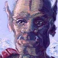
I usually use bounce lights to reflect the colours of the environment on my character (if a portrait) and also colours from my character (e.g. clothes) back onto the environment (walls, floors etc.) The reflected colours help bind the pieces of the image together.
Not sure a bounce light should be darker than the local colour? Never heard that - but then again I probably haven't heard loads of things
Not sure a bounce light should be darker than the local colour? Never heard that - but then again I probably haven't heard loads of things
Any an all misspellings are henceforth blamed on the cats.
The following user(s) said Thank You: Mindbender
Please Log in or Create an account to join the conversation.
- Mindbender
-
 Topic Author
- Offline
- Junior Member
-

26 Feb 2015 17:41 - 26 Feb 2015 17:41 #9134
by Mindbender
Replied by Mindbender on topic Mindbender's sketches, doodles and studies
Yes, I mostly think of colour when I think of reflected light, using it to describe adjacent objects and/or light sources.
In the "standard model" of light and shade on a sphere, the reflected light is rather dark. Example:
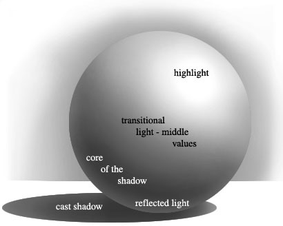
In the "standard model" of light and shade on a sphere, the reflected light is rather dark. Example:
Last edit: 26 Feb 2015 17:41 by Mindbender.
Please Log in or Create an account to join the conversation.
26 Feb 2015 18:07 #9136
by Charlotte
Any an all misspellings are henceforth blamed on the cats.
Replied by Charlotte on topic Mindbender's sketches, doodles and studies
Come to think of it I have seen that sphere before
Any an all misspellings are henceforth blamed on the cats.
Please Log in or Create an account to join the conversation.

26 Feb 2015 22:10 #9138
by Domtopia
Everything's on the right!!!
It's like driving abroad!
Replied by Domtopia on topic Mindbender's sketches, doodles and studies
That's what I meant Mind. Well done for finding a good example of it! I find that you should use whatever colour (or light) is adjacent to the shadow side of the object to highlight the shadow.
Like Charlotte said, it ties the image to its environment. Forgetting to add the bounce-light is an amateur mistake, but is so simple to do!
Like Charlotte said, it ties the image to its environment. Forgetting to add the bounce-light is an amateur mistake, but is so simple to do!
Everything's on the right!!!
It's like driving abroad!
The following user(s) said Thank You: Mindbender
Please Log in or Create an account to join the conversation.
- Mindbender
-
Topic Author
- Offline
- Junior Member
-
27 Feb 2015 13:15 #9145
by Mindbender
Replied by Mindbender on topic Mindbender's sketches, doodles and studies
Yes, I'll have to return to the basics for the rest of my life, no matter how skilled artist I may become. That's the beauty of art to me - a lifelong commitment to master something that can always be taken to yet another level of sofistication, one step closer to the essence of what you are trying to express. 
Here's a quick character design study sketch from today:
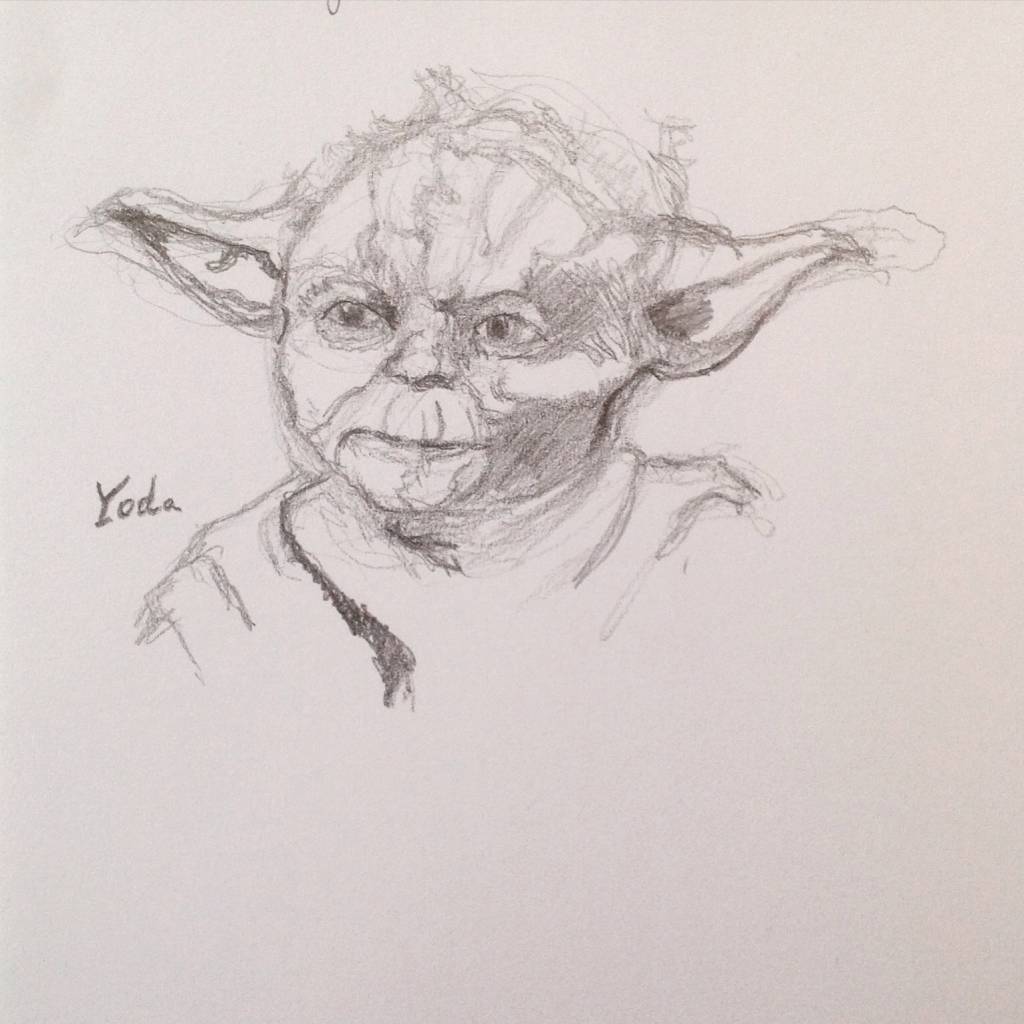
Here's a quick character design study sketch from today:
Please Log in or Create an account to join the conversation.
- crankshaft
-

- Offline
- Platinum Member
-

Less
More
- Posts: 1448
- Thank you received: 55
28 Feb 2015 16:19 #9187
by crankshaft
Replied by crankshaft on topic Mindbender's sketches, doodles and studies
Looking good mindbender! It could use more tone work though such as more halftones and darker occlusion shadows. Don't forget about the local value of the subject, eg this yoda would be green. If you rendered green in greyscale it would quite dark. Hope this helps!
Please Log in or Create an account to join the conversation.
28 Feb 2015 17:15 #9189
by Domtopia
Everything's on the right!!!
It's like driving abroad!
Replied by Domtopia on topic Mindbender's sketches, doodles and studies
Why would green be darker in grey?
I think that this would look great with a little colour though. Using colour to highlight would be interesting. Alternatively, you could use coloured paper and keep the work tonal and greyscale. Or just scan it in to a computer (which you have already) and colour the background, achieving the same result.
Some ideas anyway!
Everything's on the right!!!
It's like driving abroad!
Please Log in or Create an account to join the conversation.
- Digital Dave
-

- Offline
- Platinum Member
-
Less
More
- Posts: 2242
- Thank you received: 163
02 Mar 2015 15:00 #9268
by Digital Dave
I get sketchy around pencils! ...
Replied by Digital Dave on topic Mindbender's sketches, doodles and studies
Always a Yoda fan. But then again, I think most are. ")
I get sketchy around pencils! ...
Please Log in or Create an account to join the conversation.
- Mindbender
-
Topic Author
- Offline
- Junior Member
-
29 Dec 2015 12:10 #13094
by Mindbender
Replied by Mindbender on topic Mindbender's sketches, doodles and studies
Yes, fans of yoda we all seem to be ") Too long since I posted something here - got to change that in a not too distant future...
Too long since I posted something here - got to change that in a not too distant future...
Too long since I posted something here - got to change that in a not too distant future... Please Log in or Create an account to join the conversation.
- Mindbender
-
Topic Author
- Offline
- Junior Member
-
16 Dec 2017 17:11 #19607
by Mindbender
Replied by Mindbender on topic Mindbender's sketches, doodles and studies
Time flies, time to post something...
Cersei (Lena Headey) study
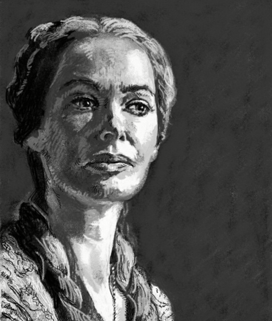
Cersei (Lena Headey) study
Please Log in or Create an account to join the conversation.
Latest Activity

Banj updated their profile picture


Charlotte Still wearing a mask? Is it so we won't see you hoarding food in those cheeks of yours?
See More
Banj Mfmuh Guhmfpf
See More
Charlotte I'll take that as a yes...
See More
Charlotte Why is there a tiny flashing thing in front of the reply link/button? It's so small I can't see if it's an exclamation mark or a question mark... or...both?)
See More
Banj Because? Both!
See More
Charlotte *gasp*
See More

CaptainDeth updated their profile picture

CaptainDeth Ahoy folks, just a newbie here, just getting started. Thanks for allowing me in.
CaptainDeth Thank You
CaptainDeth and Mr.Bungle joined the site


honbasic joined the site


Gawk joined the site