


The shoutbox is unavailable to non-members
CGMythology's Sketchbook (nudity)

14 Jan 2023 20:00 #43956
by Charlotte
Any an all misspellings are henceforth blamed on the cats.
Replied by Charlotte on topic CGMythology's Sketchbook (nudity)
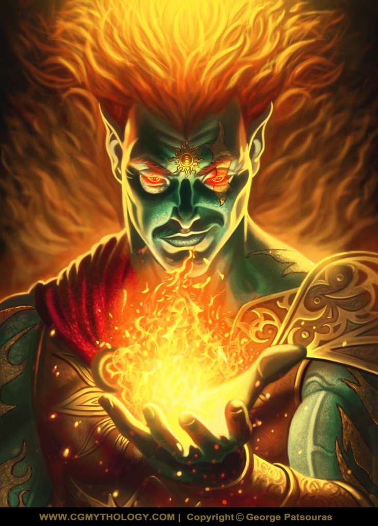
I agree with Val about that tangent. When it comes to colour I'm not really feeling the sun (so to speak) from any of them. All of the blue hair ones makes me think of Disney's Hades and I'm not sure you want people thinking it's Hades rather than Helios... I guess I'd try some bright and warm scheme, myself...
Then again that sneer (which I like) does make him look a bit villain-y.
I'm curious about the sun on his forehead - it's assymetrical left/right but symmetrical up/down which makes me wonder if it's meant to be a two part/coloured symbol (divided in half, vertically)?
Then again that sneer (which I like) does make him look a bit villain-y.
I'm curious about the sun on his forehead - it's assymetrical left/right but symmetrical up/down which makes me wonder if it's meant to be a two part/coloured symbol (divided in half, vertically)?
Any an all misspellings are henceforth blamed on the cats.
The following user(s) said Thank You: cgmythology
Please Log in or Create an account to join the conversation.
- cgmythology
-
 Topic Author
- Offline
- Senior Member
-

16 Jan 2023 15:20 #43977
by cgmythology
Replied by cgmythology on topic CGMythology's Sketchbook (nudity)
Valence: Good call, updated it I hope it works better now! Thanks for your input as always.
Charlotte: I agree about the colors and the bluish tones giving more of a Hades vibe, so I went with a warm one. I've decided this won't be a direct depiction of 'Helios' but something inspired by him, so more of an original character than anything else. As for the design, I preferred it asymaterical as it keeps things a bit more interesting.
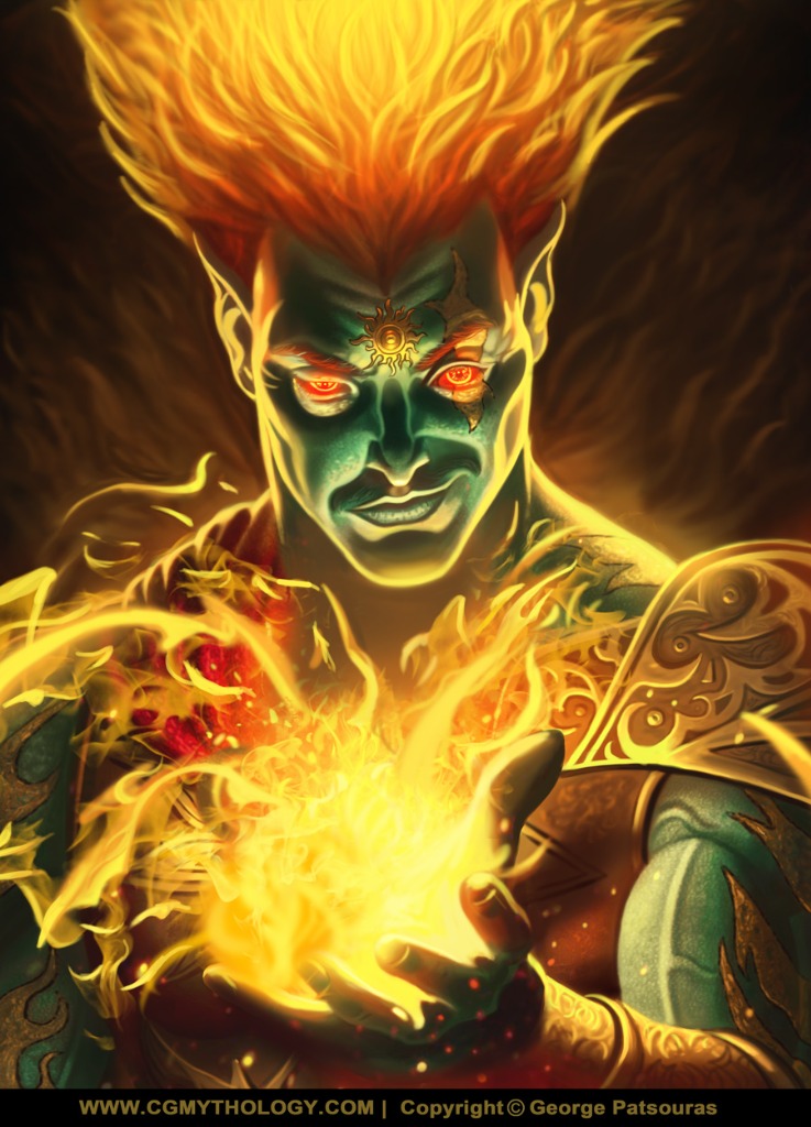
.......................I finished up the illustration, went with 'E' as the colors there give more of an impression of the sun or fire. I'm pretty satisfied with how the image turned out overall. I will also be writing a tutorial on how this image was created for my official website, free of charge, this week. In the future I'll also record a video tutorial on how to paint a portrait as well, should be fun! Below is the final followed by the steps for those interested. Any final input on the image would be appreciated as well!
Charlotte: I agree about the colors and the bluish tones giving more of a Hades vibe, so I went with a warm one. I've decided this won't be a direct depiction of 'Helios' but something inspired by him, so more of an original character than anything else. As for the design, I preferred it asymaterical as it keeps things a bit more interesting.
.......................I finished up the illustration, went with 'E' as the colors there give more of an impression of the sun or fire. I'm pretty satisfied with how the image turned out overall. I will also be writing a tutorial on how this image was created for my official website, free of charge, this week. In the future I'll also record a video tutorial on how to paint a portrait as well, should be fun! Below is the final followed by the steps for those interested. Any final input on the image would be appreciated as well!
Attachments:
Please Log in or Create an account to join the conversation.
- cgmythology
-
Topic Author
- Offline
- Senior Member
-
18 Jan 2023 18:22 #44016
by cgmythology
Replied by cgmythology on topic CGMythology's Sketchbook (nudity)
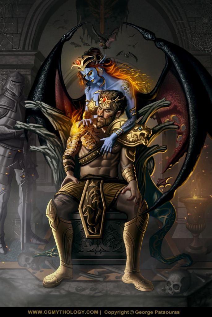
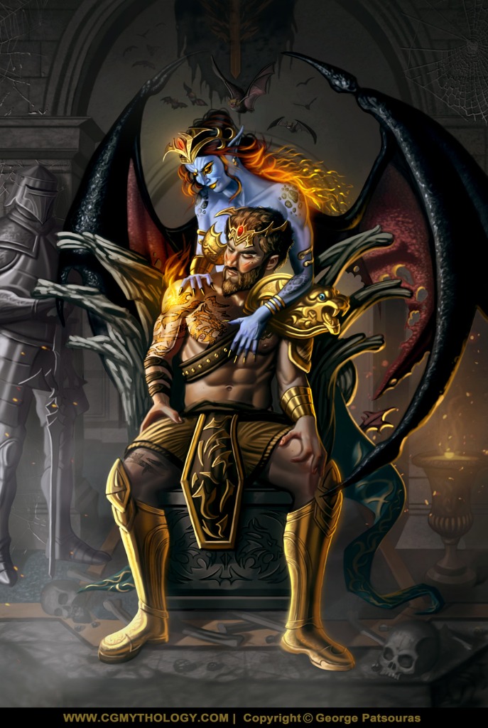
Did some final changed to the 'Pyro' image to make it a bit more dynamic and added a bit more contrast so the figure pops more:
 .................
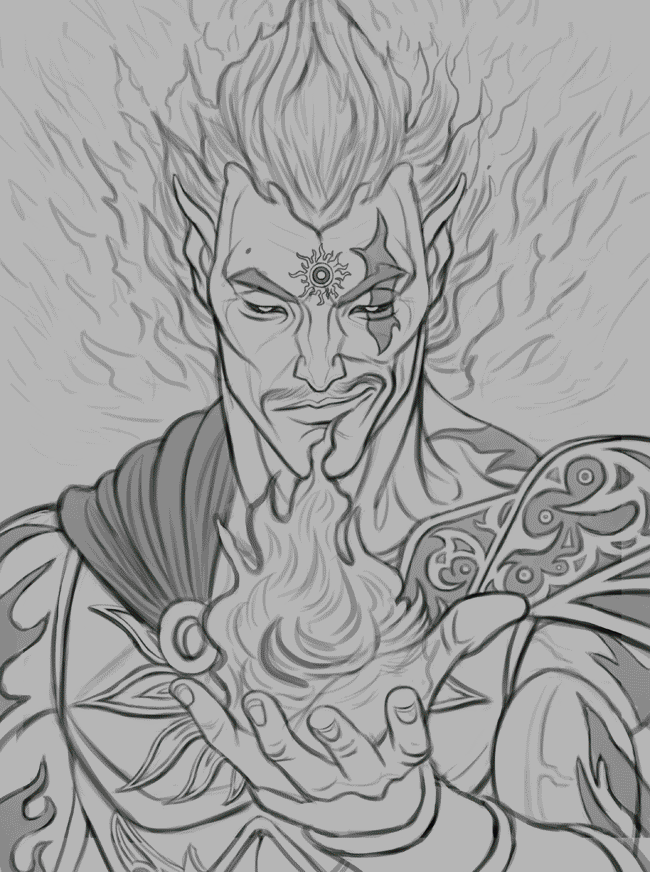
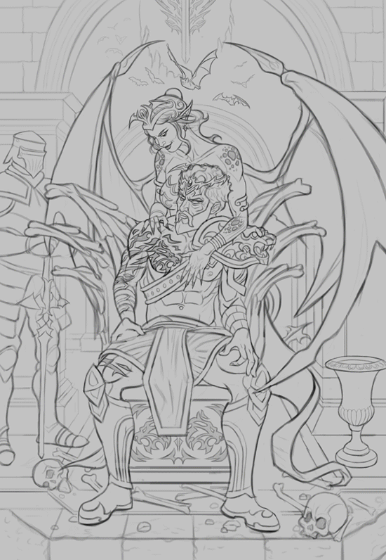
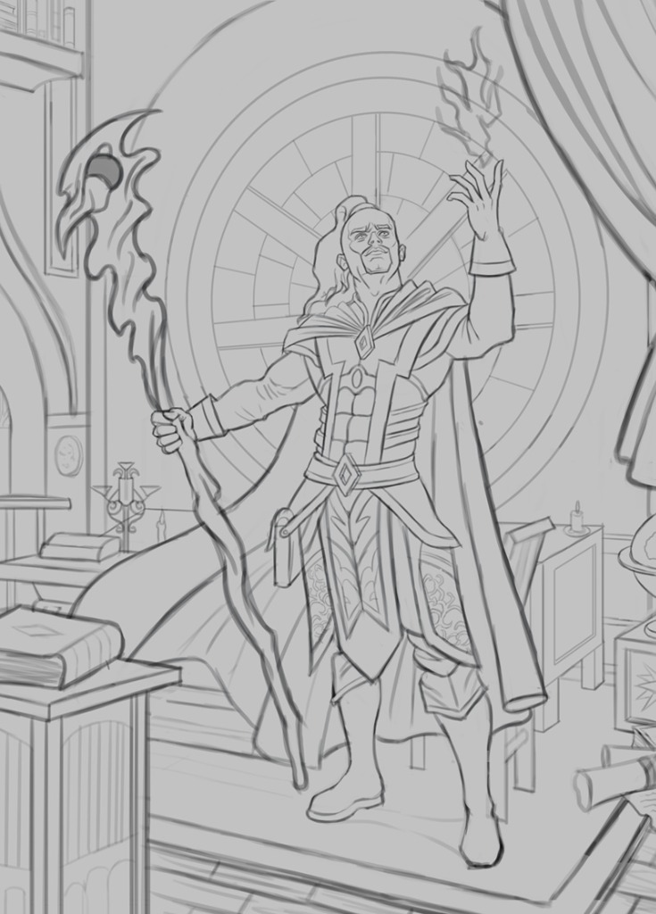
Next up a new sketch, started on this quite some time ago and finalized the linework recently, it took some time given the complexity of the image but I'm overall satisfied with the sketch. The figures were referenced from The Pose Archives here . I tried to stay true to the overall gestures/poses of the reference while coming up with what are some interesting character designs, I hope! Any input before I get started on some color tests would be most appreciated. Below is the sketch:
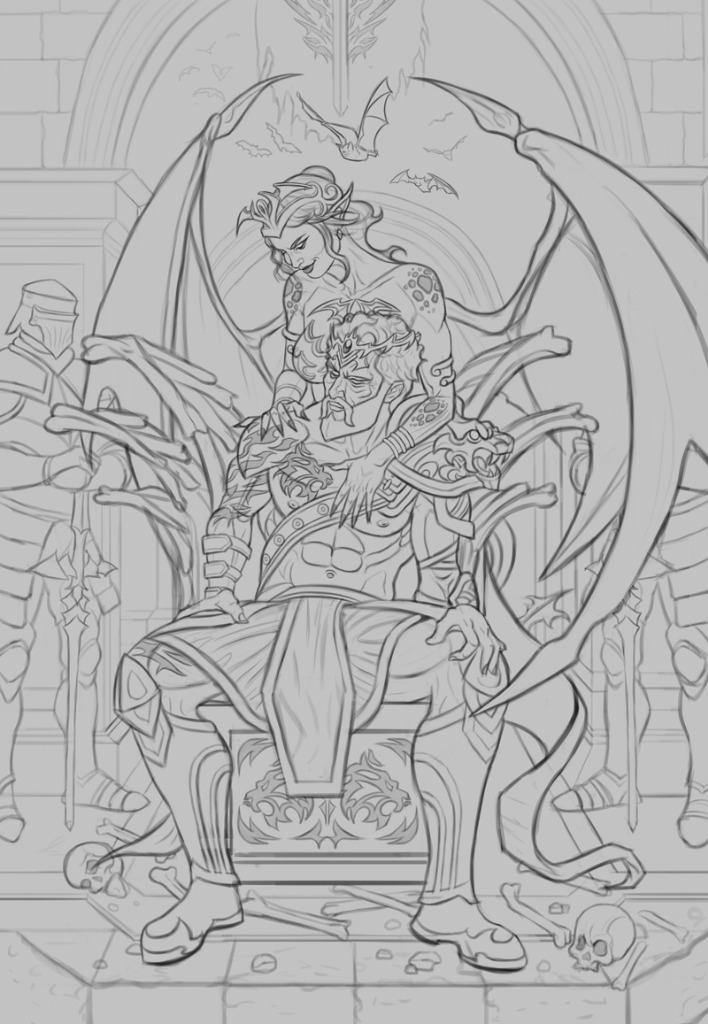
Next up a new sketch, started on this quite some time ago and finalized the linework recently, it took some time given the complexity of the image but I'm overall satisfied with the sketch. The figures were referenced from The Pose Archives here . I tried to stay true to the overall gestures/poses of the reference while coming up with what are some interesting character designs, I hope! Any input before I get started on some color tests would be most appreciated. Below is the sketch:
Attachments:
Please Log in or Create an account to join the conversation.
18 Jan 2023 19:18 #44018
by Banj
Replied by Banj on topic CGMythology's Sketchbook (nudity)
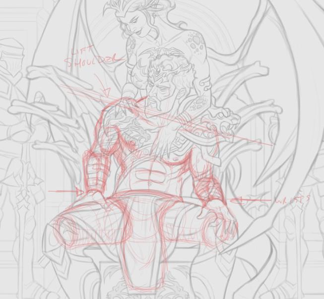
Your arms don't quite work, well yours do, but Mr sitting man's in your painting don't. The hands appear detached as your armour cuts off below the wrist line on the left, and on the right it doesn't follow the foreshortening that should occur. That leaves the arm on the right looking like it is hanging behind the leg while a random hand (Thing from Addams family) rests on his knee. Also the arm on the left should raise it's shoulder to allow room for the upper arm which should be bending back to rest the hand on his thigh.
Attachments:
The following user(s) said Thank You: cgmythology
Please Log in or Create an account to join the conversation.
18 Jan 2023 19:37 #44020
by Charlotte
Any an all misspellings are henceforth blamed on the cats.
Replied by Charlotte on topic CGMythology's Sketchbook (nudity)
The changes to Pyro really made the image pop ") I do however think the eyes look odd now - unless he can move his eyes independently of each other like a chameleon, he shouldn't be able to look at us with one open eye and down with a half closed eye. It also looks like the flame tattoo is inside his eye which seems a bit odd though I suppose it might be intentional...
I do however think the eyes look odd now - unless he can move his eyes independently of each other like a chameleon, he shouldn't be able to look at us with one open eye and down with a half closed eye. It also looks like the flame tattoo is inside his eye which seems a bit odd though I suppose it might be intentional...
The new pic is impressively detailed. I agree with Banj about the arms, though. A couple of other small things: If the skulls around his feet are supposed to be from individuals approximately the same size as him, they should be bigger (I guess these characters might be larger than humans or those skulls might not be human but some smaller monkey or so...); and it looks kind of silly with only the feet of the guard to the right, in the background. Personally I'd probably cut that one or both of them, and replace them with something like urns - something that is still decorative and detailed but doesn't quite require the same attention from the viewer as humans tend to do.
I do however think the eyes look odd now - unless he can move his eyes independently of each other like a chameleon, he shouldn't be able to look at us with one open eye and down with a half closed eye. It also looks like the flame tattoo is inside his eye which seems a bit odd though I suppose it might be intentional...The new pic is impressively detailed. I agree with Banj about the arms, though. A couple of other small things: If the skulls around his feet are supposed to be from individuals approximately the same size as him, they should be bigger (I guess these characters might be larger than humans or those skulls might not be human but some smaller monkey or so...); and it looks kind of silly with only the feet of the guard to the right, in the background. Personally I'd probably cut that one or both of them, and replace them with something like urns - something that is still decorative and detailed but doesn't quite require the same attention from the viewer as humans tend to do.
Any an all misspellings are henceforth blamed on the cats.
The following user(s) said Thank You: cgmythology
Please Log in or Create an account to join the conversation.
- cgmythology
-
Topic Author
- Offline
- Senior Member
-
19 Jan 2023 18:56 #44033
by cgmythology
Replied by cgmythology on topic CGMythology's Sketchbook (nudity)
Banj: I agree about the arms! Your sketch was very helpful as well, thanks for taking the time to do that! I refined the arms, hopefully they look more natural now!
Charlotte: Glad to hear 'Pyro' pops! Interesting point about the eyes! I think they look a bit feaky and perhaps a bit unnatural but I think that works in the favor of the image so I think I'll leave it for now! For the new image I fixed the issue with the arms, and enlarged the skulls per your input. Love the idea with the urn as well so I incorporated it, excellent suggestions! Thanks for your input as always, very helpful!I refined the sketch and began the painting process. Didn't bother with color tests as I had a very strong concept for the color scheme already, and I got it as I wanted on my first try thankfully. Image is still fairly early but I'm happy with how it's shaping up. Here is the current update:
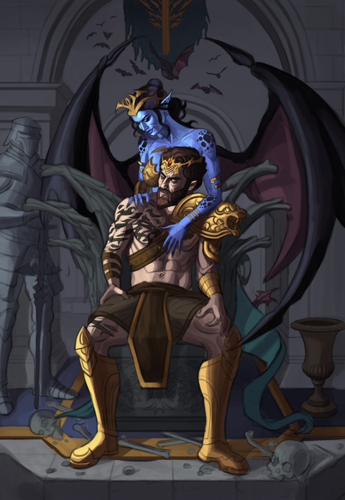
Charlotte: Glad to hear 'Pyro' pops! Interesting point about the eyes! I think they look a bit feaky and perhaps a bit unnatural but I think that works in the favor of the image so I think I'll leave it for now! For the new image I fixed the issue with the arms, and enlarged the skulls per your input. Love the idea with the urn as well so I incorporated it, excellent suggestions! Thanks for your input as always, very helpful!I refined the sketch and began the painting process. Didn't bother with color tests as I had a very strong concept for the color scheme already, and I got it as I wanted on my first try thankfully. Image is still fairly early but I'm happy with how it's shaping up. Here is the current update:
Attachments:
Please Log in or Create an account to join the conversation.
- cgmythology
-
Topic Author
- Offline
- Senior Member
-
22 Jan 2023 17:17 #44083
by cgmythology
Replied by cgmythology on topic CGMythology's Sketchbook (nudity)
I finished up the image, pretty happy with it. I think it came together nicely in the end with the warmer tones added. There's still time to make changes to the image, so if something looks off please let me know so I can refine it further if need. Below is the illustration followed by the steps for those interested:
Attachments:
Please Log in or Create an account to join the conversation.

22 Jan 2023 21:13 #44090
by Valence
Replied by Valence on topic CGMythology's Sketchbook (nudity)
I like the colour choices, the blue stands out nicely and the dark of the wings really pushes the background away well to create depth.
The guy's hands still look a little off, particularly the areas that connect the thumb and the first finger. But I'm no expert on hands and it's a very tricky gesture/pose to capture from this angle.
The guy's hands still look a little off, particularly the areas that connect the thumb and the first finger. But I'm no expert on hands and it's a very tricky gesture/pose to capture from this angle.
The following user(s) said Thank You: cgmythology
Please Log in or Create an account to join the conversation.
- cgmythology
-
Topic Author
- Offline
- Senior Member
-
23 Jan 2023 18:14 #44096
by cgmythology
Replied by cgmythology on topic CGMythology's Sketchbook (nudity)
Valence: Thank you! And yes, the hands were tricky, hopefully they're not distracting!
.......
Another update for the illustration, basically refined the gold so it looks more 'shiny' and also pushed the skin tones further. I think I'm about done with this image, worked on it long enough and I'd like to move on to another painting. Thanks everyone for the awesome feedback as well!
 Next up I decided to sketch a Mage, while paying special care to the environment as well. Overall I'm fairly pleased with it, but any feedback before I move on to the color tests would be most appreciated!
.......
Another update for the illustration, basically refined the gold so it looks more 'shiny' and also pushed the skin tones further. I think I'm about done with this image, worked on it long enough and I'd like to move on to another painting. Thanks everyone for the awesome feedback as well!
Attachments:
Please Log in or Create an account to join the conversation.
- cgmythology
-
Topic Author
- Offline
- Senior Member
-
24 Jan 2023 17:34 #44110
by cgmythology
Replied by cgmythology on topic CGMythology's Sketchbook (nudity)
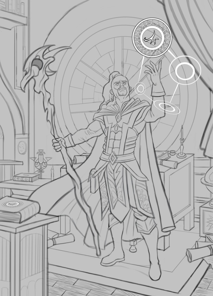
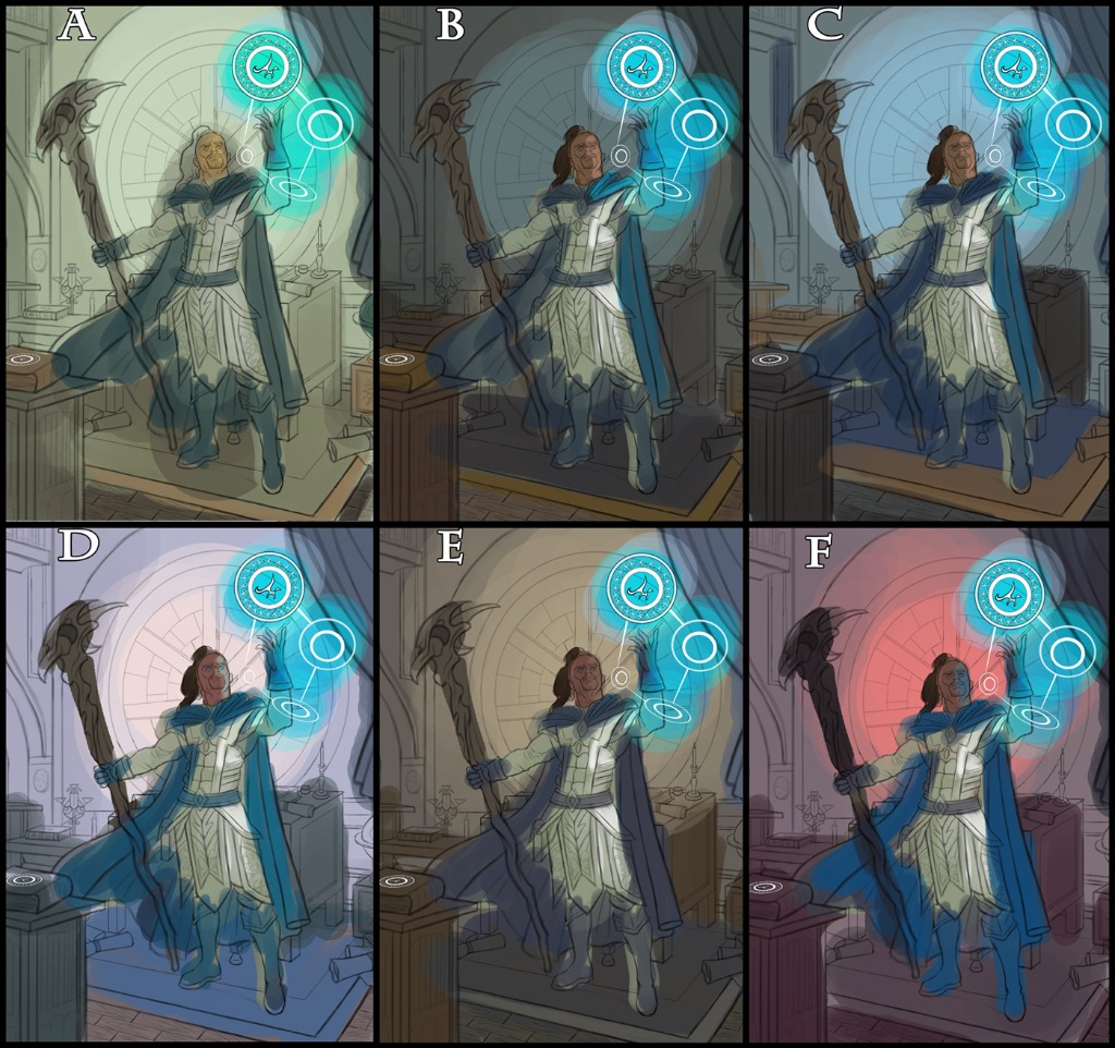
I updated the sketch, fixed some scaling issues and reworked the Mage's staff a bit. Also added some 'magic' spheres instead of a standard fireball, hopefully it's much more interesting now. Also did some color tests as well, most likely going with 'F' as the colors really pop there... although I'd love to hear any input on what works best so please let me know!
Attachments:
Please Log in or Create an account to join the conversation.
Latest Activity

Banj updated their profile picture


Charlotte Still wearing a mask? Is it so we won't see you hoarding food in those cheeks of yours?
See More
Banj Mfmuh Guhmfpf
See More
Charlotte I'll take that as a yes...
See More
Charlotte Why is there a tiny flashing thing in front of the reply link/button? It's so small I can't see if it's an exclamation mark or a question mark... or...both?)
See More
Banj Because? Both!
See More
Charlotte *gasp*
See More

CaptainDeth updated their profile picture

CaptainDeth Ahoy folks, just a newbie here, just getting started. Thanks for allowing me in.
CaptainDeth Thank You
CaptainDeth and Mr.Bungle joined the site


honbasic joined the site


Gawk joined the site