


- Posts: 10084
- Thank you received: 475
 Like I said. Now
*presses B again*
![:]](https://cgartnexus.com/images/mod_shoutbox/unsure.png)
He does like meowing a lot.
I meant *here* but I guess Val might be a cat...
Does one belong to a cat?
I suspect there are two brains here. 
The shoutbox is unavailable to non-members
Shoutbox History
Like I said. Now
*presses B again*
He does like meowing a lot.
I meant *here* but I guess Val might be a cat...
Does one belong to a cat?
I suspect there are two brains here.
CGMythology's Sketchbook (nudity)
10 Jul 2021 20:49 #35714
by Valence
Replied by Valence on topic CGMythology's Sketchbook (nudity)
Looks good. The yellow glow is a bit intense at the moment but you usually control the colours perfectly at the end of your pictures and I'm sure you'll do the same with this one. ")
Please Log in or Create an account to join the conversation.
- cgmythology
-
 Topic Author
- Offline
- Senior Member
-

18 Aug 2021 17:50 #36042
by cgmythology
Replied by cgmythology on topic CGMythology's Sketchbook (nudity)
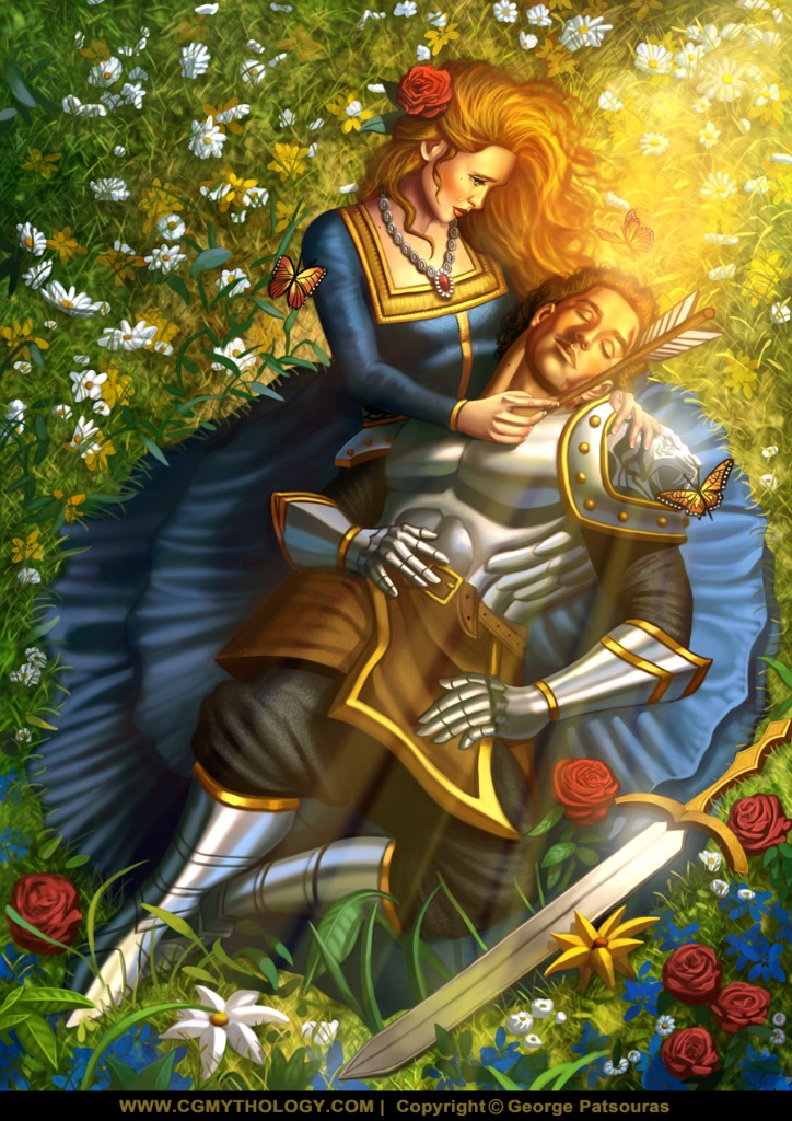
Valence: Thank you! I agree about the orange light, I toned it down a bit and I feel it works much better now!
....................I did a significant amount of work to the image based on the input I've received, and detailed it heavily to the best of my ability. I think I'm calling it finished for now, pretty pleased with how the image turned out so I will move forward with a new image. Thanks again to anyone that offered any input or advice, always appreciate it! Here is the final image, hope you enjoy!
....................I did a significant amount of work to the image based on the input I've received, and detailed it heavily to the best of my ability. I think I'm calling it finished for now, pretty pleased with how the image turned out so I will move forward with a new image. Thanks again to anyone that offered any input or advice, always appreciate it! Here is the final image, hope you enjoy!
Attachments:
Please Log in or Create an account to join the conversation.
18 Aug 2021 18:12 - 18 Aug 2021 18:12 #36045
by Valence
Replied by Valence on topic CGMythology's Sketchbook (nudity)
I really do like the flowers in the background at the top. They're so well integrated into the scene and even have a depth to them that makes the whole environment believable. You can really see how much work has gone into that. Very well done.
The only things that slightly catch my eye are the two lower butterflies. The one in the glare of the light is perfect but the other two do look a little "stuck on". Maybe it's the high contrast of the black on the wings that's making them stand out too much?
If time permits then it might be worthwhile to experiment in just knocking that back a little but even without doing that it's still a terrific and effective picture
Last edit: 18 Aug 2021 18:12 by Valence.
The following user(s) said Thank You: cgmythology
Please Log in or Create an account to join the conversation.
- cgmythology
-
Topic Author
- Offline
- Senior Member
-
27 Aug 2021 07:06 #36228
by cgmythology
Replied by cgmythology on topic CGMythology's Sketchbook (nudity)
Valence: Thank you! I spent a lot of time on the flowers and foilage so I'm glad to hear that! The butterflies could be better integrated I agree, the contrast is probably a bit too high for it's own good. Might rework them in the near future, thanks for your honesty!
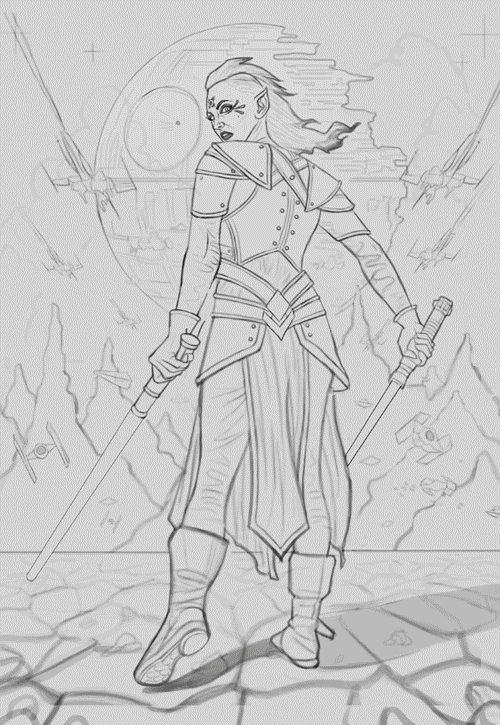
.................. I'm in the mood to paint some Star Wars art, so I chose to draw a Sith. The figure was referenced from Jagged Eye via DeviantArt here . I did my best to stick closely to the general pose of the figure, while taking a lot of artistic liberties on the costume design. Spent a lot of time on the sketch as usual, really just makes things easier and faster to paint. Any feedback would be greatly appreciated as always!
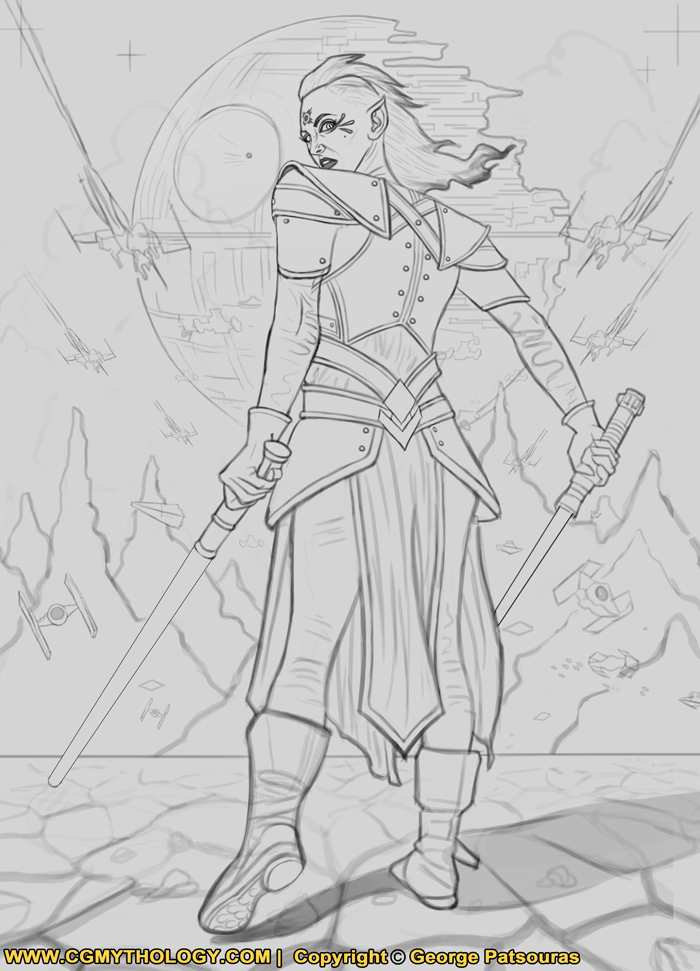
.................. I'm in the mood to paint some Star Wars art, so I chose to draw a Sith. The figure was referenced from Jagged Eye via DeviantArt here . I did my best to stick closely to the general pose of the figure, while taking a lot of artistic liberties on the costume design. Spent a lot of time on the sketch as usual, really just makes things easier and faster to paint. Any feedback would be greatly appreciated as always!
Attachments:
Please Log in or Create an account to join the conversation.
27 Aug 2021 12:00 #36238
by Valence
Replied by Valence on topic CGMythology's Sketchbook (nudity)
The straightness of that edge across the top of the shoulders looks a little stiff and awkward. Everything else looks excellent. 
Please Log in or Create an account to join the conversation.

27 Aug 2021 14:19 #36240
by Charlotte
Any an all misspellings are henceforth blamed on the cats.
Replied by Charlotte on topic CGMythology's Sketchbook (nudity)
I actually find the legs a little awkward. I looked at the ref, and of course the legs aren't exactly visible  But in comparison, your character kind of seem to be missing a bum. I agree with Val about the shoulders as well, although the shape of the armour would have an influence.
I did a little draw over - things that deviate a bit much from the ref, in blue, and the two things I think would be improved with an adjustment of the location are marked by arrows. I did try to account for your character being slimmer than the ref which is more muscular.
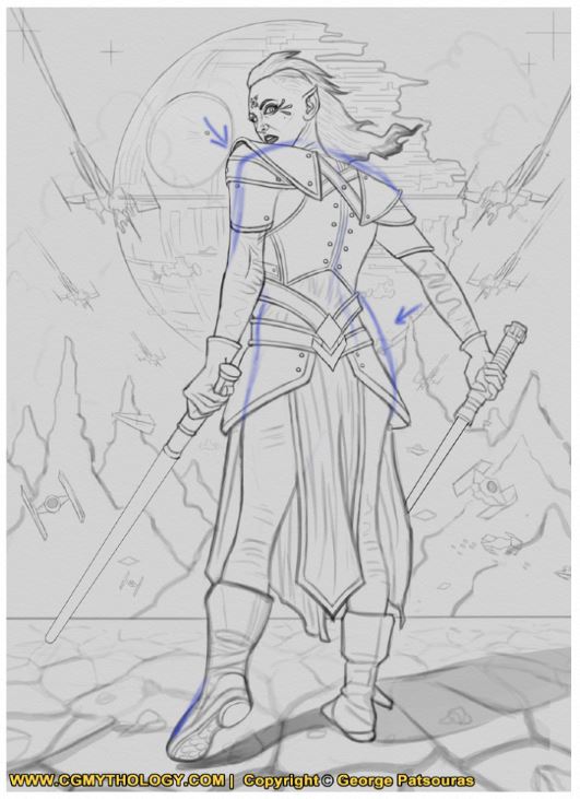
But in comparison, your character kind of seem to be missing a bum. I agree with Val about the shoulders as well, although the shape of the armour would have an influence. I did a little draw over - things that deviate a bit much from the ref, in blue, and the two things I think would be improved with an adjustment of the location are marked by arrows. I did try to account for your character being slimmer than the ref which is more muscular.
Any an all misspellings are henceforth blamed on the cats.
Attachments:
The following user(s) said Thank You: cgmythology
Please Log in or Create an account to join the conversation.
27 Aug 2021 15:42 #36241
by Banj
Replied by Banj on topic CGMythology's Sketchbook (nudity)
The position of the fingers on the hand on the right of the image suggests the lightsabre is being held at a more vertical angle pointing more straight down instead of at the angle you have it.
Please Log in or Create an account to join the conversation.
27 Aug 2021 17:02 #36242
by Charlotte
Any an all misspellings are henceforth blamed on the cats.
Replied by Charlotte on topic CGMythology's Sketchbook (nudity)
I missed that, but the ref certainly holds that weapon slightly more vertically. And personally I think it might look better to not have the two lightsabres perfectly parallell, as well.The position of the fingers on the hand on the right of the image suggests the lightsabre is being held at a more vertical angle pointing more straight down instead of at the angle you have it.
Any an all misspellings are henceforth blamed on the cats.
Please Log in or Create an account to join the conversation.
- cgmythology
-
Topic Author
- Offline
- Senior Member
-
19 Sep 2021 03:51 - 19 Sep 2021 03:51 #36676
by cgmythology
Replied by cgmythology on topic CGMythology's Sketchbook (nudity)
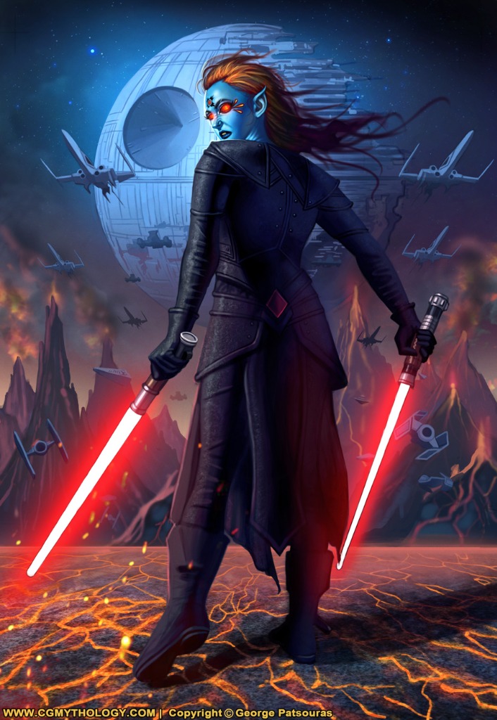
Valence: Thank you! Fixed the shoulder issue as well.
Charlotte: Excellent points you made, and I appreciate the fixed you made! I incorporated all your feedback, and I think it's better now. Thanks again!
Banj: I updated the hands/fingers a bit, changed the angle slightly so hopefully it looks more natural now!
Charlotte: I agree about the sabers, just changed the angle as well!
..............
I finished up the painting process and everything went pretty smoothly. Pretty happy with how this image turned out. Attached the final and a step by step animation for those interested, hope you dig!
Attachments:
Last edit: 19 Sep 2021 03:51 by cgmythology.
Please Log in or Create an account to join the conversation.
- cgmythology
-
Topic Author
- Offline
- Senior Member
-
19 Sep 2021 05:16 #36677
by cgmythology
Replied by cgmythology on topic CGMythology's Sketchbook (nudity)
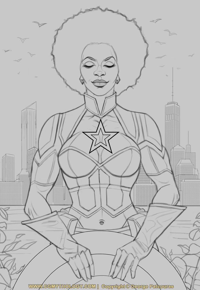
Time for a new painting! I just finished a sketch for a female Captain America illustration, spent a ton of time on this one (especially on the costume!) and am very pleased with how it turned out. Before I begin the painting process, I would love to hear any input or feedback for the sketch, as this just makes things easier for me going forward. Here is the sketch:
Attachments:
Please Log in or Create an account to join the conversation.
Latest Activity

Banj updated their profile picture


Charlotte Still wearing a mask? Is it so we won't see you hoarding food in those cheeks of yours?
See More
Banj Mfmuh Guhmfpf
See More
Charlotte I'll take that as a yes...
See More
Charlotte Why is there a tiny flashing thing in front of the reply link/button? It's so small I can't see if it's an exclamation mark or a question mark... or...both?)
See More
Banj Because? Both!
See More
Charlotte *gasp*
See More

CaptainDeth updated their profile picture

CaptainDeth Ahoy folks, just a newbie here, just getting started. Thanks for allowing me in.
CaptainDeth Thank You
CaptainDeth and Mr.Bungle joined the site


honbasic joined the site


Gawk joined the site