


 I think I must be deaf...

I didn't hear any music... 
![:]](https://cgartnexus.com/images/mod_shoutbox/unsure.png)


The shoutbox is unavailable to non-members
CGMythology's Sketchbook (nudity)
- cgmythology
-
 Topic Author
- Offline
- Senior Member
-

Less
More
18 Apr 2021 16:14 #34484
by cgmythology
Replied by cgmythology on topic CGMythology's Sketchbook (nudity)
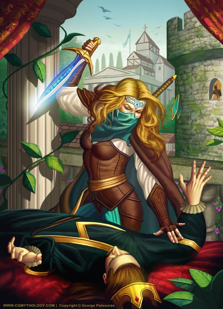
Charlotte: Thanks for your input - that was actually part of the base of the sword but I could see how it was mistaken for a thumb. I tried messing with the thumb placement and decided it looks more natural behind the base, so it ultimately wouldn't show given the perspective. Hopefully it works out in the image!
Digital Dave: Yep, would definitely see how someone would think that with the thumb. As it is the base of the sword would be covering up the thumb (thumb would be directly behind it) so it wouldn't show. Hope it looks ok now!
...........
I worked on the image a great deal, did some serious refining to it and I'm overall pleased with how it turned out. Of course there's still time to implement any final input if needed, so any feedback is always welcome! Here is the final image:
Attachments:
Please Log in or Create an account to join the conversation.

18 Apr 2021 16:38 #34486
by Charlotte
Any an all misspellings are henceforth blamed on the cats.
Replied by Charlotte on topic CGMythology's Sketchbook (nudity)
I still think it would look more natural for the thumb to come around the hilt of the dagger and show on this side - I have never actually stabbed anyone (!) but I do think you'd want a firm grip so you don't just drop the knife....
Something else I only noticed now is that the lines of the rooftops follow the lines of the tower "indent" - which makes it hard to tell which one is on front. Maybe adding some sky coloured fogginess to the back of the rooftops building will make it recede a bit and make it clear that it's behind the tower?
Otherwise it's colourful and impressive as always")
(Is that Robin Hood watching from the window!? Looks like his hat!)
Something else I only noticed now is that the lines of the rooftops follow the lines of the tower "indent" - which makes it hard to tell which one is on front. Maybe adding some sky coloured fogginess to the back of the rooftops building will make it recede a bit and make it clear that it's behind the tower?
Otherwise it's colourful and impressive as always
(Is that Robin Hood watching from the window!?
Looks like his hat!) Any an all misspellings are henceforth blamed on the cats.
Please Log in or Create an account to join the conversation.

18 Apr 2021 19:07 #34487
by Valence
Replied by Valence on topic CGMythology's Sketchbook (nudity)
Seeing as I'm not good with hands I've stayed out of the thumb discussion but I think any addition of the thumb would be made easier if the hilt of the sword was narrower so that the thumb could wrap around and overlap the fingers more like a clenched fist.
But I agree about the distant buildings. A little bit of fogging would work wonders to push them further away from the tower.
But I agree about the distant buildings. A little bit of fogging would work wonders to push them further away from the tower.
Please Log in or Create an account to join the conversation.
- cgmythology
-
Topic Author
- Offline
- Senior Member
-
30 Apr 2021 19:17 - 01 May 2021 03:49 #34647
by cgmythology
Replied by cgmythology on topic CGMythology's Sketchbook (nudity)
Charlotte: Thanks for your input regarding the hand, I might revisit this one in the future and rework the hand. I did lower the values in the background with my latest update so hopefully it reads easier!
Valence: Thanks! Might rework the image a bit further in the future, but right now I'm considering it done as I'd like to move on to another painting for now!
..........
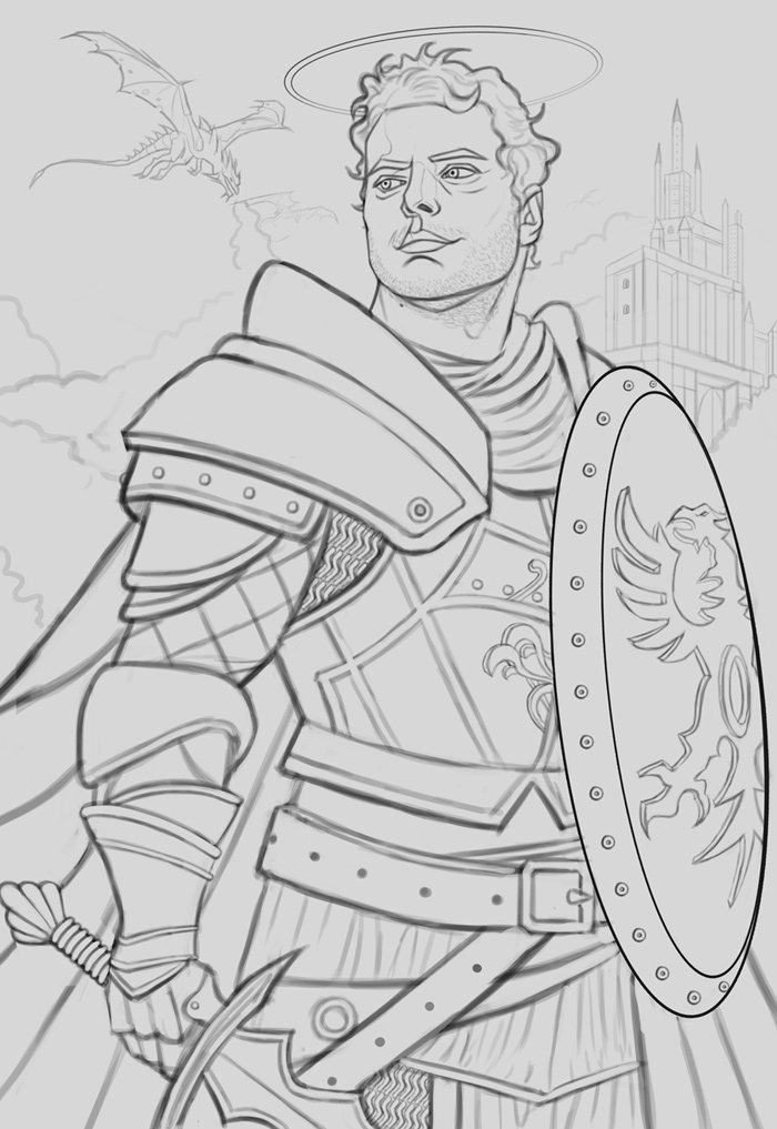
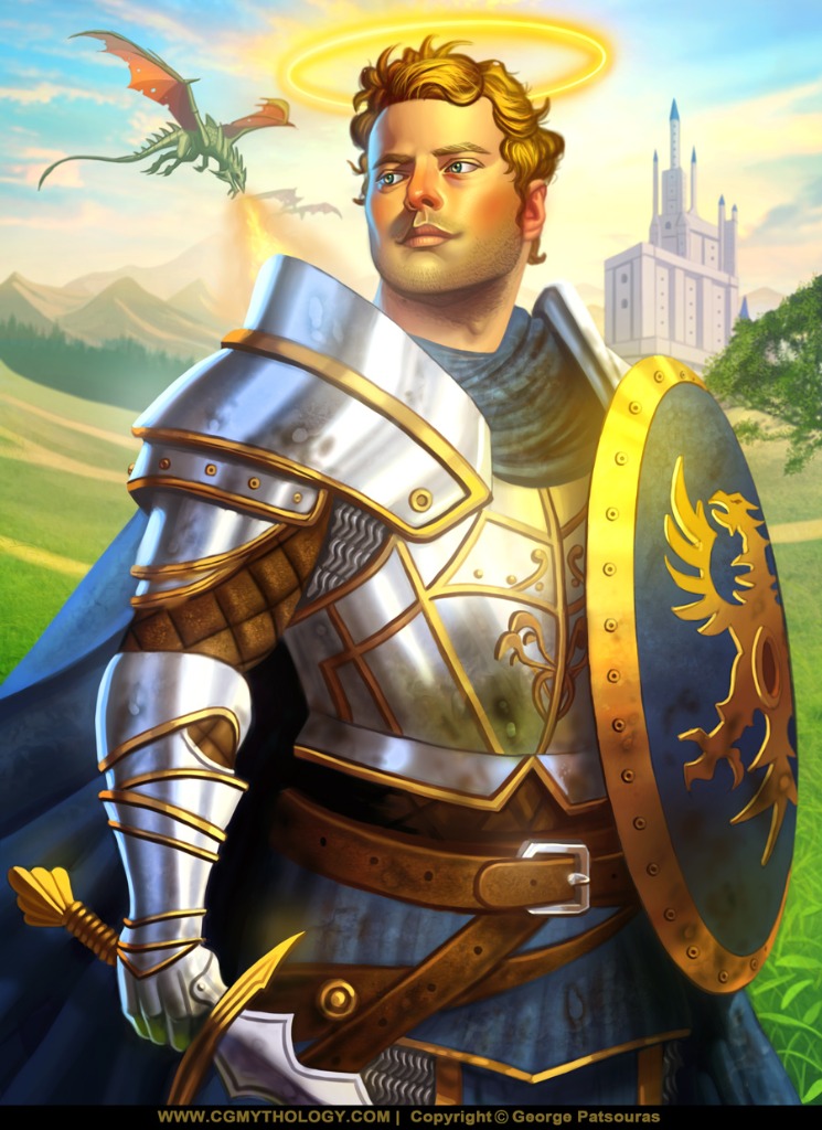
Time for a new painting! I haven't done a self portrait in probably over a decade so I decided to sketch a new one. I'm going for a fantasy theme with this, going to paint myself as a badass knight because... why not?! I spent a lot of time on the sketch as I usually do, this just makes the painting process much easier, but I want to make sure I perfect it before I even paint a single stroke, so any feedback at this stage would be greatly appreciated. Here is the sketch:
Valence: Thanks! Might rework the image a bit further in the future, but right now I'm considering it done as I'd like to move on to another painting for now!
..........
Time for a new painting! I haven't done a self portrait in probably over a decade so I decided to sketch a new one. I'm going for a fantasy theme with this, going to paint myself as a badass knight because... why not?! I spent a lot of time on the sketch as I usually do, this just makes the painting process much easier, but I want to make sure I perfect it before I even paint a single stroke, so any feedback at this stage would be greatly appreciated. Here is the sketch:
Attachments:
Last edit: 01 May 2021 03:49 by cgmythology.
Please Log in or Create an account to join the conversation.
01 May 2021 16:58 - 01 May 2021 16:59 #34657
by Valence
Replied by Valence on topic CGMythology's Sketchbook (nudity)
You're looking very heroic there.
Excellent pose and great expression too.
The only thing catching my eye is that the belt looks a little flat rather than wrapping round the body. Just a little reworking of the lines and "holes" should do the trick.
Excellent pose and great expression too.
The only thing catching my eye is that the belt looks a little flat rather than wrapping round the body. Just a little reworking of the lines and "holes" should do the trick.
Last edit: 01 May 2021 16:59 by Valence.
The following user(s) said Thank You: cgmythology
Please Log in or Create an account to join the conversation.
- cgmythology
-
Topic Author
- Offline
- Senior Member
-
02 May 2021 13:11 #34671
by cgmythology
Replied by cgmythology on topic CGMythology's Sketchbook (nudity)
Valence: Thank you! Reworked the belt a bit, hopefully it looks more natural now.
............
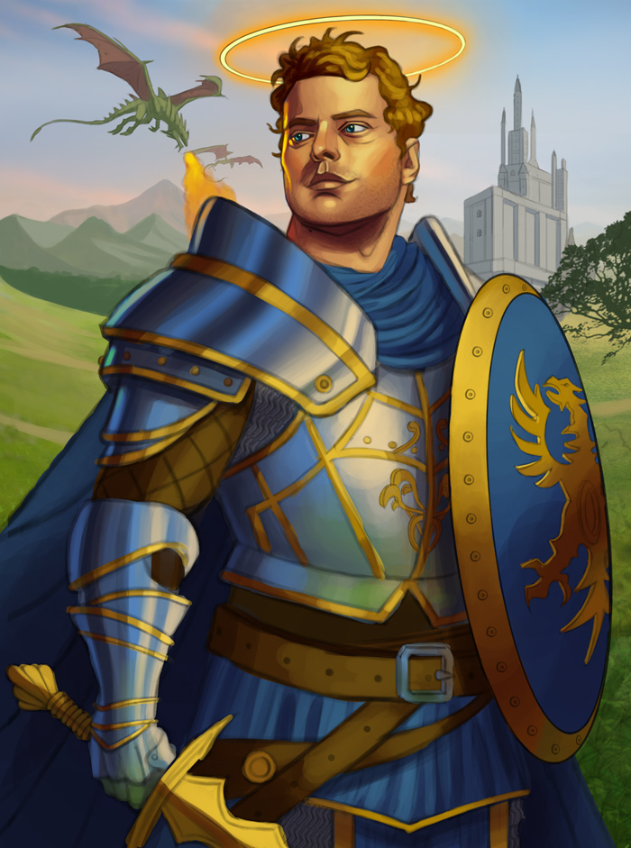
Today's update, refined the sketch based on the feedback received and began the painting process. The silver armor was tricky, in general I like to use desaturated tones when painting silver or metal, but I tried to keep in mind that the material is reflective so I added some blues and greens on the coloring, will push the colors and values even further as the image progresses. Any input is appreciated as always!
............
Today's update, refined the sketch based on the feedback received and began the painting process. The silver armor was tricky, in general I like to use desaturated tones when painting silver or metal, but I tried to keep in mind that the material is reflective so I added some blues and greens on the coloring, will push the colors and values even further as the image progresses. Any input is appreciated as always!
Attachments:
Please Log in or Create an account to join the conversation.
02 May 2021 13:22 #34672
by Charlotte
Any an all misspellings are henceforth blamed on the cats.
Replied by Charlotte on topic CGMythology's Sketchbook (nudity)
I've never mastered metal but I do think that you should layer the reflected colours horizontally rather than vertically (e.g. the glove/greave has green fingers which reflects the ground, but then the arm bit is vertically striped - it should probably also reflect some green at the bottom just over the wrist, and reflect the blue of the sky at the upwards facing surfaces, like the back of the hand and the top of the arm. Likewise that "edge" at the waist should reflect the sky above, not the grass below as it's not facing the ground... And possibly - I am by no means certain about this - there should be no reflection of fire in the shoulder metal, as the dragon is far behind you... The current reflection brings the fire and the dragon forward making it look like a tiny thing above your shoulder, but I'm guessing that's not what it's supposed to look like...)
So, good start, strong colours as always, but I think you might need to look over the metal again.
So, good start, strong colours as always, but I think you might need to look over the metal again.
Any an all misspellings are henceforth blamed on the cats.
The following user(s) said Thank You: cgmythology
Please Log in or Create an account to join the conversation.
- cgmythology
-
Topic Author
- Offline
- Senior Member
-
05 May 2021 13:22 #34719
by cgmythology
Replied by cgmythology on topic CGMythology's Sketchbook (nudity)
Charlotte: I did some studies and it appears it follows the form, although it should be much smoother so hopefully the strokes aren't too rigid. Great feedback regarding the colors in the reflections, reworked them according to your input and it's looking much more natural now
.......
I refined the image as a whole and spent some time working on the armor, tried to make it more natural looking and brighter, which helps I think. It's come quite a long way and I'm fairly happy with it. I'll continue to revise it and hopefully the armor looks even more natural by the next update. Here is the current progress:
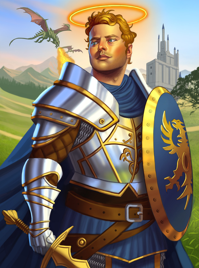
Any feedback is welcome and encouraged as always
.......
I refined the image as a whole and spent some time working on the armor, tried to make it more natural looking and brighter, which helps I think. It's come quite a long way and I'm fairly happy with it. I'll continue to revise it and hopefully the armor looks even more natural by the next update. Here is the current progress:
Any feedback is welcome and encouraged as always
Attachments:
Please Log in or Create an account to join the conversation.
05 May 2021 14:49 #34720
by Charlotte
Any an all misspellings are henceforth blamed on the cats.
Replied by Charlotte on topic CGMythology's Sketchbook (nudity)
aw but you removed the green on the fingers. I think you should have kept that!
Any an all misspellings are henceforth blamed on the cats.
Please Log in or Create an account to join the conversation.
- cgmythology
-
Topic Author
- Offline
- Senior Member
-
09 May 2021 14:18 - 10 May 2021 02:56 #34798
by cgmythology
Replied by cgmythology on topic CGMythology's Sketchbook (nudity)
Charlotte: Excellent point - just added it back in! Thanks again for your input!..................So I resumed on the image making note of all the feedback I received, and it's pretty much finalized. I'm very happy with how it turned out, put a lot of love and effort into it and I think I have a strong image as a result. Thanks again to everyone who helped me out with this one, it was a personal painting that meant quite a lot to me so I'm very grateful! Below is the final:
Attachments:
Last edit: 10 May 2021 02:56 by cgmythology.
Please Log in or Create an account to join the conversation.
Latest Activity

Banj updated their profile picture


Charlotte Still wearing a mask? Is it so we won't see you hoarding food in those cheeks of yours?
See More
Banj Mfmuh Guhmfpf
See More
Charlotte I'll take that as a yes...
See More
Charlotte Why is there a tiny flashing thing in front of the reply link/button? It's so small I can't see if it's an exclamation mark or a question mark... or...both?)
See More
Banj Because? Both!
See More
Charlotte *gasp*
See More

CaptainDeth updated their profile picture

CaptainDeth Ahoy folks, just a newbie here, just getting started. Thanks for allowing me in.
CaptainDeth Thank You
CaptainDeth and Mr.Bungle joined the site


honbasic joined the site


Gawk joined the site