- Posts: 1256
- Thank you received: 96
 Like I said. Now
*presses B again*
![:]](https://cgartnexus.com/images/mod_shoutbox/unsure.png)
He does like meowing a lot.
I meant *here* but I guess Val might be a cat...
![:]](https://cgartnexus.com/images/mod_shoutbox/unsure.png) Does one belong to a cat?
Does one belong to a cat?
I suspect there are two brains here. 
The shoutbox is unavailable to non-members
Shoutbox History
 Like I said. Now
*presses B again*
![:]](https://cgartnexus.com/images/mod_shoutbox/unsure.png)
He does like meowing a lot.
I meant *here* but I guess Val might be a cat...
![:]](https://cgartnexus.com/images/mod_shoutbox/unsure.png) Does one belong to a cat?
Does one belong to a cat?
I suspect there are two brains here. 
CGMythology's Sketchbook (nudity)
Lovely work! Keep it up!
Everything's on the right!!!
It's like driving abroad!
Please Log in or Create an account to join the conversation.
- cgmythology
-
 Topic Author
- Offline
- Senior Member
-

Digital Dave: Thank you!
evilrobot: Thanks!
............
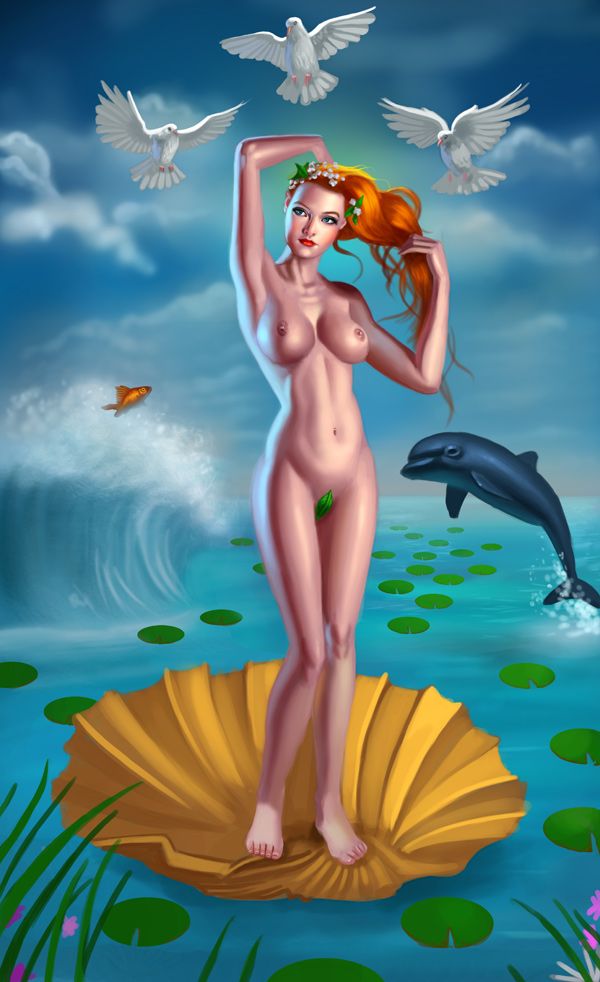
I worked on the image for several more hours, it's finally coming together... Any feedback is always welcome
Please Log in or Create an account to join the conversation.
Love how you paint skin, fancy making a tutorial George?
Please Log in or Create an account to join the conversation.
Personally, I think that her skin is too purple and could do with being adjusted a bit.
Everything's on the right!!!
It's like driving abroad!
Please Log in or Create an account to join the conversation.
I'd also say that her breasts are bit too different in size, then again I'd of thought Stuart would have pointed that out if it were so noticeable.. I think that's one of his focus areas anyways..
Lol, you make me sound like a pervert!!
It's coming together a bit more now and actually I think you're coping with the saturation pretty well, it's got a lively quality to it rather than garish.
Please Log in or Create an account to join the conversation.
- cgmythology
-
 Topic Author
- Offline
- Senior Member
-

Domtopia: Thank you, I altered the ankles a bit, I think it's the lighting that made them look like that so I changed it up a bit. I adjusted her skin tone as well.
Stuart: LOL, thanks glad the saturation is working for this image, I really didn't want to subdue the colors too much!
..................
Another update, incorporated all the feedback I received, added some more detail here and there and refined the lighting a bit:

Feedback appreciated as always
Please Log in or Create an account to join the conversation.
Any an all misspellings are henceforth blamed on the cats.
Please Log in or Create an account to join the conversation.
- Digital Dave
-
- Offline
- Platinum Member
-

- Posts: 2242
- Thank you received: 163
kazky: A skin tutorial sounds like fun, I'll get started on it as soon as I'm finished with the painting.
I really look forward to seeing that. I think your way of doing skin looks great, and I've always struggled with it myself. I also see what they're saying about the ankles too. They do seem a little too thick, but more over, you don't see any structure. Maybe thinning them some more and showing the ankle bone structure would help. Being more Petite, like you have her wrist.
I get sketchy around pencils! ...
Please Log in or Create an account to join the conversation.
Everything's on the right!!!
It's like driving abroad!
Please Log in or Create an account to join the conversation.
its cankle. calf and ankle blend into oneher ankles still look a little clunky compared to the feet (not that I actually know what clunky means but kazky used it and it sounds right). .
i also really like the colouring,
Please Log in or Create an account to join the conversation.
Latest Activity


