


- Posts: 234
- Thank you received: 26


The shoutbox is unavailable to non-members
CGAN March 2018 - Roman Gods - Final entries
Poll: March challenge voting
| cgmythology |
|
1 | 14.3% |
| Thomgirl |
|
1 | 14.3% |
| Valence |
|
3 | 42.9% |
| Atto |
|
No votes | 0% |
| hansnomad |
|
2 | 28.6% |
| Total number of voters: 7 ( oaktree, Charlotte, hansnomad, Valence, Thomgirl ) See more | |||
| Only registered users can participate to this poll | |||
02 Apr 2018 13:10 #20727
by Thomgirl
Replied by Thomgirl on topic CGAN March 2018 - Roman Gods - Final entries
Yeah, I don't want to vote either. They're all stellar. Let's just call it a draw!
Please Log in or Create an account to join the conversation.

02 Apr 2018 16:43 #20728
by Atto
No smudge tool was harmed in the making of this image.
Replied by Atto on topic CGAN March 2018 - Roman Gods - Final entries
I'm absolutely chuffed that this is such a hard vote, everyone has stepped up their game so much it's exactly why I love being a member here.
I think Val, once again, has covered everything that I wanted to say about all the entries - apart from his own that is - so I'd just like to add a little feedback about that.
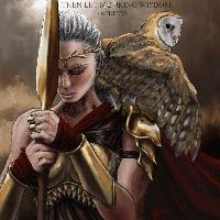
I loved your concept since the first tentative sketch Val. This kind of image really appeals to me and while it's very much a fantasy image the portraits are both absolutely brilliant in their own right. The old guys beard and hair has that greying loss of vitality to each strand (something I am personally experiencing right now). For those of you who are lucky enough not to have experienced it yet let me tell you this is exactly the way hair ages. His far eye is fantastic in its shadow and the angle of his head and his expression really sums up the feeling of resignation I often feel over the loss of yet another year gone. In contrast the younger man is full of vitality, his chin is up, he has that golden hue of vitality and strength and his eyes are clear as he faces the year ahead.
Any other month I think you would have yet another win on your hands but as you've said yourself there's so many excellent entries.
Which all adds up to the fact that this month my vote goes to.........
Hansnomad!
I'm very partial to Mucha too, in fact i used to have his prep sketches for the seasons running down the wall on my stairs. You have such a beautiful colour palette here, all the work that went into the border elements, an excellent rendition of her robe and armour (her shoulder pads are exquisite), a fantastic portrait and some of the best hair I've seen. But, in the end I voted for this because out of all the entries this would be the one I would most like to hang on my wall.
Well done all and if this month we do end up with a tie I'll consider myself lucky to not have received a sound beating by you all.
I think Val, once again, has covered everything that I wanted to say about all the entries - apart from his own that is - so I'd just like to add a little feedback about that.
I loved your concept since the first tentative sketch Val. This kind of image really appeals to me and while it's very much a fantasy image the portraits are both absolutely brilliant in their own right. The old guys beard and hair has that greying loss of vitality to each strand (something I am personally experiencing right now). For those of you who are lucky enough not to have experienced it yet let me tell you this is exactly the way hair ages. His far eye is fantastic in its shadow and the angle of his head and his expression really sums up the feeling of resignation I often feel over the loss of yet another year gone. In contrast the younger man is full of vitality, his chin is up, he has that golden hue of vitality and strength and his eyes are clear as he faces the year ahead.
Any other month I think you would have yet another win on your hands but as you've said yourself there's so many excellent entries.
Which all adds up to the fact that this month my vote goes to.........
Hansnomad!
I'm very partial to Mucha too, in fact i used to have his prep sketches for the seasons running down the wall on my stairs. You have such a beautiful colour palette here, all the work that went into the border elements, an excellent rendition of her robe and armour (her shoulder pads are exquisite), a fantastic portrait and some of the best hair I've seen. But, in the end I voted for this because out of all the entries this would be the one I would most like to hang on my wall.
Well done all and if this month we do end up with a tie I'll consider myself lucky to not have received a sound beating by you all.
No smudge tool was harmed in the making of this image.
Please Log in or Create an account to join the conversation.
02 Apr 2018 18:59 #20732
by Thomgirl
Replied by Thomgirl on topic CGAN March 2018 - Roman Gods - Final entries
Alrighty, so after a lot of thinking in the car and while doing house chores... I've finally cast my vote. But first, critiques!
CG: The vibrancy of the colors and the vast amount of little scene details is really what stands out about this piece. There's a lot to be impressed with. As my husband told me when I showed him your piece to him "Well, you've lost to him this month! He does way more with his scenery!" (Thanks, husband... I'll deal with him later... *grumbles*). But he's right, you displayed an entire scene and finished it all to the same caliber as the characters, very well done. That being said, there are a couple things that detract for me personally (though please take my opinions with a grain of salt, because it's just personal preference and perspective here). Other than the scenery and a bit with Persephony (who should be called Demiter if we're sticking to Roman gods here), there's not a lot that feels 'Roman' about it. The scenery helps carry a lot, but since Hades (who should be Pluto) is such a central figure, dominating the eye and space, it's hard to tell who he is without the title at all. To me, and I do have a lot of influence from video games, he looks like any number of lich king type characters, but not necessarily Pluto himself. It's a minor quibble, and one that ultimately did not affect my vote, but something you might want to be aware of for future character pieces. You should be very proud of your work and efforts though. It is a beautifully rendered piece regardless of anything else.
Valence: So... for all your struggling early on... way to drop a bomb on us. And I mean that as in you blew us all away. It's a simple portrait, but it's also anything but. You NAILED the aged look side of Janus. The dual color tones too is really well played. So for doing something simple in set up, you knocked it out of the park on the execution of every detail in those faces and lighting. If I had to nit pick I'll say the same thing that my husband tells me 'there's not much scenery establishing where he's at'. I argue with him on this because with portraits, I get concerned with clutter, so, I think what you've done works, but if there was more that could be done to further establish his 'roman deity-ship' whether in attire, symbols or something else, I wouldn't be able to tell you how to go about actually doing it because I would be concerned about detracting too much from the beauty of these faces. Could there maybe more to further sell the concept? Sure. But I don't think it needs it. This is a great piece you should be very proud of.
Atto: This probably had to be my favorite actually. Unfortunately, I could not give it the vote, but if it were finished to the level I know you'd have liked to bring it to, it would have been. I really hope you finish it at some point. The ambience is great, the concept is great, your execution thus far is really spot on, and the story is all there. It has all the makings of a full, beautiful illustration. Keep it up!
Hans: I've always been very partial to your work and this is no exception. Very clean, very well painted. The pattern work is super tight and well done. The only thing is the lighting. The moon is behind her, which makes me want to see her back lit, but the lighting on her face is very warm which is making my brain think 'she's facing the sun'. I'm not sure if that's what you were going for, but it's really the main thing detracting for me. I know I'm also going to speaking blasphemy here, but... on her own, the painterly style for the character is beautifully done. It feels, however, a little at odds with the tightness of the rest of the work. Mucha did a more watercolor type deal, and maybe I'm just being too much of a purist here. I think it's really well done, but it just doesn't seem to fit with everything else as well. Perhaps if there were other painterly elements in the design work or the borders, the moon, it could harmonize better and sorta step in the direction of being influenced by Mucha, but not an exact copy of style, if that makes sense. As it stands, this feels like you didn't want to be exactly like Mucha (which is major props from me, btw, I like that out of the box kind of thinking) but you didn't carry it across other elements of the work to tie it all together still. Again though, this is a really nicely done piece and I hate giving negative feedback at all to anyone's works here because ultimately they're all really well done.
As for me... yeah... when I saw the finals come in, I knew I was out of my league. Hats off to you all!
Please Log in or Create an account to join the conversation.

02 Apr 2018 19:28 - 02 Apr 2018 19:39 #20733
by Valence
Replied by Valence on topic CGAN March 2018 - Roman Gods - Final entries
Well, I've spent the day thinking and I've made a decision. While comparing the pictures I started picking out combinations of pairs and putting them side by side and there seemed to be one that always looked good no matter which other image it was paired with. So even though I'm very partial to Hansnomad's painterly colours, impressed by that moody potential of Atto's and enviously intrigued by the amazing conceptual depth of Thomgirl's (not to mention the stunning bonus of the owl character), I'm going to go for CGMYTHOLOGY.
I think it was the level and density of detail that swung it for me along with the combination of figurative depictions with stylization. The first works when viewed close up and the latter takes over when seen at a different scale.
This challenge was made for you and you delivered.
PS: Selecting only one out of this set was indeed horrible. I still want to have three more picks!
Last edit: 02 Apr 2018 19:39 by Valence.
Please Log in or Create an account to join the conversation.
- cgmythology
-

- Offline
- Senior Member
-

03 Apr 2018 07:12 #20736
by cgmythology
Replied by cgmythology on topic CGAN March 2018 - Roman Gods - Final entries
Some really great entries this month, everyone really made some quality work here I'd say.
Thomgirl: This came out great, really enjoy your brushwork in particular, very painterly. Nice composition as well, and I'm glad you decided to include the text as well as I feel it really brings it all together nicely. Thank you for the kind words regarding my entry as well, great input as well (I agree regarding the influence of video games regarding Pluto's look, but that was actually a bit intentional on my part!)
Valence: Thank you for your kind words, very glad to hear those details were noticed! Really enjoy your entry as well, the way you textured and detailed the skin in particular is ridiculously good. The way you blended both faces is fantastic as well, it feels very organic which is no easy feat.
Atto: I really enjoy the color scheme as well as the lighting on the figure, it's very well done. The contrast between warm and cool colors is very impressive as well, really makes the image pop!
hansnomad: One of my favorite entries, the composition and design is ridiculously good, feels very iconic. Strong color scheme as well!
Please Log in or Create an account to join the conversation.

03 Apr 2018 17:47 #20739
by hansnomad
Replied by hansnomad on topic CGAN March 2018 - Roman Gods - Final entries
Cgmythology:
I loved the rendering style for this piece from the beginning. It’s a blend of illustration and painting and it works very well. Really liked the color scheme and impressed how you maintained the dark theme of the subject of the piece without it actually making it dark. The gown she is wearing is one of my favorite parts of the work and it draws my eye to it every time I look at the submission. Great texture and detail work too! This one had me looking everywhere at all the detail you included and I kept getting surprised by things I initially missed. Fantastic work.
Atto:
As I mentioned in one of the earlier WIPs, your depiction of the hotness on the metal was spot on. The contrast it created was a perfect focal point to draw in the viewer. The anatomy of the figure was also great (strong and older, but very much powerful) which out of all the entries, this one really invoked what a Roman god would look like (at least for me). I really, really liked this one, but I wish the background had been more fleshed out. As others have mentioned, loved the colors and I would have loved to see some frightened fish swimming around to round out the underwater theme.
Thomgirl:
This one was screaming Wonder Woman amazon warrior at me the whole time and I was loving every minute of it. I really liked the way the Amazons were portrayed in the movie and your piece really captured that same mythological warrior feel. Your composition was so effective (her deep contemplation and the owl symbolizing wisdom) that I don’t think you needed the quote above her head to underscore your intent—your composition was so strong that it easily worked without it.
Valence:
When you started posting WIPs, I remember thinking—this is a cool God to do, but also one of the most difficult to pull off. I was skeptical it would work out because that transition between the heads is a killer. I have to say, when I saw the completed piece I was totally blown away. The older head, the intricate detail, the hair overall, the transition between the two—you pulled it all off masterfully. Kudos on the realism too. It’s so real it almost creeps me out (but in a good way).
Vote:
I hated to have to vote because the quality of all the entries was so high. After trying to put off having to vote (because I did not want to pick) I’m going to have to go with VALENCE.
I think I’m just more partial to portraits, so it’s not a negative knock on anyone else. I think different styles/colors speak differently to all of us, and some aspects/subjects of a painting tend to resonate a bit more than others (but honestly—this month not by much).
This was so much fun. I need to stop in more often. I had forgotten how much fun it is.
Please Log in or Create an account to join the conversation.

03 Apr 2018 18:10 #20740
by Charlotte
Any an all misspellings are henceforth blamed on the cats.
Replied by Charlotte on topic CGAN March 2018 - Roman Gods - Final entries
I've finally decided which one to vote for. Much feedback has already been given above, so I won't add much to it.
Basically I voted for Valence's piece because it was the only one I found nothing to change or improve on. That skin texture is fabulous and the joining of the two heads is amazingly well done.
All of the other pieces were great too. Special mention to Thomgirl for finishing her Minerva (and so well, too! - unlike me who never got further than an initial half done sketch) and Atto for making a picture that makes me go "I wish I'd done that!".
Any an all misspellings are henceforth blamed on the cats.
Please Log in or Create an account to join the conversation.
09 Apr 2018 13:10 #20763
by Banj
Replied by Banj on topic CGAN March 2018 - Roman Gods - Final entries
Not sure why the poll hasn't ended when it was supposed to, but voting is meant to be over. So the results of the poll are: Valence with 3 votes, hansnomad with 2, and cgmythology and Thomgirl with 1 each. Which makes Valence this months winner, congratulations.
Please Log in or Create an account to join the conversation.
09 Apr 2018 17:17 #20765
by Charlotte
Any an all misspellings are henceforth blamed on the cats.
Replied by Charlotte on topic CGAN March 2018 - Roman Gods - Final entries
Congrats Valence!
Any an all misspellings are henceforth blamed on the cats.
Please Log in or Create an account to join the conversation.
09 Apr 2018 22:51 #20767
by Atto
No smudge tool was harmed in the making of this image.
Replied by Atto on topic CGAN March 2018 - Roman Gods - Final entries
Indeed, congratulations!
No smudge tool was harmed in the making of this image.
Please Log in or Create an account to join the conversation.
Latest Activity

Banj updated their profile picture


Charlotte Still wearing a mask? Is it so we won't see you hoarding food in those cheeks of yours?
See More
Banj Mfmuh Guhmfpf
See More
Charlotte I'll take that as a yes...
See More
Charlotte Why is there a tiny flashing thing in front of the reply link/button? It's so small I can't see if it's an exclamation mark or a question mark... or...both?)
See More
Banj Because? Both!
See More
Charlotte *gasp*
See More

CaptainDeth updated their profile picture

CaptainDeth Ahoy folks, just a newbie here, just getting started. Thanks for allowing me in.
CaptainDeth Thank You
CaptainDeth and Mr.Bungle joined the site


honbasic joined the site


Gawk joined the site