


so I was partially right. One of them had been changed. 


Mostly. I had intended to redo it to fix the fringing that was left around the outside 
You made the background transparent on that one didn't you?  (the ones that looked smaller must have been viewed at the wrong angle through my glasses or something)


The shoutbox is unavailable to non-members
Shoutbox History
so I was partially right. One of them had been changed.
Mostly. I had intended to redo it to fix the fringing that was left around the outside
You made the background transparent on that one didn't you? (the ones that looked smaller must have been viewed at the wrong angle through my glasses or something)
CGAN March 2018 - Roman Gods - Final entries
Poll: March challenge voting
| cgmythology |
|
1 | 14.3% |
| Thomgirl |
|
1 | 14.3% |
| Valence |
|
3 | 42.9% |
| Atto |
|
No votes | 0% |
| hansnomad |
|
2 | 28.6% |
| Total number of voters: 7 ( oaktree, Charlotte, hansnomad, Valence, Thomgirl ) See more | |||
| Only registered users can participate to this poll | |||
Brief: Roman Gods, what have they ever done for us? Choose a Roman God and depict him/her/it/they in action (or just lazing about doing nothing much).
Deadline:
This is where you post your final entries, WIPs should be posted in the thread over here: cgartnexus.com/index.php/forums/challeng...2018-roman-gods-wips
Challenge rules and guidelines:
challenge rules
Rules in brief:
- All challenge entries must be your own work.
- You should post at least two WIP images that are clearly different from your final entry and each other.
- Your final entry should contain your image (inserted so it shows up full size) and at least two links to your WIP posts on the forum.
- No chatter in the finals thread – if you have questions, post them in the WIP thread or PM an admin.
- Feedback is allowed & encouraged together with the voting and in the WIP thread.
- Deadline is given in UK time (midnight GMT) with a grace period of 5 minutes for getting the post sorted.
- Each member may cast one vote
- No cheating! Admins may decide to disqualify an entry that does not adhere to the above rules.
WINNER: VALENCE
Please Log in or Create an account to join the conversation.
- cgmythology
-

- Offline
- Senior Member
-

Illustration of Hades and Persephone.
This was one of the most fun challenges I have participated in; I absolutely love Greek and Roman mythology, so I went all in with this one. I wanted to challenge myself as well, so I chose to depict a lot of figures and avoided doing a portrait as that comes much easier for me. I'm very grateful for all the input I received in the forums as well, it's always great to hear feedback from others. Overall I'm quite pleased with the image and I hope you enjoy.
WIP: cgartnexus.com/index.php/forums/challeng...2018-roman-gods-wips
cgartnexus.com/index.php/forums/challeng...n-gods-wips?start=30
Please Log in or Create an account to join the conversation.
cgartnexus.com/index.php/forums/challeng...-wips?start=40#20617
cgartnexus.com/index.php/forums/challeng...-wips?start=40#20635
My take on Minerva. This started out as something I wasn't that dedicated to due to a number of other projects I had going on this month, but upon working out some personal artistic methods with Corel, I soon fell in love with the idea of this piece and I've had an immense amount of fun working on all its elements. I want to thank everyone for all the support and encouragement.
Please Log in or Create an account to join the conversation.

So here is the two-faced Roman God, Janus.
Yes, definitely Janus, not that other two-headed fellow.
1: If there's anything more important than my ego around...
2: ...I want it caught and shot now.
Beat those deadlines, everybody!
Please Log in or Create an account to join the conversation.

I feel a little bit out of my depth with all these great entries - excellent work all - It'll be hard to pick this month

Wip 1 cgartnexus.com/index.php/forums/challeng...-wips?start=20#20471
Wip 2 cgartnexus.com/index.php/forums/challeng...-wips?start=30#20509
And my final (nipples and all!) - thanks for all the help and advice you lovely people!
No smudge tool was harmed in the making of this image.
Please Log in or Create an account to join the conversation.

My take on the Roman moon goddess Luna. Tried to maintain the Alphonse Mucha vibe with the colors and design elements. I mentioned this in the WIPs, but no, I did not draw all those elements in the frames, I used Art Noveau brushes and stamps that I found on the web to fill the frame shapes I designed.
WIPS01-04: cgartnexus.com/index.php/forums/challeng...-wips?start=20#20497
WIP05: cgartnexus.com/index.php/forums/challeng...-wips?start=30#20540
WIP06: cgartnexus.com/index.php/forums/challeng...-wips?start=30#20607
WIP07-08: cgartnexus.com/index.php/forums/challeng...-wips?start=40#20636
Please Log in or Create an account to join the conversation.
cgmythology, for future reference you WIP links are meant to link to your actual posts in the WIP thread not just the thread itself (right click the post number top right of each post and copy and paste the URL).
Please Log in or Create an account to join the conversation.
Madi:
Loved the start of your pic. That strong diagonal of the left arm with the opposing angle of the right elbow was an interesting construction that captured the moment of the bow about to be drawn. (Drawn in both senses of the word!
 )
)Hope your neck stops interfering in your art.
And Good Luck with your sketch cards!
Cgmythology:
It's hard to believe the amount of work you crammed into this picture, it made me feel a little guilty about my rather sparse effort.
The composition is really well designed in the way that imposes its symmetry onto the viewer and then breaks it, allowing the eye to move on those broken paths to guide you through the repeating shapes to all those interesting little details. And of those little things, the two that really appeal to me are the well-placed candles that balance the space in front of the reclining figure and that lovely bit of outlined art on the urn which is catching the light in a beautiful way.
All of these things are kind of like satellites orbiting the central, imposing presence of the Hades character, who sits there like a big black hole, controlling and influencing everything in his world, and the repeated shapes of the skulls and horns seem to emphasize the power he has and the fear he creates.
It's a very successful picture done with your usual, recognisable style.
Atto:
First of all, great colour scheme. The blue/orange combo always works and always looks good, and it's the perfect mood for an underwater pic. And it is recognisably underwater with that murky background, the caustic light from above and that floating hair. (In fact, it reminded me of the latest Pirates… movie where the bad guy has amazing hair that behaves as if it's always underwater!) I also love that frozen pose with the hammer held high at the moment of greatest potential, creating that sense of stillness that you get when submerged within the oppressive mass of water.
But my favourite part of the pic is that glowing metal. The colour graduation and glare is perfectly done. It just looks so blindingly hot, I can almost feel the heat coming off it! It's an excellent bit of technique and it acts as a fantastic focal point for the whole image.
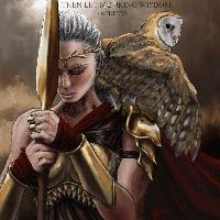
Thomgirl:
I was pretty impressed at how you effectively managed to paint two versions of the same painting in different styles while I was struggling with one.
And this is a lovely idea filled with the kind of stuff that I wish was in my picture. There's a thoughtful and emotional expression to the character that reflects against the more instinctive, eager pose of that beautifully painted owl that looks like it just wants to fly and be free (and such great feathers!) I love the way that these two concepts exist on either side of that diagonal line of the flowing fabric yet the woman's head and the owl's wing both extend across that line as if both aspects of their characters need to connect, a concept which you then manage to express as a quotation. It all gives the image a context and narrative depth that feels very satisfying.
The danger of doing two different styles is that you may end up preferring little bits from each pic and in this case I kinda wish you'd kept the woman's eye from the first version. But I have to say that the background in the final is awesome! It's painterly yet still realistic and that area of blooming light is perfectly placed behind the head.
Hansnomad:
I think everybody's work this month has something that I wish I'd done and in this case it's the Mucha theme with that glorious, ornate framing. Then again, even if I'd dared to risk it I don't think I'd have the skills to pull it off and I certainly wouldn't get anywhere near this quality. It's just so beautiful to look at. And just like Cgmythology's pic you've also played around with breaking the symmetry so that the image isn't static or overpowering, especially with the slight offset position of the head and its subtle tilt.
The whole figure is fantastic. The hair just looks real to me and the fabric's folds appear completely natural especially that area just above the horizontal arm where it billows out and hangs over.
The colour scheme is lovely too. Even though you were thinking of something cooler, this still works too and gives me the feeling of when the moon is low in the sky near the horizon, when it always seems larger than it really is and its reflected light, passing through more of the earth's atmosphere, has a warmer touch to its glow. And you've really captured that light here, not only in the moon and the staff, but also in the skin and the radiant fabric.
A really beautiful picture.
Voting?
Do I have to?
I'm really torn this month and would happily commit some kind of voter fraud to pick more than one.
I'm seriously considering not voting at all just yet and giving myself a few more days to ponder but I know I'd just end up in the same awkward dilemma.
Come on, you idiot. Pick one!
I pick …..
Nope, I'm gonna have to think about it for another day.
Hardest vote EVER!!!
Please Log in or Create an account to join the conversation.

 I pretty much agree with everything Val just said...
 Any an all misspellings are henceforth blamed on the cats.
Please Log in or Create an account to join the conversation.
- Digital Dave
-

- Offline
- Platinum Member
-

- Posts: 2242
- Thank you received: 163
I get sketchy around pencils! ...

Please Log in or Create an account to join the conversation.
Latest Activity


