


The shoutbox is unavailable to non-members
CGAN July 2017 - Random II - Finals
Poll: July challenge vote (was ended 2017-08-11 00:00:00)
| Atto |
|
1 | 20% |
| Valence |
|
4 | 80% |
| Dragon6261 |
|
No votes | 0% |
| Total number of voters: 5 ( Dragon6261, oaktree, Atto, Digital Dave, Valence ) | |||
| Only registered users can participate to this poll | |||

01 Jul 2017 18:35 - 14 Aug 2017 10:44 #16717
by Charlotte
Any an all misspellings are henceforth blamed on the cats.
CGAN July 2017 - Random II - Finals was created by Charlotte
Random II
Brief: This month you are to create an image using at least 3 of the randomly generated words listed below:
King
Guilty
Glass
Legend
Magic
Enter
Deadline:Monday 31st of July at midnight GMT Voting open until Friday the 11th
This is where you post your final entries. Works in Progress should be posted in the thread over here: cgartnexus.com/index.php/forums/challeng...-july-2017-random-ii
Challenge rules and guidelines:
challenge rules
Rules in brief:
WINNER - Valence
Brief: This month you are to create an image using at least 3 of the randomly generated words listed below:
King
Guilty
Glass
Legend
Magic
Enter
Deadline:
This is where you post your final entries. Works in Progress should be posted in the thread over here: cgartnexus.com/index.php/forums/challeng...-july-2017-random-ii
Challenge rules and guidelines:
challenge rules
Rules in brief:
- All challenge entries must be your own work.
- You should post at least two WIP images that are clearly different from your final entry and each other.
- Your final entry should contain your image (inserted so it shows up full size) and at least two links to your WIP posts on the forum.
- No chatter in the finals thread – if you have questions, post them in the WIP thread or PM an admin.
- Feedback is allowed & encouraged together with the voting and in the WIP thread.
- Deadline is given in UK time (midnight GMT) with a grace period of 5 minutes for getting the post sorted.
- Each member may cast one vote
- No cheating! Admins may decide to disqualify an entry that does not adhere to the above rules.
WINNER - Valence
Any an all misspellings are henceforth blamed on the cats.
Last edit: 14 Aug 2017 10:44 by Banj.
Please Log in or Create an account to join the conversation.
- Dragon6261
-
- Offline
- New Member
-

Less
More
- Posts: 94
- Thank you received: 3
31 Jul 2017 09:05 - 31 Jul 2017 09:12 #17157
by Dragon6261
Replied by Dragon6261 on topic CGAWN July 2017 - Random II - Finals
Here is my final(although it still needs work)
wip 1 cgartnexus.com/index.php/forums/challeng...2017-random-ii#16729
wip2 cgartnexus.com/index.php/forums/challeng...om-ii?start=10#16918
wip 3 cgartnexus.com/index.php/forums/challeng...om-ii?start=20#17083
wip 1 cgartnexus.com/index.php/forums/challeng...2017-random-ii#16729
wip2 cgartnexus.com/index.php/forums/challeng...om-ii?start=10#16918
wip 3 cgartnexus.com/index.php/forums/challeng...om-ii?start=20#17083
Last edit: 31 Jul 2017 09:12 by Dragon6261.
Please Log in or Create an account to join the conversation.

31 Jul 2017 20:24 #17188
by Valence
Replied by Valence on topic CGAWN July 2017 - Random II - Finals
This is a bit of a mess but it'll have to do. I wasted far too much time making and then remaking mistakes in a feedback loop of wrongness.
1: Something Wicked This Way Comes.
2: And when I say 'wicked' I mean that evil angle of the head!!!
And here's the 'final' of my Macbeth-inspired pic which I'd better post now because the deadline is tomorrow and tomorrow and tomorrow.")

1: Something Wicked This Way Comes.
2: And when I say 'wicked' I mean that evil angle of the head!!!
And here's the 'final' of my Macbeth-inspired pic which I'd better post now because the deadline is tomorrow and tomorrow and tomorrow.
Please Log in or Create an account to join the conversation.

31 Jul 2017 21:38 #17189
by Atto
No smudge tool was harmed in the making of this image.
Replied by Atto on topic CGAWN July 2017 - Random II - Finals
No smudge tool was harmed in the making of this image.
Please Log in or Create an account to join the conversation.
01 Aug 2017 10:25 - 01 Aug 2017 10:25 #17195
by Banj
Replied by Banj on topic CGAN July 2017 - Random II - Finals
Voting poll is open. Because of the site downtime this week it will run a little longer than normal so you have until the 11th of August to get your votes in.
Last edit: 01 Aug 2017 10:25 by Banj.
Please Log in or Create an account to join the conversation.
01 Aug 2017 15:02 #17208
by Valence
Replied by Valence on topic CGAN July 2017 - Random II - Finals
Voting time again?
And in there first!
Dragon:
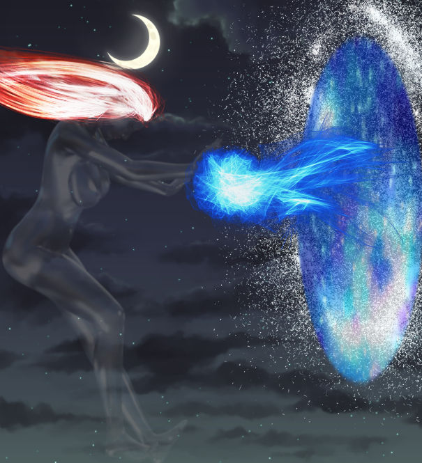
I think you did a really good job combining all the different elements in your pic this month. This is another good pose, with the angled tension in the back and shoulders showing the energy flowing through the extended arms, and the lowered head expressing the concentration required.
The graduated cloud-filled sky is lovely and that offset moon does now set up the background for the ghostly figure without interefing with how the image reads.
The spectacular glow of the magic is a fantastic centre point of the picture but I think the fiery hair is not quite as successful, it distracts a bit too much from the expression of the head and face. I can see why you wanted to add more light around the figure and after thinking about it a bit more today it might have been better to do that by adding some blue highlights reflecting off the skin from the magic and the portal. And I do like that granular dissolve around the edge. It's an imaginative choice and one that I would never have thought of doing.
Atto:
Yep, I like a bit of Bladerunner too!")
And this story suits the selection of words nicely.
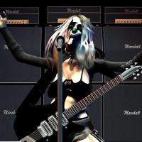
I think you've successfully managed to capture the style that you wanted. The bright saturated colours are handled very well and the contrasting muted tones of the figure give an effective sense of his mood and anguish, topped off with the little iconic details of the origami and the gun, with its wonderful foreshortening.
I also like the crop of the figure, cutting it off at the tilt of the head is visually interesting and creates a feeling of claustrophobia that traps the figure in his thoughts.
One minor thing that irks my eye a little is in the brighter areas where some of the circles are darker than the tones behind. Whenever you see these effects, whether it's a lens flare, glare, bokeh, or out of focus backscattered dust, the overlapping artifacts usually tend to brighten as they stack on top of each other. I always use a Screen layer when I'm trying that so that it automatically "adds" without me having to think about it too much.
Finally I do love the way you've added some of that brighter colour into the drink he's holding. It's a very clever device that links the two sides of the picture and helps to achieve the balance that I hoped you would get.
And for my vote… I'm gonna give it to Atto this time.
In addition to all the things I like about it (the colour, the composition and the fact it's Bladerunner) you've also sold it as a print too! Getting votes is good but having someone pay for it is even better … apparently. And you really can't argue against cold, hard cash. The customer is always right and when someone is right I try to agree with them. Don't spend it all at once.
And in there first!
Dragon:
I think you did a really good job combining all the different elements in your pic this month. This is another good pose, with the angled tension in the back and shoulders showing the energy flowing through the extended arms, and the lowered head expressing the concentration required.
The graduated cloud-filled sky is lovely and that offset moon does now set up the background for the ghostly figure without interefing with how the image reads.
The spectacular glow of the magic is a fantastic centre point of the picture but I think the fiery hair is not quite as successful, it distracts a bit too much from the expression of the head and face. I can see why you wanted to add more light around the figure and after thinking about it a bit more today it might have been better to do that by adding some blue highlights reflecting off the skin from the magic and the portal. And I do like that granular dissolve around the edge. It's an imaginative choice and one that I would never have thought of doing.
Atto:
Yep, I like a bit of Bladerunner too!
And this story suits the selection of words nicely.
I think you've successfully managed to capture the style that you wanted. The bright saturated colours are handled very well and the contrasting muted tones of the figure give an effective sense of his mood and anguish, topped off with the little iconic details of the origami and the gun, with its wonderful foreshortening.
I also like the crop of the figure, cutting it off at the tilt of the head is visually interesting and creates a feeling of claustrophobia that traps the figure in his thoughts.
One minor thing that irks my eye a little is in the brighter areas where some of the circles are darker than the tones behind. Whenever you see these effects, whether it's a lens flare, glare, bokeh, or out of focus backscattered dust, the overlapping artifacts usually tend to brighten as they stack on top of each other. I always use a Screen layer when I'm trying that so that it automatically "adds" without me having to think about it too much.
Finally I do love the way you've added some of that brighter colour into the drink he's holding. It's a very clever device that links the two sides of the picture and helps to achieve the balance that I hoped you would get.
And for my vote… I'm gonna give it to Atto this time.
In addition to all the things I like about it (the colour, the composition and the fact it's Bladerunner) you've also sold it as a print too! Getting votes is good but having someone pay for it is even better … apparently.
And you really can't argue against cold, hard cash. The customer is always right and when someone is right I try to agree with them. Don't spend it all at once.
The following user(s) said Thank You: Atto
Please Log in or Create an account to join the conversation.
02 Aug 2017 16:50 #17223
by Atto
No smudge tool was harmed in the making of this image.
Replied by Atto on topic CGAN July 2017 - Random II - Finals
Firstly let me say that I didn't mention the fact that I'd sold a print in an attempt to garner more votes - personally I feel I've done better work before that no one seems interested in buying 
As for the vote:
Dragon - love the fact you added that dispersion effect round the portal - it helps 'ground it in the image much better. I agree with Valence about the hair and with his alternative but wouldn't it have been nice if he'd thought of that a few days ago?
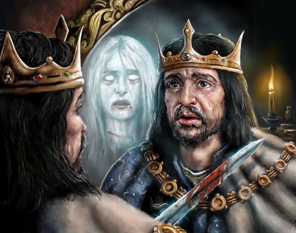
Val - It's still freaking me out that I'm a ghost when I look at this. The addition of the candle and its associated rim light is very nice too providing that warm/cold lighting across our heroes(?) face. I also loved the aged look to the sword with all its nicks along the blade and its worn patina.
So this month my vote goes to Val.
Good work guys.
As for the vote:
Dragon - love the fact you added that dispersion effect round the portal - it helps 'ground it in the image much better. I agree with Valence about the hair and with his alternative but wouldn't it have been nice if he'd thought of that a few days ago?
Val - It's still freaking me out that I'm a ghost when I look at this. The addition of the candle and its associated rim light is very nice too providing that warm/cold lighting across our heroes(?) face. I also loved the aged look to the sword with all its nicks along the blade and its worn patina.
So this month my vote goes to Val.
Good work guys.
No smudge tool was harmed in the making of this image.
Please Log in or Create an account to join the conversation.
14 Aug 2017 10:42 #17619
by Banj
Replied by Banj on topic CGAN July 2017 - Random II - Finals
Voting is over and Valence wins. Congratulations Valence.
The following user(s) said Thank You: Valence
Please Log in or Create an account to join the conversation.
14 Aug 2017 10:47 #17620
by Charlotte
Any an all misspellings are henceforth blamed on the cats.
Replied by Charlotte on topic CGAN July 2017 - Random II - Finals
Congrats Val!
and nope, I did not totally forgot about this... nope nope nope
and nope, I did not totally forgot about this... nope nope nope
Any an all misspellings are henceforth blamed on the cats.
The following user(s) said Thank You: Valence
Please Log in or Create an account to join the conversation.
Latest Activity

Banj updated their profile picture


Charlotte Still wearing a mask? Is it so we won't see you hoarding food in those cheeks of yours?
See More
Banj Mfmuh Guhmfpf
See More
Charlotte I'll take that as a yes...
See More
Charlotte Why is there a tiny flashing thing in front of the reply link/button? It's so small I can't see if it's an exclamation mark or a question mark... or...both?)
See More
Banj Because? Both!
See More
Charlotte *gasp*
See More

CaptainDeth updated their profile picture

CaptainDeth Ahoy folks, just a newbie here, just getting started. Thanks for allowing me in.
CaptainDeth Thank You
CaptainDeth and Mr.Bungle joined the site


honbasic joined the site


Gawk joined the site