


The shoutbox is unavailable to non-members
CGAN April 2017 - Warlock - Final entries
Poll: Vote for the Winning Warlock :) (was ended 2017-05-08 00:00:00)
| Atto |
|
3 | 50% |
| charco |
|
1 | 16.7% |
| Valence |
|
No votes | 0% |
| Mr Sabrosito |
|
1 | 16.7% |
| oaktree |
|
1 | 16.7% |
| Total number of voters: 6 ( microscopi, Charlotte, charco, Atto, oaktree ) See more | |||
| Only registered users can participate to this poll | |||
02 Apr 2017 10:51 - 09 May 2017 15:35 #15675
by Banj
CGAN April 2017 - Warlock - Final entries was created by Banj
Warlock
Brief: Interpret the title as you wish. A character design, a scene of magical mayhem... or something else?
Deadline: Sunday the 30th of April at Midnight GMT.
POLL is open: Vote for your favourite Warlock before May 8th!
Poll is over! Winning entry is the ravenous warlock by Atto!
This is where you post your final entries, WIPs should be posted over here: cgartnexus.com/index.php/forums/challeng...il-2017-warlock-wips
Challenge rules and guidelines:
cgartnexus.com/index.php/forums/challeng...s/39-challenge-rules
Rules in brief:
Brief: Interpret the title as you wish. A character design, a scene of magical mayhem... or something else?
Poll is over! Winning entry is the ravenous
warlock by Atto!This is where you post your final entries, WIPs should be posted over here: cgartnexus.com/index.php/forums/challeng...il-2017-warlock-wips
Challenge rules and guidelines:
cgartnexus.com/index.php/forums/challeng...s/39-challenge-rules
Rules in brief:
- All challenge entries must be your own work.
- You should post at least two WIP images that are clearly different from your final entry and each other.
- Your final entry should contain your image (inserted so it shows up full size) and at least two links to your WIP posts on the forum.
- No chatter in the finals thread – if you have questions, post them in the WIP thread or PM an admin.
- Feedback is allowed & encouraged together with the voting and in the WIP thread.
- Deadline is given in UK time (midnight GMT) with a grace period of 5 minutes for getting the post sorted.
- Each member may cast one vote
- No cheating! Admins may decide to disqualify an entry that does not adhere to the above rules.
Last edit: 09 May 2017 15:35 by Charlotte.
Please Log in or Create an account to join the conversation.

25 Apr 2017 23:30 #15948
by Atto
No smudge tool was harmed in the making of this image.
Replied by Atto on topic CGAN April 2017 - Warlock - Final entries
So first in for a change but as I said in the wip thread I'm away till after the deadline from tomorrow.
Good luck boys and girls!
Wip 1 A false start
Wip 2
Wip 3
And the final - with a (sort of) background this time.

Good luck boys and girls!
Wip 1 A false start
Wip 2
Wip 3
And the final - with a (sort of) background this time.
No smudge tool was harmed in the making of this image.
Please Log in or Create an account to join the conversation.

27 Apr 2017 17:02 #15959
by charco
Replied by charco on topic CGAN April 2017 - Warlock - Final entries
Please Log in or Create an account to join the conversation.

28 Apr 2017 20:03 #15960
by Valence
Replied by Valence on topic CGAN April 2017 - Warlock - Final entries
Done, I think.
1: The Colour of Magic.
2: Beware The Moon.
And the final...
Good Luck, Everyone. And extra thanks to Charco for the late feedback that made this pic better than it was.")
1: The Colour of Magic.
2: Beware The Moon.
And the final...
Good Luck, Everyone. And extra thanks to Charco for the late feedback that made this pic better than it was.
Please Log in or Create an account to join the conversation.
- Mr. Sabrosito
-
- Offline
- Junior Member
-

Less
More
- Posts: 131
- Thank you received: 5
30 Apr 2017 14:36 #15970
by Mr. Sabrosito
Replied by Mr. Sabrosito on topic CGAN April 2017 - Warlock - Final entries
Please Log in or Create an account to join the conversation.
30 Apr 2017 17:43 - 30 Apr 2017 17:43 #15972
by oaktree
Replied by oaktree on topic CGAN April 2017 - Warlock - Final entries
Last edit: 30 Apr 2017 17:43 by oaktree.
Please Log in or Create an account to join the conversation.

01 May 2017 20:13 #15991
by Charlotte
Any an all misspellings are henceforth blamed on the cats.
Replied by Charlotte on topic CGAN April 2017 - Warlock - Final entries
Assuming I did everything right, you should now be able to vote for your favourite Warlock! Please vote before May 8th and please - for the sake of our resident rodent - try to avoid a tie this month ")
Any an all misspellings are henceforth blamed on the cats.
Please Log in or Create an account to join the conversation.
02 May 2017 00:35 - 02 May 2017 00:45 #15996
by Valence
Replied by Valence on topic CGAN April 2017 - Warlock - Final entries
Beginneth, I shall.
First of all, it was good to see some new faces diving in to the challenge this month. All members and lurkers are welcome to jump in at any time and have a go. There's no pressure for feedback or competition, just good clean fun and some great pics.
Atto:
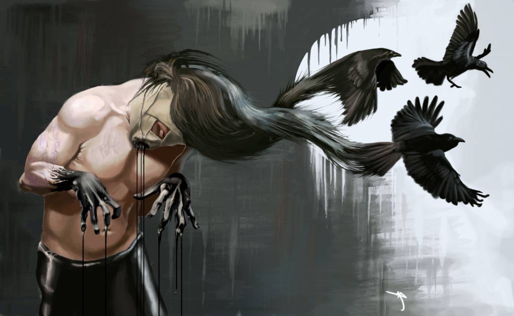
I love the bold and striking design of this image. When faced with the brief of "Warlock" the obvious thing to do is to immediately sketch out a robed, bearded guy doing some magic in a quasi-medieval setting (and what kind of idiot would do a picture like that! ) but this figure of yours is imaginative, unorthodox and most of all, interesting. The twisted tension of the pose is brilliantly dynamic and the effect of the birds emerging from the hair is very convincing to me.
Part of me wishes that you'd had a bit of extra time to render the torso as clearly as the shoulders (damn that pesky job stealing your time!) but I'm also glad you used some of that time to do a background. And, seeing as I'm going through a bit of a "drippy" phase too, that background does appeal to me and gives it a graffiti-style twist, making it a very modern take on the warlock idea.
Oaktree:
I think you've made some terrific progress this month. This is definitely the best picture I've seen you do and I was super pleased to see you throw those deep values in right from the start.
It's a great composition with the right balance, depth and focus for the subject matter. The lined, wrinkled face and its expression give a lovely sense of the character's personality and it's all very well lit from that single flame. A little touch of a more reddish hue to the shadow areas would maybe help the transition across the skin and match the well-observed highlights that are already there.
Another impressive thing about this picture is the addition of all the little details, like the translucency of the candle where the light bounces in and through the wax, that lovely lensing effect of the glass ball and the way the details of the page reflect the light sharply to pop out of the paper.
It's a big step forward from your previous pics in ambition and execution, so you should be proud of the effort and hard work you've put in this month.
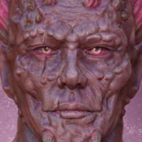
Mr Sabrosito:
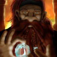
I really like the way you developed your picture. Sketching out those silhouette thumbnails and then refining and building on the best choices seemed very professional and efficient, and it was completed with the confidence of someone who knows what they're doing.
The setting and mood are perfect for this choice of character and I love the background bike with the flare in the headlight (I'm a sucker for those little lighting tricks) and the hot fiery glow is nicely consisent across the image.
None of this overshadows the warlock though, with those fantastic spikes on his head showing how powerful and dangerous he is. I do like seeing a bulging vein or two beneath the skin and here they look just right, they sit perfectly across the form and catch just enough of the light to get your attention. Good Work.
Charco:
This was a little, late gem at the end of the month. You got through it pretty quickly but you got through it very well indeed!
The big fire demon rightly dominates the picture with its full value range and the lovely control of saturation, yet there's plenty of good stuff elsewhere around the image, like the variety of colour with the magic green glow and that touch of purple, or the solid forms described by different types of edges (some crisp and clean, some blurry and others lost in the softness.) And then there's the clever composition with the arrangement of those foreground figures all leaning inwards to the centre to guide your eye back to the warlock and the demon.
And as I said in the wips, the lighting on the main figure is very good. With such a bold backlit scene it would be easy to leave the main character looking very flat and boring but that bit of green cascading down the arm adds extra dimension to the form to make him pop out further. Lovely technique.
Micro:
Grr!
Once again you had so many ideas and restarts it was like you were having your own contest! And in that contest I would have picked your first one. It had a nice depth and atmosphere. It's a shame you couldn't settle on a single concept in the time but don't worry about it. Too many ideas are better than no ideas. Just try to have more confidence in those ideas, trust those great texturing skills you have and ignore the doubt to keep working through it until the end.
I've already had enough of elections but I suppose I'd better vote in this one...
I find myself torn between Atto and Charco. I think Charco's is technically the best of all of the entries while Atto's has such an imaginative concept.
I think… I'm just gonna go for….
Atto. Yes, Atto, I've decided.
The dripping magic, the tortured pose showing the physical effort of that magic (great hands as usual) and that clever play of contrast with the background: light on dark at one side, dark on light at the other, like some graphic re-enactment of yin and yang.
That is the warlock that interests me the most and keeps me thinking about the picture when I'm not looking at it.
First of all, it was good to see some new faces diving in to the challenge this month. All members and lurkers are welcome to jump in at any time and have a go. There's no pressure for feedback or competition, just good clean fun and some great pics.
Atto:
I love the bold and striking design of this image. When faced with the brief of "Warlock" the obvious thing to do is to immediately sketch out a robed, bearded guy doing some magic in a quasi-medieval setting (and what kind of idiot would do a picture like that!
) but this figure of yours is imaginative, unorthodox and most of all, interesting. The twisted tension of the pose is brilliantly dynamic and the effect of the birds emerging from the hair is very convincing to me.Part of me wishes that you'd had a bit of extra time to render the torso as clearly as the shoulders (damn that pesky job stealing your time!) but I'm also glad you used some of that time to do a background. And, seeing as I'm going through a bit of a "drippy" phase too, that background does appeal to me and gives it a graffiti-style twist, making it a very modern take on the warlock idea.
Oaktree:
I think you've made some terrific progress this month. This is definitely the best picture I've seen you do and I was super pleased to see you throw those deep values in right from the start.
It's a great composition with the right balance, depth and focus for the subject matter. The lined, wrinkled face and its expression give a lovely sense of the character's personality and it's all very well lit from that single flame. A little touch of a more reddish hue to the shadow areas would maybe help the transition across the skin and match the well-observed highlights that are already there.
Another impressive thing about this picture is the addition of all the little details, like the translucency of the candle where the light bounces in and through the wax, that lovely lensing effect of the glass ball and the way the details of the page reflect the light sharply to pop out of the paper.
It's a big step forward from your previous pics in ambition and execution, so you should be proud of the effort and hard work you've put in this month.
Mr Sabrosito:
I really like the way you developed your picture. Sketching out those silhouette thumbnails and then refining and building on the best choices seemed very professional and efficient, and it was completed with the confidence of someone who knows what they're doing.
The setting and mood are perfect for this choice of character and I love the background bike with the flare in the headlight (I'm a sucker for those little lighting tricks
) and the hot fiery glow is nicely consisent across the image.None of this overshadows the warlock though, with those fantastic spikes on his head showing how powerful and dangerous he is. I do like seeing a bulging vein or two beneath the skin and here they look just right, they sit perfectly across the form and catch just enough of the light to get your attention. Good Work.
Charco:
This was a little, late gem at the end of the month. You got through it pretty quickly but you got through it very well indeed!
The big fire demon rightly dominates the picture with its full value range and the lovely control of saturation, yet there's plenty of good stuff elsewhere around the image, like the variety of colour with the magic green glow and that touch of purple, or the solid forms described by different types of edges (some crisp and clean, some blurry and others lost in the softness.) And then there's the clever composition with the arrangement of those foreground figures all leaning inwards to the centre to guide your eye back to the warlock and the demon.
And as I said in the wips, the lighting on the main figure is very good. With such a bold backlit scene it would be easy to leave the main character looking very flat and boring but that bit of green cascading down the arm adds extra dimension to the form to make him pop out further. Lovely technique.
Micro:
Grr!
Once again you had so many ideas and restarts it was like you were having your own contest! And in that contest I would have picked your first one. It had a nice depth and atmosphere. It's a shame you couldn't settle on a single concept in the time but don't worry about it. Too many ideas are better than no ideas.
Just try to have more confidence in those ideas, trust those great texturing skills you have and ignore the doubt to keep working through it until the end. I've already had enough of elections but I suppose I'd better vote in this one...
I find myself torn between Atto and Charco. I think Charco's is technically the best of all of the entries while Atto's has such an imaginative concept.
I think… I'm just gonna go for….
Atto. Yes, Atto, I've decided.
The dripping magic, the tortured pose showing the physical effort of that magic (great hands as usual) and that clever play of contrast with the background: light on dark at one side, dark on light at the other, like some graphic re-enactment of yin and yang.
That is the warlock that interests me the most and keeps me thinking about the picture when I'm not looking at it.
Last edit: 02 May 2017 00:45 by Valence.
The following user(s) said Thank You: Atto
Please Log in or Create an account to join the conversation.
02 May 2017 23:16 - 02 May 2017 23:19 #16012
by Atto
No smudge tool was harmed in the making of this image.
Replied by Atto on topic CGAN April 2017 - Warlock - Final entries
Going to keep this pretty short and sweet this month. Val has already said most of it anyway and I agree with all he's said (apart from the winner obviously)
In general I think the standard this month really is one of the highest since Banj and Charlotte created our very own little corner of the internet.
Oak - you really pushed yourself here and thats great to see. Good to have you back Charco and welcome again to Mr S. you guys have not only doubled the amount of entries this month but are also heavily responsible for the increase in quality of this months entries - you both certainly inspired (frightened) me to really push that much harder this month!
Val - As you couldn't possibly comment on the awesomeness of your own work I guess it falls to me to provide a little feedback.
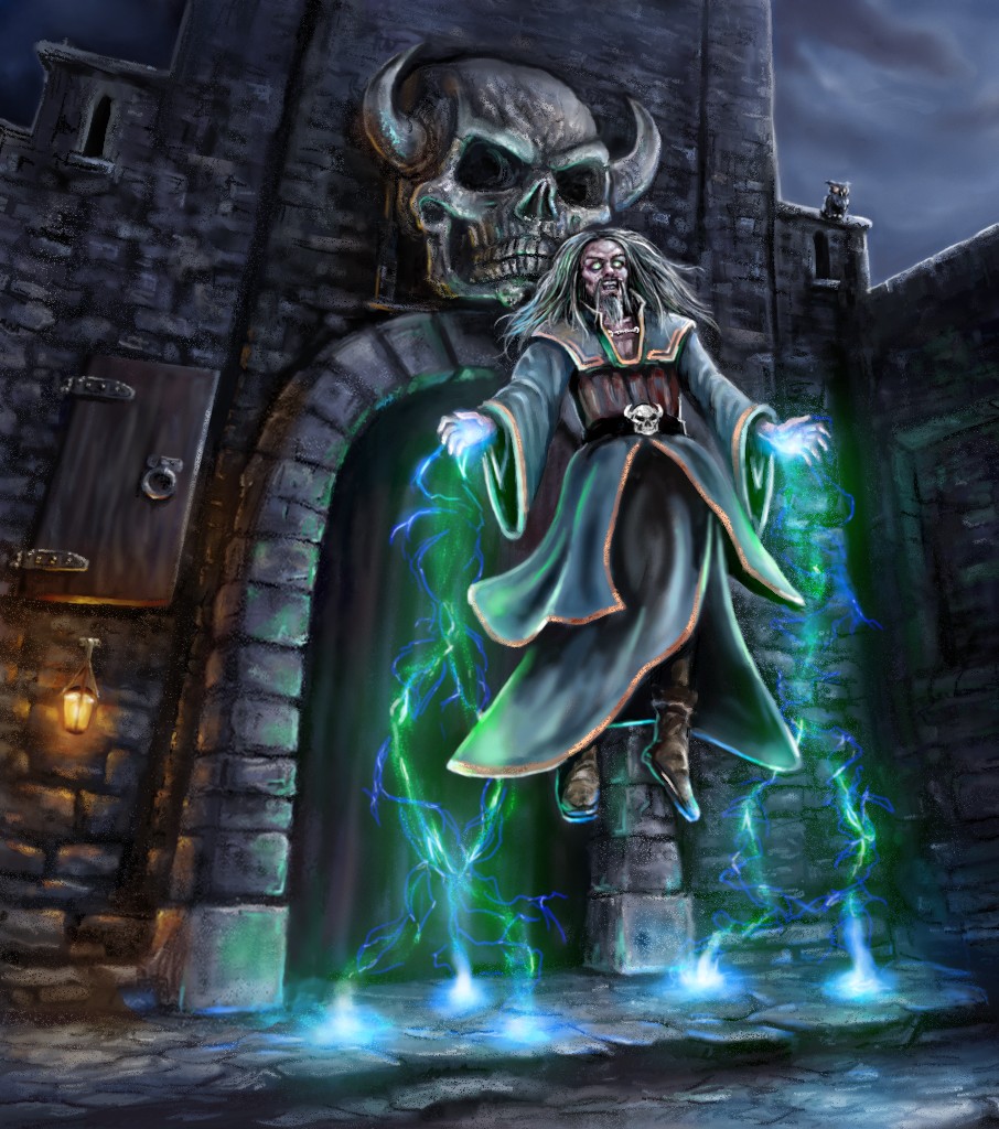
Notice how out of the five entries only two depicted a more traditional Warlock type character? I love the setting in yours and the way that skull motif is repeated from the castle to his face and again on his belt. The lighting effect to the magic is beautifully handled especially where it leaves his hands and makes contact with the floor. I also think it was the correct move taking away the moon but I love the fact you replaced it with the little owl fella sitting on the wall! The whole image is very easy to read and the composition is very strong. The inclusion of the small lamp and the brocading around the edges of his robes is a nice touch that brings in those contrasting warm tones. Nice one!
My vote this month goes to Mr S. for your interesting take on the theme, the gorgeous lighting and fire elements and just the incredibly cool idea of a Warlock on a motorbike - like warlocks need to be any cooler!
Great work all!
In general I think the standard this month really is one of the highest since Banj and Charlotte created our very own little corner of the internet.
Oak - you really pushed yourself here and thats great to see. Good to have you back Charco and welcome again to Mr S. you guys have not only doubled the amount of entries this month but are also heavily responsible for the increase in quality of this months entries - you both certainly inspired (frightened) me to really push that much harder this month!
Val - As you couldn't possibly comment on the awesomeness of your own work I guess it falls to me to provide a little feedback.
Notice how out of the five entries only two depicted a more traditional Warlock type character? I love the setting in yours and the way that skull motif is repeated from the castle to his face and again on his belt. The lighting effect to the magic is beautifully handled especially where it leaves his hands and makes contact with the floor. I also think it was the correct move taking away the moon but I love the fact you replaced it with the little owl fella sitting on the wall! The whole image is very easy to read and the composition is very strong. The inclusion of the small lamp and the brocading around the edges of his robes is a nice touch that brings in those contrasting warm tones. Nice one!
My vote this month goes to Mr S. for your interesting take on the theme, the gorgeous lighting and fire elements and just the incredibly cool idea of a Warlock on a motorbike - like warlocks need to be any cooler!
Great work all!
No smudge tool was harmed in the making of this image.
Last edit: 02 May 2017 23:19 by Atto.
Please Log in or Create an account to join the conversation.
04 May 2017 14:25 #16089
by charco
Replied by charco on topic CGAN April 2017 - Warlock - Final entries
Well done to everyone on this, they all turned out great!
Oaktree- I love the subdued feel of this. The ravens are subtle, and the perspective is really unusual (although I think the top of the chair would be at a more sheer angle to correspond with the book)
Valence, I love how this looks, and glad you took my suggestions on board The belt buckle really helps tie in the relationship between the char and the environment, well done!
Mr S- that turned out really cool, that jacket in particular turned out fantastic. Having trouble reading some of the image, but it really sells the feel.
Atto- I love your take, deliciously freaky. The only reason I didn't have you as my vote was the background is very much straights, against a very dynamic and gnarled picture. It didn't feel like it sat together for me, as well as the shiny legs possibly drawing too much attention. Idea, pose the hair, those birds, the contrast on the right, all great.
Oaktree- I love the subdued feel of this. The ravens are subtle, and the perspective is really unusual (although I think the top of the chair would be at a more sheer angle to correspond with the book)
Valence, I love how this looks, and glad you took my suggestions on board
The belt buckle really helps tie in the relationship between the char and the environment, well done!Mr S- that turned out really cool, that jacket in particular turned out fantastic. Having trouble reading some of the image, but it really sells the feel.
Atto- I love your take, deliciously freaky. The only reason I didn't have you as my vote was the background is very much straights, against a very dynamic and gnarled picture. It didn't feel like it sat together for me, as well as the shiny legs possibly drawing too much attention. Idea, pose the hair, those birds, the contrast on the right, all great.
The following user(s) said Thank You: Atto
Please Log in or Create an account to join the conversation.
Latest Activity

Banj updated their profile picture


Charlotte Still wearing a mask? Is it so we won't see you hoarding food in those cheeks of yours?
See More
Banj Mfmuh Guhmfpf
See More
Charlotte I'll take that as a yes...
See More
Charlotte Why is there a tiny flashing thing in front of the reply link/button? It's so small I can't see if it's an exclamation mark or a question mark... or...both?)
See More
Banj Because? Both!
See More
Charlotte *gasp*
See More

CaptainDeth updated their profile picture

CaptainDeth Ahoy folks, just a newbie here, just getting started. Thanks for allowing me in.
CaptainDeth Thank You
CaptainDeth and Mr.Bungle joined the site


honbasic joined the site


Gawk joined the site