


- Posts: 2113
- Thank you received: 80


The shoutbox is unavailable to non-members
CGAN August 2016 - It Came form OuterSpace - Final
Poll: Challenge vote (was ended 2016-09-08 00:00:00)
| Valence |
|
No votes | 0% |
| Banj |
|
2 | 25% |
| microscopi |
|
6 | 75% |
| Total number of voters: 8 ( Digital Dave, SchizophreniaWolf, microscopi, oaktree, Valence ) See more | |||
| Only registered users can participate to this poll | |||
01 Aug 2016 19:46 - 08 Sep 2016 10:51 #14262
by kazky
CGAN August 2016 - It Came form OuterSpace - Final was created by kazky
It Came from Outer Space
Brief An alien came from Outer space, and now it lives with you. Depict your new house mate. Is it cute, scary, large or small?
Deadline:Wednesday 31st of August at midnight GMT. VOTING OPEN UNTIL 8TH OF SEPTEMBER
This is where you post your Final entry, Wips should be posted over here:
cgartnexus.com/index.php/forums/challeng...form-outerspace-wips
Challenge rules and guidelines:
cgartnexus.com/index.php/forums/challeng...s/39-challenge-rules
Rules in brief:
•All challenge entries must be your own work.
•You should post at least two WIP images that are clearly different from your final entry and each other.
•Your final entry should contain your image (inserted so it shows up full size) and at least two links to your WIP posts on the forum.
•No chatter in the finals thread – if you have questions, post them in the WIP thread or PM an admin.
•Feedback is allowed & encouraged together with the voting and in the WIP thread.
•Deadline is given in UK time (midnight GMT) with a grace period of 5 minutes for getting the post sorted.
•Each member may cast one vote
•No cheating! Admins may decide to disqualify an entry that does not adhere to the above rules.
WINNER - microscopi
Brief An alien came from Outer space, and now it lives with you. Depict your new house mate. Is it cute, scary, large or small?
Deadline:
This is where you post your Final entry, Wips should be posted over here:
cgartnexus.com/index.php/forums/challeng...form-outerspace-wips
Challenge rules and guidelines:
cgartnexus.com/index.php/forums/challeng...s/39-challenge-rules
Rules in brief:
•All challenge entries must be your own work.
•You should post at least two WIP images that are clearly different from your final entry and each other.
•Your final entry should contain your image (inserted so it shows up full size) and at least two links to your WIP posts on the forum.
•No chatter in the finals thread – if you have questions, post them in the WIP thread or PM an admin.
•Feedback is allowed & encouraged together with the voting and in the WIP thread.
•Deadline is given in UK time (midnight GMT) with a grace period of 5 minutes for getting the post sorted.
•Each member may cast one vote
•No cheating! Admins may decide to disqualify an entry that does not adhere to the above rules.
WINNER - microscopi
Last edit: 08 Sep 2016 10:51 by Banj.
Please Log in or Create an account to join the conversation.

29 Aug 2016 13:10 #14436
by Valence
Replied by Valence on topic CGAN August 2016 - It Came form OuterSpace - Final
Getting in early this month. ")
1: First Bits.
2: A Bit More.
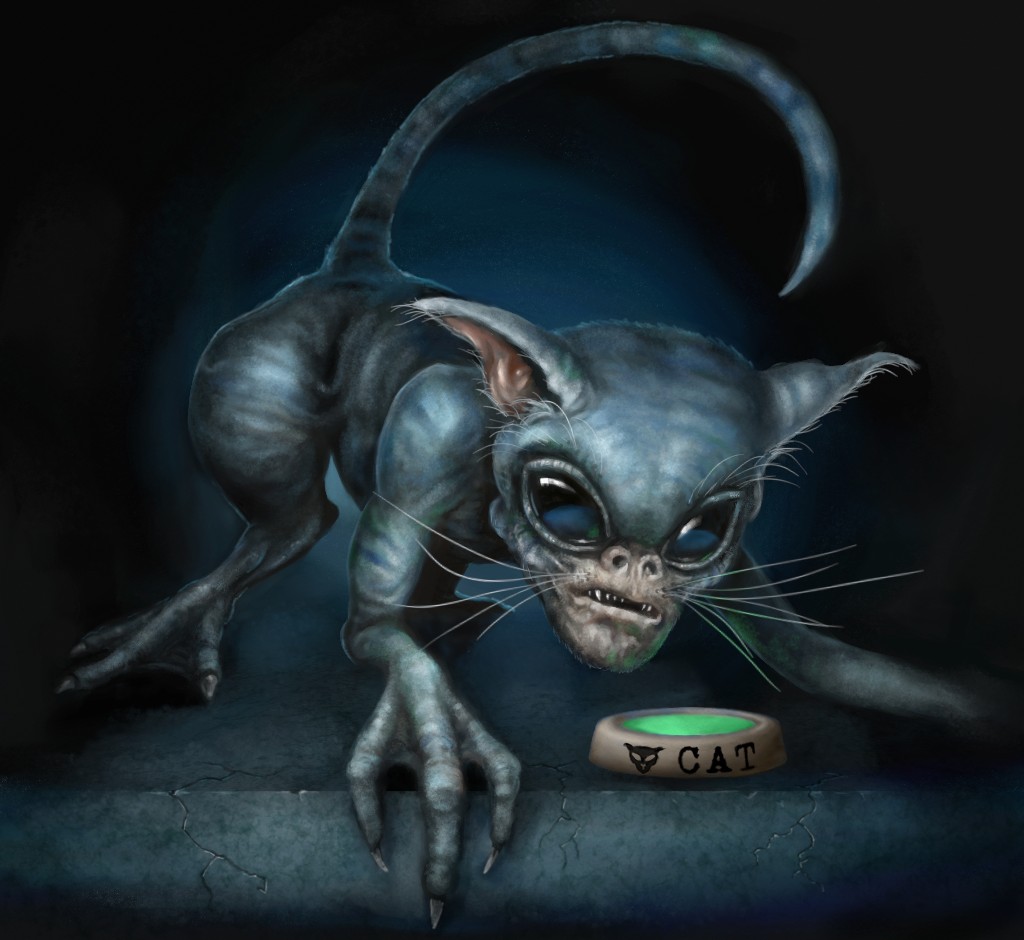
And finally feeding time for my alien cat.
1: First Bits.
2: A Bit More.
And finally feeding time for my alien cat.
Please Log in or Create an account to join the conversation.
30 Aug 2016 12:02 #14441
by Banj
Replied by Banj on topic CGAN August 2016 - It Came form OuterSpace - Final
WIPs:
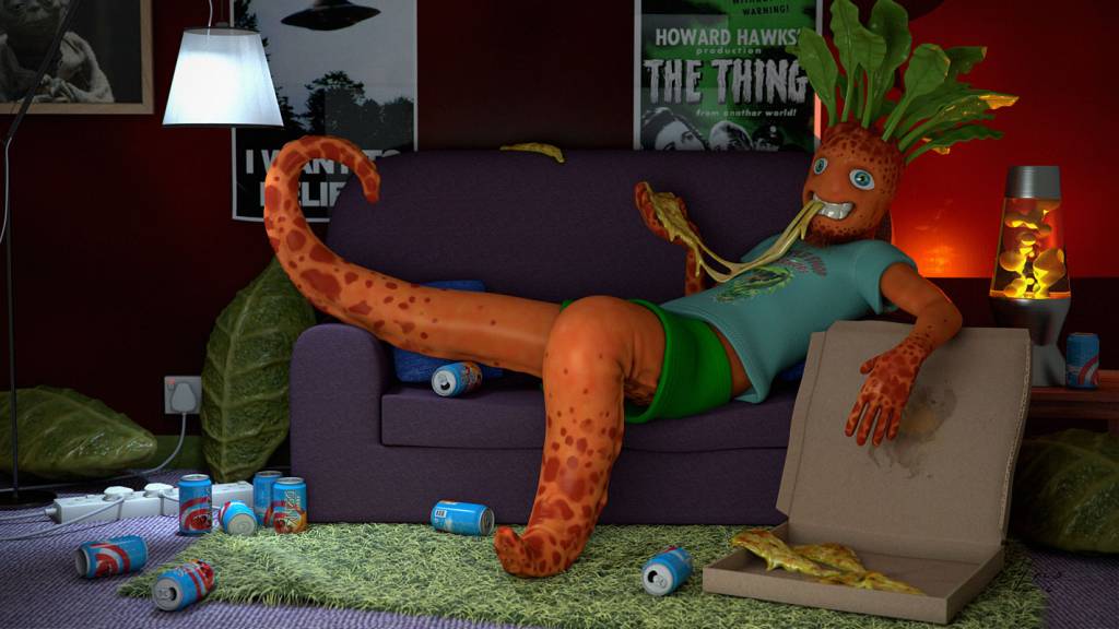
Finished image - "Vegging Out"
- cgartnexus.com/index.php/forums/challeng...-wips?start=10#14351
- cgartnexus.com/index.php/forums/challeng...-wips?start=20#14372
- cgartnexus.com/index.php/forums/challeng...-wips?start=20#14387
- cgartnexus.com/index.php/forums/challeng...-wips?start=20#14402
- cgartnexus.com/index.php/forums/challeng...-wips?start=20#14421
Finished image - "Vegging Out"
Please Log in or Create an account to join the conversation.
- microscopi
-

- Offline
- Premium Member
-

Less
More
- Posts: 743
- Thank you received: 79
01 Sep 2016 01:18 - 01 Sep 2016 01:38 #14443
by microscopi
Replied by microscopi on topic CGAN August 2016 - It Came form OuterSpace - Final
Last edit: 01 Sep 2016 01:38 by microscopi.
Please Log in or Create an account to join the conversation.
01 Sep 2016 11:14 #14444
by Banj
Replied by Banj on topic CGAN August 2016 - It Came form OuterSpace - Final
Voting is open and the poll closes on the 8th (at which point we will probably have forgotten all about it and need reminding again like usual).
While I'm here my vote goes to microscopi. This looks pretty spectacular, and I'll go as far as saying it's probably the best painting you have posted so far in my opinion. Lighting, composition etc. all working really nicely.
Valence, if I had a vote for second you would get that for the awesome kitty
Please Log in or Create an account to join the conversation.
01 Sep 2016 12:33 #14447
by Thomgirl
Replied by Thomgirl on topic CGAN August 2016 - It Came form OuterSpace - Final
Microscopi - really neat work and filled with life and story. Great illustration that I can find no fault in.
Banj - I love all the little items strewn about that bring character to the piece. The composition works well, but I think the lighting is throwing me off a bit. The main source of it seems to focus strongly on his legs, but very little on his face which I think makes it a little difficult for me to subconsciously take in the character as a whole.
Valence - Your 'cat' is creeping me out. It's a well executed work overall, and this is probably just me and my personal isms, but I feel that the 'grey' alien facial look is so popular and overused as to be uninteresting. Everything about your piece is spot on for the topic, but the alien look feels common instead of unique for me.
Please Log in or Create an account to join the conversation.

01 Sep 2016 17:10 #14449
by Charlotte
Any an all misspellings are henceforth blamed on the cats.
Replied by Charlotte on topic CGAN August 2016 - It Came form OuterSpace - Final
Valence, I really like your alien creepy cat. Unlike Thomgirl I think the humanoid face and expression works to make it more alien. In terms of following the brief you're the closest I think, in the sense of "this is my alien pet that lives with me" (although Banj's squatter is a close runner up)
Banj, I liked the sketch you did but I think the 3D version kind of lost something in terms of facial expression. I also feel that it looks a bit too "plastic", especially in the face and the clothes (and Thomgirl makes a good point about the light though I didn't really see it before...). I think I'd have preferred to see it painted. That said, I think it's both funny and well made and the character is an odd mix of harmless and creepy, somehow.
Micro, I'm just going to have to agree with Banj. I've no idea how that mama creature would work in the real world - the wings look a little backwards but they still look good. And it might not quite follow the brief "now it lives with you", but it gets my vote anyway. Each of these pics had their strenghts and weaknesses as usual, and in the end I just went by "which one would I put on my wall?". And that's this one.")
Banj, I liked the sketch you did but I think the 3D version kind of lost something in terms of facial expression. I also feel that it looks a bit too "plastic", especially in the face and the clothes (and Thomgirl makes a good point about the light though I didn't really see it before...). I think I'd have preferred to see it painted. That said, I think it's both funny and well made and the character is an odd mix of harmless and creepy, somehow.
Micro, I'm just going to have to agree with Banj. I've no idea how that mama creature would work in the real world - the wings look a little backwards but they still look good. And it might not quite follow the brief "now it lives with you", but it gets my vote anyway. Each of these pics had their strenghts and weaknesses as usual, and in the end I just went by "which one would I put on my wall?". And that's this one.
Any an all misspellings are henceforth blamed on the cats.
Please Log in or Create an account to join the conversation.
01 Sep 2016 23:50 - 01 Sep 2016 23:59 #14450
by Valence
Replied by Valence on topic CGAN August 2016 - It Came form OuterSpace - Final
Micro:
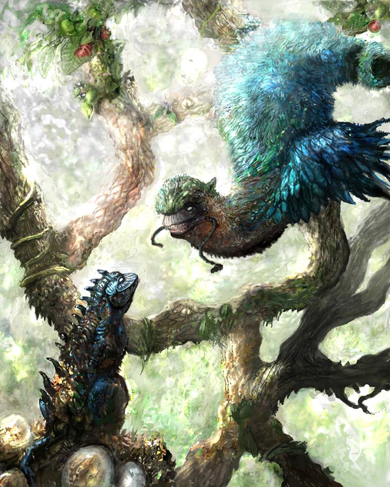
I agree with Banj, this is definitely one of your best pics. There's a good understandable connection between the two creatures that implies their relationship and I like the imaginative designs. The winding branches are a clever compositional tool, creating depth with the varying values while also guiding your eyes in and around the image and behind it all is a lovely glare that really captures that sense of dappled light through hazy foliage. The texture is good too, you're getting better and better at layering and integrating them to create a believable consistency and it even has an impasto-style look to some of the areas. I would have liked a little more depth separation between the smaller guy and the branch behind but it's not a big issue, especially after you solved the tangent problem from the wips.
I think my favourite part, though, is the choice of those iridescent blues in the feathered creature. It's very eye-catching but also well-controlled. That kind of strong saturation is tough to pull off but you've done it well here. Well Done.
Banj:
This is a fantastic concept. It made me smile straight away and seeing the details go in bit by bit in that 3D way was good fun to watch too. And that level of detail is very impressive with all the natural stuff like the leafy structures at the back and the grass-like rug, but also the smoother objects like the adapter sockets and all those cans! And if that wasn't enough there's also the added details of context with all those posters and the t-shirt. It makes me feel very embarrassed about the blank background in my pic!
The carrot-alien is a brilliant idea, I love the design with the textured spots and the well-sculpted geometry, especially the creases behind the "knee". The overall pose is just perfect too in the way that it expresses that "night in front of the TV" feeling with the lazy hand and the drooping pizza. The only minor gripes are the diverging look to the eyes (and yet that vacant gaze could be down to something alcoholic in those cans!) and the specularity of the teeth catches my eye a little too much. But none of that affects the terrific mood and personality of the picture, I know instantly what this guy is like and what he's doing, and I certainly know he isn't gonna clean up afterwards!
Segujo:
This was a great start to a picture and a wonderfully surreal creature. With that beak-shape to the head, the wings and curving body shape it made me think of a weird alien rubber duck. I don't know what colour you would have ended up doing it but in my mind it was definitely that familiar shiny yellow. I imagined it being like one of those Men In Black creatures that is disguised as a duck and is in the process of shape-shifting into its larger alien form.
And now the choosings…
Hmmm…
I think micro's is probably the best picture of the three and would get my win away from the challenge criteria, but I think I'm gonna vote for Banj because I think he really nailed the brief with his idea. The way the posters and the whole scenario perfectly matches the pulp, sci-fi theme of the title and description makes it hard for me to ignore.
I hereby order one vote for Banj.
I agree with Banj, this is definitely one of your best pics. There's a good understandable connection between the two creatures that implies their relationship and I like the imaginative designs. The winding branches are a clever compositional tool, creating depth with the varying values while also guiding your eyes in and around the image and behind it all is a lovely glare that really captures that sense of dappled light through hazy foliage. The texture is good too, you're getting better and better at layering and integrating them to create a believable consistency and it even has an impasto-style look to some of the areas. I would have liked a little more depth separation between the smaller guy and the branch behind but it's not a big issue, especially after you solved the tangent problem from the wips.
I think my favourite part, though, is the choice of those iridescent blues in the feathered creature. It's very eye-catching but also well-controlled. That kind of strong saturation is tough to pull off but you've done it well here. Well Done.
Banj:
This is a fantastic concept. It made me smile straight away and seeing the details go in bit by bit in that 3D way was good fun to watch too. And that level of detail is very impressive with all the natural stuff like the leafy structures at the back and the grass-like rug, but also the smoother objects like the adapter sockets and all those cans! And if that wasn't enough there's also the added details of context with all those posters and the t-shirt. It makes me feel very embarrassed about the blank background in my pic!
The carrot-alien is a brilliant idea, I love the design with the textured spots and the well-sculpted geometry, especially the creases behind the "knee". The overall pose is just perfect too in the way that it expresses that "night in front of the TV" feeling with the lazy hand and the drooping pizza. The only minor gripes are the diverging look to the eyes (and yet that vacant gaze could be down to something alcoholic in those cans!) and the specularity of the teeth catches my eye a little too much. But none of that affects the terrific mood and personality of the picture, I know instantly what this guy is like and what he's doing, and I certainly know he isn't gonna clean up afterwards!
Segujo:
This was a great start to a picture and a wonderfully surreal creature. With that beak-shape to the head, the wings and curving body shape it made me think of a weird alien rubber duck. I don't know what colour you would have ended up doing it but in my mind it was definitely that familiar shiny yellow.
I imagined it being like one of those Men In Black creatures that is disguised as a duck and is in the process of shape-shifting into its larger alien form. And now the choosings…
Hmmm…
I think micro's is probably the best picture of the three and would get my win away from the challenge criteria, but I think I'm gonna vote for Banj because I think he really nailed the brief with his idea. The way the posters and the whole scenario perfectly matches the pulp, sci-fi theme of the title and description makes it hard for me to ignore.
I hereby order one vote for Banj.
Last edit: 01 Sep 2016 23:59 by Valence.
Please Log in or Create an account to join the conversation.
- microscopi
-
- Offline
- Premium Member
-
Less
More
- Posts: 743
- Thank you received: 79
03 Sep 2016 04:11 #14454
by microscopi
Replied by microscopi on topic CGAN August 2016 - It Came form OuterSpace - Final
Val: Really digging your alien kitty design, the anatomy looks pretty great considering it's not based in reality! The dynamic pouncy pose adds movement to the pic, which shows the aliens aggressive nature and his prediitor insticts. I know the rock is just part of the forground but it looks great, the lighting and texture both look realistic. The eyes really help pull you into the painting and suck you in, allowing you to see all the detail in his face. the eyes are the focal point for me and I think the mysterious glow in the background makes him pop out with the rim lighting around him, which is a nice touch. Overall I think this is one of your cooler critters ! 
Banj: I know how difficult and time consuming 3D is compared to 2D. There's so much (set) detail everywhere in your pic it adds a nice touch to the central figure to tell a story, and each object has a full range of detail and texture mapping to give everything a professional looking touch. The central carrot creature is looking great with the texture and colors you chose, so given all that you win my vote this month. Cheers!
To everyone that wasn't able to finish.. that's ok, better to submit then to not submit!")
Banj: I know how difficult and time consuming 3D is compared to 2D. There's so much (set) detail everywhere in your pic it adds a nice touch to the central figure to tell a story, and each object has a full range of detail and texture mapping to give everything a professional looking touch. The central carrot creature is looking great with the texture and colors you chose, so given all that you win my vote this month. Cheers!
To everyone that wasn't able to finish.. that's ok, better to submit then to not submit!
Please Log in or Create an account to join the conversation.
03 Sep 2016 10:46 #14460
by kazky
Replied by kazky on topic CGAN August 2016 - It Came form OuterSpace - Final
These are all amazing. Outstanding quality from the minimalist cat creature (which is the only cat i'd let in my house
Please Log in or Create an account to join the conversation.
Latest Activity

Banj updated their profile picture


Charlotte Still wearing a mask? Is it so we won't see you hoarding food in those cheeks of yours?
See More
Banj Mfmuh Guhmfpf
See More
Charlotte I'll take that as a yes...
See More
Charlotte Why is there a tiny flashing thing in front of the reply link/button? It's so small I can't see if it's an exclamation mark or a question mark... or...both?)
See More
Banj Because? Both!
See More
Charlotte *gasp*
See More

CaptainDeth updated their profile picture

CaptainDeth Ahoy folks, just a newbie here, just getting started. Thanks for allowing me in.
CaptainDeth Thank You
CaptainDeth and Mr.Bungle joined the site


honbasic joined the site


Gawk joined the site