


oops 


I think they're moving in a circle... possibly around an easy prey of some sort, like a hamster... 

The shoutbox is unavailable to non-members
Shoutbox History
oops
I think they're moving in a circle... possibly around an easy prey of some sort, like a hamster...
CGAN July 2016 - The Star Spangled B*stard - Final
Poll: Voting time! (was ended 2016-08-08 00:00:00)
| The Change Agent (HansNomad) |
|
No votes | 0% |
| Captain Brexit (Valence) |
|
1 | 16.7% |
| Captain Petrol (SchizophreniaWolf) |
|
5 | 83.3% |
| Total number of voters: 6 ( Atto, hansnomad, oaktree, CherryGraphics, Valence ) See more | |||
| Only registered users can participate to this poll | |||
Brief: To celebrate our second anniversary this month your brief is a mashup of 2 suggestions by em... and Hansnomad in the suggestions thread .
Create the cover art for (an imaginary) CG Art Nexus Magazine using the template provided. The cover should depict the Star Spangled B*stard, a Captain America style hero gone bad for the lead article of the mag.
Template download: cgartnexus.com/images/cgartnexus/tempfil...N_Cover_Template.psd
Deadline: Sunday 31st of July at midnight GMT.
This is where you post your final entries. WIPs should be posted over here: cgartnexus.com/index.php/forums/challeng...pangled-b-stard-wips
Challenge rules and guidelines:
cgartnexus.com/index.php/forums/challeng...s/39-challenge-rules
Rules in brief:
- All challenge entries must be your own work.
- You should post at least two WIP images that are clearly different from your final entry and each other.
- Your final entry should contain your image (inserted so it shows up full size) and at least two links to your WIP posts on the forum.
- No chatter in the finals thread – if you have questions, post them in the WIP thread or PM an admin.
- Feedback is allowed & encouraged together with the voting and in the WIP thread.
- Deadline is given in UK time (midnight GMT) with a grace period of 5 minutes for getting the post sorted.
- Each member may cast one vote
- No cheating! Admins may decide to disqualify an entry that does not adhere to the above rules.
WINNER: SCHIZOPHRENIAWOLF

Please Log in or Create an account to join the conversation.
Is he a vigilante? Is he a criminal? Is he someone who's seen too much change and wants a return to the old ways, or is he someone who thinks everything is changing too slow? Is he a patriot, or a terrorist? It's up to the viewer to decide. One thing is for sure--he intends to use violence to do it.
cgartnexus.com/index.php/forums/challeng...d-b-stard-wips#14070
cgartnexus.com/index.php/forums/challeng...-wips?start=20#14197
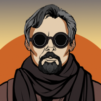
The Change Agent
And now the cropped cover version which I neglected to upload yesterday.
Please Log in or Create an account to join the conversation.

") but I'm not gonna have the chance over the next few days so I may as well post now.
but I'm not gonna have the chance over the next few days so I may as well post now.1: Scribbling The Lines.
2: Waving The Flag.
3: Layering The Face.
4: Shielding The Stars.
And here's the final of Captain BoJo Brexit.
I wasn't sure if you wanted it with or without the template so I'll post both. Same picture underneath though.
Good Luck All.
Please Log in or Create an account to join the conversation.
- SchizophreniaWolf
-
- Offline
- Junior Member
-

- Posts: 170
- Thank you received: 10
yeah, I changed the story a little bit. Just a little background to explay the afgan boy.
some help from mister 3D
cgartnexus.com/index.php/forums/challeng...-wips?start=10#14122
captain's big gun
cgartnexus.com/index.php/forums/challeng...-wips?start=10#14123
Abdul-Aziz has a gun too
cgartnexus.com/index.php/forums/challeng...-wips?start=20#14226
Please Log in or Create an account to join the conversation.

Please Log in or Create an account to join the conversation.
- SchizophreniaWolf
-
- Offline
- Junior Member
-
- Posts: 170
- Thank you received: 10
 : Just great! No wait, there is one thing, some of the text isn't very readable anymore, BUT NOTHING THAT CAN'T BE FIXED!!! You're still my hero...
Please Log in or Create an account to join the conversation.
Another very strong picture from you. It started with the usual well-controlled drawing and then built up gradually, first with those interesting layers of texture, and then with the solid lighting that captures the form of the figure, while at the same time keeping the mysterious darkness of the intriguing surroundings. I do love the composition and the confrontational pose looking straight at us with that well-defined head. The mood reminded me a bit of those old Splinter Cell games where the rugged hero would have to sneak about in near darkness only to occasionally be seen in the angle of a spotlight or the glow of a nearby fire. And that style fits very neatly with this character idea and the backstory you created.
SchizophreniaWolf:
As always, Schizo, great design, wonderful dark weirdness and the depth of a backstory too. Terrific use of 3d here, especially the way you integrated it with your painting style. It all looks completely unified in a way that's very difficult to acheive.
Both characters are well designed and work as an interesting contrast, with the cold metallic mask of the man and the softer, wounded face of the boy, and lovely lighting across that face too, with the warms on one side and the cool on the other, and with that extra bit of blue hitting the eye. Also the way the picture fits around and within the template without obscuring details or text shows that you really understand how this kind of thing works.
Quetzal:
I said it before, but I love the viewpoint here. You have the beginnings of an excellent image and the idea of the TV projecting his shadow on the wall is brilliant, like some couch-potato version of the Batman sign shining back on his own wall instead of the clouds of Gotham.
Tyl:
This was one of my favourites while it was developing. Fantastic painterly textures and brush strokes, just the kind of thing I like. And the muted colours and composition give it the look of a formal yet poignant portrait of an old fallen hero.
Also your final wip looked almost complete to me. I would've accepted that as a final. :nods:
Segujo:
Great depiction of character and personality in this. The face, the pose and the gesture with the gun give me an immediate sense of what kind of hero this guy is even without any other context. As with all unfinished works I've would have loved to see the final.
Em...:
Only a doodle but a great one. Even your quick sketches seem to communicate more than my final pictures. So clean and crisp with such efficient and economic use of colour and line.
And so to choose.
Both the finished works are excellent and if I was commissioning them for a magazine then I'd be happy to hand over good money for both of them. Also seeing all the pictures together made me realise how well they both used high contrast (something I didn't, leaving my pic looking a bit of a midtone washout.)
Hansnomad's picture has fantastic atmosphere and mood while Schizo's has lovely vivid colours while still somehow retaining a creepy darkness.
I think there's really only one thing that separates them and that is the starburst flash of sparks at the left of Schizo's picture. It's a brilliant design trick and it really catches the eye in the way that covers are supposed to.
If all the pictures were covers lined up on a shelf, I think that Captain Petrol would be the one I would look at first and therefore, as the brief is about creating a cover, I have to give that the win.
But ideally, if this was a real magazine then I'd want Schizo's on the cover and Hansnomad's to be an uncropped pull-out poster!
I'd buy that.
Please Log in or Create an account to join the conversation.
SchizophreniaWolf: I loved this one the minute I saw it. It has that comic illustration feel that I always gravitate toward. The uniform design on the character (not to mention the entire character design) was out of this world. When coupled with the lighting and the well chosen design elements like the sparks--you have a winner. My only comment is it would have stood well on it's own without the kid. The kid distracts me from the character. In any case--you get my vote. Well done.
Please Log in or Create an account to join the conversation.

Val: Love the political slant, spot on - as is the characterisation. I agree that some of the text is very difficult to read though.
Hans: As always an excellently drawn image with a great mood, especially loved the pencil version with all the texturing. Though it wouldn't have worked as the cover of a magazine I think that image stood out on its own merits as a beautiful work and I think we lost something with the coloured and cropped version.
Schizo: I agree with Hans' comment regarding the kid, I understand the story behind it and the compositional need but for me (and this may just be my slightly skewed take on things) I feel his inclusion actually softens the image and lends the Star Spangled Ba£$%"d a certain humanity that was missing before. Still an awesome image and a great character.
Though Schizos' image suffered from a little friendly fire in the final stages of the process with the empathy given to the main character with the inclusion of the child figure I still think his answers most closely the brief and works best as a magazine cover so thats where my votes going this month. Gratz!
No smudge tool was harmed in the making of this image.
Please Log in or Create an account to join the conversation.
SchizophreniaWolf
You know I'm going to say congratulations Schizo

Please Log in or Create an account to join the conversation.
Latest Activity


