


The shoutbox is unavailable to non-members
CGAN May 2016 "Fallen" - Final entries
Poll: May 2016 vote (was ended 2016-06-08 00:00:00)
| SchizophreniaWolf |
|
3 | 37.5% |
| hansnomad |
|
2 | 25% |
| Tyl |
|
1 | 12.5% |
| CherryGraphics |
|
1 | 12.5% |
| Valence |
|
1 | 12.5% |
| microscopi |
|
No votes | 0% |
| Total number of voters: 8 ( SchizophreniaWolf, microscopi, oaktree, Atto, CherryGraphics ) See more | |||
| Only registered users can participate to this poll | |||
01 May 2016 19:21 - 08 Jun 2016 09:30 #13721
by Banj
CGAN May 2016 "Fallen" - Final entries was created by Banj
Fallen
Brief: Interpret the title as you wish.
Deadline:Tuesday 31st of May, by midnight GMT VOTING OPEN UNTIL WED 8TH OF JUNE.
This is where you post your final entries. WIPs should be posted over here: cgartnexus.com/index.php/forums/challeng...may-2016-fallen-wips
Challenge rules and guidelines:
cgartnexus.com/index.php/forums/challeng...s/39-challenge-rules
Rules in brief:
WINNER - SchizophreniaWolf :

Brief: Interpret the title as you wish.
Deadline:
This is where you post your final entries. WIPs should be posted over here: cgartnexus.com/index.php/forums/challeng...may-2016-fallen-wips
Challenge rules and guidelines:
cgartnexus.com/index.php/forums/challeng...s/39-challenge-rules
Rules in brief:
- All challenge entries must be your own work.
- You should post at least two WIP images that are clearly different from your final entry and each other.
- Your final entry should contain your image (inserted so it shows up full size) and at least two links to your WIP posts on the forum.
- No chatter in the finals thread – if you have questions, post them in the WIP thread or PM an admin.
- Feedback is allowed & encouraged together with the voting and in the WIP thread.
- Deadline is given in UK time (midnight GMT) with a grace period of 5 minutes for getting the post sorted.
- Each member may cast one vote
- No cheating! Admins may decide to disqualify an entry that does not adhere to the above rules.
WINNER - SchizophreniaWolf :
Last edit: 08 Jun 2016 09:30 by Banj.
Please Log in or Create an account to join the conversation.
- SchizophreniaWolf
-
- Offline
- Junior Member
-

Less
More
- Posts: 170
- Thank you received: 10
30 May 2016 13:13 #13823
by SchizophreniaWolf
Replied by SchizophreniaWolf on topic CGAN May 2016 "Fallen" - Final entries
cgartnexus.com/index.php/forums/challeng...s?limitstart=0#13735
cgartnexus.com/index.php/forums/challeng...-wips?start=10#13749
cgartnexus.com/index.php/forums/challeng...-wips?start=10#13751 (joke :silly: )
cgartnexus.com/index.php/forums/challeng...-wips?start=10#13755
cgartnexus.com/index.php/forums/challeng...-wips?start=30#13798
cgartnexus.com/index.php/forums/challeng...-wips?start=40#13822
Please Log in or Create an account to join the conversation.
31 May 2016 01:15 #13826
by hansnomad
Replied by hansnomad on topic CGAN May 2016 "Fallen" - Final entries
cgartnexus.com/index.php/forums/challeng...-wips?start=20#13779
cgartnexus.com/index.php/forums/challeng...-wips?start=40#13810
cgartnexus.com/index.php/forums/challeng...-wips?start=40#13817
cgartnexus.com/index.php/forums/challeng...-wips?start=40#13824
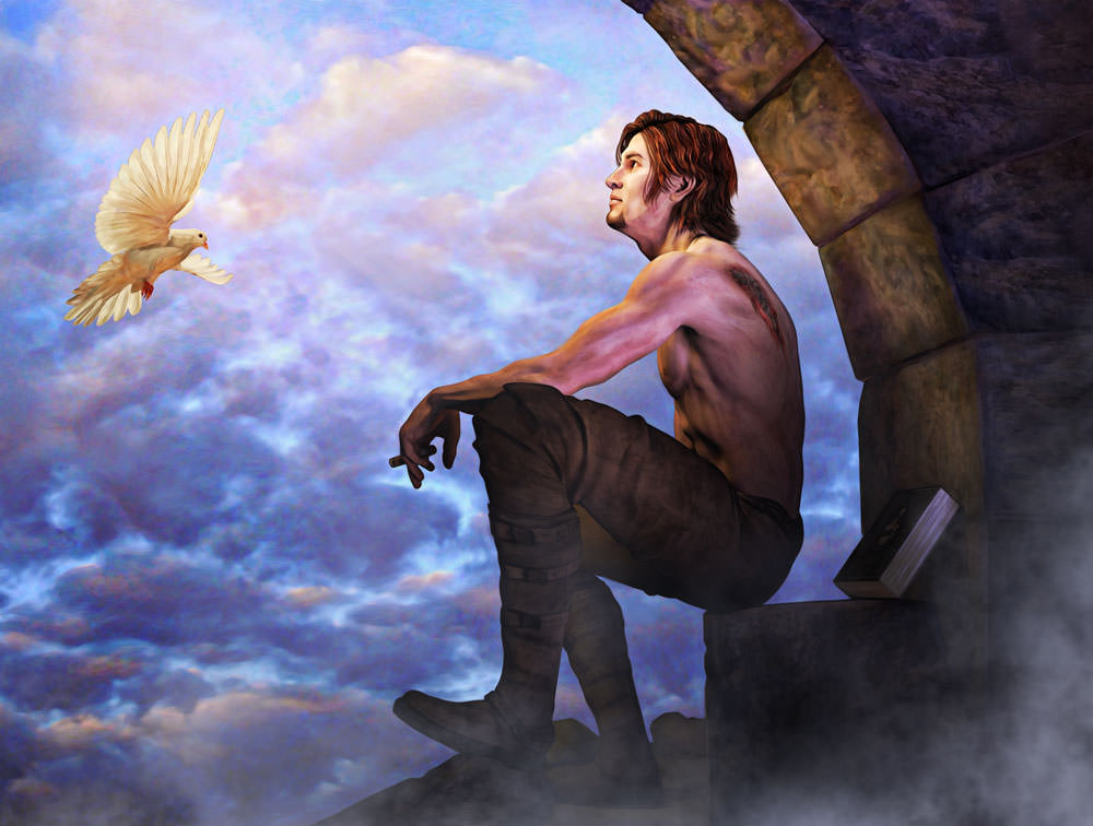
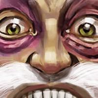
Stayed pretty much the same from concept inception except I added a cigar in his hand and a flying dove. Since the piece has strong religious overtones, I used the symbol of the dove (God) and had the character looking elsewhere for salvation (he is fallen after all). Good luck all--great pieces all around.
cgartnexus.com/index.php/forums/challeng...-wips?start=40#13810
cgartnexus.com/index.php/forums/challeng...-wips?start=40#13817
cgartnexus.com/index.php/forums/challeng...-wips?start=40#13824
Stayed pretty much the same from concept inception except I added a cigar in his hand and a flying dove. Since the piece has strong religious overtones, I used the symbol of the dove (God) and had the character looking elsewhere for salvation (he is fallen after all). Good luck all--great pieces all around.
Please Log in or Create an account to join the conversation.
31 May 2016 09:37 #13827
by Tyl
Replied by Tyl on topic CGAN May 2016 "Fallen" - Final entries
Please Log in or Create an account to join the conversation.
- CherryGraphics
-

- Offline
- Junior Member
-
Less
More
- Posts: 366
- Thank you received: 33
31 May 2016 12:44 - 31 May 2016 12:48 #13828
by CherryGraphics
Replied by CherryGraphics on topic CGAN May 2016 "Fallen" - Final entries
Nice final painting until now 
(It will be hard as always at the end.)
WIP 1 - sketchy
WIP 2 - start in green and blue
WIP 3 - there's always a raven
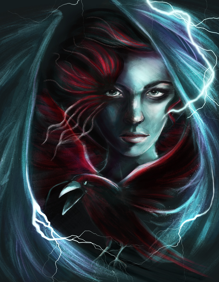
And heres the final Fallen Angel. With lightning and all of these fancy things.
(It will be hard as always at the end.)
WIP 1 - sketchy
WIP 2 - start in green and blue
WIP 3 - there's always a raven
And heres the final Fallen Angel. With lightning and all of these fancy things.
Last edit: 31 May 2016 12:48 by CherryGraphics.
Please Log in or Create an account to join the conversation.

31 May 2016 20:49 - 31 May 2016 20:50 #13830
by Valence
Replied by Valence on topic CGAN May 2016 "Fallen" - Final entries
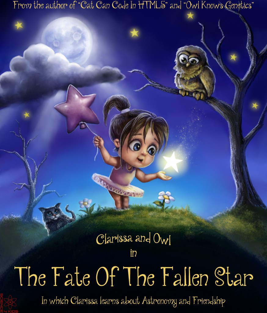
Seeing as everyone else's painting has a darker tone (and recalling that previous challenge where all the pictures were warlike or violent) I thought I'd try something different and go for a cutesy children's book cover.
So turn up the sickly sweetness to the max and get ready to overdose on green eggs and ham!
1: Early Scribbles And Sketches.
2: Fat Fingered Fun.
And
3: Final Version WITH STORY!! (Sorry, I can't help myself sometimes.)
And because this is an art challenge with no extra points for stories (or punishments for bad stories, I hope!) here's the final on it's own.
Good Luck Everyone!
Last edit: 31 May 2016 20:50 by Valence.
Please Log in or Create an account to join the conversation.
- microscopi
-

- Offline
- Premium Member
-

Less
More
- Posts: 743
- Thank you received: 79
01 Jun 2016 00:51 - 01 Jun 2016 00:55 #13831
by microscopi
Replied by microscopi on topic CGAN May 2016 "Fallen" - Final entries
Last edit: 01 Jun 2016 00:55 by microscopi.
Please Log in or Create an account to join the conversation.
01 Jun 2016 08:51 #13835
by Banj
Replied by Banj on topic CGAN May 2016 "Fallen" - Final entries
Nice work guys, voting is now open until the 8th of June. 
Please Log in or Create an account to join the conversation.
02 Jun 2016 01:24 #13838
by Valence
Replied by Valence on topic CGAN May 2016 "Fallen" - Final entries
Another good varied collection. Will be tough to choose.
Schizo:
There must be a global shortage of Epic because you seem to have it all for yourself. It's not fair.
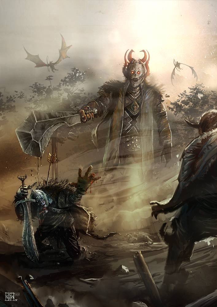
 This is another fantastic pic right up there with your previous ones. The diagonal connecting the two foreground figures creates the expectation of the perspective and to see that sloping scale broken by that huge central figure is awesome and the way he's pushed back by the veils of mist gives everything a massive sense of scale and this is enhanced even more by that suggestion of distant foliage and the creatures flying in the glare of the sky. All the poses are instantly understandable and clearly communicate the situation and the relationships between the figures. And those swords are… (hmm, can I think of a different word? Nope) …epic. That's what they are: Epic!
 ")
I understand your dilemma with the last minute colour choice but it didn't really matter because both versions work just fine for me.
Micro:
Really vibrant colours on this one,all working to give the sense of a harsh, unfamiliar, alien world. I agree with hansnomad, the design of your craft has that Syd Mead style to it and all that texturing is exactly what we've come to expect from your pics.
I mentioned working on the form in the wip thread and that's exactly what you managed to do in just the way I'd hoped. It now has a solid, coherent shape and that deep shadow gives it a good grounding and sense of mass.
I think the change in the craft design did move the pic a little further from the theme but it doesn't really matter when you have a good picture at the end of it all.
CherryGraphics:
An interesting change of style from you and that's always welcome. It's fun to see people try new ideas and it's rewarding when they come off.
The complimentary red/green colour combo always looks good and you didn't lose that excellent moody expression. Keeping those detailed, intense eyes while using bolder, expressive brush strokes elsewhere creates a subtle contrast that suggests a depth of focus as if the character is hiding behind and within the wings.
I like the addition of the lightning. It's well drawn and looks very natural (those wiggling arcs always look contrived and artificial when I do them) and the way you've blended it with the form of the wings is very clever.
I hope you continue to explore these different styles.
Tyl:
The idea of an angel trying to recapture lost feathers is a brilliant depiction of the theme and conjures up lots of other different metaphors for loss, and the ability to provoke those conceptual connections in the viewer is always a sign that you've got a good idea.
The offset X shape of the composition and the viewing angle reinforce that sense of looking down which emphasizes the "fallen" concept, and even though the face is barely visible you can still see and understand her expression. Despite the uncertainties about the anatomy and torso I still think it was acceptable and it gave the impression of her extending and reaching, almost in desperation, for those lost feathers. And I think everyone liked those colours! Great choices!
Hansnomad:
This had a really strong drawing at the start and it continued to get better with each wip. I wasn't sure how you'd go about painting the figure; with flat colours or transparent washes; but I was impressed with the opaque solidity that you brought to it and that added dimension only made the anatomy look better. I like the narrative scar too. The first one was good but the second was even more gruesome! Like something out of a medical textbook. Horrible … in a good way! One minor gripe is the dark (almost black) lower edge to the neck. It gives it a bit of a composited CG, cell-shaded look. A bit of soft glare, reflected/rim light or a bit of subsurface red would help it fit against the background more.
Speaking of which, all the other background elements are well done. The figure would have been good enough on its own but these added features give it a bit more context which suits the theme.
Atto:
Super sad that you didn't finish. I was really enjoying this and it may well have been my winner if you'd kept on. (In fact I would have been cheeky and posted that last wip as a final!) The pose is fantastic and fits the theme perfectly and that bit of metallic armour is very well observed and beautifully rendered. As it is now the pic has a lovely gradient of detail with that fine reflection in the centre and the sparse surroundings at the edges. It reminds me of those moments in films when a major character is about to die and all the noise of the battle fades away to be replaced by tiny incidental noises, the camera fixes on the fallen figure, blurring everyone else, and then a choir somewhere starts singing Adagio in D Minor. Hope you get chance to finish sometime.
And now to pick. Hmm…
(several minutes later...) Hmm… I still keep changing my mind…
(later still…) Finally, as a last resort, I've just been looking at all the pics as thumbnails as well as in detail and the one I think works best at all scales and has complete consistency is…
Schizo. He just has too much Epic.
Schizo:
There must be a global shortage of Epic because you seem to have it all for yourself. It's not fair.
This is another fantastic pic right up there with your previous ones. The diagonal connecting the two foreground figures creates the expectation of the perspective and to see that sloping scale broken by that huge central figure is awesome and the way he's pushed back by the veils of mist gives everything a massive sense of scale and this is enhanced even more by that suggestion of distant foliage and the creatures flying in the glare of the sky. All the poses are instantly understandable and clearly communicate the situation and the relationships between the figures. And those swords are… (hmm, can I think of a different word? Nope) …epic. That's what they are: Epic! I understand your dilemma with the last minute colour choice but it didn't really matter because both versions work just fine for me.
Micro:
Really vibrant colours on this one,all working to give the sense of a harsh, unfamiliar, alien world. I agree with hansnomad, the design of your craft has that Syd Mead style to it and all that texturing is exactly what we've come to expect from your pics.
I mentioned working on the form in the wip thread and that's exactly what you managed to do in just the way I'd hoped. It now has a solid, coherent shape and that deep shadow gives it a good grounding and sense of mass.
I think the change in the craft design did move the pic a little further from the theme but it doesn't really matter when you have a good picture at the end of it all.
CherryGraphics:
An interesting change of style from you and that's always welcome. It's fun to see people try new ideas and it's rewarding when they come off.
The complimentary red/green colour combo always looks good and you didn't lose that excellent moody expression. Keeping those detailed, intense eyes while using bolder, expressive brush strokes elsewhere creates a subtle contrast that suggests a depth of focus as if the character is hiding behind and within the wings.
I like the addition of the lightning. It's well drawn and looks very natural (those wiggling arcs always look contrived and artificial when I do them) and the way you've blended it with the form of the wings is very clever.
I hope you continue to explore these different styles.
Tyl:
The idea of an angel trying to recapture lost feathers is a brilliant depiction of the theme and conjures up lots of other different metaphors for loss, and the ability to provoke those conceptual connections in the viewer is always a sign that you've got a good idea.
The offset X shape of the composition and the viewing angle reinforce that sense of looking down which emphasizes the "fallen" concept, and even though the face is barely visible you can still see and understand her expression. Despite the uncertainties about the anatomy and torso I still think it was acceptable and it gave the impression of her extending and reaching, almost in desperation, for those lost feathers. And I think everyone liked those colours! Great choices!
Hansnomad:
This had a really strong drawing at the start and it continued to get better with each wip. I wasn't sure how you'd go about painting the figure; with flat colours or transparent washes; but I was impressed with the opaque solidity that you brought to it and that added dimension only made the anatomy look better. I like the narrative scar too. The first one was good but the second was even more gruesome! Like something out of a medical textbook. Horrible … in a good way! One minor gripe is the dark (almost black) lower edge to the neck. It gives it a bit of a composited CG, cell-shaded look. A bit of soft glare, reflected/rim light or a bit of subsurface red would help it fit against the background more.
Speaking of which, all the other background elements are well done. The figure would have been good enough on its own but these added features give it a bit more context which suits the theme.
Atto:
Super sad that you didn't finish. I was really enjoying this and it may well have been my winner if you'd kept on. (In fact I would have been cheeky and posted that last wip as a final!) The pose is fantastic and fits the theme perfectly and that bit of metallic armour is very well observed and beautifully rendered. As it is now the pic has a lovely gradient of detail with that fine reflection in the centre and the sparse surroundings at the edges. It reminds me of those moments in films when a major character is about to die and all the noise of the battle fades away to be replaced by tiny incidental noises, the camera fixes on the fallen figure, blurring everyone else, and then a choir somewhere starts singing Adagio in D Minor.
Hope you get chance to finish sometime.And now to pick. Hmm…
(several minutes later...) Hmm… I still keep changing my mind…
(later still…) Finally, as a last resort, I've just been looking at all the pics as thumbnails as well as in detail and the one I think works best at all scales and has complete consistency is…
Schizo. He just has too much Epic.
Please Log in or Create an account to join the conversation.
- CherryGraphics
-
- Offline
- Junior Member
-
Less
More
- Posts: 366
- Thank you received: 33
03 Jun 2016 05:55 #13842
by CherryGraphics
Replied by CherryGraphics on topic CGAN May 2016 "Fallen" - Final entries
And it's always like "YAY Valence said something to everyone. ...I don't know what I should say. Okay, just vote, it is all said."
well okay.. a few words from me
Schizo - yours is my favorite. I love your style and the scene (and the joke in the WIP-thread^^) and all of the small details.
hans - nice rendering of the picture! the figure of the man is really well drawn and the white dove is nice too just have a little problem with the feeling of the picture.. It all seems like it doesn't belong to each other. I really don't know if I can explain it right. They all seem to be put together in a frame but don't belonging to one scene. Maybe you understand it. 
tyl - i really like the handmade look from your picture, it has so much structure! the pose is also really special and well drawn.
Val - nice one! it's funny. As everyone says I have a typical style - you too have! the girls face looks exactly like a Valence-drawn-face. although she looks older than she should be. maybe it depends on the shadows on her face. but i love the idea of the book illustration and the owl and the kitty are too cute <3
micro - well... I admit I didn't followed the WIP-thread the most this time so I have a liiittle problem of understanding the picture, but nevertheless it looks like a good picture. Love the vibrant colors and - again - the structure - a lot
...AND:
What Val said.
well okay.. a few words from me
Schizo - yours is my favorite. I love your style and the scene (and the joke in the WIP-thread^^) and all of the small details.
hans - nice rendering of the picture! the figure of the man is really well drawn and the white dove is nice too
just have a little problem with the feeling of the picture.. It all seems like it doesn't belong to each other. I really don't know if I can explain it right. They all seem to be put together in a frame but don't belonging to one scene. Maybe you understand it. tyl - i really like the handmade look from your picture, it has so much structure! the pose is also really special and well drawn.
Val - nice one! it's funny. As everyone says I have a typical style - you too have! the girls face looks exactly like a Valence-drawn-face.
although she looks older than she should be. maybe it depends on the shadows on her face. but i love the idea of the book illustration and the owl and the kitty are too cute <3 micro - well... I admit I didn't followed the WIP-thread the most this time so I have a liiittle problem of understanding the picture, but nevertheless it looks like a good picture. Love the vibrant colors and - again - the structure - a lot
...AND:
What Val said.
The following user(s) said Thank You: Tyl
Please Log in or Create an account to join the conversation.
Latest Activity

Banj updated their profile picture


Charlotte Still wearing a mask? Is it so we won't see you hoarding food in those cheeks of yours?
See More
Banj Mfmuh Guhmfpf
See More
Charlotte I'll take that as a yes...
See More
Charlotte Why is there a tiny flashing thing in front of the reply link/button? It's so small I can't see if it's an exclamation mark or a question mark... or...both?)
See More
Banj Because? Both!
See More
Charlotte *gasp*
See More

CaptainDeth updated their profile picture

CaptainDeth Ahoy folks, just a newbie here, just getting started. Thanks for allowing me in.
CaptainDeth Thank You
CaptainDeth and Mr.Bungle joined the site


honbasic joined the site


Gawk joined the site