


The shoutbox is unavailable to non-members
CGAN April 2016 - Discworld - Final entries
Poll: April Voting (was ended 2016-05-08 00:00:00)
| Valence |
|
3 | 50% |
| segujo |
|
2 | 33.3% |
| microscopi |
|
1 | 16.7% |
| Total number of voters: 6 ( oaktree, microscopi, Atto, CherryGraphics, segujo ) See more | |||
| Only registered users can participate to this poll | |||
01 Apr 2016 10:09 - 13 May 2016 09:30 #13615
by Banj
CGAN April 2016 - Discworld - Final entries was created by Banj
Discworld
Brief: This months challenge was taken from the discussion in the suggestions thread and was designed by Bloody Stupid Johnson. Depict a scene, character, shopping trolley (PLOP!), or anything else from Terry Pratchett's series of Discworld novels.
Deadline:Saturday 30th of April, by midnight GMT. VOTING OPEN UNTIL 8TH OF MAY.
This is where you post your final entries. WIPs should be posted over here: cgartnexus.com/index.php/forums/challeng...discworld-wips#13616
Challenge rules and guidelines:
cgartnexus.com/index.php/forums/challeng...s/39-challenge-rules
Rules in brief:
WINNER - VALENCE

Brief: This months challenge was taken from the discussion in the suggestions thread and was designed by Bloody Stupid Johnson. Depict a scene, character, shopping trolley (PLOP!), or anything else from Terry Pratchett's series of Discworld novels.
Deadline:
This is where you post your final entries. WIPs should be posted over here: cgartnexus.com/index.php/forums/challeng...discworld-wips#13616
Challenge rules and guidelines:
cgartnexus.com/index.php/forums/challeng...s/39-challenge-rules
Rules in brief:
- All challenge entries must be your own work.
- You should post at least two WIP images that are clearly different from your final entry and each other.
- Your final entry should contain your image (inserted so it shows up full size) and at least two links to your WIP posts on the forum.
- No chatter in the finals thread – if you have questions, post them in the WIP thread or PM an admin.
- Feedback is allowed & encouraged together with the voting and in the WIP thread.
- Deadline is given in UK time (midnight GMT) with a grace period of 5 minutes for getting the post sorted.
- Each member may cast one vote
- No cheating! Admins may decide to disqualify an entry that does not adhere to the above rules.
WINNER - VALENCE
Last edit: 13 May 2016 09:30 by Banj.
Please Log in or Create an account to join the conversation.

27 Apr 2016 22:46 #13713
by Valence
Replied by Valence on topic CGAN April 2016 - Discworld - Final entries
A bit early with days to spare but I have nothing more to add to this and I'm halfway into something else, so it's time to dump it.
1: Scribbly Old Man.
2: Mismatched Hands.
And finally with a different background to make the character pop a bit more (wish I'd done them on separate layers!)...
Cohen The Barbarian struggling with a bit of sciatica!
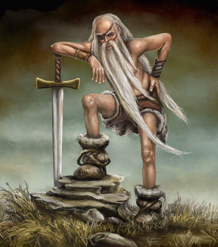
Good Luck to everyone. And I hope there is an everyone this month!
1: Scribbly Old Man.
2: Mismatched Hands.
And finally with a different background to make the character pop a bit more (wish I'd done them on separate layers!)...
Cohen The Barbarian struggling with a bit of sciatica!
Good Luck to everyone. And I hope there is an everyone this month!
Please Log in or Create an account to join the conversation.
29 Apr 2016 17:07 - 29 Apr 2016 17:10 #13715
by segujo
Replied by segujo on topic CGAN April 2016 - Discworld - Final entries
Last edit: 29 Apr 2016 17:10 by segujo.
Please Log in or Create an account to join the conversation.
- microscopi
-

- Offline
- Premium Member
-

Less
More
- Posts: 743
- Thank you received: 79
30 Apr 2016 22:33 - 30 Apr 2016 22:39 #13718
by microscopi
Replied by microscopi on topic CGAN April 2016 - Discworld - Final entries
 I really changed it up, was trying to add as much detail as I could and keep it clean. I hope it didn't overdue it with all the pink!!
Last edit: 30 Apr 2016 22:39 by microscopi.
Please Log in or Create an account to join the conversation.
01 May 2016 19:14 #13720
by Banj
Replied by Banj on topic CGAN April 2016 - Discworld - Final entries
Voting is now open, let rip with the votes of er, voting.
Please Log in or Create an account to join the conversation.
01 May 2016 22:53 #13724
by Valence
Replied by Valence on topic CGAN April 2016 - Discworld - Final entries
Micro:
I really like the use of colour in this pic. They're really vibrant and saturated, and yet they still look completely unified, and the foreground silhouette contrasts nicely against this and balances the whole composition.
I also think the density of the detailing is very well integrated throughout all the image. It's often hard to maintain that consistency when using different ideas and references but here you've got just the right amount of visual information to keep the eye interested and move the gaze around the picture without leaving any vacant gaps or awkward transitions..
I think I preferred the sparkly water version as the train is bit more of a thematic contrast but I think the strong horizontals of the tracks do help to increase the depth of the landscape.
Segujo:
I love the design of your old hag of a witch! It's classic and immediately recognisable, I can almost hear her brittle, cackling laugh as she chants out some kind of spell. The little cat is also appropriate to the character and you've also captured that feline indifference to the magic that's going on around.
You may have kept the picture dark but the final subtle changes made a noticeable, positive difference. The glow from the "orb" gives the picture a radial gradient to the composition rather than the flat darkness that was in the previous version. And finally the way this light hits the old woman's hands is very impressive and is my favourite part of the picture.
And because of all that, and the excellent colour application, this one gets my vote this month.
Well Done!
Cherry:
There you go again, teasing us with another sketch.") This character seemed perfect for your style and skills. Shame that you didn't get the time for more.
This character seemed perfect for your style and skills. Shame that you didn't get the time for more.
Atto:
The character montage was a great idea and the way you set it out gave it that perfect film-poster/book-cover style. All the individual portraits were coming along fine and I know you would have pulled that one off given the time.
And that's my rambling done for the month. Time to click the vote button...
I really like the use of colour in this pic. They're really vibrant and saturated, and yet they still look completely unified, and the foreground silhouette contrasts nicely against this and balances the whole composition.
I also think the density of the detailing is very well integrated throughout all the image. It's often hard to maintain that consistency when using different ideas and references but here you've got just the right amount of visual information to keep the eye interested and move the gaze around the picture without leaving any vacant gaps or awkward transitions..
I think I preferred the sparkly water version as the train is bit more of a thematic contrast but I think the strong horizontals of the tracks do help to increase the depth of the landscape.
Segujo:
I love the design of your old hag of a witch! It's classic and immediately recognisable, I can almost hear her brittle, cackling laugh as she chants out some kind of spell. The little cat is also appropriate to the character and you've also captured that feline indifference to the magic that's going on around.
You may have kept the picture dark but the final subtle changes made a noticeable, positive difference. The glow from the "orb" gives the picture a radial gradient to the composition rather than the flat darkness that was in the previous version. And finally the way this light hits the old woman's hands is very impressive and is my favourite part of the picture.
And because of all that, and the excellent colour application, this one gets my vote this month.
Well Done!
Cherry:
There you go again, teasing us with another sketch.
This character seemed perfect for your style and skills. Shame that you didn't get the time for more.Atto:
The character montage was a great idea and the way you set it out gave it that perfect film-poster/book-cover style. All the individual portraits were coming along fine and I know you would have pulled that one off given the time.
And that's my rambling done for the month. Time to click the vote button...
Please Log in or Create an account to join the conversation.
02 May 2016 10:46 #13725
by segujo
Replied by segujo on topic CGAN April 2016 - Discworld - Final entries
All cred to Valence for the vast analysis!
I will just add some small personal comments on the completed paintings.
Micro:
Your use of color really makes me happy. I get a view of a sunny day and I would like to run barefoot among the flowers.") I also like the sky and the atmosphereic depth.
I also like the sky and the atmosphereic depth.
Suggestions:
I think the lightning is both a strength and a weakness in your picture. Over all thats what 'makes' the piece, but I also find the lighting rather confusing in some places. Why is the foreground so dark? And are the underside of the mushrooms glowing? I also think that the motive/story is a little confuing. Maybe thats your purpose? The contrast between the natural mushroom houses and the metallic constructions and the train in the background.
Valence:
I like the story. the old barbarian trying to keep up dispite a sour back. I also like your color sheme and how you work with lights. I like your solution for the stone and the grass. And you really nailed those hands!!!
Suggestions:
I believe there are some small anatomic issues in your pic. I think the front leg beneath teh knee should have a bend outwards. I get a notion that he has two left legs.also the arm he leans towards his sword... it looks like it has a tension from the sharp elbow angle and still the hand is completely relaxed.
Anyway.
My vote will go to Valence this time.
I think both of you did a really great job!
I will just add some small personal comments on the completed paintings.
Micro:
Your use of color really makes me happy. I get a view of a sunny day and I would like to run barefoot among the flowers.
I also like the sky and the atmosphereic depth.Suggestions:
I think the lightning is both a strength and a weakness in your picture. Over all thats what 'makes' the piece, but I also find the lighting rather confusing in some places. Why is the foreground so dark? And are the underside of the mushrooms glowing? I also think that the motive/story is a little confuing. Maybe thats your purpose? The contrast between the natural mushroom houses and the metallic constructions and the train in the background.
Valence:
I like the story. the old barbarian trying to keep up dispite a sour back. I also like your color sheme and how you work with lights. I like your solution for the stone and the grass. And you really nailed those hands!!!
Suggestions:
I believe there are some small anatomic issues in your pic. I think the front leg beneath teh knee should have a bend outwards. I get a notion that he has two left legs.also the arm he leans towards his sword... it looks like it has a tension from the sharp elbow angle and still the hand is completely relaxed.
Anyway.
My vote will go to Valence this time.
I think both of you did a really great job!
Please Log in or Create an account to join the conversation.
- SchizophreniaWolf
-
- Offline
- Junior Member
-

Less
More
- Posts: 170
- Thank you received: 10
02 May 2016 19:28 #13726
by SchizophreniaWolf
Replied by SchizophreniaWolf on topic CGAN April 2016 - Discworld - Final entries
Valence: you get my vote. Funny, intresting character, nice pose. Only the sword has a poor design and looks a bit more painted digitally then the rest of the paint. But anyway... you win.
segujo: I like it, it has this cute style. But somehow it doesn't look finished, maybe it the absence of a lightsource in your enviroment, ... anyway nice and fun.
microscopi: man you are getting better and better everytime I see something by you. But now why I didn't vote for you, and people probably might think I'm a weardo, but the gills of the mushrooms aren't painted correctly enouge. Next time use a picture as reference, because it bugs my to mush(rooms)!
Please Log in or Create an account to join the conversation.
- CherryGraphics
-

- Offline
- Junior Member
-
Less
More
- Posts: 366
- Thank you received: 33
03 May 2016 13:16 #13728
by CherryGraphics
Replied by CherryGraphics on topic CGAN April 2016 - Discworld - Final entries
Yepp shame on me, I know Val! Was a hard time but now I'm able to paint more I guess.
so ... voting time, hm?
micro: I love the look of your painting, it's all bright and clear and shimmery ... and I like all those tiny flowers and details a lot!
val: as always a great character painting! love the pose and all of those strong muscles (I know it's an old man... xD ) and of course the traditional feeling of the painting is awesome. so... you get my vote.
segujo: I looooved the scribble of the painting! really it had all it needed. But something has lost between the sketch and the final painting. Maybe it's the missing light source or .. I really can't name it. But this "problem" I recognize sometimes. When the sketch is too detailed I have a lot of problems to understand the final painting right because there's just another feeling to it. It's not your fault of course.
Please Log in or Create an account to join the conversation.

03 May 2016 22:37 #13729
by Atto
No smudge tool was harmed in the making of this image.
Replied by Atto on topic CGAN April 2016 - Discworld - Final entries
Hey all!
So annoyed I didn't get to finish my entry but a ton of work was dropped on my lap right before the deadline - must do better next month!
So Val: A very nice rendition of one of the coolest characters to emerge from the mind of the great TP. I think the canvas effect to the texture is well used here and as with many of your character portraits you hit the likeness and capture the essence of the character very well.
Seg: I have no problem at all with dark images, I think you are almost there with the balance of light/dark in your entry and I really enjoy the personality you have suggested in the cat. A few more tweaks with the brightness would have taken this image to 'the next level' and I think that may be what Schizo and Cherry are describing when they say it looks a little unfinished.
Micro: Dude! Where the f&^% did that idea come from? I think you may have just justified the whole notion that ignorance can sometimes be bliss. I often shy away from producing images because I know little or nothing of the source material but this entry is such a crazy and unique take on the theme I'm currently rethinking my reluctance. Sure it's weird but weird can be good, hell it can be great! I love this strange mix of cutesy fantasy and sci-fi. I agree with Schizos point about the gills but you still get my vote =)
No smudge tool was harmed in the making of this image.
Please Log in or Create an account to join the conversation.
Latest Activity

Banj updated their profile picture


Charlotte Still wearing a mask? Is it so we won't see you hoarding food in those cheeks of yours?
See More
Banj Mfmuh Guhmfpf
See More
Charlotte I'll take that as a yes...
See More
Charlotte Why is there a tiny flashing thing in front of the reply link/button? It's so small I can't see if it's an exclamation mark or a question mark... or...both?)
See More
Banj Because? Both!
See More
Charlotte *gasp*
See More

CaptainDeth updated their profile picture

CaptainDeth Ahoy folks, just a newbie here, just getting started. Thanks for allowing me in.
CaptainDeth Thank You
CaptainDeth and Mr.Bungle joined the site


honbasic joined the site


Gawk joined the site