


oops 


I think they're moving in a circle... possibly around an easy prey of some sort, like a hamster... 
The shoutbox is unavailable to non-members
Shoutbox History
oops
I think they're moving in a circle... possibly around an easy prey of some sort, like a hamster...
CGAN Feb 2016 - Life on Mars - Finals
Poll: Voting time (was ended 2016-03-08 00:00:00)
| Nalo_does_art1 |
|
1 | 14.3% |
| Atto |
|
No votes | 0% |
| SchizophreniaWolf |
|
2 | 28.6% |
| Valence |
|
1 | 14.3% |
| microscopi |
|
3 | 42.9% |
| Total number of voters: 7 ( oaktree, microscopi, Nalo_does_art1, SchizophreniaWolf, Valence ) See more | |||
| Only registered users can participate to this poll | |||
Brief: Open brief, interpret the title into some visual masterpiece.
Deadline: Monday 29th of February, by midnight GMT.
This is where you post your final entries. WIPs should be posted over here: cgartnexus.com/index.php/forums/challeng...e-on-mars-wips#13254
Challenge rules and guidelines:
cgartnexus.com/index.php/forums/challeng...s/39-challenge-rules
Rules in brief:
- All challenge entries must be your own work.
- You should post at least two WIP images that are clearly different from your final entry and each other.
- Your final entry should contain your image (inserted so it shows up full size) and at least two links to your WIP posts on the forum.
- No chatter in the finals thread – if you have questions, post them in the WIP thread or PM an admin.
- Feedback is allowed & encouraged together with the voting and in the WIP thread.
- Deadline is given in UK time (midnight GMT) with a grace period of 5 minutes for getting the post sorted.
- Each member may cast one vote
- No cheating! Admins may decide to disqualify an entry that does not adhere to the above rules.
Winner = microscopi
Please Log in or Create an account to join the conversation.
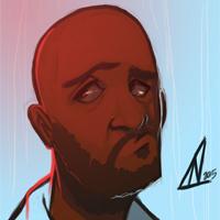
- Nalo_does_art1
-
- Offline
- New Member
-

- Posts: 6
- Thank you received: 2
")
I can't wait to see the other submission!
And here is my WIPS:
Link 1: cgartnexus.com/index.php/forums/challeng...-wips?start=40#13369
Link 2:
cgartnexus.com/index.php/forums/challeng...-wips?start=50#13378
Please Log in or Create an account to join the conversation.

Wips Wip 1
Wip 2
And the final:
Here's the colour one in case anyone's interested: Colour Version
No smudge tool was harmed in the making of this image.
Please Log in or Create an account to join the conversation.
- SchizophreniaWolf
-
- Offline
- Junior Member
-

- Posts: 170
- Thank you received: 10
Please Log in or Create an account to join the conversation.

2: Planet Panels.
3: "You Are Well-Come."
4: Less Confusing Layout.
5: Caption Competition.
And finally...
And yes, there's probably too much text and I had to make it a little too big to be readable at this resolution.

Good Luck All!
Please Log in or Create an account to join the conversation.
- microscopi
-

- Offline
- Premium Member
-

- Posts: 743
- Thank you received: 79
 I think that's an awesome story Val, you could start a comic base on just that!
  I didn't have time to put as much detail in mine (the forground rocks etc. or a character) but i'm happy with how it turned out.
Please Log in or Create an account to join the conversation.
Please Log in or Create an account to join the conversation.
- CherryGraphics
-

- Offline
- Junior Member
-
- Posts: 366
- Thank you received: 33
Congrats to all of you who finished in time with this short month. Sadly I didn't have the time to finish mine or to work on it just a bit
 But I guess this is just better for you

micro: this is just what fits you
 great epic scale and landscape, nice texturing and the bright colors are wonderfully placed. I like the story behind, where is water, there is life (sounds kind of stupid in my ear when I read this. xD ).
Val: good idea for the start of a "star wars epic" comic I think.
Unfortunately the resolution is a bit too less for my desktop here (at work) so it's a bit hard to read it but the comic is readable as itself like the style a lot!Schizo: as I said, this is just great. I love the idea of the horn-monster or whatever it should be. and it looks so different from the normal alien-stuff. Reminds me a bit on big final fantasy monsters...
atto: nice idea to give your image the style of a magazine cover! looks like a great ancient temple ruin what you created there. and the shimmery light at the bottom is a nice touch to think about. Maybe it would help to darken the place around the white headline a bit at the left bottom.
nalo: also a nice idea to have an alien pinup girl
And I love the typical font in there a lot You have a great style and I really hope you'll be with us for a longer time and now the oscar goes tooooo ..... LEONAR.... eeeeh... nope. Wait. *cough ....
Schizo. Just because. (But hey it was a very hard decision)
Please Log in or Create an account to join the conversation.
Micro: Beautiful textures and lighting again this month, a strong composition too. Very on theme with the constant and conflicting reports of possible evidence being found on Mars that water once existed there.
Val: Excellent layout and an easily read progression through yours sells the idea very well. A well thought out final reveal too.
Schizo: Such an epic sense of scale and a beautifully rendered creature. You say so much with such (a perceived) ease.
Nalo: A (worryingly) attractive alien pin-up and you have the style of this sort of poster spot on in terms of colour,design and font. I only just noticed those small figures near your monster (the two facing it down with their arms in the air and the third hightailing it outta there)!
For this reason you get my vote this month.
Hope to see you partake in future challenges.
No smudge tool was harmed in the making of this image.
Please Log in or Create an account to join the conversation.
Atto:
It was interesting watching this develop as you slowly worked out the best way to present your idea, testing out different angles and compositions. And you settled on the right one in the end. There are a lot of very complicated forms and structures here but you render them in a way that makes the space, and the story it tells, completely understandable. The wordplay that connects to the magazine is a clever idea and it left you with one of those final choices that I don't envy… Black and white or colour? The black and white image definitely works best as the magazine cover, it looks really authentic and fits perfectly with the text. But I also like the colour version as this really sells the identity of the Mars location and adds a bit of intrigue with the different coloured light, although all this would overpower the text and logo. It's always tough to pick between final versions, I hate doing it and I kind of envy professional artists who usually have an art director to make some of the difficult decisions. I still can't pick which I prefer but you should certainly be pleased with both of them. I know I would be.
Nalo:
This is a very successful painting. You set yourself a challenge to match the pin-up style and the poster/postcard look and you hit every target. I really love the main figure, especially the face, it has such a painterly quality to it with loose expressive brushstrokes but it still retains the necessary detail to demonstrate the mood. The Shai-Hulud sandworm is an excellent background detail that contrasts well in tone against the foreground and I love the depth you've got inside that scary mouth. The final touch is the added paper textures and creases that give it all a recognisable context and age. It really does look exactly like the kind of advert that you were aiming for. Well Done!
Microscopi:
Even though you did your usual change-ups throughout the month there was a consistent theme through all of your efforts, and that was a really good depiction of light. Every single version had an intriguing glow to it that pulled you in and made you wonder about what exactly was there in that mysterious glare. Adding to that, the final image has some terrific foreground rocks, and that sweeping arc of the ridge that swings you into the landscape is another epic piece of work. As Cherry said, the final addition of water connects the image to the "Life" in the title and the underlying bloom of light has a bio-luminescent quality that makes you think that there really is something alive down there!
Schizo:
Another expert piece of professional work from you. I think that whenever you step into the forum everyone puts their pen down for a moment to see what wonders you're going to do.
And this is awesome. The picture has such scale to it, in dimension, depth and mass, and yet it's done in such a subtle, almost understated, way. The creature design is brilliant and original and wouldn't look out of place in a blockbuster movie. It makes me think of the game Shadow Of The Colossus with its huge, majestic creatures, and I want to move in close to get a better look, to feel the ground shake and hear the deafening noise.
One minor distraction is the tangent where the point of the distant ridge coincides with the back of the creature, although I didn't spot it until the final image. But I think the difference in contrast is just enough to separate the two things and so it doesn't stop the image from being anything other than brilliant.
Cherry:
I really love the idea of a telescope view of Mars, being a bit of an astronomy geek it obviously appeals to me and also creates a nice circular framed composition. All the elements were there for a great picture but I know you've been busy moving to a new home. So get yourself comfortable and settled in, and save your great ideas for another day.
")
Kodabble:
Awesome drawing. Early on I thought about doing one of those Mars rovers and I immediately abandoned the idea because they're just so hard to draw. Yet you've done it perfectly! And not only that, you've also made something that's technical and mechanical fit seamlessly in with the character and personality of your Martian family. I just don't know how you've done that! Amazing. It would have been fantastic in colour too!
Oaktree:
Even with your failing Wacom problems, that pic still looks good enough to have been in the finals. You should have posted it (I would have.)
I think you've controlled the light very well in this image. From the bright glare on the white space suits, that lovely warm shadowy area in the centre at the bottom and then the specular shine on the metallic ship: it all creates a unified mood that makes for a convincing, believable environment. I also like the work on the rocks, both in the detailing and the use of varied saturation to sculpt the form in subtle ways.
And my vote? Hmmm…
I think Nalo was really close to a first time win with a first time entry (I DO love that face) but it's hard to go against Schizo when he brings out the big guns. The extra polish, the crisp, confident edges and consistent overall detail mean that my monthly winner (just!) is … SchizophreniaWolf!
Please Log in or Create an account to join the conversation.
Latest Activity


