


The shoutbox is unavailable to non-members
CGAN November 2015 - Dragon Slayer - Final entries
Poll: Who's Da Dragon Slayah!? :P (was ended 2015-12-15 00:00:00)
| cgmythology |
|
2 | 33.3% |
| microscopi |
|
4 | 66.7% |
| Total number of voters: 6 ( oaktree, Atto, CherryGraphics, Valence, Charlotte ) See more | |||
| Only registered users can participate to this poll | |||
01 Nov 2015 09:13 - 15 Dec 2015 13:20 #12725
by Banj
CGAN November 2015 - Dragon Slayer - Final entries was created by Banj
Dragon Slayer
Brief: This is an open theme to create something sci-fi or fantasy themed based on the title.
Deadline: Monday 30th of November, by midnight GMT.
This is where you post your final entries. WIPs should be posted over here: cgartnexus.com/index.php/forums/challeng...on-slayer-wips#12724
Challenge rules and guidelines:
cgartnexus.com/index.php/forums/challeng...s/39-challenge-rules
Rules in brief:
First vote results:
Atto 2
cgmythology 3
CherryGraphics 0
oaktree 0
microscopi 3
Final winner microscopi
Brief: This is an open theme to create something sci-fi or fantasy themed based on the title.
Deadline: Monday 30th of November, by midnight GMT.
This is where you post your final entries. WIPs should be posted over here: cgartnexus.com/index.php/forums/challeng...on-slayer-wips#12724
Challenge rules and guidelines:
cgartnexus.com/index.php/forums/challeng...s/39-challenge-rules
Rules in brief:
- All challenge entries must be your own work.
- You should post at least two WIP images that are clearly different from your final entry and each other.
- Your final entry should contain your image (inserted so it shows up full size) and at least two links to your WIP posts on the forum.
- No chatter in the finals thread – if you have questions, post them in the WIP thread or PM an admin.
- Feedback is allowed & encouraged together with the voting and in the WIP thread.
- Deadline is given in UK time (midnight GMT) with a grace period of 5 minutes for getting the post sorted.
- Each member may cast one vote
- No cheating! Admins may decide to disqualify an entry that does not adhere to the above rules.
First vote results:
Atto 2
cgmythology 3
CherryGraphics 0
oaktree 0
microscopi 3
Final winner microscopi
Last edit: 15 Dec 2015 13:20 by Banj.
Please Log in or Create an account to join the conversation.

28 Nov 2015 21:01 - 28 Nov 2015 21:04 #12878
by Atto
No smudge tool was harmed in the making of this image.
Replied by Atto on topic CGAN November 2015 - Dragon Slayer - Final entries
Had a huge pile of fun on this challenge even if I did have a few false starts. Anyway here it is:
Wip 1
Errr... Wip 1 Take 2
Oooh! what about this?... Wip 1 Take 3
Yeah this one definitly.
And the final(ish) version.
Good Luck all!
Wip 1
Errr... Wip 1 Take 2
Oooh! what about this?... Wip 1 Take 3
Yeah this one definitly.
And the final(ish) version.
Good Luck all!
No smudge tool was harmed in the making of this image.
Last edit: 28 Nov 2015 21:04 by Atto.
Please Log in or Create an account to join the conversation.
- cgmythology
-

- Offline
- Senior Member
-

29 Nov 2015 22:33 - 29 Nov 2015 22:35 #12887
by cgmythology
Replied by cgmythology on topic CGAN November 2015 - Dragon Slayer - Final entries
Here's my entry for the challenge, special thanks to everyone who helped me out with this one, very much appreciate it. Good luck to everyone!
WIP: cgartnexus.com/index.php/forums/challeng...slayer-wips?start=40

WIP: cgartnexus.com/index.php/forums/challeng...slayer-wips?start=40
Last edit: 29 Nov 2015 22:35 by cgmythology.
Please Log in or Create an account to join the conversation.
- CherryGraphics
-

- Offline
- Junior Member
-

Less
More
- Posts: 366
- Thank you received: 33
30 Nov 2015 10:04 #12893
by CherryGraphics
Replied by CherryGraphics on topic CGAN November 2015 - Dragon Slayer - Final entries
It was a pleasure  ! Good luck to all
 ")
WIP 1 - first steps
WIP 2 - white, fluffy hair
WIP 3 - half alive, half tattoo *phew
WIP 4 - the samurai
! Good luck to all WIP 1 - first steps
WIP 2 - white, fluffy hair
WIP 3 - half alive, half tattoo *phew
WIP 4 - the samurai
Please Log in or Create an account to join the conversation.
30 Nov 2015 21:02 - 30 Nov 2015 21:36 #12899
by oaktree
Replied by oaktree on topic CGAN November 2015 - Dragon Slayer - Final entries
Last edit: 30 Nov 2015 21:36 by oaktree.
Please Log in or Create an account to join the conversation.
- microscopi
-

- Offline
- Premium Member
-

Less
More
- Posts: 743
- Thank you received: 79
30 Nov 2015 21:17 - 30 Nov 2015 21:20 #12900
by microscopi
Replied by microscopi on topic CGAN November 2015 - Dragon Slayer - Final entries
 Good luck guys
Last edit: 30 Nov 2015 21:20 by microscopi.
Please Log in or Create an account to join the conversation.

01 Dec 2015 19:36 #12920
by Valence
Replied by Valence on topic CGAN November 2015 - Dragon Slayer - Final entries
Atto:
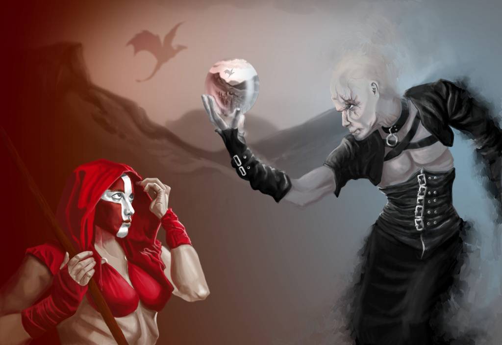
You said you don't like doing faces but I don't know why, there's some great work in the expressions here. I like the way you changed your mind but always learnt something from each stage, and kept the best bits to use as a new starting point to create a genuine evolution of a concept.
The split colour scheme offers a great way to distinguish between the characters and to express their differences with the warm and cool contrasts and also in the differing ways they blend into their backgrounds, one with colour and the other with those well-used painterly strokes. Even though I suggested some rim light I didn't want you to lose that, it was more a question of dimension and form. Pictures can sometimes look a little flat when edges disappear into similar colours but there's enough shape in the hood to compensate for this.
The best part of this picture for me is the sense of narrative with the pose and stature of the characters, the crystal ball and its inner environment and then the ominous dragon. They all link together to form the points from which the viewer can weave a story of their own.
Oaktree:
I love the action in this. You can see the physical effort of the horse and the aggression of the rider with his hair blowing behind him to show the speed and movement while the spear points you towards that distant dragon. The distant buildings are very nicely done with minimal suggestive strokes and the ship with its subtle reflection and that little glow of light (repeated in the castle) describes a bit of life still hanging on amid the raining fire and smoke that together show the layers and depth of the landscape. Although I do like the dragon I kinda wish you'd had it facing the other way (I think an earlier wip had it that way?) Having the horse, the slayer, his spear and the dragon all facing to the right tends to guide your eye out of the picture. It's always good to have the last object/character facing back in to the image to point the gaze to something else and keep you looking and moving around the picture and its space.
The colour of that distant blaze is nicely done. I especially like the way the warm tones peek through the brush strokes of greyer colours of the top corners. It makes it look like a traditional painting done over a toned canvas and adds an extra bit of vibrancy.
CherryGraphics:
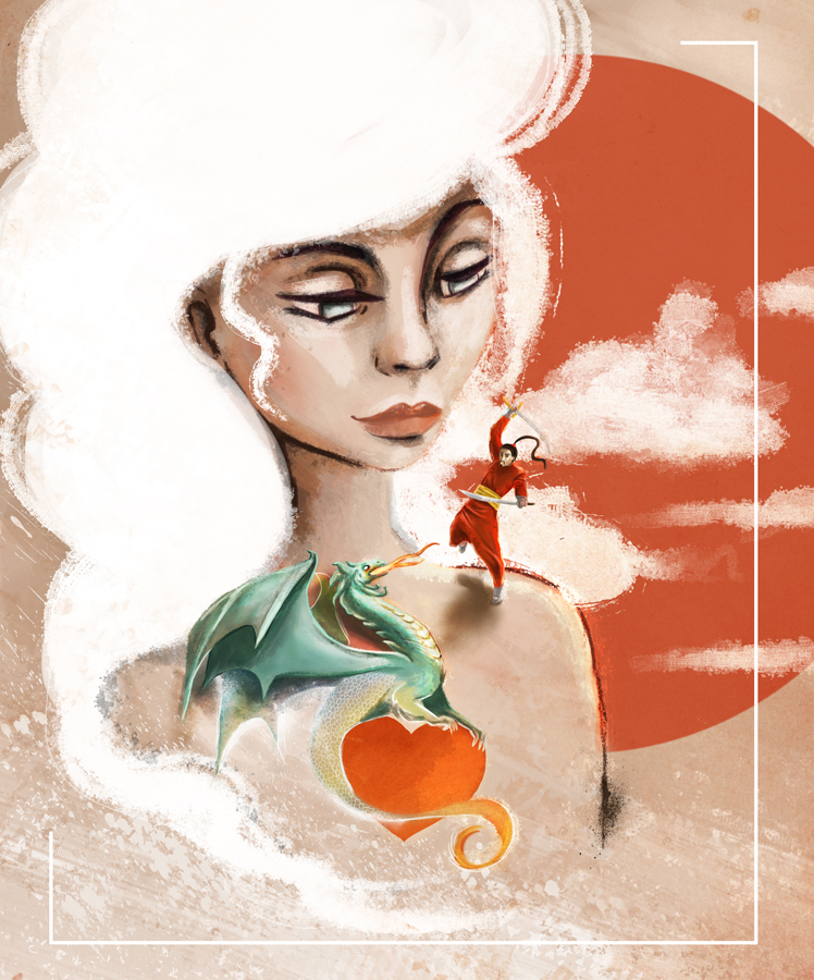
Top marks for originality in both content and style. While working through this you were aware of each problem that you would face and confidently worked through the required solution to end up with a picture that does exactly what you wanted it to do. The overall style and the texture of individual marks fit together beautifully (I particularly like that bit of line that ends with an ink splodge!) The dragon is successfully real and animated, and the little samurai has a fantastic balletic quality to his balance and motion.
One area where I'd like a little more is the mass of hair at the top. The large block of flat white colour could use either a bit of shading or (if you wanted it to be a negative shape) a bit of paper-style texture showing through but the way it turns into wispy clouds at the top and blizzard-like streaks at the bottom is varied and visually interesting. And you always know when and how to use a frame!
Microscopi:
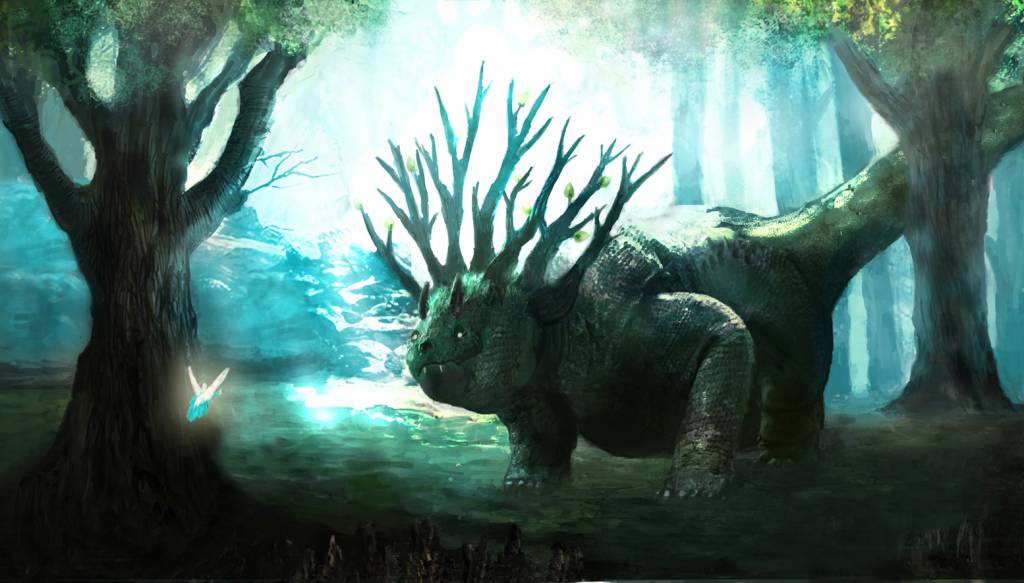
This one came together really well in the end. The background glow is absolutely beautiful and is completely convincing as an ethereal, woodland fantasy scene. The dragon design is also an excellent choice with its expression of bright-eyed innocence and curiosity, the texture that accurately shapes around the forms of the body and the branch-like frill to the head; it all reminded me of those creatures that Bobby Chiu paints that always blend into their surroundings in a whimsical way. It's clear that you've really put some thought into the design and it gives the whole picture a lot more depth and a natural credibility that makes it so much easier to accept and believe in the character and the world. This isn't a dragon as a monster or a beast but a dragon as a living, breathing animal in its habitat.
The fairy doesn't quite come across as being the evil slayer (perhaps a red glow would have emphasized that) but it doesn't really matter, there's still a visible connection between them that explains enough to keep you interested.
CGMythology:
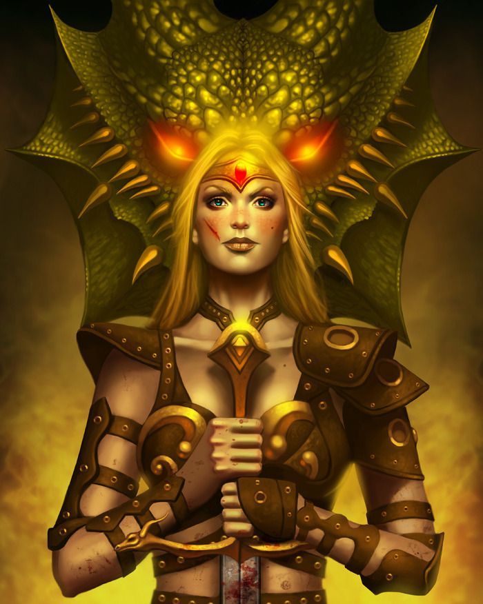
A really strong drawing on show here and an equally strong character, it made me think of Brienne of Tarth from Game Of Thrones, she has a real presence and attitude that you've managed to express. As always, your colouring and texturing are excellent and help build the picture even further from the initial foundation of the linework.
One area I find a little uncertain is in the difference between the top and bottom of the picture. The top part is very realistic with her proud expression and scars and the wonderfully lit dragon looming behind, while the bottom seems quite stylized in the angular shapes and forms of the hands and arms. I do like both the styles and the idea of having both in the same image also appeals but the transition between could be smoother. Perhaps it's a deadline issue, although I know you work quickly you started posting quite late and given another day or two the image styles could have been unified more.
Still very impressive though in its desciption of character and the variety and accuracy of the well-rendered surfaces.
DigitalDave:
Excellent composition you settled on after your earlier sketch. Your slayer is certainly not someone to mess with as he marches out of the screen in that confrontational way. Everything seemed to be going right for this picture so it's annoying that time and deadline had to intervene.
SchizophreniaWolf:
Noooo! Another great image slips by the deadline. For Christmas someone should buy you an alarm clock that goes off just before the end of the month!") I enjoyed this picture a lot. Lots of dragon concepts, in art, books, tv and movies, all seem to fall into the two categories of Fantasy or Action (or both) but here you've done a dragon as pure Horror in a fantastic gothic-style setting. Wonderfully original and also very unsettling in its brilliant composition with its criss-crossing angles. The combination of the converging verticals and bending legs give the subconscious impression of a great spider's web and the man is the little fly trapped until his doom, and we feel his fear too!
I enjoyed this picture a lot. Lots of dragon concepts, in art, books, tv and movies, all seem to fall into the two categories of Fantasy or Action (or both) but here you've done a dragon as pure Horror in a fantastic gothic-style setting. Wonderfully original and also very unsettling in its brilliant composition with its criss-crossing angles. The combination of the converging verticals and bending legs give the subconscious impression of a great spider's web and the man is the little fly trapped until his doom, and we feel his fear too!
If you do finish it please post it in the gallery. Pleeeease!
Kodabble:
Shame you couldn't develop this further but it doesn't matter too much because even your first sketches have so much goodness in them: always filled with little character interactions and expressions that hint at a great story. And I do love that old dragon's face!
As for voting…. Hmm… I've changed my mind a few times over the month and with some amazing improvements towards the end the choice has been tricky. But I think I'm gonna go for microscopi: the extra lighting introduced in the final few wips made the image look really cinematic in a way that appeals to me and even though its focus is more on the dragon than the slayer, that dragon design makes me want to keep looking at it one more time.
You said you don't like doing faces but I don't know why, there's some great work in the expressions here. I like the way you changed your mind but always learnt something from each stage, and kept the best bits to use as a new starting point to create a genuine evolution of a concept.
The split colour scheme offers a great way to distinguish between the characters and to express their differences with the warm and cool contrasts and also in the differing ways they blend into their backgrounds, one with colour and the other with those well-used painterly strokes. Even though I suggested some rim light I didn't want you to lose that, it was more a question of dimension and form. Pictures can sometimes look a little flat when edges disappear into similar colours but there's enough shape in the hood to compensate for this.
The best part of this picture for me is the sense of narrative with the pose and stature of the characters, the crystal ball and its inner environment and then the ominous dragon. They all link together to form the points from which the viewer can weave a story of their own.
Oaktree:
I love the action in this. You can see the physical effort of the horse and the aggression of the rider with his hair blowing behind him to show the speed and movement while the spear points you towards that distant dragon. The distant buildings are very nicely done with minimal suggestive strokes and the ship with its subtle reflection and that little glow of light (repeated in the castle) describes a bit of life still hanging on amid the raining fire and smoke that together show the layers and depth of the landscape. Although I do like the dragon I kinda wish you'd had it facing the other way (I think an earlier wip had it that way?) Having the horse, the slayer, his spear and the dragon all facing to the right tends to guide your eye out of the picture. It's always good to have the last object/character facing back in to the image to point the gaze to something else and keep you looking and moving around the picture and its space.
The colour of that distant blaze is nicely done. I especially like the way the warm tones peek through the brush strokes of greyer colours of the top corners. It makes it look like a traditional painting done over a toned canvas and adds an extra bit of vibrancy.
CherryGraphics:
Top marks for originality in both content and style. While working through this you were aware of each problem that you would face and confidently worked through the required solution to end up with a picture that does exactly what you wanted it to do. The overall style and the texture of individual marks fit together beautifully (I particularly like that bit of line that ends with an ink splodge!) The dragon is successfully real and animated, and the little samurai has a fantastic balletic quality to his balance and motion.
One area where I'd like a little more is the mass of hair at the top. The large block of flat white colour could use either a bit of shading or (if you wanted it to be a negative shape) a bit of paper-style texture showing through but the way it turns into wispy clouds at the top and blizzard-like streaks at the bottom is varied and visually interesting. And you always know when and how to use a frame!
Microscopi:
This one came together really well in the end. The background glow is absolutely beautiful and is completely convincing as an ethereal, woodland fantasy scene. The dragon design is also an excellent choice with its expression of bright-eyed innocence and curiosity, the texture that accurately shapes around the forms of the body and the branch-like frill to the head; it all reminded me of those creatures that Bobby Chiu paints that always blend into their surroundings in a whimsical way. It's clear that you've really put some thought into the design and it gives the whole picture a lot more depth and a natural credibility that makes it so much easier to accept and believe in the character and the world. This isn't a dragon as a monster or a beast but a dragon as a living, breathing animal in its habitat.
The fairy doesn't quite come across as being the evil slayer (perhaps a red glow would have emphasized that) but it doesn't really matter, there's still a visible connection between them that explains enough to keep you interested.
CGMythology:
A really strong drawing on show here and an equally strong character, it made me think of Brienne of Tarth from Game Of Thrones, she has a real presence and attitude that you've managed to express. As always, your colouring and texturing are excellent and help build the picture even further from the initial foundation of the linework.
One area I find a little uncertain is in the difference between the top and bottom of the picture. The top part is very realistic with her proud expression and scars and the wonderfully lit dragon looming behind, while the bottom seems quite stylized in the angular shapes and forms of the hands and arms. I do like both the styles and the idea of having both in the same image also appeals but the transition between could be smoother. Perhaps it's a deadline issue, although I know you work quickly you started posting quite late and given another day or two the image styles could have been unified more.
Still very impressive though in its desciption of character and the variety and accuracy of the well-rendered surfaces.
DigitalDave:
Excellent composition you settled on after your earlier sketch. Your slayer is certainly not someone to mess with as he marches out of the screen in that confrontational way. Everything seemed to be going right for this picture so it's annoying that time and deadline had to intervene.
SchizophreniaWolf:
Noooo! Another great image slips by the deadline. For Christmas someone should buy you an alarm clock that goes off just before the end of the month!
I enjoyed this picture a lot. Lots of dragon concepts, in art, books, tv and movies, all seem to fall into the two categories of Fantasy or Action (or both) but here you've done a dragon as pure Horror in a fantastic gothic-style setting. Wonderfully original and also very unsettling in its brilliant composition with its criss-crossing angles. The combination of the converging verticals and bending legs give the subconscious impression of a great spider's web and the man is the little fly trapped until his doom, and we feel his fear too!If you do finish it please post it in the gallery. Pleeeease!
Kodabble:
Shame you couldn't develop this further but it doesn't matter too much because even your first sketches have so much goodness in them: always filled with little character interactions and expressions that hint at a great story. And I do love that old dragon's face!
As for voting…. Hmm… I've changed my mind a few times over the month and with some amazing improvements towards the end the choice has been tricky. But I think I'm gonna go for microscopi: the extra lighting introduced in the final few wips made the image look really cinematic in a way that appeals to me and even though its focus is more on the dragon than the slayer, that dragon design makes me want to keep looking at it one more time.
Please Log in or Create an account to join the conversation.
01 Dec 2015 20:52 #12923
by Atto
No smudge tool was harmed in the making of this image.
Replied by Atto on topic CGAN November 2015 - Dragon Slayer - Final entries
Wow! I think Val has already covered everything I wanted to say but at the risk of repeating him here's the scores from the Derbyshire panel. (Eoruvision? No? OK)
CGMythology - A fantastically powerful peice and extremely well put together and rendered. I love the central characters armour, the concentration of protection on what would be the leading arm during combat is something I love to see. I have to agree with Val about the lack of form to the hands and lower half of the piece. If it wasn't for the splatters of blood and the cut to her face I dont think it would bother me at all. A beautifully constructed image with all those devices that draw the eye to her face and those piercing blue eyes hold the gaze wonderfully well.
Cherry - You certainly resolved those concerns you had over the dragon, I've never seen the style of tattoo you mentioned in the Wip thread but if they look anything like your rendition then sign me up for my first ink! I also love the way the dragons breath reverts back to what seems a graphic device instead of a realistic rendering. The whole texture of the piece is great and those ink splotches Val mentioned are not only beautifully well handled but also sell the graphic elements as hand drawn. I thought you may add more negative space round the image but I'm glad you didn't.
Oaktree - That horses eye that you nailed on your first Wip is fantastic, you get a real sense of urgency to the riders actions and his desperation to confront the dragon. The inferno that engulfs the town behind him has such a great feeling of heat to it and you managed to really ground those buildings within the flames.
I would have liked to see a little more reflected light from those flames on the horse and rider, (where you have done it helps to unify the whole image) but the reflections on the water are excellent.
Micro - Someone once wrote " A building never knew how beautiful it was until light hit it." And neither did your dragon I suspect. As Val has already said this is a dragon from reality, not a device or a representation, a symbol or a construct but a breathing, living creature that has just happened upon a glade where you were sitting with sketchbook to hand. His worn lived in hide is the stuff of the forest and rocks where he resides and is battered and scarred from his long life. There's a fantastic beleivability to his form, as with any successful rendition of a fantastical creature it all .....works. We can see the effect of his skull on the surface of his face and the muscle of his jaw. The atmosphere you have created and the quality of light pouring down from above brings his habitat to life so we experience it not just as a pretty setting but as an actual location with its attendant weather, sounds and smells.
An excellent job - and if you hadn't already guessed you get my vote too. (Though that's only because you added an offensive little fairy 'just for me')
No smudge tool was harmed in the making of this image.
The following user(s) said Thank You: cgmythology, CherryGraphics
Please Log in or Create an account to join the conversation.
- CherryGraphics
-
- Offline
- Junior Member
-
Less
More
- Posts: 366
- Thank you received: 33
02 Dec 2015 09:43 #12926
by CherryGraphics
Replied by CherryGraphics on topic CGAN November 2015 - Dragon Slayer - Final entries
At first: thanks a lot for those helpful nice words
micro: I love your forest dragon! he reminds of a triceratops ... and the facial expression looks like the triceratops from "little foot"... just forgot the name. but maybe you know who I mean it was a great choice to have this big bright light in the background!
oak: I like the battle scene! Just as Atto mentioned - I would have preferred to have a little bit more light effect from the dragons fire... something to get him out of the background. but the background itself is really nicely done.
cg: that's a great image. It has strong colors and a strong woman. I love the idea, that the dragon slayer is female! The eyes of the dragon are full of power and I like the dragon scales a lot. Just one thing I would say: the hands of her are a bit static and ... square. I placed my own hands in this position and saw that the form is a bit more round and narrowing. Or I simply have weird hands. xD
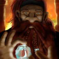
atto: I liked the idea from the beginning and hoped this would be it. ^^ and it was! the crystal ball is a wonderful thing and to see the scene in the background again is really nice. I just thought some more lights would be good for the attention. the brightest spot is the white part of the woman and this is what guides the eye, but the crystal ball is more important for the scene. just a thought for future.
My vote goes to CGmythology because I like the idea of the strong female dragon slayer the most.
micro: I love your forest dragon! he reminds of a triceratops ... and the facial expression looks like the triceratops from "little foot"... just forgot the name. but maybe you know who I mean
it was a great choice to have this big bright light in the background!oak: I like the battle scene! Just as Atto mentioned - I would have preferred to have a little bit more light effect from the dragons fire... something to get him out of the background. but the background itself is really nicely done.
cg: that's a great image. It has strong colors and a strong woman. I love the idea, that the dragon slayer is female! The eyes of the dragon are full of power and I like the dragon scales a lot. Just one thing I would say: the hands of her are a bit static and ... square. I placed my own hands in this position and saw that the form is a bit more round and narrowing. Or I simply have weird hands. xD
atto: I liked the idea from the beginning and hoped this would be it. ^^ and it was!
the crystal ball is a wonderful thing and to see the scene in the background again is really nice. I just thought some more lights would be good for the attention. the brightest spot is the white part of the woman and this is what guides the eye, but the crystal ball is more important for the scene. just a thought for future. My vote goes to CGmythology because I like the idea of the strong female dragon slayer the most.
The following user(s) said Thank You: Atto, cgmythology
Please Log in or Create an account to join the conversation.
- Digital Dave
-

- Offline
- Platinum Member
-

Less
More
- Posts: 2242
- Thank you received: 163
03 Dec 2015 14:20 #12928
by Digital Dave
I get sketchy around pencils! ...
Replied by Digital Dave on topic CGAN November 2015 - Dragon Slayer - Final entries
Some nice works for this one, but my vote was for Atto. ... I really like the characters in this, especially the one on the left. I like their expressions, and the overall color scheme of the pic.
I get sketchy around pencils! ...
The following user(s) said Thank You: Atto
Please Log in or Create an account to join the conversation.
Latest Activity

Banj updated their profile picture


Charlotte Still wearing a mask? Is it so we won't see you hoarding food in those cheeks of yours?
See More
Banj Mfmuh Guhmfpf
See More
Charlotte I'll take that as a yes...
See More
Charlotte Why is there a tiny flashing thing in front of the reply link/button? It's so small I can't see if it's an exclamation mark or a question mark... or...both?)
See More
Banj Because? Both!
See More
Charlotte *gasp*
See More

CaptainDeth updated their profile picture

CaptainDeth Ahoy folks, just a newbie here, just getting started. Thanks for allowing me in.
CaptainDeth Thank You
CaptainDeth and Mr.Bungle joined the site


honbasic joined the site


Gawk joined the site