


 I think I must be deaf...

I didn't hear any music... 
![:]](https://cgartnexus.com/images/mod_shoutbox/unsure.png)

The shoutbox is unavailable to non-members
CGAN Sept. 2015 Challenge - Black & White - Finals
Poll: Black and White challenge voting (was ended 2015-10-08 00:00:00)
| Valence |
|
2 | 50% |
| CherryGraphics |
|
No votes | 0% |
| Thomgirl |
|
2 | 50% |
| Total number of voters: 4 ( CherryGraphics, Valence, Digital Dave, Atto ) | |||
| Only registered users can participate to this poll | |||

01 Sep 2015 17:00 - 09 Oct 2015 08:15 #12193
by Charlotte
Any an all misspellings are henceforth blamed on the cats.
CGAN Sept. 2015 Challenge - Black & White - Finals was created by Charlotte
Black & White
Brief: I took a looksie in the latest Imagine FX issue (#126) and there's a section featuring multiple artists and them working in greyscale or monochrome. And I decided (all by myself!) that you will do the same! So, you can paint anything you want but it should be done in black & white or greyscale, though a faint monochrome (like sepia) is also acceptable, as is the occassional accent color.
Deadline: Wednesday 30th September, by midnight GMT.
This is where you posts your FINAL ENTRIES
Your WIPs should be posted over here ...
Challenge rules and guidelines:
cgartnexus.com/index.php/forums/challenge-rules/39-challenge-rules
Rules in brief:
All challenge entries must be your own work.
You should post at least two WIP images that are clearly different from your final entry and each other.
Your final entry should contain your image (inserted so it shows up full size) and at least two links to your WIP posts on the forum.
No chatter in the finals thread – if you have questions, post them in the WIP thread or PM an admin.
Feedback is allowed & encouraged together with the voting and in the WIP thread.
Deadline is given in UK time (midnight GMT) with a grace period of 5 minutes for getting the post sorted.
Each member may cast one vote
No cheating! Admins may decide to disqualify an entry that does not adhere to the above rules.
WINNER - VALENCE:
Any an all misspellings are henceforth blamed on the cats.
Last edit: 09 Oct 2015 08:15 by Banj.
Please Log in or Create an account to join the conversation.

27 Sep 2015 23:33 #12442
by Valence
Replied by Valence on topic CGAN Sept. 2015 Challenge - Black & White - Finals
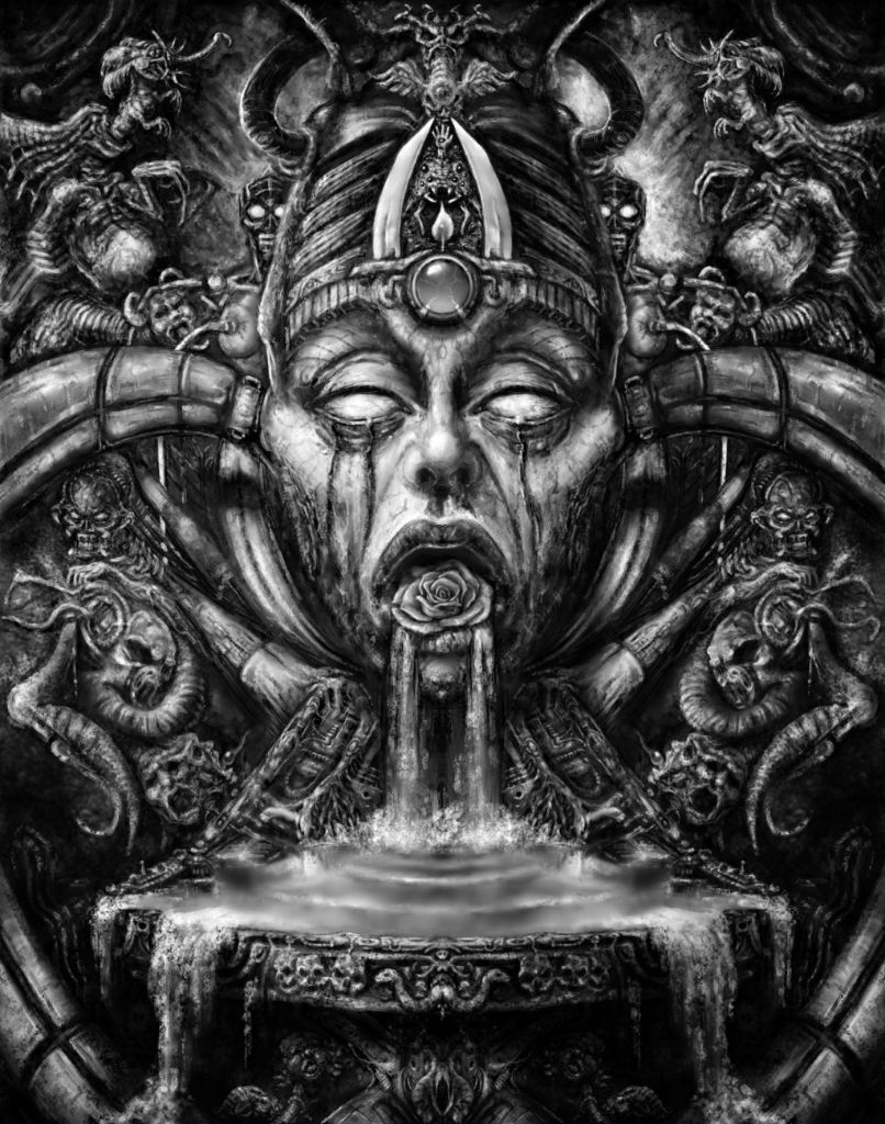
I've been pondering which of three versions to post and now I've decided. I did have a go at adding a touch of colour, both in the flower and the orb, but it didn't look right so I've gone with pure (and boring) black and white. If I was going to colour it then I'd colour it all and that's a bit too big a job (and not what the challenge requires.)
1: Fingertip Symmetry.
2: Doodling Detail.
3: And Stretch.
And finally some light and shadow ... and a mouthful of flower.
Hope everyone finishes in time!
1: Fingertip Symmetry.
2: Doodling Detail.
3: And Stretch.
And finally some light and shadow ... and a mouthful of flower.
Hope everyone finishes in time!
Please Log in or Create an account to join the conversation.
- CherryGraphics
-

- Offline
- Junior Member
-

Less
More
- Posts: 366
- Thank you received: 33
28 Sep 2015 09:11 #12451
by CherryGraphics
Replied by CherryGraphics on topic CGAN Sept. 2015 Challenge - Black & White - Finals
I think I don't want to change anything else now. Finished is finihed. (and this is the third finished version) - hey, like Val, too! 
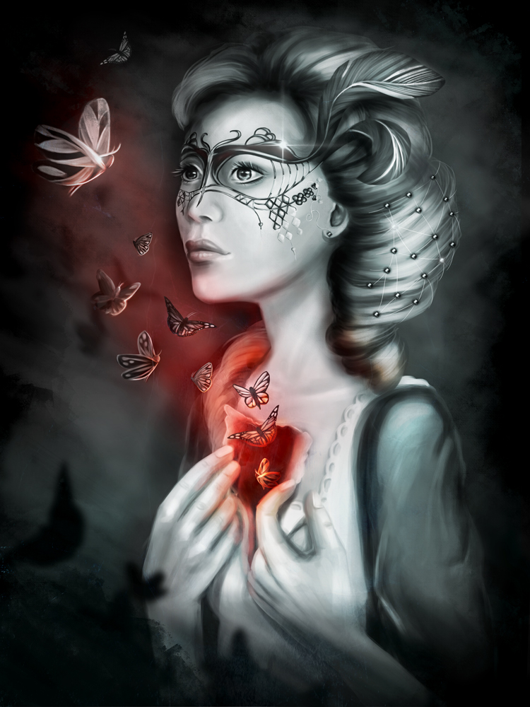
I thought this challenge would be a hard one for me but I think I handled it good without too much colors. It's not that black and white in original, but I have used just a blend of blueish und a red light.
so... let the butterflies fly!
WIP 1 - the start
WIP 2 - A touch of elegance
WIP 2 - what's inside?
Please Log in or Create an account to join the conversation.
28 Sep 2015 20:01 - 28 Sep 2015 20:19 #12458
by Thomgirl
Replied by Thomgirl on topic CGAN Sept. 2015 Challenge - Black & White - Finals
Well, my spawn decided to cooperate with me and I got my submission finished up. Really loved this challenge and some really beautiful submissions thus far. Good luck to everyone!
WIP1: cgartnexus.com/index.php/forums/challeng...-wips?start=20#12397
WIP2: cgartnexus.com/index.php/forums/challeng...-wips?start=30#12421
WIP1: cgartnexus.com/index.php/forums/challeng...-wips?start=20#12397
WIP2: cgartnexus.com/index.php/forums/challeng...-wips?start=30#12421
Last edit: 28 Sep 2015 20:19 by Thomgirl. Reason: forgot the wip links
Please Log in or Create an account to join the conversation.
01 Oct 2015 19:47 #12481
by Banj
Replied by Banj on topic CGAN Sept. 2015 Challenge - Black & White - Finals
Sorry about the delay, voting is now open and will close on the 8th. 
Please Log in or Create an account to join the conversation.

01 Oct 2015 22:56 #12488
by Atto
No smudge tool was harmed in the making of this image.
Replied by Atto on topic CGAN Sept. 2015 Challenge - Black & White - Finals
Thought I'd get this thing started so.....
Valence gets my vote
I was a little concerned when you mentioned the addition of a rose - in a Giger inspired piece? Really? But it works! I don't know why but somehow it does. I love the effect of the pools reflection and the pouring water, the small jewel in her forehead with that crackle of electricity across it and the texture of the whole piece. All the bio-mechanical elements are really well intergrated and that heavy plinth toward the bottom has a great feeling of solidity. Everytime I look at your entry I see another little creature staring back at me.
Cherry
The red lighting in this is beautifully done as is the highlight on her mask and the silhouette of the butterflies in the foreground. The butterfly (second out from her chest) that I believe is a red admiral is the real star of the piece for me, it's so well observed and the lighting effect (even down to the colour burn on its lower edge) has me crying with envy.
Thomgirl
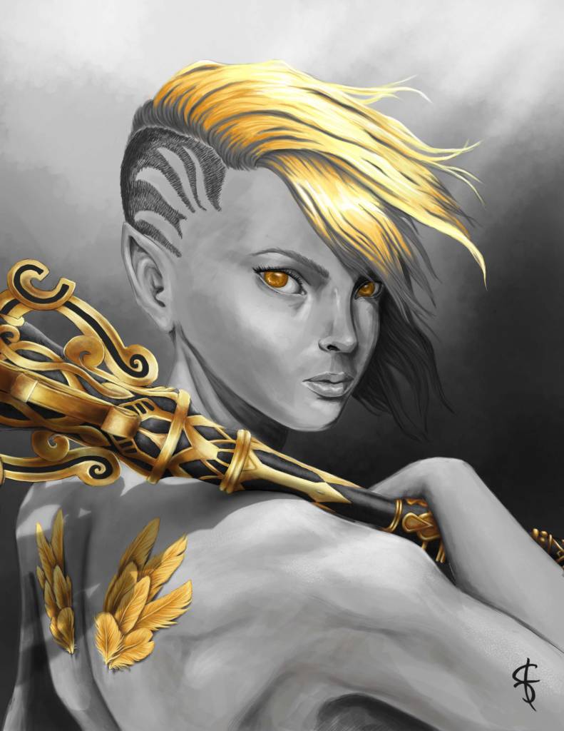
As I said in the Wip thread that gold has come off really well and hearing how you struggled with it makes the final result even more impressive. The sceptre/mace has an excellent weight to it where it rests on the shoulder and the composition draws my gaze to those golden eyes and beautiful elfin features without looking forced or contrived.
Excellent work all.
Valence gets my vote
I was a little concerned when you mentioned the addition of a rose - in a Giger inspired piece? Really? But it works! I don't know why but somehow it does. I love the effect of the pools reflection and the pouring water, the small jewel in her forehead with that crackle of electricity across it and the texture of the whole piece. All the bio-mechanical elements are really well intergrated and that heavy plinth toward the bottom has a great feeling of solidity. Everytime I look at your entry I see another little creature staring back at me.
Cherry
The red lighting in this is beautifully done as is the highlight on her mask and the silhouette of the butterflies in the foreground. The butterfly (second out from her chest) that I believe is a red admiral is the real star of the piece for me, it's so well observed and the lighting effect (even down to the colour burn on its lower edge) has me crying with envy.
Thomgirl
As I said in the Wip thread that gold has come off really well and hearing how you struggled with it makes the final result even more impressive. The sceptre/mace has an excellent weight to it where it rests on the shoulder and the composition draws my gaze to those golden eyes and beautiful elfin features without looking forced or contrived.
Excellent work all.
No smudge tool was harmed in the making of this image.
Please Log in or Create an account to join the conversation.
- Digital Dave
-

- Offline
- Platinum Member
-

Less
More
- Posts: 2242
- Thank you received: 163
01 Oct 2015 23:30 #12490
by Digital Dave
I get sketchy around pencils! ...
Replied by Digital Dave on topic CGAN Sept. 2015 Challenge - Black & White - Finals
Three fantastic images! But I really love the work on the scepter, and had to give it to Thomgirl. ")
I get sketchy around pencils! ...
Please Log in or Create an account to join the conversation.
02 Oct 2015 00:13 - 02 Oct 2015 00:29 #12491
by Valence
Replied by Valence on topic CGAN Sept. 2015 Challenge - Black & White - Finals
Well this is a very tricky one to call this month. As I start typing I still haven't quite decided. Maybe I'll pick a winner as I go along...
Cherry:
You seemed a bit uncertain at the start of the challenge but I don't know why, your picture shows that there was no need to worry. The face is lovely in both design and technique, and the expression has a poignant depth to it. As I said in the other thread, I really like the long slender neck and its proud extension, it gives her that sense of elegance that perfectly suits all the other aspects of the character. The hand gesture is nicely posed although I think the fingers could be a little thinner to match the slenderness of the rest of the figure.
The mask is very well done and is exactly the kind of thing I struggle with especially in this kind of three-quarter view. Designing its shape and then getting it to fit against the complex forms of a face is very tricky but you've done it perfectly and you were right to draw attention to it with those sparkling flares.
The red colour works well with the butterflies to add some movement and context and I especially like the shadow butterflies at the bottom. They give the picture an extra dark edge that really appeals to me. Well done, and I hope your achievements and experience with this picture will mean that you won't be as uncertain the next time you do a black and white image.
Thomgirl:
There's some good work here on the face and the pose. The expression and the over-the-shoulder glance really express the personality, attitude and strength of the character.
The way you've used the gold is really impressive. Even though it's just one colour you've used it in several different ways to represent different things. The fine flowing hair, the organic depth of the eyes and the cold, smooth glare of the metal (so good against the darks on the handle!) All done with just gold and yet all so visibly and tangibly different. And then there are the feathers too! I wasn't expecting those so it was a nice surprise at the end and again so brilliantly done. They look like they're made out of gold leaf and stuck onto my screen. I want to reach out and touch them and get my grubby fingerprints on my display.
One minor issue for my eye is the armpit. I don't think it's wrong, it's just that the crop of the bottom of the picture makes it difficult to read the form. Extending the picture lower to show more of the body or cropping higher to cut out the armpit completely would both make it a little easier on the eye. Well, my eye at least. But being such a trivial thing (and rather subjective) it doesn't affect the overwhelming success of the picture.
Susie:
A lovely first sketch with fine details and nice sense of disturbing creepiness showing a character with two sides. Not only left and right but inside and outside too with the skin peeling back to reveal a different kind of layered depth. Would have been a good one and may still turn out to be if you choose to work it further.
Kodabble:
I was hoping you were going for another last minute rush like you did in some previous challenges but I guess it wasn't to be this month. As always your first wip showed excellent imagination and linework, there's a beautiful connection between the characters despite their obvious differences and I know you would have developed it well given the chance. I hope you get the necessary free time for your next picture.
And my vote? So difficult… especially with the way that BOTH the finished pictures kept improving right until the end, with Cherry's rich, moody values and Thomgirl's beautiful feathers and clever use of colour. Hmm… I'm going to go for…
Thomgirl.
Just. By a tiny fraction.
Those feathers at the end did it for me.
I just want to touch them!!
Edit: And Atto.. (I was sure I'd typed this earlier but I clearly haven't. That'll teach me to do this after 1am!) Your picture had an interesting idea expressing a narrative with a clever visual twist. As I said elsewhere the sharp edges give it a clean comic book style and the composition has the feel of an opening panel showing an establishing shot. It's a shame you didn't finish but I know you've been working hard on other sketches and making good progress with them too.
Last edit: 02 Oct 2015 00:29 by Valence.
Please Log in or Create an account to join the conversation.
- CherryGraphics
-
- Offline
- Junior Member
-
Less
More
- Posts: 366
- Thank you received: 33
02 Oct 2015 09:28 #12498
by CherryGraphics
Replied by CherryGraphics on topic CGAN Sept. 2015 Challenge - Black & White - Finals
My vote goes to Val.
As I said, I like the symmetry a lot and the special light which gives the picture a more asymmetrical feeling is a nice touch.
Thomgirl - I'm glad you're back! This is a nice painting. I like the feathers a lot like Val. And her pose and her look at all. I just thought there is something missing, some more depth maybe. Next time. ")
As I said, I like the symmetry a lot and the special light which gives the picture a more asymmetrical feeling is a nice touch.
Thomgirl - I'm glad you're back!
This is a nice painting. I like the feathers a lot like Val. And her pose and her look at all. I just thought there is something missing, some more depth maybe. Next time. Please Log in or Create an account to join the conversation.
02 Oct 2015 13:05 #12504
by Thomgirl
Replied by Thomgirl on topic CGAN Sept. 2015 Challenge - Black & White - Finals
Valence
After much deliberation through the night, I'm going to have to with Valence's work. The execution and detail is just too strong here to pass up.
Cherry, it was hard not to choose yours because conceptually I thought yours was more interesting story-wise. I feel like the hands though could have used more work to be more defined, especially with how high detail the rest of the piece is.
Please Log in or Create an account to join the conversation.
Latest Activity

Banj updated their profile picture


Charlotte Still wearing a mask? Is it so we won't see you hoarding food in those cheeks of yours?
See More
Banj Mfmuh Guhmfpf
See More
Charlotte I'll take that as a yes...
See More
Charlotte Why is there a tiny flashing thing in front of the reply link/button? It's so small I can't see if it's an exclamation mark or a question mark... or...both?)
See More
Banj Because? Both!
See More
Charlotte *gasp*
See More

CaptainDeth updated their profile picture

CaptainDeth Ahoy folks, just a newbie here, just getting started. Thanks for allowing me in.
CaptainDeth Thank You
CaptainDeth and Mr.Bungle joined the site


honbasic joined the site


Gawk joined the site