- Posts: 43
- Thank you received: 4
 Like I said. Now
*presses B again*
![:]](https://cgartnexus.com/images/mod_shoutbox/unsure.png)
He does like meowing a lot.
I meant *here* but I guess Val might be a cat...
![:]](https://cgartnexus.com/images/mod_shoutbox/unsure.png) Does one belong to a cat?
Does one belong to a cat?
I suspect there are two brains here. 
The shoutbox is unavailable to non-members
Shoutbox History
 Like I said. Now
*presses B again*
![:]](https://cgartnexus.com/images/mod_shoutbox/unsure.png)
He does like meowing a lot.
I meant *here* but I guess Val might be a cat...
![:]](https://cgartnexus.com/images/mod_shoutbox/unsure.png) Does one belong to a cat?
Does one belong to a cat?
I suspect there are two brains here. 
CGAN - June 2015 - IT Movie Poster - Pennywise remake - Final
Poll: Who made your favourite scary IT poster? (was ended 2015-07-08 00:00:00)
| Haywire |
|
1 | 10% |
| Valence |
|
3 | 30% |
| CherryGraphics |
|
2 | 20% |
| microscopi |
|
4 | 40% |
| SchizophreniaWolf |
|
No votes | 0% |
| Susie1981 |
|
No votes | 0% |
| Total number of voters: 10 ( Kodabble, microscopi, Susie1981, CherryGraphics, ArtbyAlReid ) See more | |||
| Only registered users can participate to this poll | |||
- ArtbyAlReid
-

- Offline
- New Member
-

Please Log in or Create an account to join the conversation.
- CherryGraphics
-
- Offline
- Junior Member
-

- Posts: 366
- Thank you received: 33
Haywire: I love this one. It is so much different from all the others.
But unfortunately it doesn't look like a moviel poster to me, more like a book cover. This would be great!
Val: As was to be expected a great movie picture, a great movie poster. I like the idea of bringing critique into the poster and the 18 sign but I think there's a bit too much font at the bottom. So much clear-reading fonts so the IT spelling painting falls a bit out of attention. And thanks for reminding on "Schnute"
micro: yeah there it is - the cute creepy clown
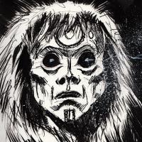
Schizo: lol - with this sentence above I always have the song in mind... o.O I like the head of the clown a lot - so terrifying ! I wish you would have had a tiny bit more time for this.
Susie: this is a really cool clown! Freaky AND some kind of cute (like the one of micro... wait... since when do I clowns call cute?!
Please Log in or Create an account to join the conversation.
Thanks for the feedback - Cherry you are absolutely right, felt rushed towards the end.
Valance, thanks for the nice comments.
My winner is Microscopi - whilst it moved further away from the traditional vision of Pennywise, it captured my imagination to question where the story would have gone if it had been written now.
Haywire - I love the intensity on your clowns face - it really pulls you in.
Val - the texture and depth I have loved from the start - also love how you have made the word IT part of the imagery.
Cherry - the cracked empty head is brilliant - puts me on edge straight away, and the overall composition is really strong.
Schizo - think if you had had chance to develop this it would have been a really strong contender - its a great image.
Well done everyone.
Please Log in or Create an account to join the conversation.
- microscopi
-
- Offline
- Premium Member
-

- Posts: 743
- Thank you received: 79
Valence: Your clown was definitely the creepiest out of everyone's, the amount of detail you put in the his face was great and the jagged teeth are really sinister. Great design, definitely would see this one in a horror movie, the background is really cool too, the cemetary setting really helps add to the mood, the graves are looking realistic with the grass and dirt, did a great job there, and with the words looking like bloody characters was a cool touch for sure!
Cherry: Pennywise looks really freaky on a darker background, not like your usual style, but you can do creepy too definitely. I like the old school design sort of a vintage pennywise, and the kids are my favorite part, I dont know why, but you really did a great job with the shadows, and lighting it looks cool, maybe you should do environment painting more
Susie: I know you were getting a little frustrated with yours, but impressed that you came up with the design, it's has a lot of character with the pose, and with more detail in the background it would help to build up more elements to make it stand out.
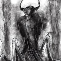
Schizo: I agree with more time you definitely could of made yours a lot cooler, if you detailed that huge pile of grotesque'ness
Haywire: What you did with the reference pic was awesome, the design came out great, if it had more detail, definitely would of scored you higher.
Please Log in or Create an account to join the conversation.
Please Log in or Create an account to join the conversation.
Voted, and I see how this streamlined the voting process though I miss the first, second, and third. This limits the winner to receiving only the number one votes where the old method could allow someone with a lot of second and third place votes to win the challenge (Not sure if that was a good thing or not, but I liked the old in that respect).
The poll voting is currently a trial run for a few challenges to see if it's any better/easier, if people prefer the comment votes that we have been doing up until now we might return to that. We are just seeing how things go right now.
Please Log in or Create an account to join the conversation.
- CherryGraphics
-

- Offline
- Junior Member
-

- Posts: 366
- Thank you received: 33
It's nice when all you need to do is click a button - but I guess this is also a problem. When you have to write the names down there's a smaller hurdle to also write a little critique. Like we can see 10 votes and just 4 wrote a bit about the others. Just a thought.
I also liked the 3 names - 3 places thing.
ah and:
CONGRATS MICRO !
Please Log in or Create an account to join the conversation.
And my opinion of the poll?
Although I'm always happy to drone on (and on, and on...) with unrequited feedback and opinions it's important to know that it's not necessary to do so when voting and people shouldn't be put off participating (either voting or painting) just because they don't feel comfortable writing about it. And the poll with its one-click option is a great way of emphasizing that and encouraging people to get involved.
The one possible downside is that if you don't get enough people voting then you may end up with a lot of ties. The second and third votes act as a good way to separate the entries further.
Please Log in or Create an account to join the conversation.
- microscopi
-

- Offline
- Premium Member
-

- Posts: 743
- Thank you received: 79
The voting system is a nice touch I think, maybe you can adjust it a little to incorporate 2nd and 3rd votes also Banj, incase of a tie.
Please Log in or Create an account to join the conversation.
AHHHHH I want my computer so I can participate. Almost there
Please Log in or Create an account to join the conversation.
Latest Activity
