


- Posts: 10084
- Thank you received: 475
 Like I said. Now
*presses B again*
![:]](https://cgartnexus.com/images/mod_shoutbox/unsure.png)
He does like meowing a lot.
I meant *here* but I guess Val might be a cat...
Does one belong to a cat?
I suspect there are two brains here. 
The shoutbox is unavailable to non-members
Shoutbox History
Like I said. Now
*presses B again*
He does like meowing a lot.
I meant *here* but I guess Val might be a cat...
Does one belong to a cat?
I suspect there are two brains here.
CGAN May 2015 - The Scorcerer's Apprentice - Final
01 Jun 2015 19:58 - 01 Jun 2015 20:49 #10944
by Valence
Replied by Valence on topic CGAN May 2015 - The Scorcerer's Apprentice - Final
There was a lot of crossover of ideas this month so judging the pictures made me lean more towards technique and visualisation and both criteria were strongly represented in different ways.
But my always reluctant order is this...
1: SchizophreniaWolf.
2: microscopi.
3: CherryGraphics.
And my completely unnecessary yet lengthy ramblings (sorry!) in no particular order go like this…
Dragon:
As mentioned before, I do have a soft spot for 3D CGI and it was refreshing to see one in the challenge. It reminded me of all the software I have installed on my PC but have neglected in recent years: Daz Studio for figure work, Blender and Sculptris for building models, Terragen and Bryce for landscapes and fractal images with Apophysis and Incendia (also in a little coincidence I recently discovered Mandelbulb3D to add to them.)
But enough of my hard drive and back to your picture… I think you were successful in recreating the mysterious mood that you teased us with in your first "selfie" wip. The pose you constructed had a good contrapostal twist between the body and head that indicated the concentration and attention of the sorcerer while maintaining his balance. And as suggested you softened the hand gesture well, making it seem relaxed and natural but still keeping enough tension in the fingers to imply that the magician is making some physical effort to control the magic rather than being just a passive character. As I mentioned in the wip thread, getting the hands right is really the key to posing these figures and taking the time to angle them realistically is rewarding in the end as you demonstrated here. I like the way you brought him out of the darkness with both the red glow and the ambient shine to shape his form, painting his face not with brush strokes but with light. In fact watching this happen really helped me to understand how I could make similar improvements in my own picture. (My gratitude ensues.)
One area where the picture could be made even better is the background. The resolution and distortion of the texture in that area makes the background seem much closer than it need be and creates a claustrophobia that fights with the dark lighting of the man. I was thinking about this when judging all the pictures and wondered if one alternative could be to use a more abstract background, perhaps even one of those fractal flame images to show him opening a magical dimension around him. (Also as a little aside, you should have a go at experimenting with "render layers" whereby intead of relying on just one render you output several different renders with different settings for lights, textures and backgrounds and then recombine them as layers in Photoshop (or any 2D software) with different blend modes and opacities.)
But all of that was an indulgent thought on my part, the picture works as it is and you should be proud of it. I really enjoyed watching it develop and waiting for, and anticipating, the next wip rekindled my interest is these 3D things and for that I'm very thankful to you.
Cherry:
By far the easiest thing to do for this challenge was to plunder the over-used archives of fantasy and draw a hooded/pointy-hatted Dumbledore figure along with a Harry Potter/Hermione hybrid, and guess what? That's exactly what I did! (Unoriginal floon that I am!) But not you, so extra kudos for your superior imagination and creativity.
Your picture made me think of two things (although neither of them have anything to do with this challenge. My mind just works in strange ways.)
First of all it reminded me of that religion in Game Of Thrones. Not the weird tree one or the lord of light but that one made up of The Seven separate icons that all represent a different part of life. In your picture I also see that kind of resonant, mythic symbolism involving recognisable archetypes that transcend individual cultures and genres: The Warrior; The Shaman or Wise Man; The Mother or Goddess; The Child or Heir or perhaps The Young Usurper; and finally The Listener or Passive Witness who then offers judgement or acceptance. It was all reminiscent of the themes of Joseph Campbell and his monomyth idea of the Hero's Journey which seems increasingly quoted these days. (And there I go quoting it as well.)
The second thing your picture made me think of was that old Jim Henson TV show that I used to love starring John Hurt, and more specifically the way that every episode started with the phrase: "The best place by the fire is kept for … The Storyteller." (In fact I had to go watch a couple of episodes on YouTube to satisfy my nostalgia!)
Technically your image is a good one, the way you control saturated colours over all values is always impressive (they always go a bit muddy when I try that) and here it accurately captures that communal fireside mood. The figures are ambitious in their variety and their poses, perhaps some direct reference for the foreground hands could have tightened up some areas there but it's not detrimental to the picture.
The late decision you took regarding the character positions was well made and enhances (and clarifies) the narrative involving the dramatic tension between the shaman and the child who now oppose each other across the flames. Finally the storytelling smoke is colourful and lively in a way that I would never have imagined or expected. Overall it's a brilliantly original interpretation of an otherwise familiar theme all executed with excellent style.
Micro:
I knew this was going to be good right from the start as soon as I saw the way that you were framing it (I never seem to think of that kind of thing until it's too late.)
The Dutch Tilt not only works, it works in two ways. First it gives you that uneasy atmosphere with also a sense of motion, action, anticipation and apprehension, a classic over-the-shoulder videogame view setting a dynamic perspective to the scene. And secondly, as a composition it forces your eye to literally act out the narrative: starting at the top left the tilt acts like gravity pulling your eye down the slope until you meet the upright angle of the figure, this chevron shape then sends your eye up to the web where the concentric threads look like a bullseye showing the target area where all the action will take place any moment now. It's a journey not only across the image in space but also into the scene in time, describing the intentions of the character and the story that will take place, as if the action itself is visually encoded into the composition.
The danger with tilted compositions is the potential weakness of the corners on the opposite diagonal but you balance them perfectly, especially the shadowy area that closes off the bottom left.
The one slight criticism is that the image alone doesn't quite explain the sorcerer-apprentice relationship but this is a minor quirk that is far outweighed by the quality of the image. And out of all the challenges I've seen from you I think that this is definitely the best drawing technically and one that really stands out in your portfolio. I don't know if it's because you had more time for this or if it's part of a continuous progression of improvement but either way the end result is a positive one and something you should be satisfied with.
Schizo:
Terrific first sketch (I'd be happy entering that as a final.) Technical yet still expressive and artistic, especially in the way that it clearly defines the relationship and connection between the two characters despite the differences in height, age and personality. Their faces and gestures tell the story loud and clear, and it's a story that everyone can understand: the wise yet eccentric old man explaining his world to the eager, impressed child filled with wonder. These open-ended storytelling briefs are very well suited to your skills, so much so that you really should do dark, twisted book illustrations or quirky, stylized comic books.
When you mentioned using photos I was worried for a moment, not because it's a bad thing to do but because, when not doing an overly stylized image, combining the two can sometimes expose flaws in the drawing when the realism of the photo contrasts with any lack of realism in the painting. But of course I soon realised that this isn't a problem for you when your drawing skills are as strong as this. In fact the two things combine perfectly here, the extra overpainting you've done creates a such a unified integrated style that I can no longer see the differences.
The designs you've used for Grandpa are really innovative in a whimsical way with his bauble shaped outfit, the hat that looks like it's a paper bag with it's accompanying teddy bear and the way he wears all those badges as if the corporate logos are magical runes that are the key to some mystical spell. The colouring of his face is just perfect and elsewhere in the picture the wild angles of the child's pose brilliantly capture that gyrating giddiness of excited children when they try to keep up with an adult.
The only thing that I would add to the picture is to put a darker shadowy area at their feet just to anchor the characters to the ground a little more, especially Grandpa with his top-heavy outfit. This would help the image read clearer as a thumbnail but it's not a big issue as it still looks fine at full size.
You've clearly put a lot of thought into this challenge by creating a little backstory to the characters (and I knew you wouldn't be able to resist having some bleak deaths in there! Your fairy tales are super sinister) but more importantly- the picture is supplemented by the story rather than depending on it. All of the important information is right there on show in the image and that is why this picture succeeds so well on its own.
EbArt:
A great piece of architectural interior design here. From the structure, the space, the hanging crown of the chandelier and the choices for the shapes of windows I can see immediately what the subject of the picture is. The background is effectively the establishing shot that sets the stage for the characters and it's established well here. The slight blurring adds a depth of field that allows the characters to exist and breathe at a comfortable distance and the motes of dust drifting in the shafts of light are so good that I want them in my picture and I want them now!
The seated child is reminiscent of those religious adoration paintings, which is echoed by the stained-glass windows and their streaming beams of colour. This is then contrasted in tone and subject by the dark hooded sorcerer and that classic pose of the pointing finger which is either instructing him to pay attention or chastising him for whatever he's done to that poor teddy bear. There's a discernible tension and balance between extremes in your picture, between light and dark, young and old, innocence and experience, naivety and knowledge, and all this adds a meaning to the narrative that you're depicting. And again, that poor teddy bear is stuck in the middle. I fear for his fluffy little face.
Kodabble:
A great drawing of a lovely, well-balanced composition. You managed to colour it up with alarming speed and did so with some great choices. The dragon is spectacular and dominates the image just as it should but you've made a great effort to keep the sorcerer and the apprentice relevant to the scene. Their poses and expressions keep them in your focus and stop them from being overshadowed by the magic creature.
You were quick to analyze the picture and were receptive to feedback which resulted in you successfully correcting the minor errors. The way you eventually fixed the troublesome leg was very satisfying even for an observer (like seeing your team score a goal!) It's such a difficult pose especially from that viewpoint but you pulled it off in a believable way.
Once again you joined the challenge late and even though you worked very quickly I always want you to have an extra day or two just to add a couple of touches or details. In this case just a few colour notes here and there of a warmer, complementary hue to play against that excellent green choice would have added that final bit of polish to the image. But with deadline approaching you were right to prioritise the work on the pose and proportions as that is often what makes a picture succeed.
EdTucker:
Although I was sad to see you distracted away from finishing I do know exactly how you feel. That final push to complete a picture is awful and I have numerous examples where I was happy to just let them go. In fact I never really finish pictures properly, I just … stop, when it starts getting worse.
And yet you still had a good picture going there. Your character displayed a mischievous kind of joy as he dashed towards us leaving a drifting trail of magic behind his billowing cape. The colours were bold and vivid and the face and its expression were straight from a classic fairytale. The use of Minecraft to create the geometric perspective was completely unique (to my eyes, at least.) I have fiddled with that voxel-style Android app Qubism but incorporating your creation from a game into your art made for an interesting combination with the hand drawn figure. I found myself wanting to know more about this fellow and the world he was skipping through.
Dannyblack:
Another good picture that didn't quite make it to the deadline and it was progressing well. The cat playing with magic was a great idea and you constructed a pose showing the animal as being curious but still tentative. You can see that it wants to touch and yet is frightened enough to be pulling away at the same time. Painting characters that are torn between two options is always a tough one but when it's done right like this it always make you smile and also helps you to empathise with the situation. I also loved the shadow of the hand at the top of the image and how it mirrored the shape of the tail. Was it the shadow of a different character? Or was it a magic shadow of the cat showing it in a human form? Were we witnessing some kind of transformation spell as it happened? Questions like these pull us into the world you create and show that you have the skill to captivate the viewer and keep them looking into your work. Keep doing that and we'll keep watching.
Susie:
Just like with Schizo, this was a brilliant first drawing. And just like with Ed I was sad to see that you didn't get chance to develop it further. There's a real sense of movement and humour with the girl struggling carry all of the scrolls and books and I wanted to learn more about her connection to the sorcerer, about where they were and what exactly he was doing. The sketch asked a lot of questions (in the way that all good sketches do) and there was lots of potential for the possible answers. I look forward to seeing more questions and answers in future pictures.
Last edit: 01 Jun 2015 20:49 by Valence.
The following user(s) said Thank You: CherryGraphics, SchizophreniaWolf
Please Log in or Create an account to join the conversation.
- CherryGraphics
-

- Offline
- Junior Member
-

Less
More
- Posts: 366
- Thank you received: 33
02 Jun 2015 06:13 #10949
by CherryGraphics
Replied by CherryGraphics on topic CGAN May 2015 - The Scorcerer's Apprentice - Final
So it's voting time, eh? Okaaaay here we go! ")
1) Schizo - I loved the sketch that much, the style is unique the idea lovely and the story you've written for it is a brilliant way to give the picture more depth. And what should I say - the final image is great. I would print it, frame it and hang it on my wall. really!
2) micro - As I said the whole last month - I love this picture (sorry for giving Schizo the first place in the last days ) and I think this is one of your best I've seen. Your style fits this image so well there's no need to polish some things more like I would liked in other pictures. Great one! (and good there's no octopus anymore
  )
)
3) Kodabble - Like your style a lot and the colors you've chosen are great and especially the green is so different from all of the other pictures I think his leg is now really really better just with this little "more" I also like the dragon a lot and the expression of the face of the boy.
Val) I also like your picture as I always like your pictures. The character is nice drawn and the whole environment too! I guess I have already have a little litte -itzy-bitzy- problem with the angle of his eyes - I still think he looks out of the picture. And - but this is really just personal - I liked the dark face of the old man a bit more, but I don't know why. 
Dragon) I like your 3D art! It's always good to see some other styles here. But I hoped there would be just a bit more. You know? A bit more background or story or just ... magic. Maybe you surprise us next month
ebArt) I like the environment a lot! The church is a great idea for a story. The holy church - and there's dark magic. great.
1) Schizo - I loved the sketch that much, the style is unique the idea lovely and the story you've written for it is a brilliant way to give the picture more depth. And what should I say - the final image is great. I would print it, frame it and hang it on my wall. really!
2) micro - As I said the whole last month - I love this picture (sorry for giving Schizo the first place in the last days
) and I think this is one of your best I've seen. Your style fits this image so well there's no need to polish some things more like I would liked in other pictures. Great one! (and good there's no octopus anymore )3) Kodabble - Like your style a lot and the colors you've chosen are great and especially the green is so different from all of the other pictures
I think his leg is now really really better just with this little "more" I also like the dragon a lot and the expression of the face of the boy.Val) I also like your picture as I always like your pictures.
The character is nice drawn and the whole environment too! I guess I have already have a little litte -itzy-bitzy- problem with the angle of his eyes - I still think he looks out of the picture. And - but this is really just personal - I liked the dark face of the old man a bit more, but I don't know why. Dragon) I like your 3D art! It's always good to see some other styles here.
But I hoped there would be just a bit more. You know? A bit more background or story or just ... magic. Maybe you surprise us next month ebArt) I like the environment a lot! The church is a great idea for a story. The holy church - and there's dark magic. great.
The following user(s) said Thank You: SchizophreniaWolf
Please Log in or Create an account to join the conversation.
02 Jun 2015 23:06 #10975
by aonodori
Replied by aonodori on topic CGAN May 2015 - The Scorcerer's Apprentice - Final
1) Schizo - I loved this picture the moment I saw the sketch, but I think i'm gonna make up my own story  You're one is a bit sad.. everything looks just great and the detail is perfect.
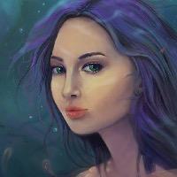
2) Valence - I have to admit that each time you posted something it didn't seem like much had changed because the changes were subtle but as I kept looking back through your WIP's it's just come a long way with all the little details like the bottles and the lighting and the wizards face, it tells a great story no matter how you read it.
3) Cherry - There's a couple of things that seem off, like how dark the guys face is compared to the girls (the people at the front) but I think the idea is really creative and I like the different approach to the apprentice.
Sorry for not critiquing everyone this time but well done
Also hope my votes aren't too late!
You're one is a bit sad.. everything looks just great and the detail is perfect.2) Valence - I have to admit that each time you posted something it didn't seem like much had changed because the changes were subtle but as I kept looking back through your WIP's it's just come a long way with all the little details like the bottles and the lighting and the wizards face, it tells a great story no matter how you read it.
3) Cherry - There's a couple of things that seem off, like how dark the guys face is compared to the girls (the people at the front) but I think the idea is really creative and I like the different approach to the apprentice.
Sorry for not critiquing everyone this time but well done
Also hope my votes aren't too late!
The following user(s) said Thank You: SchizophreniaWolf
Please Log in or Create an account to join the conversation.
- Mercurycat
-
- Offline
- New Member
-

Less
More
- Posts: 16
- Thank you received: 0
04 Jun 2015 16:19 #11007
by Mercurycat
Replied by Mercurycat on topic CGAN May 2015 - The Scorcerer's Apprentice - Final
Ooh, nice entries.
My favorites:
1 Valence
2 SchizophreniaWolf
3 Kodabble
My favorites:
1 Valence
2 SchizophreniaWolf
3 Kodabble
Please Log in or Create an account to join the conversation.
- microscopi
-

- Offline
- Premium Member
-

Less
More
- Posts: 743
- Thank you received: 79
04 Jun 2015 22:44 #11014
by microscopi
Replied by microscopi on topic CGAN May 2015 - The Scorcerer's Apprentice - Final
This was my favorite challenge so far, I really learned some things this time, was just splendid 
1 - Schizo - Your wacky design won me over, I think for me it's the strange details you always include, where do you think of this stuff? I know you use photos heavily in your stuff, but you mix them in with your drawings so well that the textures and colors match and it all looks seamlessly from the same environment. I'm not sure about the center building though as it's a bit distracting but overall the tiny details and the characters are awesome.
2 - Kod - It was hard not to give you first place as I really liked yours a lot. You did a awesome job with the characters, they are detailed great, and you really have a great hold on storytelling in your pics, the circular shape to your image is cool too. The way the lighting all works together with his wand glow and the dragon fire doesn't overwhelm the colors which is great. Awesome job.
3 - Valence - Your attention to details really paid off again, you always come up with a cool designs and execute well. For this really like the perspective of the girl with the book in the forground, the small details around the room are all good additions and seem to fit in that environment. Looking at your pic, and I don't know why I didn't notice before but, if you were to of pushed the scorcerer back into the doorway more, you could of surrounded with a cool lighting effect and would help to push the perspective back more, for more depth but alas I just saw noticed that now sorry!
Cherry - I'm sorry I didn't put you in the top three, I think the story with your pic is awesome, my favorite character is the center one, the chief, he looks awesome, the expression on his face is perfect for the ritual and the detail you put into him and the baby looks really well done. The spirits coming out of the fire is a cool idea.
Eb - Atmosphere is really great with yours, lighting is realistic, especially on the wooden floor. I like how the sorceror is covered in shadow, you can imagine what type of environment it is just with the light coming through the window and the small details really hint at the story well.
Dragon - Glad you got done, and your joining the challenges, you have that 3D style already, which is definitely cool, and individual style all your own. I think your character model is really cool, you did a great job on his face, it's really well detailed, I think you did a great job there.
The following user(s) said Thank You: SchizophreniaWolf
Please Log in or Create an account to join the conversation.

04 Jun 2015 22:59 #11015
by ebArt
Replied by ebArt on topic CGAN May 2015 - The Scorcerer's Apprentice - Final
1. Schizo
2. Valence
3. Microscopi
Great challenge!
2. Valence
3. Microscopi
Great challenge!
The following user(s) said Thank You: SchizophreniaWolf
Please Log in or Create an account to join the conversation.
- SchizophreniaWolf
-
- Offline
- Junior Member
-
Less
More
- Posts: 170
- Thank you received: 10
05 Jun 2015 08:29 - 08 Jun 2015 19:19 #11018
by SchizophreniaWolf
Replied by SchizophreniaWolf on topic CGAN May 2015 - The Scorcerer's Apprentice - Final
waw thanks for al those votes 
1. Micro: Yep, like that atmosfere alot. It looks so strange, like a world that has been under water for years. Two things, the robe is still trumpet-shaped, symmetry is often a little bit dull and the magic in his hand looks a bit dirty and blury. BUT love it anyway.
2. Valence: Like the fx on the book; the face of the girl (lol she looks like the young ice princess you painted in the white as snow contest), the lights and details, all very nicely done. I don't like the shape of the wizard, that one can be better. BUT love it anyway.
3. ebArt: Nice atmosfere! I love the mysterious scorcerer, he looks extremely charismatic. What I realy dont like is the bright red and green on the baby and the windows in the back. It's the pastel colors and the clumsy painting, they draw alot of attention and should get more order and detail even when they are blured... I think BUT love it anyway.
Cherry: I know you can do better than this, the gloom and composition are nice, but the anatomy and fx are poor. But you know I love you and your work")
Kodabble: I like it; it has that 70's fantasy mood. And it's nicely painted, good for print in a cool book. But I like modern fantasy more. BUT love it anyway.
1. Micro: Yep, like that atmosfere alot. It looks so strange, like a world that has been under water for years. Two things, the robe is still trumpet-shaped, symmetry is often a little bit dull and the magic in his hand looks a bit dirty and blury. BUT love it anyway.
2. Valence: Like the fx on the book; the face of the girl (lol she looks like the young ice princess you painted in the white as snow contest), the lights and details, all very nicely done. I don't like the shape of the wizard, that one can be better. BUT love it anyway.
3. ebArt: Nice atmosfere! I love the mysterious scorcerer, he looks extremely charismatic. What I realy dont like is the bright red and green on the baby and the windows in the back. It's the pastel colors and the clumsy painting, they draw alot of attention and should get more order and detail even when they are blured... I think
BUT love it anyway.Cherry: I know you can do better than this, the gloom and composition are nice, but the anatomy and fx are poor. But you know I love you and your work
Kodabble: I like it; it has that 70's fantasy mood. And it's nicely painted, good for print in a cool book. But I like modern fantasy more. BUT love it anyway.
Last edit: 08 Jun 2015 19:19 by SchizophreniaWolf.
Please Log in or Create an account to join the conversation.
05 Jun 2015 15:43 #11026
by Kodabble
Replied by Kodabble on topic CGAN May 2015 - The Scorcerer's Apprentice - Final
Well done everyone . Here are my votes:
1 Valence
2 microscopi
3 SchizophreniaWolf
. Here are my votes:1 Valence
2 microscopi
3 SchizophreniaWolf
Please Log in or Create an account to join the conversation.
- CherryGraphics
-
- Offline
- Junior Member
-
Less
More
- Posts: 366
- Thank you received: 33
09 Jun 2015 08:11 #11071
by CherryGraphics
Replied by CherryGraphics on topic CGAN May 2015 - The Scorcerer's Apprentice - Final
Is it just me or do we have more (unused) time to vote the last couple of months? 

Please Log in or Create an account to join the conversation.

09 Jun 2015 08:56 #11072
by kazky
Replied by kazky on topic CGAN May 2015 - The Scorcerer's Apprentice - Final
its not you Cherry, i'm not used to doing this so i forgot to tally! I'm at work so i'll close off later, sorry for the delay!
Please Log in or Create an account to join the conversation.
Latest Activity

Banj updated their profile picture


Charlotte Still wearing a mask? Is it so we won't see you hoarding food in those cheeks of yours?
See More
Banj Mfmuh Guhmfpf
See More
Charlotte I'll take that as a yes...
See More
Charlotte Why is there a tiny flashing thing in front of the reply link/button? It's so small I can't see if it's an exclamation mark or a question mark... or...both?)
See More
Banj Because? Both!
See More
Charlotte *gasp*
See More

CaptainDeth updated their profile picture

CaptainDeth Ahoy folks, just a newbie here, just getting started. Thanks for allowing me in.
CaptainDeth Thank You
CaptainDeth and Mr.Bungle joined the site


honbasic joined the site


Gawk joined the site