


![:]](https://cgartnexus.com/images/mod_shoutbox/unsure.png) Does one belong to a cat?
Does one belong to a cat?
I suspect there are two brains here. 


I can assure you there are no brains here
Now we have brains everywhere again. No wonder the zombies keep coming back...

The shoutbox is unavailable to non-members
Shoutbox History
Does one belong to a cat?
I suspect there are two brains here.
I can assure you there are no brains here
Now we have brains everywhere again. No wonder the zombies keep coming back...
CGAN April 2015 Challenge - Me, Myself, and I
 but if you really must vote then post you favourite 3 images (1st, 2nd, 3rd) from the following...
Aonodori
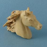
Hobbyhorse
CherryGraphics
Susi1981
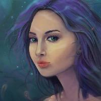
Jessi
Microscopic
SchizophreniaWolf
Edtuckerartist
Go!
Please Log in or Create an account to join the conversation.
I think 1st: susie1981 - I really love the colours, while normally I love smooth artwork there are times when it just doesn't suit the theme of the image andi think yours looks great
")
2nd: CherryGraphics - I think yours is very creative, the colours all work nicely together, perhaps the image shouldn't have started from darkness at the bottom but rather work in from light or fire, but I can't talk, my bg is dark too haha
3rd: for me is Hobbyhorse - your drawing skills are beautiful and I'm sorry I couldn't put all of you at first place but I just find the amount of blur (including the bg) a bit distracting, like its a teaser image of the bigger picture. I understand wanting the bg out of focus but perhaps bringing in a middle ground element like less blurry leaves or tree stems? Anyway still looks very nice
and let's not forget cute!Feedback:
Jesse - I think the coloured fish are a nice added element in your illustration, I can see on the forehead that you played with scales but perhaps some textures or some kind of detailing on the rest of the face to go with the aquatic theme would help it blend in more? At the moment there's a lot of detail and then there's a large blue area without anything, but all in all very nice
Microscopi - I remember thinking randomly in the car about your picture and thinking you should probably show some nice reflection on your face from the light sabre, and low and behold you've already done it
 I like the artwork of the figure itself but the glow and the bg make it seem a little unfinished? Do jedi's glow? Don't get mad, I've seen Star Wars but not for a while, and I don't remember much glowing sorry!!
Sir wolf -
I found your WIP's very cool to watch, the mess was fascinating, but in the final image I'm a bit confused about what the story is, I can't actually tell what's suppose to be happening sorryEd - I think if you had more time to finish the things you aren't happy with this would look really nice, the idea was very cool, I personally love the original three musketeers and who doesn't love batman? This isn't to say that it looks bad but I can see some of the unfinished elements like the eyes? But the direction from the rest of the image looks great
Good luck all!!
Please Log in or Create an account to join the conversation.

Hmmm, this month I think there were two standouts for me and it was tricky to pick between them (and then pick between the others!) but I think I'll go with this order...
1:hobbyhorse
2:CherryGraphics
3:aonodori
hobbyhorse: I thought this one was simply the best portrait and the best likeness. Just focusing in on the head and shoulders you can see it makes a great picture just there in a classical style. For that alone I'll just edge it past Cherry's. But of course the picture doesn't end there. Expanding your view reveals a wonderfully imaginative composition that shows a keen eye for detail and a great understanding of how characters and figures interact within the same space. The initial model-making (cats with wings!!!!) and posing also demonstrates a kind of forethought and level of preparation that is way beyond my own sad lack of patience. I always admire those that can successfully achieve the things that I can't do (or can't be bothered to do) and in this picture all those things are undoubtably a success. Therefore have my winning points for your expert skill.
Cherry: Just like hobby's image the attention to detail is an enormous selling point for this picture. The thought, the effort and the necessary skill required to do something like this are all shown there on the screen for everyone to see. There's a wonderful variety of ideas, shapes and textures here from the furry little critter on your head to the leaves and the feathers, the orb of water with the army of ghosts and dew drops and, importantly, the radiant skin texture of the recognisable face with its fiery hair. The picture is well populated with concepts and wherever you look there's always something for your eye to find and enjoy yet it's never overpowering, everything is well balanced by the symmetry of the composition. Also the way you understood the problems you faced with the neck and corrected accordingly was nicely done and added a final credibilty to the picture.
aonodori: The third place was a difficult choice between lots of different styles and techniques and also the different ways that you can "like" a piece of art (so sorry to all the others) but I'm going for this because I just kept wanting to look at it again. There's something quite endearing and appealing about the playfulness of both the pose and expression, with the concentrating tongue, the closed eye and then the framing hand gesture that's repeated by the cute little fellow on your arm. I also liked the hair tangled into the background, it's a really awkward thing to paint but you've done it convincingly in a way that links the character to the environment. The proportions of the face are well done, the hands are way better that the ones I can do and the skin has both a good texture and a good variety of hues that give it that bit of life you need in a portrait. The one critique I'd offer relates to your own complaint of a lack of time. I think just one more "shading pass" over the whole picture would have deepened the dark areas in an AO kind of way and added more subtlety to the forms, especially the armpit area. At this point I should acknowledge that armpits are evil things to draw and paint with their horrific intersections of positive and negative curvature (indeed, I am often happy to cover them up or crop them out, slipshod coward that I am! so extra kudos for having the bravery to do it.) But even without the extra shading the remaining style is consistent across the whole picture and it still works for me and makes me want to look at it again.
edtucker: I think the time constraints affected you too a little. You came quite late to the challenge and yet I was amazed at the quick progress you made. Right with your first colour you immediately created a deep, receding landscape with well-described buildings and one of those cloudy yet blue skies you often see in classical oil paintings, all with believable aerial perspective. The figure is well placed and composed, and the presence and idea of the modern-style superhero transformed into an historical context is an interesting one. I can't help but imagine how well the image would have developed further with a little more time to work on the foreground forms but all the things you managed to do were things you did well. Keep the progress going!
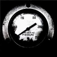
Jessie: Lovely style as always; crisp, clean and striking. I do like watching your pictures develop in ways I just don't understand, ways that are so alien to my own scribbly, smeary mess. And this picture's another good one. Despite the hardness of line and solidity of colour that comes with vector work you've still managed to capture the softness of hair and the delicate ethereal forms of amorphous jellyfish, all encapsulated in the ominous pressure of the surrounding water, a pressure that emphasizes the melancholic mood- that internal state created and influenced by external stresses, stresses that the soft jellyfish seem oblivious to as you gaze at them almost in envy of their indifference to the oppressive force. There's a real sense that the picture is expressing something beyond what we can see in the image, it has a real emotional maturity and sophistication and if this was an open brief this may well have won it for me but the "fantasy self portrait" tag made me lean towards something less darker. In fact the more I talk about this picture the more I want to give it some points but voting rules won't let me. Damn them! No, I made my decision, slap me for it if you like, I certainly deserve it, but congratulations on a great painting!
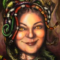
Susie: Everyone said it in the wip thread (including me) but it's worth saying again: Those snakes are awesome!!! Challenges are fun because you see other people's early sketches and you can't help but try and imagine how you yourself would colour and develop their ideas and my version (in my head) of how I would do those snakes was nowhere near as good as how they turned out. Nowhere near! Not even close! My jaw dropped, literally, in the cartoony Wile E Coyote style when I first saw how you did it. But we shouldn't talk just about the snakes. The whole idea was good, emerging from that pun, and you developed it well. It's a nice likeness with good proportions and the expression- what would be a benign smile in a normal picture- when juxtaposed with all those snakes suddenly becomes much deeper, more sinister, ambiguous and enigmatic, and the addition of the high contrast eyes at the end added an extra punch to this. As was mentioned before the skin tones are saturated but given the fantasy nature of the picture and the vivid colours of the snakes it still balances well enough. Skin tones can be quite intimidating but it's important to remember that it is just another surface to observe and reproduce, and you've shown here with those snakes that it's something that you can do very well.
microscopi: I've said this to you before but it's true: It amazes me how quickly you can change your pictures and ideas while you're still painting them! It's so brave to make such bold decisions and in this picture those decisions were undoubtably correct. The idea you settled on was by far the best and I was impressed by the way it was so different from your usual style. The likeness is good and you have got a really solid pose there. There's a mood and an anticipation to the picture as if the fight is just about to start and that lightsabre is about to be swung. And whoever the opponent is ... they're in trouble! The lighting you chose was a tricky one but even with the deadline approaching you worked it out well and made some great changes at the end to make the image work.
Schizo: Another excellent piece of professional quality work ... as always. I knew you'd be the imposing bad guy and you nailed it in the picture, along with the accompanying back story. I do like the vertical upshot perspective to the background, I tried and failed to do that myself recently but you hit all the lines just right here. The wolf and figure are perfectly defined and the surrounding diagonals form an impressive composition. My reaction is similar to Jessie's picture regarding the brief, I didn't quite put you in the points because the mood is less of a self portrait and much more an epic piece of graphic design. It's like a film poster or a magazine cover, something that should be out there on a massive billboard looming over us in its scaled-up brilliance. And like I said to Jessie, if it was an open brief this could be a contender, I like it a lot and it probably deserves the points that I'd like to give it but haven't. So set that scary dog on me and let loose your evil drones and I'll run for my life!

Finally, let me add that it was great to see some new faces in here (literally so, given the brief!) I hope you all stick around for another one, it was fun! Well Done Everyone!
Please Log in or Create an account to join the conversation.
- edtuckerartist
-

- Offline
- New Member
-

- Posts: 98
- Thank you received: 2
2 CherryGraphics
3 Hobbyhorse
Sorry I have no rhyme or reason for picking any of these entries above another as everyone did such an awesome job, however I had to pick the three I liked the most.
Please Log in or Create an account to join the conversation.
- CherryGraphics
-

- Offline
- Junior Member
-

- Posts: 366
- Thank you received: 33
 ...or to vote.
 It's a really hard decision - I wanna give you all point! But I can't so my points go to....:
1) Jessi
2) Schizo
3) aonodori
---
Jessi: Again a really good picture! I love the strong blue color and the lightning from the jellyfishs. The fish scales in your face gave the right touch. Well done!
Schizo: I liked your scribbles and ideas the whole way through. Even if i don't understand the whole picture in detail I think it is really nice balanced with forms and colors. I love the wolf! You remind me of one of the "Stark" boys from Game of Thrones. This gave you my heart ^^
aonodori: Even if you're painting isn't finally finished I like it a lot! I can see how it would have been continued and I love the concentration tongue
 There might have been more spot on the little creature, it looks a bit flat right now.
micro: You really look like Obi Wan Kenobi with this robe! Great
Your right arm looks a bit strange but i can't say why.. maybe it looks a bit - just a bit - like gummy. You know what i mean? like there is a important bone is missing...hobby: I Like this really a lot! I would have give you points but for me it is still to pixelated. The blurry background is okay but on the edges it's irritating a bit. Like aonodori said, it looks like a teaser image.
susie: I love all those snakes a lot! And I love how they come from your head. ^^ But I think a bit more darkness to your eyes would give the picture a bit more focus. But nevertheless a great picture!
ed: Nice one! A pity you couldn't finished a. This would have been a really nice Renaissance-Batman
Please Log in or Create an account to join the conversation.
- hobbyhorse
-
- Offline
- Junior Member
-
- Posts: 132
- Thank you received: 15
1st -Cherry
2nd-jessie
3rd-susie
Cherry- Strong piece from beginning to end. Beautiful colors that work well with each other and love all the little details and critters.
Jessie- The strong mono chromatic color scheme could have overwhelmed the piece but is tempered by the addition of the accent color in the fish and the lovely lighting of the creatures and the bounced lighting on the face.
Susie- This turned out wonderfully and the time spent on the snakes show. The addition of the different eyes in your face is a nice touch, This might of placed higher if one, the front snake was a bit more refined and two if the two snakes on the right did not lead the viewers eye off the page. They are made more noticeable because of their similar shape and that one touches the edge of the image.
aonodori- This was a strong contender. Loved the idea and the hair turned out beautifully. The hands and face read well and what a cute 'helper/mascot' The only thing that it needs is to warm up the flesh, the color looks a bit flat though the rendering of the form is good.
Micro- This could be a great piece and a challenging piece and I hope you will take the time to refine it. I think the shape of the hand looks good, just a few lights and darks to give it some more form/volume.
Schizo- Very futuristic but your face gets a bit lost in the rest of the image. This would make a great movie poster.
Ed- I would really like to see this done. Such a promising start but time was not on your side.
Good Luck to all.
Please Log in or Create an account to join the conversation.
1) Cherry: Your picture is fantastic! The colors you've chosen - the beautiful idea - the whole details - they all make this painting perfect.
2) Hobbyhorse: your picture is also great and I really like your idea. you've got talent!
3) schizo: the portrait works really harmonic with the background. It's awesome!
Jessi: I like your work, the tones of blue and the idea beyond is great.
Aonodori: Your picture is also really nice Keep it up!
Susie1981: The idea of the "Me"-dusa is really awesome. And the snake-like eyes are a great idea!
Micro: Like it - again Such a cool idea
Edtuckerist: I like your color scheme and I think the background is really well done!
GOOD LUCK TO ALL
")
Please Log in or Create an account to join the conversation.
- microscopi
-

- Offline
- Premium Member
-

- Posts: 743
- Thank you received: 79
And now for the finalists
(1) Cherry - You really have outdone yourself with this pic, definitely one of your best. You packed so much detail into this from the wave to the bird in your hair to those awesome cobwebs and flowers. I like how smooth the brush strokes are, kind of admire that because I can't get my stuff to look like that ! The colors all go great together, everything ties together so well, awesome job!
(2) hobbyhorse - I really think you did an awesome job with this, first of all the lighting is awesome,it definitely adds more realism to your pic, but managing to incorporate all the details with the cats and horse really worked out great ! Overall I really like the perspective and the story you have here, the fact that the animals are based on models you built is just taking it to another level !
(3) aonodori - Really like the design it's a cool idea, it brings your interest in right away, the nature theme is done well, with the added paintbrush and veggy bra, the little guy is a nice addition, and I like the humor side of it how he's mimicking your pose.
Jessie - Was really hard not to vote for your because it's pretty awesome, the blue hue themed with the ocean life is a cool idea and you did it really well, love the jellyfish and other details, brush strokes are really smooth too, and the colors are great!
Susie - Awesome job, the fine details of the all the snakes and the colors really make this a great pic. You did a great job with the skin texture and lighting and I like how you matched the snake eyes and skin texture to bring it all together, great job, I think you make a way better medusa!
Schizo - Your style is always interesting to me, the background elements and wolf are a great collage of images, not so sure what they all represent but they are thrown together in a cool way, I like the textures all over everything, you're really awesome with those. I really dig the golden colors a lot.
Ed - Great job, you should be happy with how it turned out because you did a awesome job, the perspective is interesting, and you can see how much work you put into the background details and your clothing, keep at it, make the next one even better!
Please Log in or Create an account to join the conversation.
- SchizophreniaWolf
-
- Offline
- Junior Member
-
- Posts: 170
- Thank you received: 10
I wish I had real killer-drones... 1. jessie: Might sound funny but I would love to print it on a big wall in a disco somewhere, It feels a bit like Tomorrowland, only better. Lines are perfect, but it's the colors that are making me really excited lol. I want to be there with you, when are you coming to pick me up.
2. CherryGraphics: I still have start seeing The Games of the Thrones
") , and I'm planning to do so, but thx for the complement! Stark got style
, and I'm planning to do so, but thx for the complement! Stark got style  . Your paint is great. I like this "Hindu" kind of vibe. I can hear music when I look at it. I only would've painted a bit more plants, because plants don't know where to stop. I would've filled the black with plants. Anyway, nice one again.
3. aonodori: Alway liked it. The line-art was already very cool. There is something about the color and the tones that makes it so soft, and the directions in the composition are fun to look at. One thing, i don't like the furry creature, I mean it's funny, but it needs some improvements: anatomy, pose, shadows, ...
Please Log in or Create an account to join the conversation.
2 - Cherrygraphics: The details you have built in keep me going back to see if I can see something new, it feels dynamic.
3 - Jesse: your colours are so brave and the lighting is beautiful.
I thought everyone did a fantastic Job, can't wait to see what you guys come up with next.
Please Log in or Create an account to join the conversation.
Latest Activity


