oops 


I think they're moving in a circle... possibly around an easy prey of some sort, like a hamster... 


The shoutbox is unavailable to non-members
Shoutbox History
oops 


I think they're moving in a circle... possibly around an easy prey of some sort, like a hamster... 


CGAN Mar 2015 Challenge - Tribute to Nimoy - Final
Brief: Since Leonard Nimoy passed away on the 27th of February it seems only fitting to do a tribute to him. He's known to us Fantasy and Sci-fi geeks as Mr Spock of course, but he's also written poetry, acted on stage, directed and worked with photography (and more). So your tribute can encompass everything and anything you want from his creative deeds.
Deadline: Tuesday 31st March, by midnight GMT. After which voting will begin.
This is where you posts your final entries. WIPs (works in progress) should be posted over here:
cgartnexus.com/index.php/forums/challeng...ribute-to-nimoy-wips
Challenge rules and guidelines:
cgartnexus.com/index.php/forums/challeng...s/39-challenge-rules
Rules in brief:
- All challenge entries must be your own work.
- You should post at least two WIP images that are clearly different from your final entry and each other.
- Your final entry should contain your image (inserted so it shows up full size) and at least two links to your WIP posts on the forum.
- No chatter in the finals thread – if you have questions, post them in the WIP thread or PM an admin.
- Feedback is allowed & encouraged together with the voting and in the WIP thread.
- Deadline is given in UK time (midnight GMT) with a grace period of 5 minutes for getting the post sorted.
- Each member may cast one set of votes, for their 3 favourites.
- No cheating! Admins may decide to disqualify an entry that does not adhere to the above rules.
Any an all misspellings are henceforth blamed on the cats.
Please Log in or Create an account to join the conversation.
- CherryGraphics
-
- Offline
- Junior Member
-

- Posts: 366
- Thank you received: 33
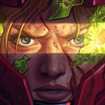
It seems I am the only one who didn't paint Nimoy as the person or Nimoy as Mr. Spock - or both.
I decided to take a poem by him to illustrate.
Will I think of you?
No ...
Only when I'm with others.
Surrounded
In a crowded
party room
Listening to
Several conversations
People communicating
Or trying to ...
Watching the
Blurr of figures and
Faces go past
none coming into focus
Except yours
Again and again
In each corner
In each chair
In every smile
Only you
persistent
forever
Only then
WIP 1
WIP 2
WIP 3
Good luck
Please Log in or Create an account to join the conversation.
- hobbyhorse
-
- Offline
- Junior Member
-

- Posts: 132
- Thank you received: 15
I can't seem to attach Wips Right-clicking number does nothing.
WIP 1: cgartnexus.com/index.php/forums/challeng...y-wips?start=50#9756
WIP 2: cgartnexus.com/index.php/forums/challeng...y-wips?start=60#9765
WIP 3: cgartnexus.com/index.php/forums/challeng...y-wips?start=70#9796
WIP 4: cgartnexus.com/index.php/forums/challeng...y-wips?start=70#9810
WIP 5: cgartnexus.com/index.php/forums/challeng...y-wips?start=70#9816
Thanks Guys.
Please Log in or Create an account to join the conversation.
I did try a few more tweaks but they only made the picture worse and that seems to be my definition of finished. But looking at the other entries I do wish I'd got a better likeness.
Here it is anyway (with nebula!)
1: "A Piece Of The Action."
2: "Wink Of An Eye."
3: "Spock's Brain."
4: "Space Seed."
5: "The Alternative Factor."
Please Log in or Create an account to join the conversation.
Please Log in or Create an account to join the conversation.
So voting time
Vote for your fave 1st, 2nd & 3rd place from the entries below
CherryGraphics
Hobbyhorse
Valence
Jessie
Go now!
You have one week to vote
Please Log in or Create an account to join the conversation.
1 Jessie
2 hobbyhorse
3 CherryGraphics
Jessie: I think everyone has been impressed by the style of your picture (and all your pictures!) It has an excellent likeness and includes the Spock references in a clever and subtle way that tells the story and context of the character and the actor but it's the beautiful simplicity that sets it apart. Creating art involves a lot of things: observation, skill/technique and imagination etc. but an important factor that's often overlooked (and something that I struggle with) is decision making: choosing what exactly to do to express what you want and working out how to achieve that, but also deciding what to leave out. And it's here that you excelled. By stripping the image back to it's essentials you've effectively distilled the picture down to a concentrated idea that expresses the most with the least amount of extraneous detail. A worthy winner, methinks.
hobbyhorse: As well as a great picture this was also a great tutorial in color management. It's always good when you (and others) learn something interesting while painting along. I actually liked the earlier muted picture, the colours gave it an old fashioned, nostalgic air showing the man of that time in his time. The brighter colours changed that mood a little but this wasn't a bad thing, the greater colour range actually improved the form of what you'd painted and made the likeness even better than it already was (and for that reason alone I'll put it just ahead of Cherry.) And I am slightly envious of that likeness, seeing it pop out at the end made me want to repaint mine (but sadly didn't give me the will power to do it!) And such a great expression! showing the man beneath the adornments and effects of the character, peeping to the side to reveal a moment when we can connect with who he really is.
Cherry: Loved the idea behind this. A picture inspired by his poetry seems a much more personal and emotive way to do a tribute and is a great way to acknowledge a part of his life that is usually overlooked. And you've perfectly captured the story and mood behind the poem, the narrative is clearly readable and understandable in your image. The silhouettes were nicely delineated and then blended well into the background. The eyes are wonderfully intense and capture your gaze instantly (thanks to that stripe of bright colour) and then, like an illusion the rest of the face slowly appears, pushing all the other figures away exactly as the poem Implies. Even though you were uncertain about the colours at the end the combinations you chose were good ones: they draw your attention to the right areas of the image in the right order and having that progression of horizontal stripes gives the picture a genuine sense of depth and space despite the stylized nature that would usually flatten an image. It's a really imaginative, unorthodox and successful picture.
Like I said it was difficult to put these into an order and I suspect that if I voted again on another day then that order could easily change, they were that close. All of which is a convoluted way of saying Well Done to everyone.
And Charlotte, Stop Dying, it's not allowed round here.
Please Log in or Create an account to join the conversation.
- CherryGraphics
-

- Offline
- Junior Member
-

- Posts: 366
- Thank you received: 33
1) Jessie: I love your picture because you have an impressing style with your vectors. I always found it hard to construct a picture like this so you have my whole respect
2) Valence: Again a great portrait, my dear. I love how you drew all of his wrinkles in his face with this much plasticity. And the nebula works really nice in the background
3) Hobbyhorse: Your picture is also really well drawn, I like your style too but I missed a little bit more depth in colors. I know you said you like it this way but for my personal feeling I would have prefered a little bit more.
Please Log in or Create an account to join the conversation.
- hobbyhorse
-

- Offline
- Junior Member
-

- Posts: 132
- Thank you received: 15
2.cherry- what a wonderful use of color and I agree that it is perfect for the poem. Busy in it's design, like a crowded room, but the focus on the eyes with their rendering and the bands of color, and with just enough emphasis on the mouth and nose that the viewer can easily read the face in the image. A truly challenging piece.
3.jessie- There is a preciseness in the clean lines that very much fit the character and the man. The duality that you captured also reads well and the little details complete the portrait nicely.
Please Log in or Create an account to join the conversation.
1) Valence - I'm not as graceful with words as the rest of you seem to be so I'll just say it as it comes to me.
Your piece is awesome. That's all there is to say. I did favor the simple background for...well, it's simplicity, but the nebula brings the memory of his beloved character into the piece which, in turn, makes it a perfect tribute. The thought and detail you put into it is beyond me and my ability in Photoshop. Just awesome.
2) Hobbyhorse - I don't want to place numbers next to anyone for the simple fact that they are all great. Everyone's style is different. But because your piece doesn't show as much detail as the other piece in your gallery, I feel like it isn't finished and find myself yearning for something more - another update. For that reason I had to slide you under Valence even though I know the muted tones is what you were originally going for. On the other hand the colors and compositions shows him in his time which reminds me the most of when I would sit and watch Star Trek with my dad. The main reason I decided to participate in this challenge (aside from Kaz twisting my arm- which still hurts btw
3) CherryGraphics - Loved the Nimoy, Spock or Nimock comment. Thanks for that chuckle this morning.
Great idea in your image. To bring life to one of his poems is something I would of never thought of- let alone, known how to execute as perfectly as you did. I agree with Valence, a picture inspired by his poetry seems much more personal.
Please Log in or Create an account to join the conversation.
Latest Activity
