


- Posts: 743
- Thank you received: 79
 Like I said. Now
*presses B again*
![:]](https://cgartnexus.com/images/mod_shoutbox/unsure.png)
He does like meowing a lot.
I meant *here* but I guess Val might be a cat...
Does one belong to a cat?
I suspect there are two brains here. 
The shoutbox is unavailable to non-members
Shoutbox History
Like I said. Now
*presses B again*
He does like meowing a lot.
I meant *here* but I guess Val might be a cat...
Does one belong to a cat?
I suspect there are two brains here.
CGAN Feb 2015 - Letting off Steam - FINALS
- microscopi
-

- Offline
- Premium Member
-

Less
More
02 Mar 2015 02:39 - 02 Mar 2015 02:46 #9241
by microscopi
Replied by microscopi on topic CGAN Feb 2015 - Letting off Steam - FINALS
I think this was my favorite challenge month so far, had a lot of fun working on my pic, its hard to choose everyone did a freaken awesome job 
(1) Domtopia : Great design, excellent metal texture, and lighting. You did a really great job with optimus's texture, captures the lighting and reflections so well, as Valence said the edges are awesome and I like how he looks from head to toe, the metal texture really comes alive. I like the pose and anatomy of optimus a lot also, the kids helmet is great, designed well and brings the piece some humour, which makes it really all come together.
(2) Valence : The story behind your image really makes it more interesting, I appreciate all the time and detail you put into your images, it's always great to have a good backstory, it makes designing a lot easier, I like the addition of the details you put on the right, it really goes perfectly with the foreground. The robot looks awesome and the girl equally so, the traditional feel you created really comes across with the colors and atmoshphere, the perspective of the characters looking down brings a lot of depth and interesting story elements into it.
(3)Cherry: Lovin the map in the background like everyone else, the detail of the ships is outstanding, as well as the texture of the map paper and the old weathered look, the image looks very polished. The girl and parrot are perfect match to each other especially with that parrot hat. The design of her attire and the fabric texture looks really great, like the shading a lot.
Oaktree : It was so hard not to vote for yours, it really is an amazing piece. If not for the couple of unfinished details you would definitely be in the top three. The airship chase is a great idea, and the colors are perfect, I really like the mood you created with the colors and perspective, you did a good job of creating depth in the pic, awesome.
Dave: Too bad you weren't able to get your pic in, but I felt it was finished as it was minus the color, you had so much detail in there it was looking awesome. The bull was really well done, the metal texture, lighting, components and anatomy. Hopefully can finish it soon and will see it in the galary.
Schizo: Your design was looking cool so far, like the design and all the details you started, can just imagine how much you would of put into the final, hope to see you in the next challenge.
Kodabble: Interesting concept with all the firepower, and the idea is pretty cool, was looking forward to seeing yours get done too. What you have so far perspective wise looks great, everything is setup and positioned well from what I can see.
Last edit: 02 Mar 2015 02:46 by microscopi.
Please Log in or Create an account to join the conversation.
- CherryGraphics
-

- Offline
- Junior Member
-

Less
More
- Posts: 366
- Thank you received: 33
02 Mar 2015 08:05 #9242
by CherryGraphics
Replied by CherryGraphics on topic CGAN Feb 2015 - Letting off Steam - FINALS
Drrrrrrr..... drumroll
time to vote")
1. micro - As I said - I love the idea to do a steampunk Charlie tschuff-tschuff. Your style is unique as always - really well done (And after I'll have finished my recent book I have to read the dark tower again. ^^)
2. Dom - really interesting idea! This is something totally different from the steampunk style I know. I like the calm they both exude. And the metal look is awesome!
3. Val - Wonderful idea with the story you wrote around it. Her face reminds me of the snow white girl last month - just with black hair. ^^
oak: good idea with the fight in the air - the background is a complete other style than the foreground ...it would be good if both could stick together more to build a overall picture.
Schizo & Kodabble & Dave: So sad you didn't have time to complete yours - I think they would have been all very great .... hopefully next time!
time to vote
1. micro - As I said - I love the idea to do a steampunk Charlie tschuff-tschuff.
Your style is unique as always - really well done (And after I'll have finished my recent book I have to read the dark tower again. ^^)2. Dom - really interesting idea! This is something totally different from the steampunk style I know. I like the calm they both exude. And the metal look is awesome!
3. Val - Wonderful idea with the story you wrote around it. Her face reminds me of the snow white girl last month - just with black hair. ^^
oak: good idea with the fight in the air - the background is a complete other style than the foreground ...it would be good if both could stick together more to build a overall picture.
Schizo & Kodabble & Dave: So sad you didn't have time to complete yours - I think they would have been all very great .... hopefully next time!
Please Log in or Create an account to join the conversation.
02 Mar 2015 16:37 - 02 Mar 2015 16:41 #9276
by Kodabble
Replied by Kodabble on topic CGAN Feb 2015 - Letting off Steam - FINALS
Sorry I didn’t get mine done in time for this, it just kept fighting me and wasn’t going the way I wanted it to. Anyway there are great entries so on with the voting:
1 - CherryGraphics: Nice “steam punk” theme as I understand it. The girl has what I take it as the steam look, but it is the background with the airship and map that did it for me.
2 - Valence: Nice night atmospheric image to go with your stroy . Like the steam powered robot, would think it would have been more steamie if the shoulder stacks had white steam and the top hat had the black smoke. Like the use of the signs to add to the story.
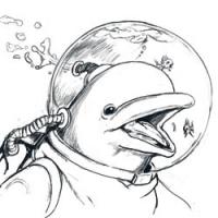
3 - microscopi: I like the human/robot concept and it seems to fit the steam punk idea with the complex brass look. One thing I would have liked to have seen is steam coming out of the piston cylinders.
Domtopia: this is a really nice image but I don’t see Optimus Prime fishing as fitting the theme if the challenge. Not a steam punk nor the figurative “letting off steam (pent up energy or anger)”. For that it didn’t make my choice, otherwise it is a really nice picture.
Oaktree: This was close for third. The concept is good and the airship designs appear to be steam punkie, but the overall looks unfinished, with sharp detail in some areas like the rear gun and the brass steam tank, while the balloon and the forward gun and ship motors look like they are still unfinished. I do like the overall color scheme.
1 - CherryGraphics: Nice “steam punk” theme as I understand it. The girl has what I take it as the steam look, but it is the background with the airship and map that did it for me.
2 - Valence: Nice night atmospheric image to go with your stroy . Like the steam powered robot, would think it would have been more steamie if the shoulder stacks had white steam and the top hat had the black smoke. Like the use of the signs to add to the story.
3 - microscopi: I like the human/robot concept and it seems to fit the steam punk idea with the complex brass look. One thing I would have liked to have seen is steam coming out of the piston cylinders.
Domtopia: this is a really nice image but I don’t see Optimus Prime fishing as fitting the theme if the challenge. Not a steam punk nor the figurative “letting off steam (pent up energy or anger)”. For that it didn’t make my choice, otherwise it is a really nice picture.
Oaktree: This was close for third. The concept is good and the airship designs appear to be steam punkie, but the overall looks unfinished, with sharp detail in some areas like the rear gun and the brass steam tank, while the balloon and the forward gun and ship motors look like they are still unfinished. I do like the overall color scheme.
Last edit: 02 Mar 2015 16:41 by Kodabble.
Please Log in or Create an account to join the conversation.
- Digital Dave
-

- Offline
- Platinum Member
-

Less
More
- Posts: 2242
- Thank you received: 163
03 Mar 2015 00:00 #9311
by Digital Dave
I get sketchy around pencils! ...
Replied by Digital Dave on topic CGAN Feb 2015 - Letting off Steam - FINALS
Also sorry I didn't finish, but had a blast just the same & appreciate the kind words. ... Not being that familiar with the 'Steam Punk' style itself, is really what got me interested in joining in. Though I agree with Kodabble's definition of letting off steam, (aggression release) which does fit the theme & makes sense. To me, I don't think anyone went this route, including myself. I was thinking more along the lines of trying to get the look, fashion, environment, etc. of being a steam punk image.
1 - Cherry ... Definitely says Steam Punk to me and is nicely painted with a great palette.
2 - Valence ... Again, very Steam Punk. I like both the characters and environmental design too.
3 - Oaktree ... Though I agree it has an unfinished feel, I also like that with this image. I also like the atmosphere.
Dom - Just a fantastic image. Well painted and there's just something so cool about Optimus leisurely enjoying some peaceful fishing with a youngster. Great concept, but agree with Kodabble, it just doesn't say Steam Punk. I honestly thought you were going to add some steam punk elements in the end. Apologies for not being around much to inquire.
Micro - Like others, I really liked the train concept from the start. But I think the surrounding elements and atmosphere you added make me think more of a western, then steam punk. Again, sorry I didn't mention this earlier. With the limited time, I guess I wasn't close enough attention. It's also one of the reasons I don't care to critique work in the finals like this. (This being my first time, I believe?)
Also sorry Schizo & Kodabble didn't finish theirs, and hope they share them when they do. I think both images were coming along quite nice, and seem to fit the theme very well indeed. ... Great challenge everyone.
... Not being that familiar with the 'Steam Punk' style itself, is really what got me interested in joining in. Though I agree with Kodabble's definition of letting off steam, (aggression release) which does fit the theme & makes sense. To me, I don't think anyone went this route, including myself. I was thinking more along the lines of trying to get the look, fashion, environment, etc. of being a steam punk image.1 - Cherry ... Definitely says Steam Punk to me and is nicely painted with a great palette.
2 - Valence ... Again, very Steam Punk. I like both the characters and environmental design too.
3 - Oaktree ... Though I agree it has an unfinished feel, I also like that with this image. I also like the atmosphere.
Dom - Just a fantastic image. Well painted and there's just something so cool about Optimus leisurely enjoying some peaceful fishing with a youngster. Great concept, but agree with Kodabble, it just doesn't say Steam Punk. I honestly thought you were going to add some steam punk elements in the end. Apologies for not being around much to inquire.
Micro - Like others, I really liked the train concept from the start. But I think the surrounding elements and atmosphere you added make me think more of a western, then steam punk. Again, sorry I didn't mention this earlier. With the limited time, I guess I wasn't close enough attention. It's also one of the reasons I don't care to critique work in the finals like this. (This being my first time, I believe?)
Also sorry Schizo & Kodabble didn't finish theirs, and hope they share them when they do. I think both images were coming along quite nice, and seem to fit the theme very well indeed. ... Great challenge everyone.
I get sketchy around pencils! ...
Please Log in or Create an account to join the conversation.
- SchizophreniaWolf
-
- Offline
- Junior Member
-
Less
More
- Posts: 170
- Thank you received: 10
06 Mar 2015 13:54 #9395
by SchizophreniaWolf
Replied by SchizophreniaWolf on topic CGAN Feb 2015 - Letting off Steam - FINALS
1. CherryGraphics: Hot redhead, cool zeppelin-boot-ship-thing.
2. microscopi: Cool, freaky train. I like the texture
3. Valence: Can't win 'em all") . Ha no, I like the woman (you paint some nice weman!), don't like her hat, don't like the robot.
. Ha no, I like the woman (you paint some nice weman!), don't like her hat, don't like the robot.
I didn't have enough time for mine, to bad. I finish it in another life I guess
2. microscopi: Cool, freaky train. I like the texture
3. Valence: Can't win 'em all
. Ha no, I like the woman (you paint some nice weman!), don't like her hat, don't like the robot.I didn't have enough time for mine, to bad. I finish it in another life I guess
Please Log in or Create an account to join the conversation.

07 Mar 2015 18:38 #9427
by Charlotte
Any an all misspellings are henceforth blamed on the cats.
Replied by Charlotte on topic CGAN Feb 2015 - Letting off Steam - FINALS
I won't be going to Stockholm tomorrow* after all but as promised, here's the results of the vote!
 I remembered!
Domtopia 8
CherryGraphics 17
Valence 10
Oaktree 2
Microscopi 11
And the winner is Cherry! Congratulations!
* Apparently people have been waiting in line between 3-5 hours today to get into the Game of Thrones exhibit. While the queues may be somewhat shorter tomorrow, I just don't think it's worth it.
I remembered!Domtopia 8
CherryGraphics 17
Valence 10
Oaktree 2
Microscopi 11
And the winner is Cherry! Congratulations!
* Apparently people have been waiting in line between 3-5 hours today to get into the Game of Thrones exhibit. While the queues may be somewhat shorter tomorrow, I just don't think it's worth it.
Any an all misspellings are henceforth blamed on the cats.
Please Log in or Create an account to join the conversation.
- microscopi
-
- Offline
- Premium Member
-
Less
More
- Posts: 743
- Thank you received: 79
07 Mar 2015 20:43 #9433
by microscopi
Replied by microscopi on topic CGAN Feb 2015 - Letting off Steam - FINALS
Way to go Cherry, getting up there!
Please Log in or Create an account to join the conversation.

08 Mar 2015 11:58 #9434
by kazky
Replied by kazky on topic CGAN Feb 2015 - Letting off Steam - FINALS
Congrats Cherry, great image
Please Log in or Create an account to join the conversation.

08 Mar 2015 14:36 - 08 Mar 2015 14:36 #9435
by Domtopia
Everything's on the right!!!
It's like driving abroad!
Replied by Domtopia on topic CGAN Feb 2015 - Letting off Steam - FINALS
Well done Cherry. Great final piece and well deserved!!
Now that the voting is over, I just wanted to address my disqualification by a couple of voters for this last challenge. The brief said "Steampunk (or not, if you have other ideas!)", so I went for something different.
My understanding was that letting off steam meant to relax and wind down, not releasing "pent up energy or anger". Fishing, for example, is a very popular way of letting off steam and it doesn't require the fisher to run around the pond, or scream at the fish!
I wanted to wait for the voting to finish before posting my protest, as I didn't want to appear whiny. But, I feel a little hard done by because of the reinterpretation of the brief.
Nonetheless, thanks to everyone who commented and/or voted for my piece. It's a real boost to the confidence to even get 1 vote! So thanks!!
Once again, well done Cherry! Wonderful piece of work there!!
Everything's on the right!!!
It's like driving abroad!
Last edit: 08 Mar 2015 14:36 by Domtopia.
Please Log in or Create an account to join the conversation.

08 Mar 2015 15:20 #9439
by Valence
Replied by Valence on topic CGAN Feb 2015 - Letting off Steam - FINALS
Well Done Cherry! All that hard work doing the map has really paid off.
Dom: Yes that's how I too understand "Letting Off Steam" in the literal sense (I mentioned it in my feedback). Perhaps that's a parochial British interpretation of the phrase. You forget sometimes that this internet's a global thing and that people in other countries have slightly different takes on familiar idioms but it's always fascinating to find these things out.
Dom: Yes that's how I too understand "Letting Off Steam" in the literal sense (I mentioned it in my feedback). Perhaps that's a parochial British interpretation of the phrase. You forget sometimes that this internet's a global thing and that people in other countries have slightly different takes on familiar idioms but it's always fascinating to find these things out.
Please Log in or Create an account to join the conversation.
Latest Activity

Banj updated their profile picture


Charlotte Still wearing a mask? Is it so we won't see you hoarding food in those cheeks of yours?
See More
Banj Mfmuh Guhmfpf
See More
Charlotte I'll take that as a yes...
See More
Charlotte Why is there a tiny flashing thing in front of the reply link/button? It's so small I can't see if it's an exclamation mark or a question mark... or...both?)
See More
Banj Because? Both!
See More
Charlotte *gasp*
See More

CaptainDeth updated their profile picture

CaptainDeth Ahoy folks, just a newbie here, just getting started. Thanks for allowing me in.
CaptainDeth Thank You
CaptainDeth and Mr.Bungle joined the site


honbasic joined the site


Gawk joined the site