


- Posts: 173
- Thank you received: 16
🕰️ 
 !
!

![:]](https://cgartnexus.com/images/mod_shoutbox/unsure.png)
No zombies, surprisingly  At least none that I remember.


or not. I slept, but had rather a lot of restless/stressful dreams. Loads of people. 

Guess it's safe to go then
The shoutbox is unavailable to non-members
Shoutbox History
🕰️ !
No zombies, surprisingly At least none that I remember.
or not. I slept, but had rather a lot of restless/stressful dreams. Loads of people.
Guess it's safe to go then
Feb19 - Locked in Ice - WIPs
17 Feb 2019 19:40 #23826
by oaktree
Replied by oaktree on topic Feb19 - Locked in Ice - WIPs
update

Please Log in or Create an account to join the conversation.

18 Feb 2019 20:45 #23833
by Valence
Replied by Valence on topic Feb19 - Locked in Ice - WIPs
Looking good, oaktree.
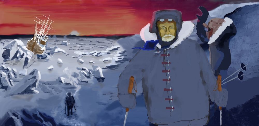
I think a bit more light around the horizon would be nice, both to brighten the sun and bleed some warm colours into the snow. But I like the dominant figure in the foreground. It adds to the depth and sense of scale in the landscape and it's the kind of thing my picture could do with. Among other things.
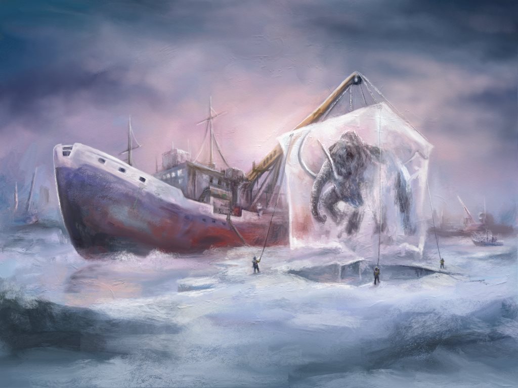
It doesn't look that different really. I've just been trying to solidify those edges a bit more to give it a bit of definition. I did also experiment by darkening the pic and adding some spot lighting effects but I think more needs to be done elsewhere before I commit to that.
I think a bit more light around the horizon would be nice, both to brighten the sun and bleed some warm colours into the snow. But I like the dominant figure in the foreground. It adds to the depth and sense of scale in the landscape and it's the kind of thing my picture could do with. Among other things.
It doesn't look that different really. I've just been trying to solidify those edges a bit more to give it a bit of definition. I did also experiment by darkening the pic and adding some spot lighting effects but I think more needs to be done elsewhere before I commit to that.
Attachments:
Please Log in or Create an account to join the conversation.

19 Feb 2019 19:48 #23840
by Atto
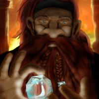
No smudge tool was harmed in the making of this image.
Replied by Atto on topic Feb19 - Locked in Ice - WIPs
Both looking good.
Those are some nice edges now Val and I like the twilight feel in yours Oak. Good stuff!
Those are some nice edges now Val and I like the twilight feel in yours Oak. Good stuff!
No smudge tool was harmed in the making of this image.
Please Log in or Create an account to join the conversation.
19 Feb 2019 23:49 - 19 Feb 2019 23:50 #23843
by oaktree
Replied by oaktree on topic Feb19 - Locked in Ice - WIPs
Valence looking good I just noticed your set of slingers guiding the ice block. Thanks for the idea with lightening the sky which will allow me to add some colours into the ice sheet. I will probably go over the top with it, it's a great idea.
Thanks for your comments Atto much appreciated I will try to keep the twilight feel but add some more dramatic colour to the sky and ice.
I have given the lead character a face instead of the mask hope it works.
Update from me
Thanks for your comments Atto much appreciated I will try to keep the twilight feel but add some more dramatic colour to the sky and ice.
I have given the lead character a face instead of the mask hope it works.
Update from me
Last edit: 19 Feb 2019 23:50 by oaktree. Reason: missed work
Please Log in or Create an account to join the conversation.
23 Feb 2019 20:16 #23886
by oaktree
Replied by oaktree on topic Feb19 - Locked in Ice - WIPs
update from me

Please Log in or Create an account to join the conversation.
24 Feb 2019 15:36 #23890
by Valence
Replied by Valence on topic Feb19 - Locked in Ice - WIPs
I like the change to the positions of the foreground figures. The previous versions were a little confusing in that area. I think a bit more shading/texture in the clothing to break up the flat colours would help further to separate the different depths and distances.
If there's time of course. I'm struggling to fit mine in too!
If there's time of course. I'm struggling to fit mine in too!
Please Log in or Create an account to join the conversation.
24 Feb 2019 19:17 #23891
by oaktree
Replied by oaktree on topic Feb19 - Locked in Ice - WIPs
Thanks for the feedback Valence. It needs to improve a lot before I post it again at the moment I do not like it at all I'm only here making up the numbers.
Please Log in or Create an account to join the conversation.
Latest Activity

Banj updated their profile picture


Charlotte Still wearing a mask? Is it so we won't see you hoarding food in those cheeks of yours?
See More
Banj Mfmuh Guhmfpf
See More
Charlotte I'll take that as a yes...
See More
Charlotte Why is there a tiny flashing thing in front of the reply link/button? It's so small I can't see if it's an exclamation mark or a question mark... or...both?)
See More
Banj Because? Both!
See More
Charlotte *gasp*
See More

CaptainDeth updated their profile picture

CaptainDeth Ahoy folks, just a newbie here, just getting started. Thanks for allowing me in.
CaptainDeth Thank You
CaptainDeth and Mr.Bungle joined the site


honbasic joined the site


Gawk joined the site