


- Posts: 234
- Thank you received: 26


The shoutbox is unavailable to non-members
CGAN March 2018 - Roman Gods - WIPs
27 Mar 2018 15:21 #20656
by Thomgirl
Replied by Thomgirl on topic CGAN March 2018 - Roman Gods - WIPs
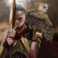
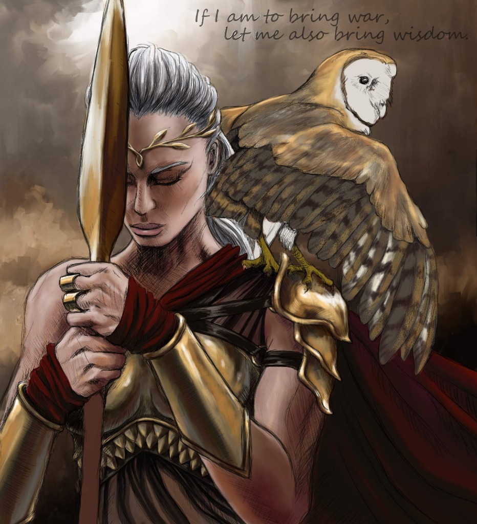
Thanks, CG for the crit  Very helpful. Something hadn't been really selling me on the background, but your specific point made it click. I am hoping now that I've messed around with it, it's setting a bit better. I'm getting super close to done. There's more detail work on the owl, probably some attention to the skin tone liveliness and that spear haft I keep neglecting. Probably a few odds 'n ends with the metal line work as well just to clean it up a bit. This will be my last post here, though. Going for broke to finish today or tomorrow.
Very helpful. Something hadn't been really selling me on the background, but your specific point made it click. I am hoping now that I've messed around with it, it's setting a bit better. I'm getting super close to done. There's more detail work on the owl, probably some attention to the skin tone liveliness and that spear haft I keep neglecting. Probably a few odds 'n ends with the metal line work as well just to clean it up a bit. This will be my last post here, though. Going for broke to finish today or tomorrow. Please Log in or Create an account to join the conversation.
- cgmythology
-

- Offline
- Senior Member
-

27 Mar 2018 15:56 #20657
by cgmythology
Replied by cgmythology on topic CGAN March 2018 - Roman Gods - WIPs
HUGE improvement on the background, love the new update! Excellent brushstrokes and value work there. Looking forward to seeing the next update!
Please Log in or Create an account to join the conversation.

28 Mar 2018 22:53 #20670
by Atto
No smudge tool was harmed in the making of this image.
Replied by Atto on topic CGAN March 2018 - Roman Gods - WIPs
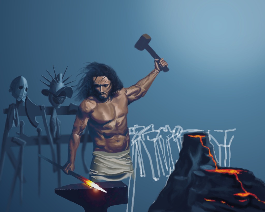
So I've picked this up again tonight - I'm not loving it but the deadline is fast approaching and I'm fed up with 'almost' completing challenges. Still a ways to go - just the small issue of trying to get across the idea that the scene is set underwater, finish the background, give him some legs, design a more fitting hammer and finish off his belt and skirty type thing.
No pressure!
No pressure!
No smudge tool was harmed in the making of this image.
Please Log in or Create an account to join the conversation.

28 Mar 2018 23:34 #20672
by Valence
Replied by Valence on topic CGAN March 2018 - Roman Gods - WIPs
If you're still worrying about making it seem underwater then bubbles will help. Some around the swinging hammer and some more fizzing around the glowing metal will do the trick.
But as I said before, it already does look underwater to me.")
But as I said before, it already does look underwater to me.
The following user(s) said Thank You: Atto
Please Log in or Create an account to join the conversation.

29 Mar 2018 08:39 #20674
by Charlotte
Any an all misspellings are henceforth blamed on the cats.
Replied by Charlotte on topic CGAN March 2018 - Roman Gods - WIPs
Legs would be good  and a hint of nipples (if gods have those, you never know...)
Maybe a bit of heat haze/wirliness in the water over the volcano...
I agree with Valence, though. The colouring and flow of his hair already suggests underwater quite well
and a hint of nipples (if gods have those, you never know...)Maybe a bit of heat haze/wirliness in the water over the volcano...
I agree with Valence, though. The colouring and flow of his hair already suggests underwater quite well
Any an all misspellings are henceforth blamed on the cats.
The following user(s) said Thank You: Atto
Please Log in or Create an account to join the conversation.
29 Mar 2018 11:25 #20675
by Valence
Replied by Valence on topic CGAN March 2018 - Roman Gods - WIPs
It would be nice if gods didn't have nipples. It would have saved me quite a lot of hours of failure in my pic.
It was going so repeatedly bad the other day that I considered giving my two-faced Janus a bra to cover it up!
It was going so repeatedly bad the other day that I considered giving my two-faced Janus a bra to cover it up!
Please Log in or Create an account to join the conversation.
29 Mar 2018 13:13 #20676
by Thomgirl
Replied by Thomgirl on topic CGAN March 2018 - Roman Gods - WIPs
You know, Atto, you could also just extend the anvil and make it something massive to skip having to deal with leg work (I know it may seem cheap, but in all fairness, there's the deadline to consider and I don't think it would take away from the work). As for the underwater thing, I agree with the others. You've got the right tones, I think some loose coral looking structures in the background would work and some water shimmer haze/heat, bubbles and maybe some little seaweed or bottom feeder critters creeping about the forge or anvil would work.
Try looking up some images of underwater volcanic activities or steam vents. May help give you some ideas to sell it.
Valence: You better submit or I will be very put out")
Try looking up some images of underwater volcanic activities or steam vents. May help give you some ideas to sell it.
Valence: You better submit or I will be very put out
The following user(s) said Thank You: Atto
Please Log in or Create an account to join the conversation.
29 Mar 2018 20:02 #20678
by Valence
Replied by Valence on topic CGAN March 2018 - Roman Gods - WIPs
Wish granted.
Please Log in or Create an account to join the conversation.
29 Mar 2018 20:13 #20679
by Charlotte
Any an all misspellings are henceforth blamed on the cats.
Replied by Charlotte on topic CGAN March 2018 - Roman Gods - WIPs
wow, you've been forgetting to post quite a few wips between the last one and your final, I think. You keep belittling yourself but it looks really well done to me. You even managed a very realistic nipple!
I think I'd like to see a version where the bg colours are flipped just to see if that makes it pop more (old, cool colour guy against warm bg and young warm colour guy against cool bg...). That's just a thought, though
I think I'd like to see a version where the bg colours are flipped just to see if that makes it pop more (old, cool colour guy against warm bg and young warm colour guy against cool bg...). That's just a thought, though
Any an all misspellings are henceforth blamed on the cats.
The following user(s) said Thank You: Valence
Please Log in or Create an account to join the conversation.
29 Mar 2018 20:53 #20680
by Valence
Replied by Valence on topic CGAN March 2018 - Roman Gods - WIPs
For a long, long time it looked exactly like that last wip (but with the hair added) and all my early efforts at doing that fleshy join were truly horrible, far too embarrassing to post.  So I ended up going back to that wip and restarting several times and it felt like posting another would be pointless if I was just gonna go back to that point and start again.
It wasn't until I extended the canvas that it started to make some progress and then the nipple thing started to annoy me! Not only did it change shape and colour, it moved around quite a bit too until finally settled right ... there.
And, yes, I agree, with another week (or two) I too would like to experiment with that background and also add some kind of symbolism or framing to explain the figure. I'd be able to do so much more with my pics if I didn't waste so much time correcting mistakes.
So I ended up going back to that wip and restarting several times and it felt like posting another would be pointless if I was just gonna go back to that point and start again.It wasn't until I extended the canvas that it started to make some progress and then the nipple thing started to annoy me! Not only did it change shape and colour, it moved around quite a bit too until finally settled right ... there.
And, yes, I agree, with another week (or two) I too would like to experiment with that background and also add some kind of symbolism or framing to explain the figure. I'd be able to do so much more with my pics if I didn't waste so much time correcting mistakes.
Please Log in or Create an account to join the conversation.
Latest Activity

Banj updated their profile picture


Charlotte Still wearing a mask? Is it so we won't see you hoarding food in those cheeks of yours?
See More
Banj Mfmuh Guhmfpf
See More
Charlotte I'll take that as a yes...
See More
Charlotte Why is there a tiny flashing thing in front of the reply link/button? It's so small I can't see if it's an exclamation mark or a question mark... or...both?)
See More
Banj Because? Both!
See More
Charlotte *gasp*
See More

CaptainDeth updated their profile picture

CaptainDeth Ahoy folks, just a newbie here, just getting started. Thanks for allowing me in.
CaptainDeth Thank You
CaptainDeth and Mr.Bungle joined the site


honbasic joined the site


Gawk joined the site