


- Posts: 10081
- Thank you received: 475
 Hopefully not
Oh, did it just want to make friends with the other three? 


oops 

The shoutbox is unavailable to non-members
Shoutbox History
CGAN March 2016 - The Last Stand - WIPs
06 Mar 2016 12:59 - 06 Mar 2016 15:28 #13476
by Valence
Replied by Valence on topic CGAN March 2016 - The Last Stand - WIPs
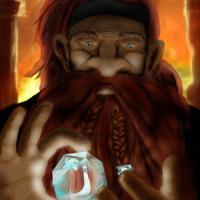
Looking very impressive, Atto. There's some good, detailed work in that eye.
If you're not quite happy with it then I think it might be down to the small chin and its relationship to the mouth. It looks a bit like the facial features are fractionally too big for the head.
There are two ways to tweak that; by either adding a bit more to the chin/jawline; or just select the facial features, shrink them down a little bit and nudge them upwards. Also keep an eye on the alignment and symmetry of the nostrils and the eye(s).
It's looking very good so far. I love the three-dimensional nature of the pose, it has a fantastic, dynamic depth.
EDIT: didn't have time to type this earlier...
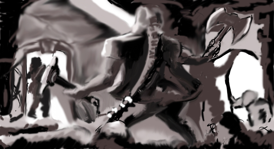
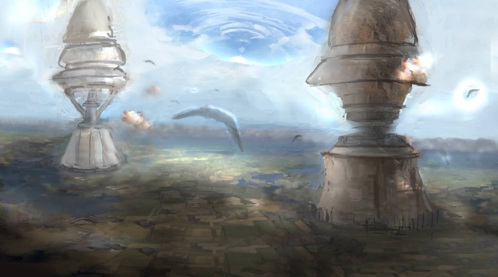
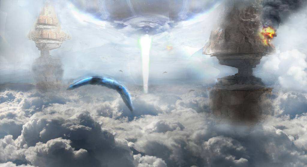
Micro: Those two big structures are really intriguing, especially with those narrow sections in the middle.
The way your pictures develop always makes me feel like I'm slowly approaching something. All these shapes and forms appear in the distant mist and then gradually emerge into detail until everything becomes clear. Keep it going!
If you're not quite happy with it then I think it might be down to the small chin and its relationship to the mouth. It looks a bit like the facial features are fractionally too big for the head.
There are two ways to tweak that; by either adding a bit more to the chin/jawline; or just select the facial features, shrink them down a little bit and nudge them upwards. Also keep an eye on the alignment and symmetry of the nostrils and the eye(s).
It's looking very good so far. I love the three-dimensional nature of the pose, it has a fantastic, dynamic depth.
EDIT: didn't have time to type this earlier...
Micro: Those two big structures are really intriguing, especially with those narrow sections in the middle.
The way your pictures develop always makes me feel like I'm slowly approaching something. All these shapes and forms appear in the distant mist and then gradually emerge into detail until everything becomes clear. Keep it going!
Last edit: 06 Mar 2016 15:28 by Valence.
The following user(s) said Thank You: Atto
Please Log in or Create an account to join the conversation.
- microscopi
-

- Offline
- Premium Member
-

Less
More
- Posts: 743
- Thank you received: 79
07 Mar 2016 01:35 - 07 Mar 2016 18:11 #13478
by microscopi
Replied by microscopi on topic CGAN March 2016 - The Last Stand - WIPs
Atto I agree with Val, as that's whats very noticeable from what I can see too. Facial features mostly the nose and mouth are too big in relation to his face. Maybe extend the chin a bit and decrease the size of his forehead and will look great. Admire your ability to draw anatomy so well, I really suck at it ! The pose of the guy clutching the wall has so much drama in it! Like shakespear style  Thanks for the encouragement on mine, it's supposed to be a alien space battle, but not involving humans! Like the first final fantasy movie I suppose.
Val to be completely honest, for the past couple pics i've made I used photo guidance. I keep changing my mind so much lately it's tough to commit to a sketch at the moment, and it's making me a bit angry with myself knowing it's a bad habit to get into.
Saw this pic online that inspired me, and I know I should be making my own thumbnails for that, but I am starting to become lazy! So now it's all about covering up the photo with solid traditional brushstrokes which is what you see now. I hope as it comes into more detail you guys will see the alien battle play out more..
Thanks for the encouragement on mine, it's supposed to be a alien space battle, but not involving humans! Like the first final fantasy movie I suppose. Val to be completely honest, for the past couple pics i've made I used photo guidance. I keep changing my mind so much lately it's tough to commit to a sketch at the moment, and it's making me a bit angry with myself knowing it's a bad habit to get into.
Saw this pic online that inspired me, and I know I should be making my own thumbnails for that, but I am starting to become lazy!
So now it's all about covering up the photo with solid traditional brushstrokes which is what you see now. I hope as it comes into more detail you guys will see the alien battle play out more..
Last edit: 07 Mar 2016 18:11 by microscopi. Reason: Being a downer
The following user(s) said Thank You: Atto
Please Log in or Create an account to join the conversation.
07 Mar 2016 15:17 #13480
by oaktree
Replied by oaktree on topic CGAN March 2016 - The Last Stand - WIPs
Hi all
Good starts so far here is an explanation for my attempt.
The Last Stand of Balin's Colony
This is my take on Ori in the Chamber of Mazarbul
Balin along with Ori and others were Dwarves in the company of Thorin Oakenshield that travelled with Bilbo Baggins and Gandalf in the quest to reclaim Erabor (the lonely mountain from Smaug the Dragon) this is a story that is well known and will not be repeated here.
Not so well knows is that some years later Balin led a small group of Dwarves which included Ori away from the lonely mountain to try and resettle the Dwarf city of Moria which lay beneath the Misty Mountains and had been lost many years before. The quest was successful but for only a small number of years. Eventually one day whilst gazing into Lake Mirrormere which lay close by the east gate of Moria, Balin was struck and killed by an Orc arrow and his people where assailed by a great many Orcs which had travelled up the Silverlode River. The Dwarves were forced back into Moria, and being vastly out numbered they lost first the gate and then the first hall, they retreated further and further back until the last four Dwarves which included Ori made there last stand in the Chamber of Mazarbul.
Based on the historic writings of J R R Tolkien
Please Log in or Create an account to join the conversation.
- microscopi
-
- Offline
- Premium Member
-
Less
More
- Posts: 743
- Thank you received: 79
07 Mar 2016 18:16 - 07 Mar 2016 18:17 #13481
by microscopi
Replied by microscopi on topic CGAN March 2016 - The Last Stand - WIPs
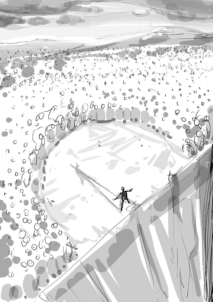
Nice composition Oak, I can see a lot through all the chaos so far and you definitely have an interesting layout going now! The main character looks great so far, anatomy is perfect except for the lower part past his waste, his legs being too short, even for a dwarf, and they're a bit too thin.
It's good you're keeping it really rough so you can make changes early so later on you don't get discouraged when you're doing all the detail. I would work more on the main character to help you keep the inspiration flowing, but seriously looking cool so far!
It's good you're keeping it really rough so you can make changes early so later on you don't get discouraged when you're doing all the detail. I would work more on the main character to help you keep the inspiration flowing, but seriously looking cool so far!
Last edit: 07 Mar 2016 18:17 by microscopi.
Please Log in or Create an account to join the conversation.
07 Mar 2016 22:07 #13482
by oaktree
Replied by oaktree on topic CGAN March 2016 - The Last Stand - WIPs
Thanks for the comments micro i have made changes but still not happy.

Please Log in or Create an account to join the conversation.

08 Mar 2016 02:33 - 08 Mar 2016 02:43 #13483
by Atto
No smudge tool was harmed in the making of this image.
Replied by Atto on topic CGAN March 2016 - The Last Stand - WIPs
Thanks for the feedback guys!
Micro: Ah thats what I thought was going on. I don't thing using photo guidance is a particular problem to layout an idea. Sure like anything a crutch will slow your development (mines still the smudge tool though I now only really use it on hair) but I know a lot of industry professionals who utilise it to great effect. Recognising it for what it is is surely the key to using it effectively as a tool.
Oaktree: Thats a great composition and pose - such a sense of action already. I particularly like the orcs head appearing in the crux of the dwarves right arm
I've redrawn the face on mine and tried to add some weight to the figure (he looked way too athletic before). Think I may have fleshed out his right cheek a little too much but I'm happier with the way he looks and his facial expression. I realise that right now the eye is drawn to the red hair of the woman but hopefully when I add all the blood, pointy sticks and a little grey to her locks it will balance a bit better.
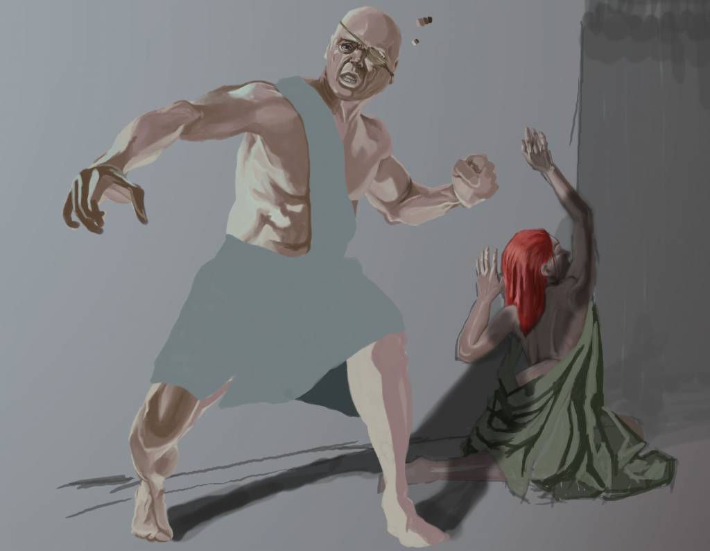
Edit: I'm now really struggling with the cast shadow across her form. I want the image to move from darkness on the right toward light on the central figure and to return to darker tones on the left. If I darken the shadow enough for the contrast across her body to really pop it just becomes too dark and unnatural. If I increase the brightness of her lighter areas they jump out visually in front of the main character.
I miss the days when my biggest concern was drawing a hand
Micro: Ah thats what I thought was going on. I don't thing using photo guidance is a particular problem to layout an idea. Sure like anything a crutch will slow your development (mines still the smudge tool though I now only really use it on hair) but I know a lot of industry professionals who utilise it to great effect. Recognising it for what it is is surely the key to using it effectively as a tool.
Oaktree: Thats a great composition and pose - such a sense of action already. I particularly like the orcs head appearing in the crux of the dwarves right arm
I've redrawn the face on mine and tried to add some weight to the figure (he looked way too athletic before). Think I may have fleshed out his right cheek a little too much but I'm happier with the way he looks and his facial expression. I realise that right now the eye is drawn to the red hair of the woman but hopefully when I add all the blood, pointy sticks and a little grey to her locks it will balance a bit better.
Edit: I'm now really struggling with the cast shadow across her form. I want the image to move from darkness on the right toward light on the central figure and to return to darker tones on the left. If I darken the shadow enough for the contrast across her body to really pop it just becomes too dark and unnatural. If I increase the brightness of her lighter areas they jump out visually in front of the main character.
I miss the days when my biggest concern was drawing a hand
No smudge tool was harmed in the making of this image.
Last edit: 08 Mar 2016 02:43 by Atto.
Please Log in or Create an account to join the conversation.
- microscopi
-
- Offline
- Premium Member
-
Less
More
- Posts: 743
- Thank you received: 79
08 Mar 2016 09:05 #13484
by microscopi
Replied by microscopi on topic CGAN March 2016 - The Last Stand - WIPs
Stick with it Oak, just have to focus on the areas that are bothering you the most and it will get better. 
Atto, for the shadow issue, maybe you can just have it running on the floor, that way she will not lose any lighting, although if your concerned she is coming through more then the main character you can make her darker in value so that the main character pops out more because he has a lighter value, also desaturating her hair might help take the focus off.
Here's bit of an update on mine.
Please Log in or Create an account to join the conversation.
- microscopi
-
- Offline
- Premium Member
-
Less
More
- Posts: 743
- Thank you received: 79
08 Mar 2016 20:54 #13486
by microscopi
Replied by microscopi on topic CGAN March 2016 - The Last Stand - WIPs
Please Log in or Create an account to join the conversation.
- SchizophreniaWolf
-

- Offline
- Junior Member
-

Less
More
- Posts: 170
- Thank you received: 10
08 Mar 2016 22:30 #13487
by SchizophreniaWolf
Replied by SchizophreniaWolf on topic CGAN March 2016 - The Last Stand - WIPs
Please Log in or Create an account to join the conversation.
08 Mar 2016 22:41 #13489
by Atto
No smudge tool was harmed in the making of this image.
Replied by Atto on topic CGAN March 2016 - The Last Stand - WIPs
Schizo:  "one at a time or all together! Makes no odds to me!"
"one at a time or all together! Makes no odds to me!" No smudge tool was harmed in the making of this image.
Please Log in or Create an account to join the conversation.
Latest Activity

Banj updated their profile picture


Charlotte Still wearing a mask? Is it so we won't see you hoarding food in those cheeks of yours?
See More
Banj Mfmuh Guhmfpf
See More
Charlotte I'll take that as a yes...
See More
Charlotte Why is there a tiny flashing thing in front of the reply link/button? It's so small I can't see if it's an exclamation mark or a question mark... or...both?)
See More
Banj Because? Both!
See More
Charlotte *gasp*
See More

CaptainDeth updated their profile picture

CaptainDeth Ahoy folks, just a newbie here, just getting started. Thanks for allowing me in.
CaptainDeth Thank You
CaptainDeth and Mr.Bungle joined the site


honbasic joined the site


Gawk joined the site