


- Posts: 743
- Thank you received: 79


The shoutbox is unavailable to non-members
CGAN Feb 2016 - Life on Mars - WIPs
- microscopi
-

- Offline
- Premium Member
-

Less
More
06 Feb 2016 02:09 #13300
by microscopi
Replied by microscopi on topic CGAN Feb 2016 - Life on Mars - WIPs
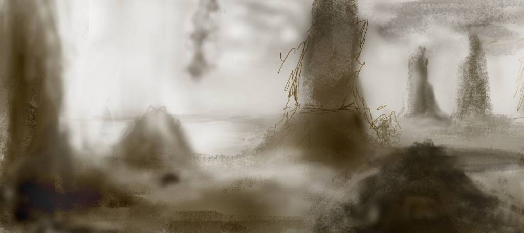
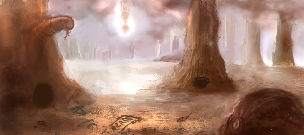
I think since I keep changing my idea i'm going to keep the initial ideas really rough like this one, might post a few of these and pick the best one, want to capture the moment the capsule came down to the surface of the planet.
Great update Atto, I think you captured the a more interesting viewpoint with the structure, you could add some great atmospheric effects in the final to make it stand out.
Kod really love your designs, so much character in your characters I saw a pic you did of a dragon and it was dated 1984? Wow you have been awesome for longer then I could hold a pencil!
Great update Atto, I think you captured the a more interesting viewpoint with the structure, you could add some great atmospheric effects in the final to make it stand out.
Kod really love your designs, so much character in your characters
I saw a pic you did of a dragon and it was dated 1984? Wow you have been awesome for longer then I could hold a pencil!
The following user(s) said Thank You: Atto
Please Log in or Create an account to join the conversation.

06 Feb 2016 19:29 #13307
by Valence
Replied by Valence on topic CGAN Feb 2016 - Life on Mars - WIPs
Micro: The rough loose style actually makes that look really moody and atmospheric. I want to move forward into those bright areas and discover what's there!
Finally scribbled something of mine but, oh dear, there's gonna be too many NASA probes this month and I'm adding to the overdose. Apologies.
As I said, my first thought for this was John Carter, but after that my second thought was War Of The Worlds and I thought it'd be good to reverse it and have the earth probes provoking the martians to war.
For ages I've wanted to have a go at doing a comicbook page and this seemed like the idea to try that so I've spent the last couple of days trying to learn about the visual grammar of comic storytelling and I've come up with this thumbnail layout..
Panels 1-3 have a "shooting star" decending on a planet.
Panels 4-6 show our hero searching for the meteorite, using a scanner to navigate the duststorms but then finding a probe instead of a crater.
Panels 7-9 show the big "reveal" that our hero is actually a martian, the invading "alien" probe is from earth, and this means war!
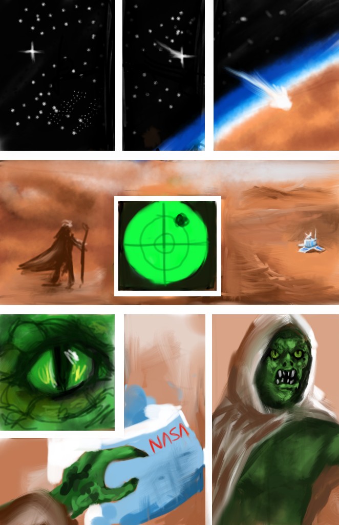
I'm still messing about with layout and "script" so the martian design may change somewhat and I'm not at all confident about finishing in time.
Finally scribbled something of mine but, oh dear, there's gonna be too many NASA probes this month and I'm adding to the overdose. Apologies.
As I said, my first thought for this was John Carter, but after that my second thought was War Of The Worlds and I thought it'd be good to reverse it and have the earth probes provoking the martians to war.
For ages I've wanted to have a go at doing a comicbook page and this seemed like the idea to try that so I've spent the last couple of days trying to learn about the visual grammar of comic storytelling and I've come up with this thumbnail layout..
Panels 1-3 have a "shooting star" decending on a planet.
Panels 4-6 show our hero searching for the meteorite, using a scanner to navigate the duststorms but then finding a probe instead of a crater.
Panels 7-9 show the big "reveal" that our hero is actually a martian, the invading "alien" probe is from earth, and this means war!
I'm still messing about with layout and "script" so the martian design may change somewhat and I'm not at all confident about finishing in time.
Please Log in or Create an account to join the conversation.

06 Feb 2016 23:02 #13308
by Atto
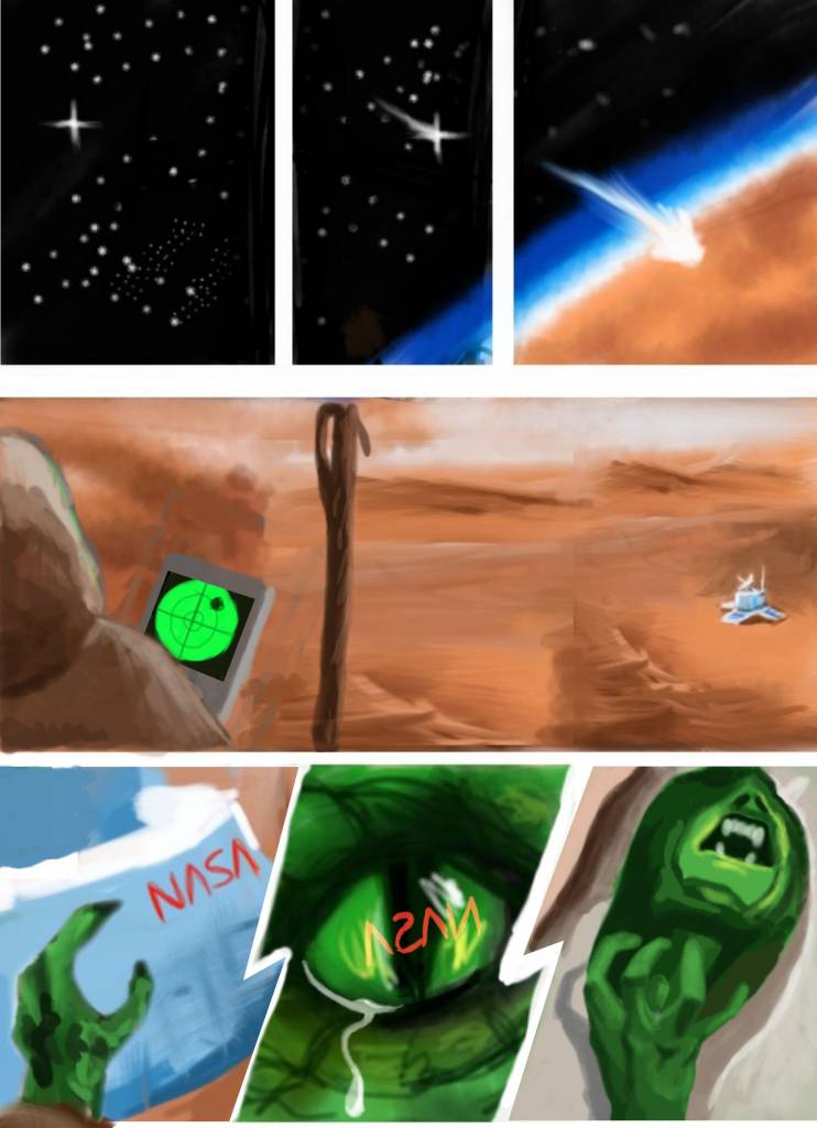
No smudge tool was harmed in the making of this image.
Replied by Atto on topic CGAN Feb 2016 - Life on Mars - WIPs
Val, I really like the role reversal idea, kind of reminds me of the animated film a few years back with the Alien dog who peed acid, my memory fails me just now..... oooh it was Planet 51!
I'm loving the 3 top panels, the way you've used 1 scene to show a time lapse of the meteor approaching the planet.
The next panoramic panel doesn't read as well due to the scanner centred in the scene. I then realised that you may have placed it there as a device to split the panel suggesting the probe is actually further away from our hero than it first appears.
I think you can make more of the bottom three panels too so I did a rough paint over (though I got a little carried away with the last one). Hope you don't mind.
I redrew our heros staff in the second panel so you could still use it as a dividing device if thats what you were going for and if you want to break the three bottom panels differently - so they don't mirror exactly the top three - you could always move the centre panel up so it encroaches on the panoramic panel a little.
This is the way I'd do it at least.
No smudge tool was harmed in the making of this image.
The following user(s) said Thank You: Valence
Please Log in or Create an account to join the conversation.
06 Feb 2016 23:34 #13309
by Valence
Replied by Valence on topic CGAN Feb 2016 - Life on Mars - WIPs
That's a pretty good paint-over, Atto. *applause*
I think your last three panels look way better than mine, and their order makes a bit more sense in a purely visual way. I was trying to create a diagonal link to guide your eye down the page starting with the planet and then connecting the similar shapes and colours of the scanner and the eye, but that backward L-shaped panel bothers me a bit so your version is a good insight into how I can change that.
I'm also thinking of having the raging martian pop-out of the final panel a bit to differentiate it from the other panels.
And you're right I was using the scanner to divide the middle layer in time and space. I was thinking that the captions may explain that a bit more when I get them in. It's quite hard trying to compose little pictures around text that you've written but haven't put in yet. It messes with your head a bit.")
But I'm still at the planning stage so there's plenty of time to try some new ideas before I get drawing properly.
I think your last three panels look way better than mine, and their order makes a bit more sense in a purely visual way. I was trying to create a diagonal link to guide your eye down the page starting with the planet and then connecting the similar shapes and colours of the scanner and the eye, but that backward L-shaped panel bothers me a bit so your version is a good insight into how I can change that.
I'm also thinking of having the raging martian pop-out of the final panel a bit to differentiate it from the other panels.
And you're right I was using the scanner to divide the middle layer in time and space. I was thinking that the captions may explain that a bit more when I get them in. It's quite hard trying to compose little pictures around text that you've written but haven't put in yet. It messes with your head a bit.
But I'm still at the planning stage so there's plenty of time to try some new ideas before I get drawing properly.
Please Log in or Create an account to join the conversation.

07 Feb 2016 19:42 #13310
by oaktree
Replied by oaktree on topic CGAN Feb 2016 - Life on Mars - WIPs
Thanks for the comments all
Atto much preferred the second sketch to the first but then your third sketch is on the money
Cherry G love the colours of this and look forward to seeing how it turns out.
Kodabble Love your idea spot on .
Micro I agree with what Valence said l also want to see into the light areas.
Valence The story book idea is great and I also think Attos paint over gives it a better flow can’t wait to see where you take it.
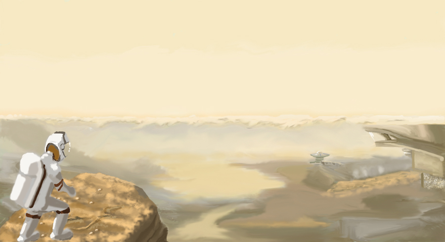
I've put a little more time into it trying different things but have not decided on where to take it yet.
The idea so far is a landing place or permanent settlement near to the polar ice cap which is in the distance.
Atto much preferred the second sketch to the first but then your third sketch is on the money
Cherry G love the colours of this and look forward to seeing how it turns out.
Kodabble Love your idea spot on .
Micro I agree with what Valence said l also want to see into the light areas.
Valence The story book idea is great and I also think Attos paint over gives it a better flow can’t wait to see where you take it.
I've put a little more time into it trying different things but have not decided on where to take it yet.
The idea so far is a landing place or permanent settlement near to the polar ice cap which is in the distance.
The following user(s) said Thank You: Atto
Please Log in or Create an account to join the conversation.
08 Feb 2016 20:53 #13323
by Valence
Replied by Valence on topic CGAN Feb 2016 - Life on Mars - WIPs
I love the light hitting the back of the astronaut. "White" objects are often quite difficult to shade but that looks solid and three-dimensional already!
Please Log in or Create an account to join the conversation.
09 Feb 2016 21:31 #13326
by oaktree
Replied by oaktree on topic CGAN Feb 2016 - Life on Mars - WIPs
many thanks Valence
here is another update from me , looking at it now however I think one of the outcrops of rock is
a dry stone wall
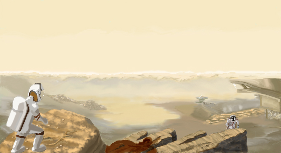
here is another update from me , looking at it now however I think one of the outcrops of rock is
a dry stone wall
Please Log in or Create an account to join the conversation.
10 Feb 2016 01:18 #13327
by Atto
No smudge tool was harmed in the making of this image.
Replied by Atto on topic CGAN Feb 2016 - Life on Mars - WIPs
Micro - that sense of light and scale is coming along nicely again, its the early detail and texture that is creating all that interest in people trying to explore your landscape I believe. A bit like all those Mars photos where people claim they can see figures and faces, the eye tries to make sense of the light and dark forms and I really dig that in yours.
Val - I completely missed that diagonal line that ties in the three circular objects but now you point it out I can see the absolute sense in it to tie the composition together. I tried doing some thing similar (but far less complicated) with the hands in the bottom two panels but looking at it now I think I should have twisted the first of the hand more to show the back of it. I actually meant to have your martian popping out of that final frame - I think that would work great - just got carried away with his hand
Oak - As Val said there's a nice solidity to that foreground astronaut but I think the distance one is even better as he strides up the hill towards us. Remember that horses face in the dragon slayer challenge you nailed right from the word go? Well you've done it again here . I actually really like that dry stone wall - if I can get a similar texture into the walls on mine I'll be happy.
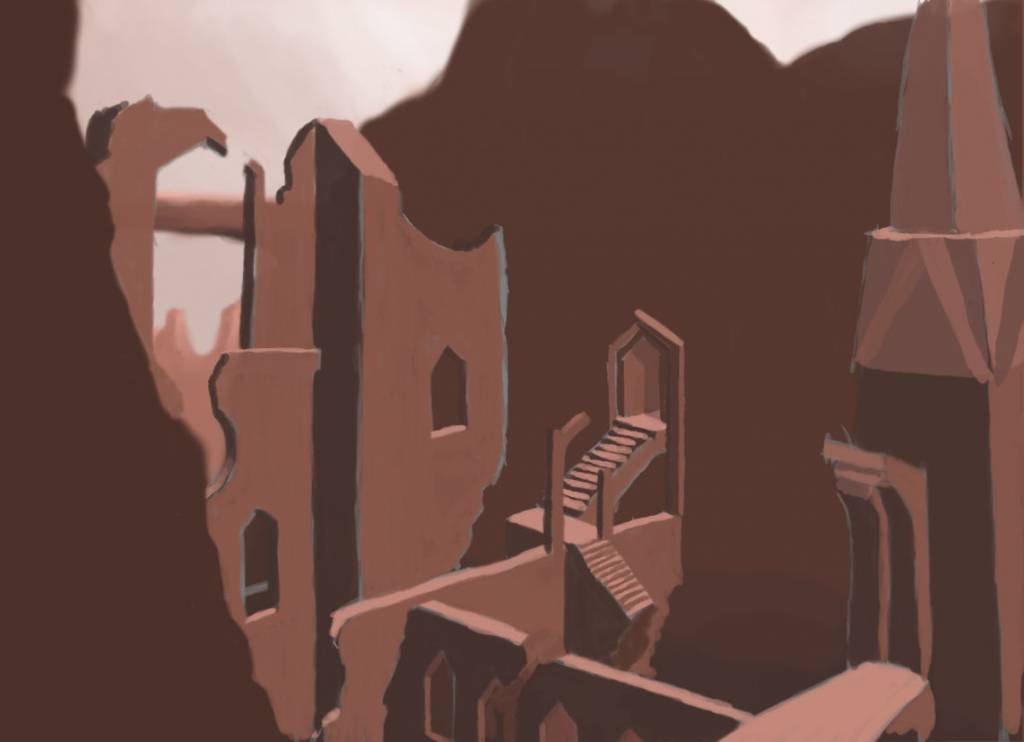
So I'm still working out the composition on mine - so far I've tried a Mayan looking temple, a gothic cathedral (but gave up with all those arches) and a roman style ampitheatre but I think I'm closer with this one. Just the basic forms down right now, will let it fester for a little and then its on with the architectural flourishes and trying to show a nice difference in the natural and man (Alien) made surfaces.
Val - I completely missed that diagonal line that ties in the three circular objects but now you point it out I can see the absolute sense in it to tie the composition together. I tried doing some thing similar (but far less complicated) with the hands in the bottom two panels but looking at it now I think I should have twisted the first of the hand more to show the back of it. I actually meant to have your martian popping out of that final frame - I think that would work great - just got carried away with his hand
Oak - As Val said there's a nice solidity to that foreground astronaut but I think the distance one is even better as he strides up the hill towards us. Remember that horses face in the dragon slayer challenge you nailed right from the word go? Well you've done it again here
. I actually really like that dry stone wall - if I can get a similar texture into the walls on mine I'll be happy.So I'm still working out the composition on mine - so far I've tried a Mayan looking temple, a gothic cathedral (but gave up with all those arches) and a roman style ampitheatre but I think I'm closer with this one. Just the basic forms down right now, will let it fester for a little and then its on with the architectural flourishes and trying to show a nice difference in the natural and man (Alien) made surfaces.
No smudge tool was harmed in the making of this image.
Please Log in or Create an account to join the conversation.
10 Feb 2016 02:14 #13328
by Valence
Replied by Valence on topic CGAN Feb 2016 - Life on Mars - WIPs
Atto: I like the stairway idea. It reminds me of the MC Escher bit in the film Labyrinth, which would also link to the David Bowie connection.
I'm still messing with the layout in mine but I think I've come up with a way to incorporate your advice while still hitting all the story beats that I wanted. I'm gonna go with four rows instead of three then I can fit one of those epic full-width panels that you did. Now I just need to start the actual painting!
I'm still messing with the layout in mine but I think I've come up with a way to incorporate your advice while still hitting all the story beats that I wanted. I'm gonna go with four rows instead of three then I can fit one of those epic full-width panels that you did.
Now I just need to start the actual painting! Please Log in or Create an account to join the conversation.
- microscopi
-
- Offline
- Premium Member
-
Less
More
- Posts: 743
- Thank you received: 79
11 Feb 2016 00:11 #13329
by microscopi
Replied by microscopi on topic CGAN Feb 2016 - Life on Mars - WIPs
Thanks for the comments guys I think after working with my initial design I am liking it so here's an update, haven't been online in a bit, but will comment on your guys stufff in a bit.
I think after working with my initial design I am liking it so here's an update, haven't been online in a bit, but will comment on your guys stufff in a bit.Please Log in or Create an account to join the conversation.
Latest Activity

Banj updated their profile picture


Charlotte Still wearing a mask? Is it so we won't see you hoarding food in those cheeks of yours?
See More
Banj Mfmuh Guhmfpf
See More
Charlotte I'll take that as a yes...
See More
Charlotte Why is there a tiny flashing thing in front of the reply link/button? It's so small I can't see if it's an exclamation mark or a question mark... or...both?)
See More
Banj Because? Both!
See More
Charlotte *gasp*
See More

CaptainDeth updated their profile picture

CaptainDeth Ahoy folks, just a newbie here, just getting started. Thanks for allowing me in.
CaptainDeth Thank You
CaptainDeth and Mr.Bungle joined the site


honbasic joined the site


Gawk joined the site