


- Posts: 10070
- Thank you received: 475


The shoutbox is unavailable to non-members
CGAN Jan 2016 - New Dawn - WIPs
06 Jan 2016 15:48 #13137
by Valence
Name your price, Cherry! I'm sure I can't afford it.
On second thoughts feel free to keep my motivation. I'm certain you can use it better than I can.")
And that's a super cute pic you've got there. It reminds me of those squirrels at the start of those short Gruffalo films that are on TV every Christmas.
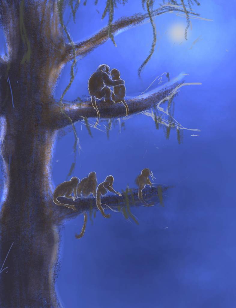
Micro: Looks good so far. I love all those tails, they're all really expressive and can be used to connect and describe the creatures' personalities and relationships.
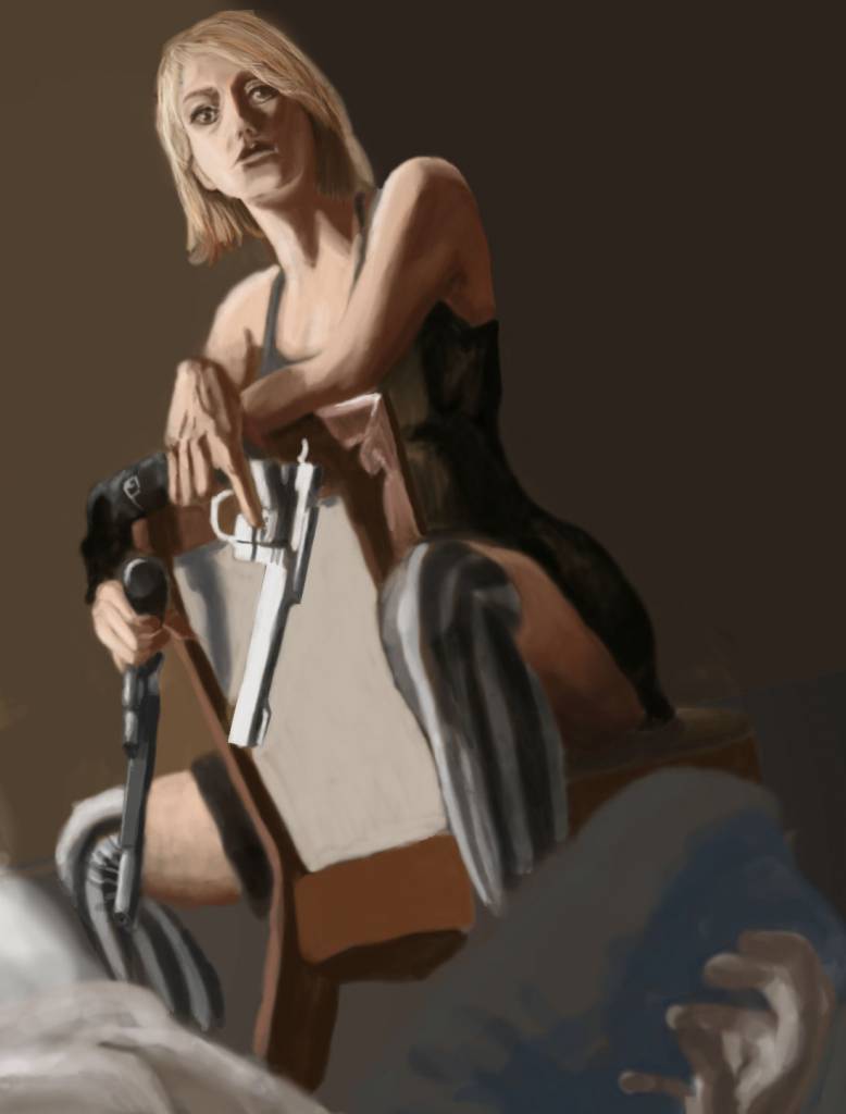
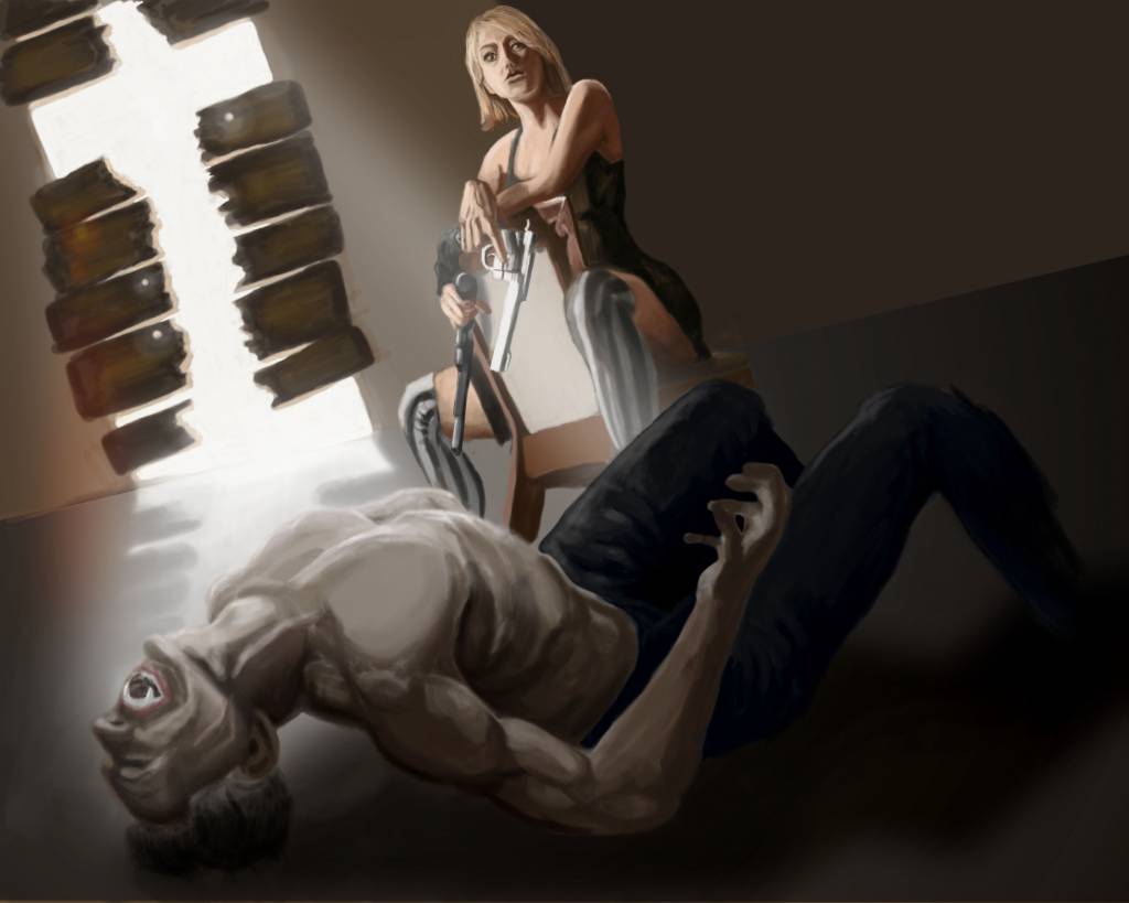
Atto: The crucifix shaped light source is a great idea and a clever way to introduce the necessary symbolism. It's all coming together well but I would check out the girl's raised shoulder. It's the right pose to go for but the shoulder looks a bit too far from the head/neck. Reducing or refining that extension will make it look a bit more natural.
Replied by Valence on topic CGAN Jan 2016 - New Dawn - WIPs
Val? I found some of your motivation under my pillow. What would you give me for this for a
compensation?

Name your price, Cherry! I'm sure I can't afford it.
On second thoughts feel free to keep my motivation. I'm certain you can use it better than I can.
And that's a super cute pic you've got there. It reminds me of those squirrels at the start of those short Gruffalo films that are on TV every Christmas.
Micro: Looks good so far. I love all those tails, they're all really expressive and can be used to connect and describe the creatures' personalities and relationships.
Atto: The crucifix shaped light source is a great idea and a clever way to introduce the necessary symbolism. It's all coming together well but I would check out the girl's raised shoulder. It's the right pose to go for but the shoulder looks a bit too far from the head/neck. Reducing or refining that extension will make it look a bit more natural.
The following user(s) said Thank You: Atto
Please Log in or Create an account to join the conversation.

07 Jan 2016 02:28 - 07 Jan 2016 03:03 #13141
by Atto
No smudge tool was harmed in the making of this image.
Replied by Atto on topic CGAN Jan 2016 - New Dawn - WIPs
Have to say Micro I always love to see the way you build up your images using light and this ones no exception. That's given you such an interesting ground to work on and already you have a certain 'fluffiness' to your monkeys.
But the award for early fluffiness really has to be laid at your door Cherry. The contrast of those glassy eyes and the softness of the fur is lovely and, as has already been noted, their personalities are already shining through.
Just a quick update tonight as I've been spending most of the day on my tax return - god I hate this time of year, so many more interesting things I could be doing with my time.
Still, heres a detail of our vampire slayer, she looks a little older than I intended but I'm going to roll with it, not all slayers have to be pubescent teens, eh, Buffy?
Edit: Theres something about her lower lip that is really bugging me but I cant tell what it is and hopefully that shoulder looks a little better now Val. Thanks for that.
But the award for early fluffiness really has to be laid at your door Cherry. The contrast of those glassy eyes and the softness of the fur is lovely and, as has already been noted, their personalities are already shining through.
Just a quick update tonight as I've been spending most of the day on my tax return - god I hate this time of year, so many more interesting things I could be doing with my time.
Still, heres a detail of our vampire slayer, she looks a little older than I intended but I'm going to roll with it, not all slayers have to be pubescent teens, eh, Buffy?
Edit: Theres something about her lower lip that is really bugging me but I cant tell what it is
and hopefully that shoulder looks a little better now Val. Thanks for that. No smudge tool was harmed in the making of this image.
Last edit: 07 Jan 2016 03:03 by Atto.
Please Log in or Create an account to join the conversation.
- hobbyhorse
-
- Offline
- Junior Member
-

Less
More
- Posts: 132
- Thank you received: 15
07 Jan 2016 14:17 #13143
by hobbyhorse
Replied by hobbyhorse on topic CGAN Jan 2016 - New Dawn - WIPs
Atto- the shadows on her chin and the shape of her lower lip make it flat across her face rather than curving back into her cheek. Because of your low POV the shadow at the bottom of her chin, neck line, is going to curve up.
Please Log in or Create an account to join the conversation.
07 Jan 2016 15:32 #13144
by Valence
Replied by Valence on topic CGAN Jan 2016 - New Dawn - WIPs
Atto: the lip doesn't look too bad to me but Hobby's comments on the chin seem right.
I'm glad you posted the close up because it shows up some issues with with alignment: the left side eye, the distant leg, the length of the forearm and I'd still move the head closer to that shoulder.
All the drawing, shading, colour and light are excellent so it can all be fixed with a little selection and transform.
I don't really like doing unsolicited paintovers (it always feels a bit rude) but sometimes it's easier to show than tell so apologies in advance as I had a quick go on my tablet. Again just cutting and pasting, no actual painting was necessary...
The following user(s) said Thank You: Atto
Please Log in or Create an account to join the conversation.
- microscopi
-

- Offline
- Premium Member
-

Less
More
- Posts: 743
- Thank you received: 79
08 Jan 2016 01:00 #13145
by microscopi
Replied by microscopi on topic CGAN Jan 2016 - New Dawn - WIPs
I'm trying to work up the mood and lighting as you guys suggested  Thanks for comments, Atto I think I started improving more when I determined where the light source is early on, then I can get an idea of what the final will look like.
I agree with Valence seeing the paintover, I was just thinking her bottom lip should be more curvy to give it more dimention, although i'm really digging the idea and your execution (pun intended) of it is going great so far, you definitely have some deadly lighting in yours too (another pun intended)
Thanks for comments, Atto I think I started improving more when I determined where the light source is early on, then I can get an idea of what the final will look like.I agree with Valence seeing the paintover, I was just thinking her bottom lip should be more curvy to give it more dimention, although i'm really digging the idea and your execution (pun intended) of it is going great so far, you definitely have some deadly lighting in yours too (another pun intended)
The following user(s) said Thank You: Atto
Please Log in or Create an account to join the conversation.
09 Jan 2016 00:05 #13146
by Atto
No smudge tool was harmed in the making of this image.
Replied by Atto on topic CGAN Jan 2016 - New Dawn - WIPs
@Hobby, thanks - I'm going to try altering that, hopefully it'll look a little better.
@Val, no apologies necessary Val, I'm actually very flattered when some one takes the time to do a paint over, it's very kind of people to care so much that they take the time to try and help my progress. I hereby solicit you to solicitously paint over any of my solicitations in the future. I think all your points are valid though I can't see a massive change to her eye something just seems.....righter.....about it
@Micro, thanks dude for the comments and I'll try that with the bottom lip. I'm starting to think that you're absolutely spot on about defining that light source early. I used to think that the form and composition was the most important element to nail first but, it seems, the more I consider lighting the more unified result I get (I think that was part of the issue with my Exodos entry). I'm still loving yours by the way I just hope you don't monkey around with it too much (yeah I went there).
No smudge tool was harmed in the making of this image.
Please Log in or Create an account to join the conversation.
10 Jan 2016 02:08 #13152
by Valence
Replied by Valence on topic CGAN Jan 2016 - New Dawn - WIPs
Atto: The eye was just nudged down and more central to line it up more with the other eye and the corner of the mouth. Only a couple of pixels though, like I said all the drawing and detail was good and the positions were only slightly out. When doing faces you want a line connecting the centre of both eyes to be parallel (perspective permitting) to the "horizontal" line of the mouth and you want the corners of the mouth to line up "vertically" with the same point of each eye, usually just inside of the centre. Of course when you angle the head or use a Dutch Tilt composition it's very easy to lose track of these alignments, I do it myself all the time.  All The Time!
One good thing to use (if your particular software has it) is the Rotate Canvas View option which allows you to turn the whole picture around and just paint the faces in their normal orientation.
Micro: I like the blue colour scheme. It's a really unexpected choice for a "Dawn" picture but it has a lovely peaceful quality to it. Keep it going.
All The Time!One good thing to use (if your particular software has it) is the Rotate Canvas View option which allows you to turn the whole picture around and just paint the faces in their normal orientation.
Micro: I like the blue colour scheme. It's a really unexpected choice for a "Dawn" picture but it has a lovely peaceful quality to it. Keep it going.
The following user(s) said Thank You: Atto
Please Log in or Create an account to join the conversation.
- microscopi
-
- Offline
- Premium Member
-
Less
More
- Posts: 743
- Thank you received: 79
10 Jan 2016 06:04 - 10 Jan 2016 06:16 #13154
by microscopi
Replied by microscopi on topic CGAN Jan 2016 - New Dawn - WIPs
Val I was trying to focus on the background as I was thinking the same thing, so I have a bit of dawn creeping in there now. Atto, I was really considering expanding it to be a landscape instead, with the tree as the centre point and more monkeys, really tore myself up deciding on which to choose, but decided after all not to monkey with it too much like you said! 
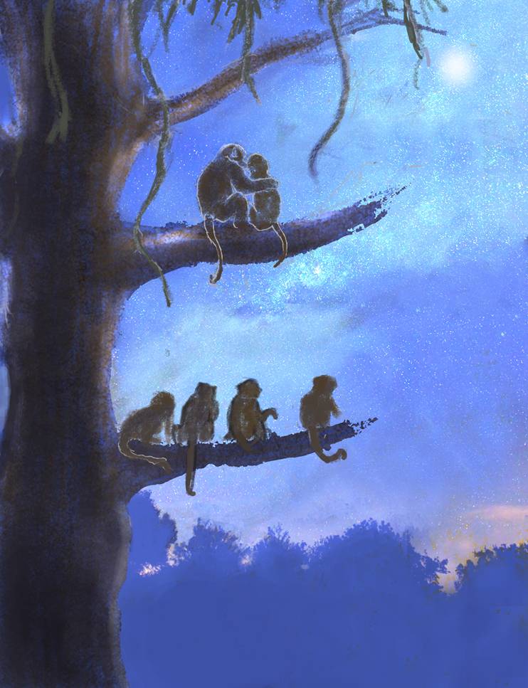
Atto, I was really considering expanding it to be a landscape instead, with the tree as the centre point and more monkeys, really tore myself up deciding on which to choose, but decided after all not to monkey with it too much like you said!
Last edit: 10 Jan 2016 06:16 by microscopi.
Please Log in or Create an account to join the conversation.
11 Jan 2016 02:25 #13157
by Atto
No smudge tool was harmed in the making of this image.
Replied by Atto on topic CGAN Jan 2016 - New Dawn - WIPs
I think that touch of pink really pushes the sky further Micro - loving it and the silhouettes of the trees contain just the right amount of detail in their profiles to my eye.
I've tried to fix those issues you raised Val - I think its looking better now, I finally figured out what you did with the eye too but thanks for the explanation I've tried to spend some more time on the lighting too but am a little concerned I've pushed the dark a bit far and the sunburst down the side I'm not 100% happy with.
I'm considering having our vampires skin curling and crisping in the morning light, flaking away and smoking as he is destroyed but I'm not to happy with the few times Ive tried to render it.
I've tried to fix those issues you raised Val - I think its looking better now, I finally figured out what you did with the eye too but thanks for the explanation
I've tried to spend some more time on the lighting too but am a little concerned I've pushed the dark a bit far and the sunburst down the side I'm not 100% happy with.I'm considering having our vampires skin curling and crisping in the morning light, flaking away and smoking as he is destroyed but I'm not to happy with the few times Ive tried to render it.
No smudge tool was harmed in the making of this image.
Please Log in or Create an account to join the conversation.
11 Jan 2016 09:59 #13158
by Banj
Replied by Banj on topic CGAN Jan 2016 - New Dawn - WIPs
I find your background a little confusing Atto. The line across and the reflection of the light through the gap at the back suggest that is a door in the wall and the light is shining on the floor, but the position of the characters in the foreground and the chair are at a different perspective and make it look much higher up like a window (in which case the light reflection doesn't make sense).
The following user(s) said Thank You: Atto
Please Log in or Create an account to join the conversation.
Latest Activity

Banj updated their profile picture


Charlotte Still wearing a mask? Is it so we won't see you hoarding food in those cheeks of yours?
See More
Banj Mfmuh Guhmfpf
See More
Charlotte I'll take that as a yes...
See More
Charlotte Why is there a tiny flashing thing in front of the reply link/button? It's so small I can't see if it's an exclamation mark or a question mark... or...both?)
See More
Banj Because? Both!
See More
Charlotte *gasp*
See More

CaptainDeth updated their profile picture

CaptainDeth Ahoy folks, just a newbie here, just getting started. Thanks for allowing me in.
CaptainDeth Thank You
CaptainDeth and Mr.Bungle joined the site


honbasic joined the site


Gawk joined the site