


- Posts: 10071
- Thank you received: 475


Were you lurking?


The shoutbox is unavailable to non-members
CGAN Zodiac - Scorpio challenge - WIPs
09 Nov 2015 21:24 #12787
by Valence
Replied by Valence on topic CGAN Zodiac - Scorpio challenge - WIPs
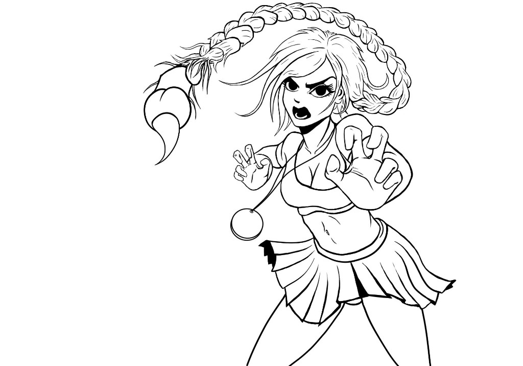
I literally cannot believe how long this so-called "inking" is taking me! People do this for a living? No wait- People do this for fun?!?
But I've finally got some lines for the figure (and yes it's all bland outlines, no nice spot blacks or feathered shading or anything credible.) I went back into ArtRage and managed to work out a method for using that inkpen. The best settings (for me, at least) is to have the smoothing set quite high and to switch off the tapering completely by reducing it to 0% and I can then taper lines manually using the eraser.
I then went back into Photoshop and redid some of the longer lines using the path/pen tool with the Stroke Path option.
And with that tracing done I am now more than happy to start painting properly with colour and everything! I can still see some problems in the linework (odd squiggles and tangents) but I'll correct them as I go, in fact I might change/add to some of the lines as I'm painting. I'll see how it goes. And I have to work out a background too!
But I've finally got some lines for the figure (and yes it's all bland outlines, no nice spot blacks or feathered shading or anything credible.) I went back into ArtRage and managed to work out a method for using that inkpen. The best settings (for me, at least) is to have the smoothing set quite high and to switch off the tapering completely by reducing it to 0% and I can then taper lines manually using the eraser.
I then went back into Photoshop and redid some of the longer lines using the path/pen tool with the Stroke Path option.
And with that tracing done I am now more than happy to start painting properly with colour and everything!
I can still see some problems in the linework (odd squiggles and tangents) but I'll correct them as I go, in fact I might change/add to some of the lines as I'm painting. I'll see how it goes. And I have to work out a background too! Please Log in or Create an account to join the conversation.
- Digital Dave
-

- Offline
- Platinum Member
-

Less
More
- Posts: 2242
- Thank you received: 163
09 Nov 2015 22:48 - 09 Nov 2015 23:14 #12792
by Digital Dave
I get sketchy around pencils! ...
Replied by Digital Dave on topic CGAN Zodiac - Scorpio challenge - WIPs
Looking very cool, Valence. Like you, I always wanted to try doing a manga styled image, but haven't given that a go just yet. ") But think you have done a great job on the design for this one, and look forward to seeing it's completion.
But think you have done a great job on the design for this one, and look forward to seeing it's completion.
Though, there are two things that stand out to me at the moment, both in relation to her skirt. First, on the left side where it reaches out toward the medallion. With the current shadowing, it appears to be pointing forward, and looks unnatural to me. I would think the skirt would be more rounded there, flowing, following the contours of her hips. - Second, with the front of the skirt slightly raised, I still don't know if we would see the lower portion of her crotch and it seems a little distracting in it's current positioning? When I follow her torso down from her breast, toward her hips, it appears it would be further back, and also higher in position. Mainly because the torso is giving the impression that she is bent over more at the waist. This is also giving her an unbalanced feel, if that makes sense? - Like if you brought her left leg forward, (similarly to how you have done with her hands) that would not only fit the pose, but give her better overall balanced feel. ... But again, these are just my opinions on it, so I could be wrong! Try standing in her present pose, and see what ya think
But think you have done a great job on the design for this one, and look forward to seeing it's completion.Though, there are two things that stand out to me at the moment, both in relation to her skirt. First, on the left side where it reaches out toward the medallion. With the current shadowing, it appears to be pointing forward, and looks unnatural to me. I would think the skirt would be more rounded there, flowing, following the contours of her hips. - Second, with the front of the skirt slightly raised, I still don't know if we would see the lower portion of her crotch and it seems a little distracting in it's current positioning? When I follow her torso down from her breast, toward her hips, it appears it would be further back, and also higher in position. Mainly because the torso is giving the impression that she is bent over more at the waist. This is also giving her an unbalanced feel, if that makes sense? - Like if you brought her left leg forward, (similarly to how you have done with her hands) that would not only fit the pose, but give her better overall balanced feel. ... But again, these are just my opinions on it, so I could be wrong!
Try standing in her present pose, and see what ya think I get sketchy around pencils! ...
Last edit: 09 Nov 2015 23:14 by Digital Dave.
The following user(s) said Thank You: Valence
Please Log in or Create an account to join the conversation.
10 Nov 2015 00:07 #12795
by Valence
Replied by Valence on topic CGAN Zodiac - Scorpio challenge - WIPs
Cheers Dave, I'll take a look at those things next time.
Manga pictures do seem to be obsessed with occasional glimpses of underwear and pleated skirts but those folds are pretty hard to visualise especially as linework. I'm hoping (again) than when I get some colour/shading in I'll give myself a better understanding of the forms and be able to see what corrections to make. Also manga proportions in general are a bit of a mystery to me (especially the way they bend the spines!) so I may have fudged that a bit. I'll see what I can do.
Manga pictures do seem to be obsessed with occasional glimpses of underwear and pleated skirts but those folds are pretty hard to visualise especially as linework. I'm hoping (again) than when I get some colour/shading in I'll give myself a better understanding of the forms and be able to see what corrections to make. Also manga proportions in general are a bit of a mystery to me (especially the way they bend the spines!) so I may have fudged that a bit.
I'll see what I can do. Please Log in or Create an account to join the conversation.
11 Nov 2015 21:51 #12798
by Valence
Replied by Valence on topic CGAN Zodiac - Scorpio challenge - WIPs
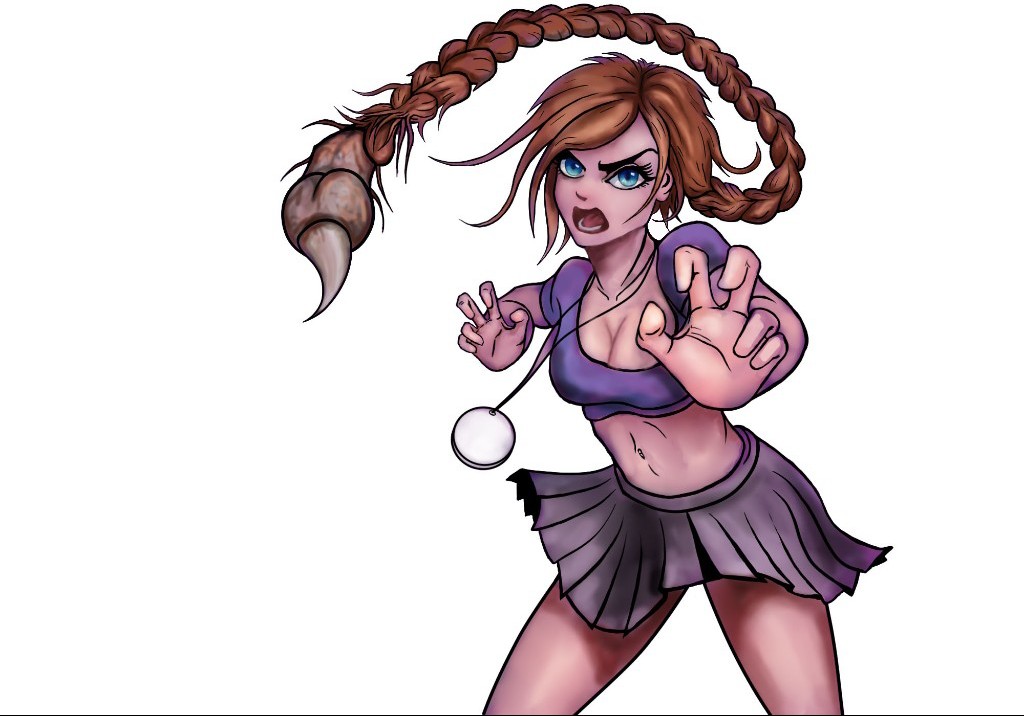
Here's a quick messy colour test.
I made some subtle changes to the legs to try and solve the anatomy issue but I've yet to make any changes to the clothing.
I did sketch out a few backgrounds, I wanted it to be dark and purple (you can probably still see that cast in the skin) but it looked pretty ordinary so I ditched it and will think again.
As well as that I want to also integrate the colour with linework a bit better to give it a more realistic form, especially that foreground hand. If and when the picture eventually falls apart I think that'll be the cause.
Please Log in or Create an account to join the conversation.

12 Nov 2015 00:55 #12800
by Atto
No smudge tool was harmed in the making of this image.
Replied by Atto on topic CGAN Zodiac - Scorpio challenge - WIPs
I think the line work is looking pretty sweet Val and the colouring in ") is describing all the main forms very well. Her face, ribcage and fore hand are particularly nice. Her crop top in my opinion is a little less successful but I think thats more to do with the cast light from the background you attempted to add.
is describing all the main forms very well. Her face, ribcage and fore hand are particularly nice. Her crop top in my opinion is a little less successful but I think thats more to do with the cast light from the background you attempted to add.
Her hair braid seems a little static and flat atm a slight blur may help both the sense of movement and to knock it out of focus a little to bring it in front of the optimal focal depth.
Oh and watch that space between the cords of her necklace looks like you neglected to remove a little of the BG.
is describing all the main forms very well. Her face, ribcage and fore hand are particularly nice. Her crop top in my opinion is a little less successful but I think thats more to do with the cast light from the background you attempted to add.Her hair braid seems a little static and flat atm a slight blur may help both the sense of movement and to knock it out of focus a little to bring it in front of the optimal focal depth.
Oh and watch that space between the cords of her necklace looks like you neglected to remove a little of the BG.
No smudge tool was harmed in the making of this image.
Please Log in or Create an account to join the conversation.
12 Nov 2015 01:17 #12801
by Valence
Replied by Valence on topic CGAN Zodiac - Scorpio challenge - WIPs
Thanks Atto.
That's a good spot about the (non)missing background. You clearly have eagle eyes while I have ...erm.. pigeon eyes And the magic wand tool is not quite as magic as I would like.
I agree the crop top is terribly bland, some kind of detailing there is another priority. I'm also pondering the dilemma of long/short sleeves. Long sleeves would help create a dark area all around that hand and help it to push forward but it seems like an odd design so I'm keeping options open at the moment ... and delaying decisions.
I do have an idea about the braid though. When I get the background in I want to add some of that colour over the middle part of the braid, fading it into the distance like atmospheric mist, so that its curve will go back from the head and then forward again. But I have also been thinking about the slight blur that you suggested. In fact some of that might work for the distant hand too. Hmm...
I've got plenty to think about.
That's a good spot about the (non)missing background. You clearly have eagle eyes while I have ...erm.. pigeon eyes
And the magic wand tool is not quite as magic as I would like. I agree the crop top is terribly bland, some kind of detailing there is another priority. I'm also pondering the dilemma of long/short sleeves. Long sleeves would help create a dark area all around that hand and help it to push forward but it seems like an odd design so I'm keeping options open at the moment ... and delaying decisions.
I do have an idea about the braid though. When I get the background in I want to add some of that colour over the middle part of the braid, fading it into the distance like atmospheric mist, so that its curve will go back from the head and then forward again. But I have also been thinking about the slight blur that you suggested. In fact some of that might work for the distant hand too. Hmm...
I've got plenty to think about.
Please Log in or Create an account to join the conversation.
12 Nov 2015 10:38 - 12 Nov 2015 14:11 #12802
by Atto
No smudge tool was harmed in the making of this image.
Replied by Atto on topic CGAN Zodiac - Scorpio challenge - WIPs
I wanted to give you a little company for this one Val - but then I have just received my rota for the next few weeks and as of Saturday I'm working 9 days straight for about 11 hours/day.
That being said I'm gonna try to get something done in the next few days while I'm off.
On top of that I thought I would also try out a new technique and type of image - because I'm not under enough pressure already .
So here goes:
Scorpio.
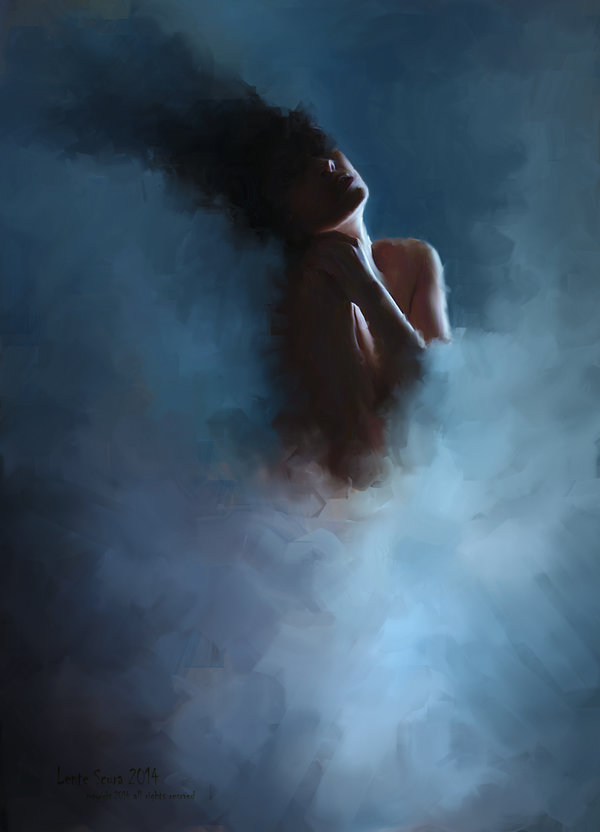
I've included a ref image of the type of technique I want to try by a very cool artist Lente Scura, I've never worked this way before and am going in completely unprepared but what the hey! Lets see what happens.
Something along these lines:
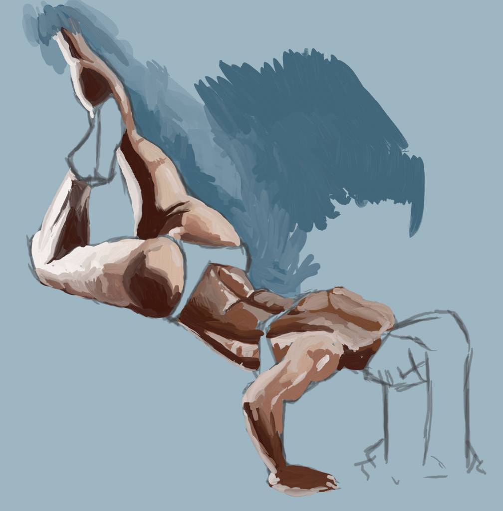
And heres my initial sketches
That being said I'm gonna try to get something done in the next few days while I'm off.
On top of that I thought I would also try out a new technique and type of image - because I'm not under enough pressure already
.So here goes:
Scorpio.
I've included a ref image of the type of technique I want to try by a very cool artist Lente Scura, I've never worked this way before and am going in completely unprepared but what the hey! Lets see what happens.
Something along these lines:
And heres my initial sketches
No smudge tool was harmed in the making of this image.
Last edit: 12 Nov 2015 14:11 by Atto.
Please Log in or Create an account to join the conversation.
12 Nov 2015 14:48 #12803
by Atto
No smudge tool was harmed in the making of this image.
Replied by Atto on topic CGAN Zodiac - Scorpio challenge - WIPs
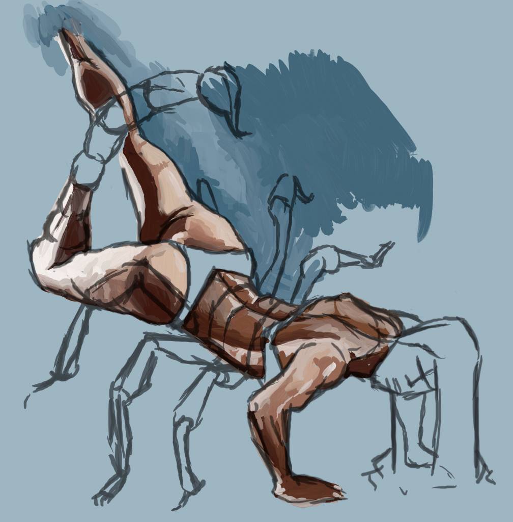
Beginning to drop more of the forms in. That rear leg will be shrouded in mist later to emphasise the form of the scorpion more and to reduce the strong outline of the human silhouette.
Much happier now with her rendering but still quite heavy handed.
My biggest problem right now is how to articulate the change in texture from her front leg to the scorpion tail.
Much happier now with her rendering but still quite heavy handed.
My biggest problem right now is how to articulate the change in texture from her front leg to the scorpion tail.
No smudge tool was harmed in the making of this image.
Please Log in or Create an account to join the conversation.
12 Nov 2015 23:43 - 12 Nov 2015 23:56 #12804
by Atto
No smudge tool was harmed in the making of this image.
Replied by Atto on topic CGAN Zodiac - Scorpio challenge - WIPs
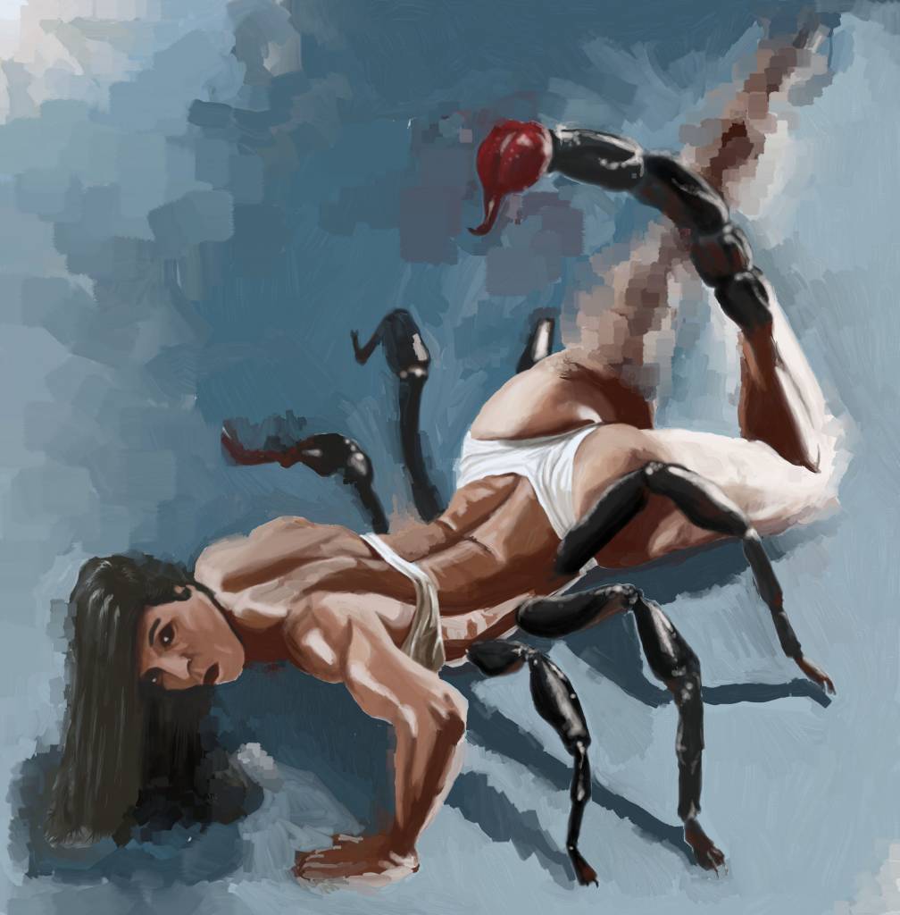
Well I think I'm about done, that was a very intense yet enjoyable 15 hours or so with just a few coffee breaks and a half hour for food.
There's a lot I'd do differently if I had more time but I may only get a few hours tomorrow to polish it some.
The BG is a little arbritrary and her face is poor but I quite like the stinger with its surrounding pinky squares and the little warm parts to the underside of the scorpions legs.
I guess it is what it is
No smudge tool was harmed in the making of this image.
Last edit: 12 Nov 2015 23:56 by Atto.
Please Log in or Create an account to join the conversation.
13 Nov 2015 00:11 #12806
by Valence
Replied by Valence on topic CGAN Zodiac - Scorpio challenge - WIPs
Well that all happened quick! You've started and finished before I can slowly type an opinion. 
I like the background, it looks very painterly especially how it merges with the leg.
And it's a really imaginative idea too.
I like the background, it looks very painterly especially how it merges with the leg.
And it's a really imaginative idea too.
The following user(s) said Thank You: Atto
Please Log in or Create an account to join the conversation.
Latest Activity

Banj updated their profile picture


Charlotte Still wearing a mask? Is it so we won't see you hoarding food in those cheeks of yours?
See More
Banj Mfmuh Guhmfpf
See More
Charlotte I'll take that as a yes...
See More
Charlotte Why is there a tiny flashing thing in front of the reply link/button? It's so small I can't see if it's an exclamation mark or a question mark... or...both?)
See More
Banj Because? Both!
See More
Charlotte *gasp*
See More

CaptainDeth updated their profile picture

CaptainDeth Ahoy folks, just a newbie here, just getting started. Thanks for allowing me in.
CaptainDeth Thank You
CaptainDeth and Mr.Bungle joined the site


honbasic joined the site


Gawk joined the site