


- Posts: 1256
- Thank you received: 96


 Like I said. Now
*presses B again*
![:]](https://cgartnexus.com/images/mod_shoutbox/unsure.png)
The shoutbox is unavailable to non-members
CGAN Feb 2015 - Letting off Steam - WIPS
18 Feb 2015 19:14 #8980
by Domtopia
Everything's on the right!!!
It's like driving abroad!
Replied by Domtopia on topic CGAN Feb 2015 - Letting off Steam - WIPS
Only the best for the Prime!!
Everything's on the right!!!
It's like driving abroad!
Please Log in or Create an account to join the conversation.
- Digital Dave
-

- Offline
- Platinum Member
-

Less
More
- Posts: 2242
- Thank you received: 163
19 Feb 2015 23:13 #8992
by Digital Dave
I get sketchy around pencils! ...
Replied by Digital Dave on topic CGAN Feb 2015 - Letting off Steam - WIPS
Really enjoying all the different images for this, and they are all coming along nicely. Probably won't be able to get back to mine until maybe sometime next week? Haven't had a day off in two weeks now, and been working stupid snow shifts all this week. ... Plus, they are already calling for more snow on Saturday, so this weekend is probably a bust as well.
Was actually thinking of even taking off tomorrow just to rest up some, but not sure if I will feel up to doing anything other then sleeping/laying down?
Was actually thinking of even taking off tomorrow just to rest up some, but not sure if I will feel up to doing anything other then sleeping/laying down?
I get sketchy around pencils! ...
Please Log in or Create an account to join the conversation.
- microscopi
-

- Offline
- Premium Member
-

Less
More
- Posts: 743
- Thank you received: 79
20 Feb 2015 23:44 #9010
by microscopi
Replied by microscopi on topic CGAN Feb 2015 - Letting off Steam - WIPS
Oak thats awesome, I use an older version of photoshop too cs3 it's 8 yrs old now but it still works great for me, I don't use any other software except for some apps on my phone, but painting on a phone is so frustrating !
I can definitely identify with your creation process, most ideas come to me when i'm just roughly sketching, throwing down shapes and playing with color, the thumbnail way. As soon as I started this I noticed improvement. Art fundamentals will really boost your skills.") :
:
Dom the helmet looks perfect ! Exactly what I was thinking, actually turned out better then I
was thinking, design is awesome, really ties the story and mood together too!
Dave, hope you get some time this weekend, I don't want to wait till next week to see your pic in color !
Cherry, Schizo, Valence .. the anticipation is killing me !
I can definitely identify with your creation process, most ideas come to me when i'm just roughly sketching, throwing down shapes and playing with color, the thumbnail way. As soon as I started this I noticed improvement. Art fundamentals will really boost your skills.
:Dom the helmet looks perfect !
Exactly what I was thinking, actually turned out better then Iwas thinking, design is awesome, really ties the story and mood together too!
Dave, hope you get some time this weekend, I don't want to wait till next week to see your pic in color !
Cherry, Schizo, Valence .. the anticipation is killing me !
Please Log in or Create an account to join the conversation.
- crankshaft
-

- Online
- Platinum Member
-
Less
More
- Posts: 1448
- Thank you received: 55
21 Feb 2015 15:50 #9019
by crankshaft
Replied by crankshaft on topic CGAN Feb 2015 - Letting off Steam - WIPS
Wow great art work here!
@Valence Great ideas here. I would move the light post slightly farther to avoid forming a tangent with the robot's right shoulder. Also you could try lightening the steam just coming out of the pipes to indicate intense heat and light.
@Dom Loving the idea of the helmet on the boy's head! I do think there could be more light or stronger water reflections near the boy's feet.
@Micro Great color palette! Has a nice gritty feel to it. You could try varying the smoke with lighter tones as well.
Please Log in or Create an account to join the conversation.

21 Feb 2015 17:00 - 21 Feb 2015 17:01 #9020
by Valence
Replied by Valence on topic CGAN Feb 2015 - Letting off Steam - WIPS
Good spot crank. I knew there was a problem at that side of the picture but was keeping my options open for a while. I was considering occluding the lamppost with some more steam but realised it was getting a bit cramped over there so I have moved everything else over a bit. I haven't posted because it doesn't look that different from the last one and I spent yesterday painting some different faces for the girl on a blank canvas, I thought it'd be better to do that at a higher resolution and then shrink it down into the main picture. Now I need to do a better hand and think about her outfit. There are many things that I am not, and I am not a fashion designer! Time to trawl through reference.
Last edit: 21 Feb 2015 17:01 by Valence.
Please Log in or Create an account to join the conversation.
- microscopi
-
- Offline
- Premium Member
-
Less
More
- Posts: 743
- Thank you received: 79
21 Feb 2015 23:07 #9021
by microscopi
Replied by microscopi on topic CGAN Feb 2015 - Letting off Steam - WIPS
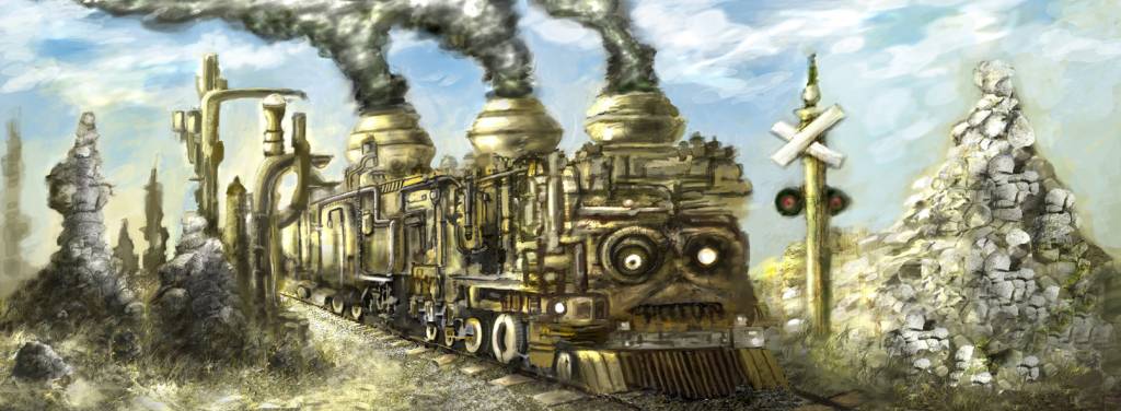
I think I'm nearly done with mine too, added some tracks and tried to get some more detail done on the train, it still looks pretty rough right now, but I worked more on the lighting, I want it to seem like it's almost noon and the sun is shining almost overhead. The left side is really neglected but it only takes up 25% of the image so that's ok.
Please Log in or Create an account to join the conversation.
21 Feb 2015 23:16 #9022
by Domtopia
Everything's on the right!!!
It's like driving abroad!
Replied by Domtopia on topic CGAN Feb 2015 - Letting off Steam - WIPS
I think the pile on the right is too bright and is competing with the train a bit in the foreground.
If the idea is that it is actually in-front on the train, then that's fine, but otherwise, I think it is a little too prominent.
The intricate details on the side of the train look great. The attention to detail is really paying off in terms of visual interest Mic. Nice work! And once again... great idea dude!!!
Everything's on the right!!!
It's like driving abroad!
Please Log in or Create an account to join the conversation.
- crankshaft
-
- Online
- Platinum Member
-
Less
More
- Posts: 1448
- Thank you received: 55
22 Feb 2015 14:58 #9026
by crankshaft
Replied by crankshaft on topic CGAN Feb 2015 - Letting off Steam - WIPS
Looking good micro! Loving the attention to detail. I do think that the last 2 smoke stacks/funnels should be smaller and recede more as they get closer to the horizon (in this case they're actually the opposite, they're getting bigger).
I also think the left side could use more visual simplification as it is quite complex looking in terms of design compared to the right side (all those pipes compared to the rock on the right).
I also think the left side could use more visual simplification as it is quite complex looking in terms of design compared to the right side (all those pipes compared to the rock on the right).
Please Log in or Create an account to join the conversation.
- microscopi
-
- Offline
- Premium Member
-
Less
More
- Posts: 743
- Thank you received: 79
22 Feb 2015 15:15 - 22 Feb 2015 15:19 #9027
by microscopi
Replied by microscopi on topic CGAN Feb 2015 - Letting off Steam - WIPS
Thanks guys !  Looking over it today, I can see the front of the train is really messy and sort of blurry, I think it needs some of that shiny metal look yours has Dom, I want it to look more like metal but I don't want it to take away from the grittyness. I'm going to darken the left side like you suggested too the brightness draws your eye away from the train I know. Crank thanks for pointing out about the left side, I was trying to stay away with too much detail, I like the idea of having the pipes there to show he's getting a tune up but it's overcrowded with the rocks, although I could push the pipes further into the background and make them lighter to show them further away and it would bring out the forground more, I actually spent way more time on the background then I have on the train !
Looking over it today, I can see the front of the train is really messy and sort of blurry, I think it needs some of that shiny metal look yours has Dom, I want it to look more like metal but I don't want it to take away from the grittyness. I'm going to darken the left side like you suggested too the brightness draws your eye away from the train I know. Crank thanks for pointing out about the left side, I was trying to stay away with too much detail, I like the idea of having the pipes there to show he's getting a tune up but it's overcrowded with the rocks, although I could push the pipes further into the background and make them lighter to show them further away and it would bring out the forground more, I actually spent way more time on the background then I have on the train !
Last edit: 22 Feb 2015 15:19 by microscopi.
Please Log in or Create an account to join the conversation.
- CherryGraphics
-

- Offline
- Junior Member
-

Less
More
- Posts: 366
- Thank you received: 33
23 Feb 2015 14:36 #9055
by CherryGraphics
Replied by CherryGraphics on topic CGAN Feb 2015 - Letting off Steam - WIPS
Oh my ... I really forgot to update my WIPS. o.O But nevertheless I worked on it!
Haven't so much time now to comment on all your works - but what I've seen is great so far")
And micro I love Charlie
Haven't so much time now to comment on all your works - but what I've seen is great so far
And micro I love Charlie
Please Log in or Create an account to join the conversation.
Latest Activity

Banj updated their profile picture


Charlotte Still wearing a mask? Is it so we won't see you hoarding food in those cheeks of yours?
See More
Banj Mfmuh Guhmfpf
See More
Charlotte I'll take that as a yes...
See More
Charlotte Why is there a tiny flashing thing in front of the reply link/button? It's so small I can't see if it's an exclamation mark or a question mark... or...both?)
See More
Banj Because? Both!
See More
Charlotte *gasp*
See More

CaptainDeth updated their profile picture

CaptainDeth Ahoy folks, just a newbie here, just getting started. Thanks for allowing me in.
CaptainDeth Thank You
CaptainDeth and Mr.Bungle joined the site


honbasic joined the site


Gawk joined the site