


- Posts: 10080
- Thank you received: 475


I think they're moving in a circle... possibly around an easy prey of some sort, like a hamster... 

Nah, it's the same ones as before. They'll just stick around until deady dead.
![:]](https://cgartnexus.com/images/mod_shoutbox/unsure.png) We are just going to get overrun with s
We are just going to get overrun with s
The shoutbox is unavailable to non-members
Shoutbox History
I think they're moving in a circle... possibly around an easy prey of some sort, like a hamster...
Nah, it's the same ones as before. They'll just stick around until deady dead.
We are just going to get overrun with s
CGAN Oct 2014 Challenge - Dead of Night - WIPs
13 Oct 2014 18:36 #6656
by Valence
Replied by Valence on topic CGAN Oct 2014 Challenge - Dead of Night - WIPs
Micro: That ground plane looks super good now, really expansive and believable.
I understand why you would want to put a tree in front of the moon (I too always get that urge to have some branches poking in front of the bright glow) but it would be wise to also push the tree further back into the distance. Either by making it a little smaller or instead perhaps adding some hazy atmospheric perspective. At the moment it really dominates the image due to the high contrast and high position in the picture which, when combined with the sloping ground, can unbalance the composition and lead your eye to drift to the side and "fall off" the edge.
But these are minor technical details. As a whole the image is coming along fine and I'm looking forward to seeing a bit more detail in that horde.
Keep it up!
Please Log in or Create an account to join the conversation.
- microscopi
-

- Offline
- Premium Member
-

Less
More
- Posts: 743
- Thank you received: 79
16 Oct 2014 21:20 #6697
by microscopi
Replied by microscopi on topic CGAN Oct 2014 Challenge - Dead of Night - WIPs
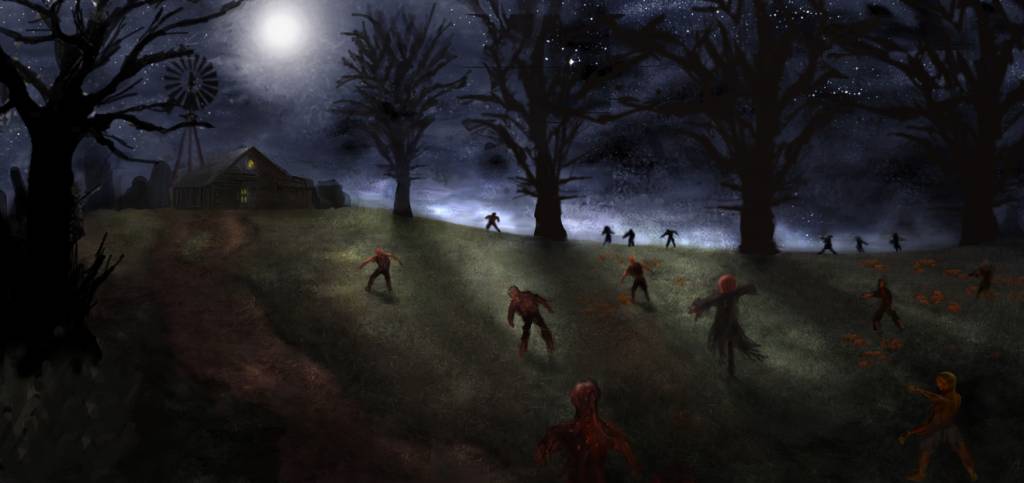
Thanks Valence, tried to make the tree bit smaller and faded into the background more, worked more on the background, still struggling a bit with the zombies, going to detail them more, not sure about the placement either, look forward to seeing anyone else's update. 
Please Log in or Create an account to join the conversation.
17 Oct 2014 18:19 #6710
by Valence
Replied by Valence on topic CGAN Oct 2014 Challenge - Dead of Night - WIPs
Really great!
The spotlighting of the zombies created by the shadows is a really imaginative idea and the backlighting on the horizon is very dramatic. And is that a scarecrow looming out of the dark?? It is!
Very well done.
The spotlighting of the zombies created by the shadows is a really imaginative idea and the backlighting on the horizon is very dramatic. And is that a scarecrow looming out of the dark?? It is!
Very well done.
Please Log in or Create an account to join the conversation.
20 Oct 2014 16:12 - 20 Oct 2014 16:17 #6742
by Linasue
Replied by Linasue on topic CGAN Oct 2014 Challenge - Dead of Night - WIPs
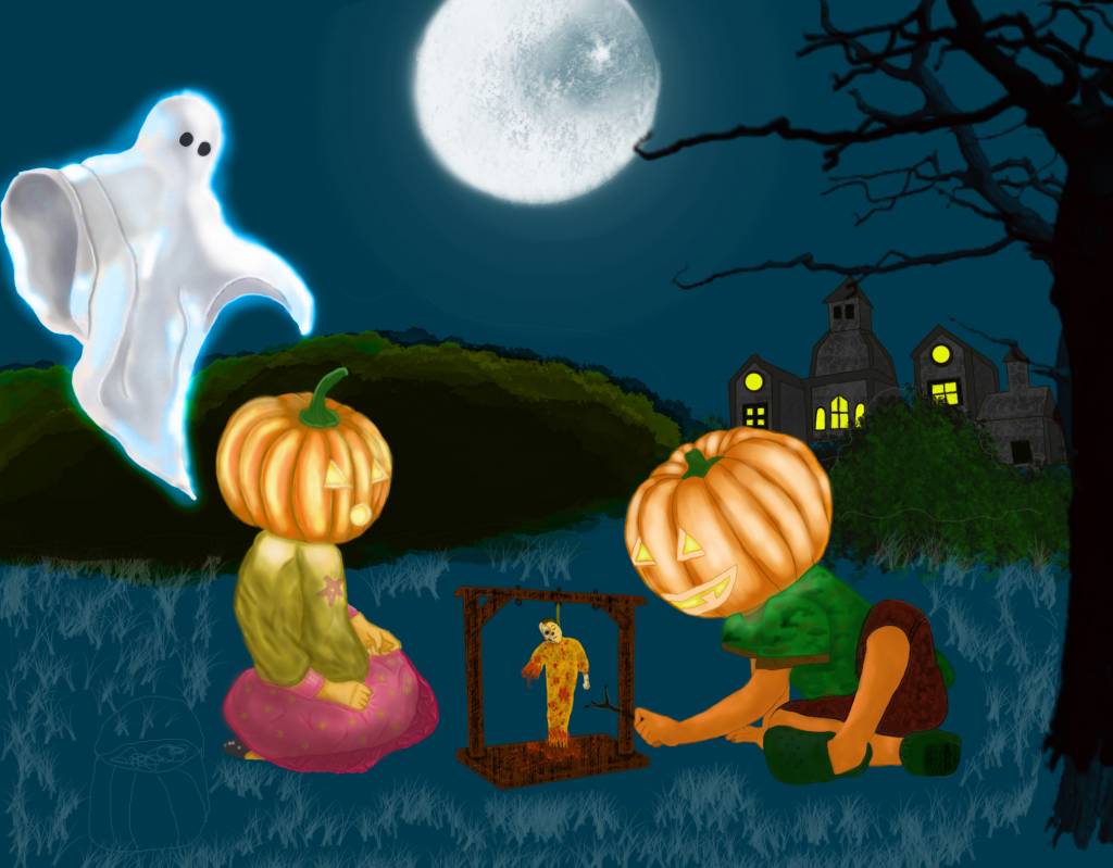
My next WIP. Is it ok ? ")
Last edit: 20 Oct 2014 16:17 by Linasue.
Please Log in or Create an account to join the conversation.
20 Oct 2014 18:24 #6746
by Valence
Replied by Valence on topic CGAN Oct 2014 Challenge - Dead of Night - WIPs
Linasue: That's a great moon. I feel like I could reach out an extra long arm to touch that cratered textured surface. I'd soften the edges of the hazy glow around it though, the concentric circles are a bit too distinct. Perhaps a dark cloud or two peeking in from the top corners could also break up the plain colour and add a bit of depth.
I like the way the glowing pumpkin heads are throwing light onto the figures' shoulders. Perhaps a bit more shadow/shading on the arms/legs would give a bit more dimension and form. And keep thinking about those shadows when you work on the ground to really fix and anchor the figures in place.
Keep going, I'm enjoying it.
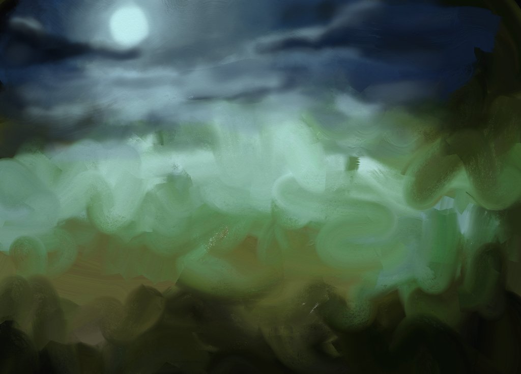
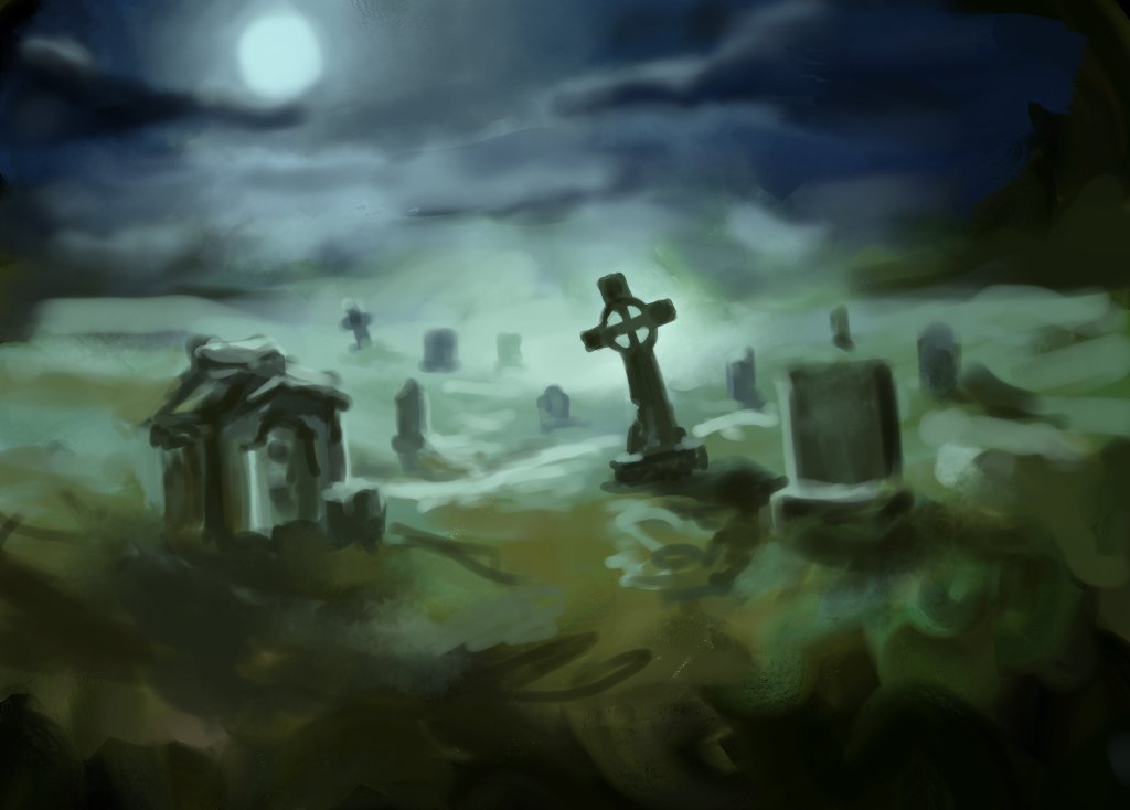
And I know it's a bit late in the day but I thought I might have a final week flurry and try my hand at a graveyard scene. I'm kinda making it up as I go so it's sadly bereft of any kind of supernatural zombie/pumpkin things but I might add some of that later if it progresses. And if not then let's just quietly forget about it.
Actually it developed quite quickly today (in contrast to my non-starting failures at the start of the month) so I saved two wips during 90 minutes work. So here they are...
I like the way the glowing pumpkin heads are throwing light onto the figures' shoulders. Perhaps a bit more shadow/shading on the arms/legs would give a bit more dimension and form. And keep thinking about those shadows when you work on the ground to really fix and anchor the figures in place.
Keep going, I'm enjoying it.
And I know it's a bit late in the day but I thought I might have a final week flurry and try my hand at a graveyard scene. I'm kinda making it up as I go so it's sadly bereft of any kind of supernatural zombie/pumpkin things but I might add some of that later if it progresses. And if not then let's just quietly forget about it.
Actually it developed quite quickly today (in contrast to my non-starting failures at the start of the month) so I saved two wips during 90 minutes work. So here they are...
The following user(s) said Thank You: Linasue
Please Log in or Create an account to join the conversation.
- microscopi
-
- Offline
- Premium Member
-
Less
More
- Posts: 743
- Thank you received: 79
21 Oct 2014 05:15 - 21 Oct 2014 05:25 #6749
by microscopi
Replied by microscopi on topic CGAN Oct 2014 Challenge - Dead of Night - WIPs
Linasue, awesome update. I think the moon looks great and will definitely add some nice lighting to your picture. The anatomy of the kids is spot on too, especially the one on the right, I agree with Valence to play with the lighting now, try to make the foreground by the kids darker and the background lighter, try to imagine how far the light of the moon would reach, the house in the background would be covered in it, should make it lighter, looking great so far, keep it up!
Valence, thanks for your feedback on mine very much appreciated
Also I really love the dramatic mood of yours, wow , the lighting and atmosphere from what you have already is incredible, I think as far as zombies go, maybe an arm or two coming from the ground would put xtra creepyness in yours.
Cherry and Wolf, I get it you got lost in your halloween costume making, finish your pics, print them out huge like and you can both go as your pic for halloween !
Last edit: 21 Oct 2014 05:25 by microscopi.
Please Log in or Create an account to join the conversation.
- CherryGraphics
-

- Offline
- Junior Member
-

Less
More
- Posts: 366
- Thank you received: 33
21 Oct 2014 08:06 - 21 Oct 2014 08:09 #6753
by CherryGraphics
Replied by CherryGraphics on topic CGAN Oct 2014 Challenge - Dead of Night - WIPs
Hey micro - trick or treat, mh? Here I am! 

(this is the time to make a scared face") )
)
Nope. Just had / have to much to do cause I'm leaving my old home to get a new apartment ...
Okay, enough of excitement. I'm a bit sad. This is such a great subject but there are no more than a handful of people taking part in this challenge. eeeey. where are you all???
At first: Micro - I really really love your picture. I've got heebie-jeebies while I looked at it. But I would like if the trees would look a bit more different from each other. They really look the same. :silly: I think this could give a lot more depth to your picture.
Lina: I like it! Hope you'll add some clouds or stars to the scene. This will give depth and the heaven would look more dramatic I think Like Valence said try to work more with shadows on the ground to combine the individual elements.
Valance: Great start! I like the smudge style. It's like a creepy dream I'm fallen in.
So. My next Wip. I really hope I can paint more details until the end of october. This is one of the last steps so I have to hurry up myself a bit. ^^
(this is the time to make a scared face
)Nope. Just had / have to much to do cause I'm leaving my old home to get a new apartment ...
Okay, enough of excitement.
I'm a bit sad. This is such a great subject but there are no more than a handful of people taking part in this challenge. eeeey. where are you all???At first: Micro - I really really love your picture. I've got heebie-jeebies while I looked at it. But I would like if the trees would look a bit more different from each other. They really look the same.
:silly: I think this could give a lot more depth to your picture.Lina: I like it! Hope you'll add some clouds or stars to the scene. This will give depth and the heaven would look more dramatic I think
Like Valence said try to work more with shadows on the ground to combine the individual elements. Valance: Great start! I like the smudge style. It's like a creepy dream I'm fallen in.
So. My next Wip. I really hope I can paint more details until the end of october. This is one of the last steps so I have to hurry up myself a bit. ^^
Last edit: 21 Oct 2014 08:09 by CherryGraphics.
Please Log in or Create an account to join the conversation.
21 Oct 2014 11:10 #6754
by Linasue
Replied by Linasue on topic CGAN Oct 2014 Challenge - Dead of Night - WIPs
Valence, micro and cherry - thanks a lot for your kind words and tips! I will keep that in mind. I'm really happy that you like my work - this really motivates me! You are SO nice :9 Your pictures are so great - I really hope I'll paint this good later.
Please Log in or Create an account to join the conversation.

21 Oct 2014 13:29 #6757
by AngieA
Replied by AngieA on topic CGAN Oct 2014 Challenge - Dead of Night - WIPs
I haven't had a chance to start yet but wanted to pop in and see what's happening. There are some very different styles in this challenge from ultra cute to scary and they all look great to me. It's nice to see such variety.
Please Log in or Create an account to join the conversation.
21 Oct 2014 18:27 #6763
by Valence
Replied by Valence on topic CGAN Oct 2014 Challenge - Dead of Night - WIPs
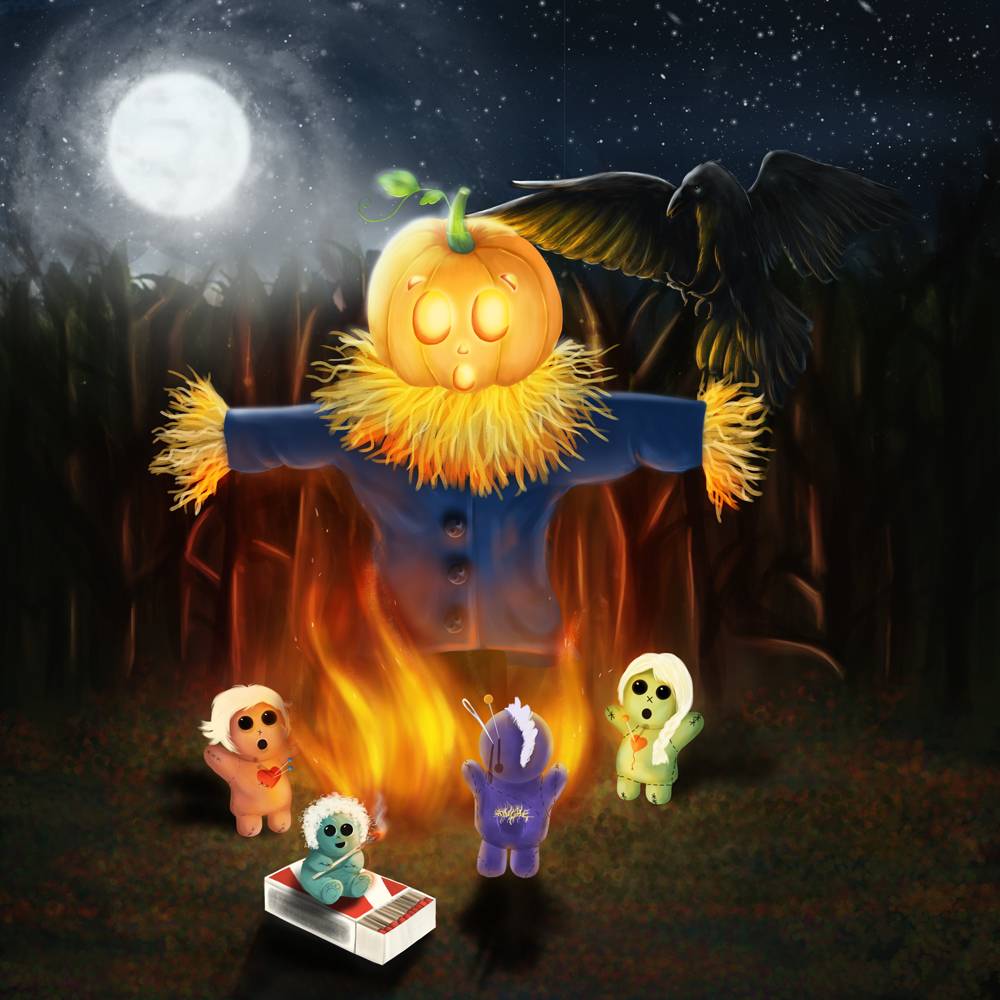
Cherry: Excellent progress.
I do think you should darken that matchbox. Maybe you were going to do it anyway and I've jumped the gun a little bit, but at the moment it's almost the brightest thing in the picture and draws your eye away from the action.
Also have a play around with that purple/blueish doll. It's stood directly in front of the flames so although I don't think it would be a complete silhouette it would appear a bit darker with some bright rim light and maybe a bit of subsurface glow towards the edge.
That bird is super sinister! I was almost going to suggest adding more glow from the fire but now I'm not sure. I think it looks spookier as it is with just that subtle edge to it, like a ghostly thing that's there and not there at the same time! Like something you think you see out of the corner of your eye but when you turn to look .... it's gone!
The following user(s) said Thank You: CherryGraphics
Please Log in or Create an account to join the conversation.
Latest Activity

Banj updated their profile picture


Charlotte Still wearing a mask? Is it so we won't see you hoarding food in those cheeks of yours?
See More
Banj Mfmuh Guhmfpf
See More
Charlotte I'll take that as a yes...
See More
Charlotte Why is there a tiny flashing thing in front of the reply link/button? It's so small I can't see if it's an exclamation mark or a question mark... or...both?)
See More
Banj Because? Both!
See More
Charlotte *gasp*
See More

CaptainDeth updated their profile picture

CaptainDeth Ahoy folks, just a newbie here, just getting started. Thanks for allowing me in.
CaptainDeth Thank You
CaptainDeth and Mr.Bungle joined the site


honbasic joined the site


Gawk joined the site