


- Posts: 173
- Thank you received: 16
oops 


I think they're moving in a circle... possibly around an easy prey of some sort, like a hamster... 

The shoutbox is unavailable to non-members
Shoutbox History
oops
I think they're moving in a circle... possibly around an easy prey of some sort, like a hamster...
CGAN Feb 2015 - Letting off Steam - WIPS
23 Feb 2015 15:36 #9060
by oaktree
Replied by oaktree on topic CGAN Feb 2015 - Letting off Steam - WIPS
quick update from me
Please Log in or Create an account to join the conversation.

23 Feb 2015 20:29 #9065
by Domtopia
Everything's on the right!!!
It's like driving abroad!
Replied by Domtopia on topic CGAN Feb 2015 - Letting off Steam - WIPS
That... is... cool!!!!
Everything's on the right!!!
It's like driving abroad!
Please Log in or Create an account to join the conversation.

24 Feb 2015 00:49 - 24 Feb 2015 02:37 #9067
by Valence
Replied by Valence on topic CGAN Feb 2015 - Letting off Steam - WIPS
Cherry: I wondered what you were gonna do with the background and the map idea is a good one. I like that look of that old textured paper. Hard to do but very nice to look at.
Oaktree: Nice to see a foreground object/figure to add to the depth of the image. Try to pick out some subtle highlights in it to make it pop (but not burst! )but not too much to distract from that lovely painterly background. And great design for the ships too!
Well this is a bit of a struggle for me. I hadn't given much thought to the girl's pose. I knew I wanted her right-hand to be touching the robot's claw on her shoulder to show some kind of connection between them. And for the other hand? … I just scribbled something that seemed natural, a hand on hip kind of thing. Then when it came to detailing I realised that it was exactly the same pose from Cherry's picture, albeit from a different angle. I know I'm always unoriginal but that's going a bit too far (plus Cherry's drawn it much better than me so I'd rather not expose my failings with a direct comparison!). So I've been trying out some different hand/arm poses for that side. I tried the (still unoriginal) dainty umbrella one first but all the angles seemed a little unbalanced and the umbrella obscured a bit too much behind her head and ruined the high contrast edge to the hat. (Plus having to draw that intricate umbrella mechanism underneath the canopy is absolute hell.) So I then had a go at the (STILL unoriginal!) angled cane pose and I know it's still sketchy at the moment but I think it looks balanced and works compositionally. And if it doesn't, well I don't know if I'll have time to try anything else. I only remembered the other day that we're in February and that means several days less than I thought I'd have. So part of the picture may have to remain loose and sketchy.
Oh and please don't ask me how those hip joints are supposed to work.")
Edit: and I think her exposed shoulder may be a bit "wide". I'll nip it in a bit next time and see if that looks better/worse.
2nd Edit: Just spotted another mistake. I had altered the position of the robot's arm via a bit of select/transform to avoid another tangent and foolishly I've left a bit of the unaltered layer peeping through under the claw at the bottom left which makes the "finger" look too long and the perspective to seem clumsy and ... well, wrong! One more thing to go on the list of corrections.

Oaktree: Nice to see a foreground object/figure to add to the depth of the image. Try to pick out some subtle highlights in it to make it pop (but not burst!
)but not too much to distract from that lovely painterly background. And great design for the ships too!Well this is a bit of a struggle for me. I hadn't given much thought to the girl's pose. I knew I wanted her right-hand to be touching the robot's claw on her shoulder to show some kind of connection between them. And for the other hand? … I just scribbled something that seemed natural, a hand on hip kind of thing. Then when it came to detailing I realised that it was exactly the same pose from Cherry's picture, albeit from a different angle. I know I'm always unoriginal but that's going a bit too far (plus Cherry's drawn it much better than me so I'd rather not expose my failings with a direct comparison!). So I've been trying out some different hand/arm poses for that side. I tried the (still unoriginal) dainty umbrella one first but all the angles seemed a little unbalanced and the umbrella obscured a bit too much behind her head and ruined the high contrast edge to the hat. (Plus having to draw that intricate umbrella mechanism underneath the canopy is absolute hell.) So I then had a go at the (STILL unoriginal!) angled cane pose and I know it's still sketchy at the moment but I think it looks balanced and works compositionally. And if it doesn't, well I don't know if I'll have time to try anything else. I only remembered the other day that we're in February and that means several days less than I thought I'd have. So part of the picture may have to remain loose and sketchy.
Oh and please don't ask me how those hip joints are supposed to work.
Edit: and I think her exposed shoulder may be a bit "wide". I'll nip it in a bit next time and see if that looks better/worse.
2nd Edit: Just spotted another mistake. I had altered the position of the robot's arm via a bit of select/transform to avoid another tangent and foolishly I've left a bit of the unaltered layer peeping through under the claw at the bottom left which makes the "finger" look too long and the perspective to seem clumsy and ... well, wrong! One more thing to go on the list of corrections.
Last edit: 24 Feb 2015 02:37 by Valence.
Please Log in or Create an account to join the conversation.
24 Feb 2015 15:31 #9070
by Domtopia
Everything's on the right!!!
It's like driving abroad!
Replied by Domtopia on topic CGAN Feb 2015 - Letting off Steam - WIPS
Val: I think the umbrella idea is an interesting one, if you can pull it off. Maybe just by widening the canvas a bit you could accommodate it with out ruining the composition. Plus, if you keep it light then you will lose non of that nice contrast you mentioned.
The lamp post is a weak point for me, because it seems kind of isolated and unattached to the composition. If you want a linear object for that side of the painting, then maybe giving HIM the cane might be a better idea and it would add extra novelty to the character.
One other observation is the perspective. We should be looking edge on to the it's knee, or maybe even looking down slightly, judging by the way we are looking down slightly on the woman, but at the moment we are looking up at them. If it's elbows are at eye height, which is what it looks to be, then use that to judge what we are looking up at and what we are looking down at.
There's still time dude! See what you think!!
Everything's on the right!!!
It's like driving abroad!
Please Log in or Create an account to join the conversation.
24 Feb 2015 16:57 #9073
by Valence
Replied by Valence on topic CGAN Feb 2015 - Letting off Steam - WIPS
Yes I too like the umbrella idea and if I was starting from scratch (and planning things for once!) then I would definitely go with that but the time (and the necessary compositional fudge) is currently killing that idea for me.
The cane for the robot is also a good idea. I ruled it out early on due to not knowing how his big clumsy claws would hold it but I might have another go seeing as I'm correcting errors there anyway. (I'd be able to do so much more with my pictures if I didn't waste so much time correcting so many errors!)
As for the perspective, I am actually going for the "upshot" view from below her eyeline with the characters looking down as that's the best way to emphasize tall figures and objects. That's really the only reason for the lamp (aside from it being a classic Victorian cliche.) Having the lamp and the opposite building as a converging frame is intended to imply vertical distance and hence the tallness of the robot. Also one thing I'm also going to add is a bit of distant misty skyline which will appear very low (between the robots legs) so perhaps that sense of horizon will help me explain and correct the view more when it's in.
The weak part, whether it's viewpoint perspective or pose, is always gonna be the girl, I think that's where the major errors are so hopefully, time permitting, that's where I'll try and fix it.
Please Log in or Create an account to join the conversation.
24 Feb 2015 21:32 - 24 Feb 2015 21:32 #9074
by Domtopia
Everything's on the right!!!
It's like driving abroad!
Replied by Domtopia on topic CGAN Feb 2015 - Letting off Steam - WIPS
The girl is fine. The problem is with the robot I think.
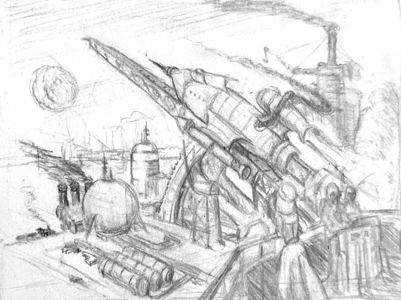
I can see that you have tried to use the building on the right to create a sense of scale, but it is too close to the picture plane so doesn't read well. I might try to elongate the robot's body. The perspective will work better then. At the moment, if you were to trace the robots legs down to where the woman's legs would end, you can see that the torso is really truncated. That extra height will sell the scale better than the building does.
I've done a quick paintover to show what I mean. It took minutes to make these changes. You could make changes like these easily in the next four days.
Everything's on the right!!!
It's like driving abroad!
Last edit: 24 Feb 2015 21:32 by Domtopia.
The following user(s) said Thank You: Valence
Please Log in or Create an account to join the conversation.
24 Feb 2015 22:19 - 24 Feb 2015 22:21 #9075
by Valence
Replied by Valence on topic CGAN Feb 2015 - Letting off Steam - WIPS
It is always fascinating to discuss things like this and find out how other people view things and work things out. The robot you've done is a bit too top-heavy to my eye although I see how it'd work with a different viewpoint. But with an upshot view that'd be way too big.
For instance, if you do a normal landscape with a straight road disappearing into the distance, then the more distant half of the road would appear shorter than the nearest half because the horizontal lengths appear to gradually contract the further away you get. When you do a tilted "upshot" the same thing happens with vertical lengths the higher you get, so for the picture I've been trying to do the top half of the robot has to appear shorter than the bottom half. The reason that the perspective isn't instinctively obvious to the viewer (and this is the failing on my part and the nature of the errors I'm trying to correct) is because the same thing isn't happening with the girl, and seeing as she's human your eye focuses more on her than the robot and judges the picture from her incorrect figure.
I have been trying to enlarge the lower part of her body but I really don't want her to have gargantuan hips! I think reducing the gap between the chin and the chest may have a positive effect and I'll be experimenting with this tomorrow … as well as detailing the hand a bit better. I also had some plans for the building but like I said … time, time, time.
I wish I could work as fast as you do paintovers Dom!")
For instance, if you do a normal landscape with a straight road disappearing into the distance, then the more distant half of the road would appear shorter than the nearest half because the horizontal lengths appear to gradually contract the further away you get. When you do a tilted "upshot" the same thing happens with vertical lengths the higher you get, so for the picture I've been trying to do the top half of the robot has to appear shorter than the bottom half. The reason that the perspective isn't instinctively obvious to the viewer (and this is the failing on my part and the nature of the errors I'm trying to correct) is because the same thing isn't happening with the girl, and seeing as she's human your eye focuses more on her than the robot and judges the picture from her incorrect figure.
I have been trying to enlarge the lower part of her body but I really don't want her to have gargantuan hips! I think reducing the gap between the chin and the chest may have a positive effect and I'll be experimenting with this tomorrow … as well as detailing the hand a bit better. I also had some plans for the building but like I said … time, time, time.
I wish I could work as fast as you do paintovers Dom!
Last edit: 24 Feb 2015 22:21 by Valence.
Please Log in or Create an account to join the conversation.
24 Feb 2015 22:54 #9076
by Domtopia
Everything's on the right!!!
It's like driving abroad!
Replied by Domtopia on topic CGAN Feb 2015 - Letting off Steam - WIPS
Again Val, I think the female character is fine. But if you extend the image to accommodate a full body pose, then you may spot where the perspective problems start.
I did that for the paintover, hence the elongated body to match the machine's over-long legs. The image is too straight-on for any serious foreshortening on the machine, unless it is much taller. Because we are presented with two different points of view, one for the woman and one for the machine, we are given two different perspectives. The result is just as you mentioned, it's not "instinctively obvious to the viewer" just where the machine is in relation to the woman.
You are wise to have connected the two characters using the machine's arm on her shoulder. That should be your eye-line to judge the rest of the image because that's the perspective from which the woman has been drawn.
In my opinion, she is the strongest part of this image so far, so you should stick with her!
Everything's on the right!!!
It's like driving abroad!
Please Log in or Create an account to join the conversation.

24 Feb 2015 22:56 #9077
by Kodabble
Replied by Kodabble on topic CGAN Feb 2015 - Letting off Steam - WIPS
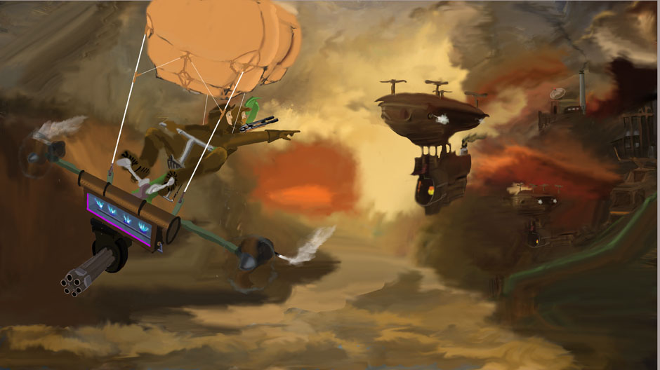
So I finally started on my idea of a steam launched spaceship. Not sure yet if I am going the right direction for a steam punk image.
WIP 1
WIP 1
Please Log in or Create an account to join the conversation.
24 Feb 2015 22:59 #9078
by Kodabble
Replied by Kodabble on topic CGAN Feb 2015 - Letting off Steam - WIPS
And a little color work.
WIP 2

WIP 2
Please Log in or Create an account to join the conversation.
Latest Activity

Banj updated their profile picture


Charlotte Still wearing a mask? Is it so we won't see you hoarding food in those cheeks of yours?
See More
Banj Mfmuh Guhmfpf
See More
Charlotte I'll take that as a yes...
See More
Charlotte Why is there a tiny flashing thing in front of the reply link/button? It's so small I can't see if it's an exclamation mark or a question mark... or...both?)
See More
Banj Because? Both!
See More
Charlotte *gasp*
See More

CaptainDeth updated their profile picture

CaptainDeth Ahoy folks, just a newbie here, just getting started. Thanks for allowing me in.
CaptainDeth Thank You
CaptainDeth and Mr.Bungle joined the site


honbasic joined the site


Gawk joined the site